I'm a sucker for good little microinteractions. The author's checkbox may not be one of those, as it seems a bit overdone, but I'd have to try it to be sure. It's easy to go too far.
To each their own. I find the hover states on the jam3 site unintuitive, like the clickable area is moving out from under me, forcing me to track it before perfoming the actual click. Reminds me of a flash ad where the target moves as your mouse gets closer.
Yep that hover animation alters user perception of it's fundamental state, from a button to link. Not saying experimentation is bad, but in general that kind of incongruence is a big no-no for production UX.
The hamburglar icon is a perfect example - the whimsey happens after the action is performed (arguably the menu should appear immediately instead of pop out, but it's pretty quick) instead of delaying the action until the animation completes.
The animation is highly distracting. It draws the attention to the button instead of to the menu the user now wants to use. The animation creates a “wow” effect on first use, but that’s exactly the kind of visual affordance you don’t want on a UI element for routine use.
IMO, it works because the button moves much less than the menu itself, which is a large block of color that slides out. My eye is drawn to the larger visual change.
I think it's perfect. It's hard to miss the giant white sidebar that pops up. Actually, I think it's safe to say nobody is going to miss it. Keeping immediate attention on the hamburger icon that now switched to an 'x' gives users information on how to close the sidebar if they wish (as opposed to swiping it left or something). If the "distracting" animation we're omitted, the site could have a different problem that users didn't see the 'x' and now don't know how to close the sidebar. I think this site found a perfect balance on usability.
It’s pretty slow. The movement in isn’t too slow (though it’d be better faster), but I find the little bounce at the end to be slow and disconcerting (that’s not the way a physical spring would go). I’d be inclined to almost double the speed, halve the bounce and speed it up even more.
More interesting is something exposed in the dev tools. I managed to die.
Yeah, I think that bounce at the end could use a bit of tightening up. I would have made it quicker but with less horizontal movement, so it feels more elastic.
Thank you for this, bookmarked. However, I like the original example because the spinning animation on the hamburger menu almost looks like it's directly causing the side nav to appear, as if it were a hand crank. The spinning matches up perfectly.
The red button shows how important depth is for UI controls. There would never be any doubt that it’s an interactive element.
I wish the flat design trend we’re only now starting to drag ourselves out of only extended to materials. I’ve no problem with getting rid of the OS X Aqua/Windows Aero-style gloss that was everywhere and starting to look dated, but we lost a ton of usability by making interactive elements indistinguishable from labels.
The red button is also lacking some really subtle queues if the press is cancelled. On mobile, touch the button and drag-scroll, and the button should not remain down. On desktop, ctrl-click and the button should not press, or click down on your mouse and press [ESC], and the button should cancel (I think - I am not on my desktop).
Most controls have a bunch of really subtle and unobvious platform dependant behaviour. Often control replacements/skins lose subtle behaviours.
In my opinion the timing of a very quick tap on the button feels off on my iPad - although I’m unsure if that could be improved with CSS or JavaScript.
Very nice example of texture animation driven by css transitions. I'm a game dev. After Unity began to support css transitions, I found myself doing more and more flipbook stuff to really give existing UI elements that extra punch. A recent example: https://vimeo.com/718225603
The citymapper hamburger icon definitely has a humorous element too!
I'm not sure I agree with the quote though. It so happens that the websites I linked all had an element of playfulness, but I don't think that's required.
IMO, there's nothing playful or "humorous" about this animation. I would describe it instead as "elegant"—it gives the site an extra level of sophistication.
It's really great that unlike Jam3, your site and the first example still work perfectly fine without javascript enabled! It's amazing how many people will spend a lot of time on little details and animations while neglecting to make sure the site degrades gracefully and is still useful without a bunch of remotely hosted JS.
I actually spent a significant amount of time making my site work without Javascript. My noscript.css is only ten lines, but it adds an extra pathway into the code. I've broken several times while making other changes, and it took a while to fix. It's easy to make motherfuckingwebsite.com work without Javascript, but start adding fanciness and it becomes difficult quickly.
I do it anyway because it's my personal site, and so I set out with certain rules for myself. In addition to working without Javascript in modern browsers, my site also supports IE 11 and Safari 6 (when Javascript is enabled). There is no build system, and all the code is handwritten (with a handful of very tiny third-party libraries like Waypoints).
Philosophically, I believe this is the right way to make a website. Realistically, I would never do any of it on a professional project. No one ever actually sees it.
(I'd like to make a distinction between support for unusually-configured software and support for weak hardware. I think it's broadly unethical to ignore performance because you're lucky enough to afford a fast computer. Manufacturing chips is bad for the planet, and the new ones might as well be no faster than the old ones if the code is going to be slower.)
Some combination of taps on the green one next to it (might be a double tap on the green) and taps on the hamburger break the hamburger in iOS. I guess that the price for having a fun button.
You might be interested in checking out the playdate[0]. It's a handheld game console that's absolutely chock full of these sorts of things and it's absolutely delightful.
For example to unlock it you need to press the unlock button twice. If you press it once one eye opens, if you press it twice both eyes open and the thing unlocks. If you press once and wait a bit a thought bubble pops up telling you you need to press it twice.
I don’t know why, but I wish this rotated clockwise for both sun → moon and moon → sun. The fact that it’s a wheel, but switches direction, is deeply unsatisfying to me for some reason.
I agree. It might be because having it go clockwise would make the sun appear to be setting? I do agree with the other point about having the wheel just go in one direction as well.
One more I initially resisted sharing because I worked on it: https://2019-annual-report.fnih.org/ The hover states on "Understanding", "Breakthroughs", "Solutions".
There's no framework involved by the way, it's just some CSS transforms. :)
Wow, the hover states in the second link are incredible. They feel "just right".
> I also happen to be quite proud of the hover states on my own site
Those are nice as well, though I'm not sure why the button animation is so delayed. It felt like I missed the button with the cursor until it suddenly started wiggling.
This might be something I need to rethink—the entire card is a link, not just the tiny button. I don't expect most users to hover for long enough to see the wiggle; it's meant to say: "alright, you've been thinking about this for a while now, come on and click already."
The animations on things like this can be cute and fun the first time, but man they can get annoying if they're constant and can't be skipped. Hearthstone is an example of this; there's tons of cute animations for the various cards, but they can take way too long.
Hiding "no animations" for power users under accessibility is a great way to go.
Once a day for a few things that you are tracking (and really want to improve) doesn't seem to fall into my "constant" definition. Hearthstone would have dozens (hundreds?) of those animations on every single game you play. Here, it's three or four times a day? For things that you really feel satisfied to accomplish?
I liked the end result a lot. The whole animation seems very appropriate in this case to me. The rant that I see in your comment (and every other comment here by the time I am writing this) seems very out of place. Everyone is complaining about things that are not what this designer did.
I'm doing online shopping once a week. At some point they added a 3 second animation of "boost" in points to some products. I see it once a week and I hate it with passion. It slows down what I'm trying to do, even if I achieve something I maybe even could care about... but I hate the interference so much I refuse to check what the "boosting" is even about.
The point is - it doesn't matter how infrequent it is. If you don't allow disabling it, it's going to piss someone off.
If a service uses any amount of animation, then i'm instantly searching for an alternative. Excessive animation like this and i'm lost customer right away.
Depends on how frequently you're interacting with this widget. The annoyance of animations comes from the integral of all time you have to spend watching them; if they're in the critical path of a workflow that you do multiple times a day they get very annoying very quickly.
I've only glanced at this app, but the goal seems to be forming a habit of doing things once a day. If you're only interacting once every 24 hours, I'd take a 1second animation with some charm over a static checkbox.
Yes please. Let me turn that off. It is now becoming harder and harder to turn all those time wasting animations everywhere
Android for example has clearly a bunch of bugs where some stupid slow animations cannot be tured off. Yes even with turning off animations in accessibility and via the developper options.
On iOS, it doesn't seem to be possible to turn any of them off. You can merely "reduce motion". But it still wastes up to second in the worst case.
What about gtk3 or 4. Now there is some crap animation everywhere in gtk applications and I don't know how to turn that off.
Computers are so fast. Most software is already bad enough that it manages to slow down our beautiful hardware. Let's not make it even slower with animations.
Sure have optional animations if that helps newcomers understand better the flow of your application. But make it optional please. Pretty please?
> Android for example has clearly a bunch of bugs where some stupid slow animations cannot be tured off. Yes even with turning off animations in accessibility and via the developper options.
I recently found out about Android's animation disable feature and holy hell it made my phone feel so much more snappy and responsive to input. But as you mentioned there are too many bugs - one of the more annoying ones is that loading wheels (which I would prefer to keep because you have to wait anyway) are not animated. I'm tempted to use it anyway. Hopefully in the future Android will add some sort of categorization/prioritization for animations so things can be tweaked more.
I may be in the minority here but I am kind of annoyed with how "juicing" the interface/experience seems to be kind of bleeding over into general applications from the game development scene. It does make sense for games and some apps but in general I don't need animations and tweens attached to every button on my phone.
The end result is that all animations provided by the OS are running at twice the speed and it feels snappy while still allowing animations to do their job at hinting information.
> one of the more annoying ones is that loading wheels (which I would prefer to keep because you have to wait anyway) are not animated.
Pretty sure this is due to the fact that being able to disable animations is usually done as an accessibility concern - for people who are motion sensitive it could be problematic to have loading bars etc.
I agree that the categorization of animations could be helpful. Or at least being able to limit it by app.
The key thing I think is you have to keep the user in control.
I have the same rant about excessive animation in the user interface, and on reflection it is not exactly the animation that is the problem, sure, it is the exasperating factor, but the underlying problem is that you have removed the users control in favor of the animation, however, that being said, keeping the user in control requires an interruptible animation system, which requires more moving part and is harder to get right... probably for the best to just leave off the animation entirely.
My impression is that Android implements animations by reducing the animation frames but not the frame per second rate.
So if an animation is a long rotation (like a loading indicator) it turns into a high frequency strobe light
(Most loading animations are replaced by a static image, but not all)
Hearthstone is such a catastrophe on this. There are multiple fun strategies that are literally rendered unviable because the animations slow you down too much and it's not possible to execute them well within the turn timer (for e.g. infinite pirates or brann in battlegrounds).
Actually I think they can stay fun indefinitely if they are fidgetable and to be fidgetable you can make those animations rendering and acting differently according to the user input.
Back in the day, the lock screen of the iPhones hand a physics based bounciness. When you slide the lock screen from the top it would slightly bounce at the bottom and if you accelerate the lock screen it would bounce more. I fidgeted with that all the time, I was sad when they removed that.
UIs become so boring, I hope and expect to get some skeuomorphism back. Our current devices are so capable that this time the skeuomorphic designs can be much more convincing.
Totally agree, I even think that adding all this is not making the product better but actually worse.
I agree that making actions feel more rewarding is great, so adding some sound and maybe a bit of more design to the check box is great. One of the things I enjoy the most about my mechanical keyboard is the click that each keystroke makes.
But going all the way to create a 3D animation, that now takes seconds to go from unchecked to checked actually feels like making a daily process more time consuming and annoying.
Starcraft did it better, everything responds 'instantly' or very quickly and persist clicking is rewarded with fun animations and pop culture voice lines. Hearthstone could take all your inputs first and queue up animations second.
Yes. I don't want to have to hold down a button just to check a box if it's something I need to do with any kind of regularity. Just give me a damn checkbox. If it's something big and rare, this cutesy stuff is fine.
I think the point of the app is that this is something big and rare. You're developing a daily habit, so you're pressing this once a day, which is pretty rare in the scheme of digital interactions.
There was a game called Battle Chess 3000 or something, on Windows 95. It had aliens and robots who would kill each other in funny ways when pieces were taken. The moves sometimes took 20 seconds or more to show. Fortunately, the developers included a "skip animations" option to move things along.
Just a matter of degree, which becomes obvious when you imagine the extreme: HS without any animations would be very unfun.
So the answer is somewhere in between and the optimal UX might only be achieved by adjusting for individual players, for example depending on their speed or for how they have played the game.
Slay the Spire, a deck building rogue like has very sparse animations and a "fast mode" which I enabled almost immediately. Then again, it's not a multiplayer game and has no loot, which may have influenced the decision in Hearthstone.
Agreed, for best user experience animations are generally capped at 500ms. Dealing with something like this checkbox where you interact with it more than once would kill the novelty real quick.
They do that to keep you playing longer. I wonder if OP would describe the loot opening dance in games like hearthstone and Overwatch as rewarding game feel, rather than an intentional time sink.
Remember, for a user centric app, the goal is for the user to use it AS LITTLE AS POSSIBLE. Not because it is frustrating to use but because it is efficient and you respect their time. Optimising for stickiness is user hostile.
It's pretty cool! As experiments I really love andy.works' work. I appreciate what he's trying to accomplish. And I think he's on to something with the idea. But the execution is always a little off to me.
I just don't find this checkbox all that satisfying. Why? The thing I find satisfying about checkboxes is the same as any switch – the click. On/off. It's snappy. I don't think about it. Click... click... click click!
So this grandiose check animation is taking something inherently snappy and prolonging it to its own defeat. Even the sound effect is like an ethereal chime or something, rather than a snap. The scale is super big for the actual space of the phone. The animation too long. I also don't like the angle of the 3D checkmark itself. It's not really oblique, not really at any sort of satisfying geometric angle? I can live with that though.
Anyway really cool work. Wish it were more satisfying.
I share exactly your sentiment. The snappy on/off is what makes the checkbox satisfying for me. The "ding" whenever you check an item off the list in Wunderlist comes to mind.
I've learned to design UX that "gets out of the way." I have written some pretty cool UI elements that I've ended up, not using.
Here's an example; It's a cool "popup prize-wheel spinner" for iOS, and I have tried using it a few times, but we always decide that it's too intrusive: https://github.com/RiftValleySoftware/RVS_Spinner
This post is everything that’s wrong with UX. Somewhere along the way they forgot about simplicity of implementation, mental models, repeat user experience, and most of all, stopped listening to what the user wanted and instead designed things in an ivory tower for award shows.
Aren’t those points exactly what the post and the award-winning app is about? Certainly the users’ needs are why this exists, and while not exactly simple to implement, implementation serves design serves user needs.
Being data-driven is how you get Google's UIs where every color is A/B tested and yet nobody likes the results. Nobody is actually qualified enough to use statistics this way, and nobody who has good taste enough to make the decisions when you don't get good data back is going to put up with the A/B test in the first place.
An A/B test with two bad options will just lead to the least worst option but OP correctly points out that to design a new way of doing a checkbox etc. with no problem to solve is a dangerous exercise in vanity. In some cases these unecessary changes get put upon users potentially ruining muscle memory, overload people with sensory disorders and not achieving much more than a simple checkbox.
I don't necessarily think we should never try for something better but it should be based on data. It should also recognise the physical metaphor that these controls were based on for a reason. Ask a question on a paper form and a checkbox is simple for cognitive load. That's why I get annoyed at these flat designs where buttons don't look like buttons and tabs don't look like tabs so you end up having to explore to use something that would be 100 times easier in a paper form. Using hover for feedback is perverse both because it requires you interact with controls to work out whether you can interact with them and secondly that it doesn't work instinctively (or at all) on touch devices.
The thing about an A/B test is that you don't have to put up with it because you don't know you're in it. So I don't think there's much friction in executing one as long as you're bucketing the population in a sane way (e.g., don't show two different things to the same person at two different times).
I hear you on the misuse of statistics, but unless you're running multivariate experiments, this isn't much of an issue. Yes, if you can't even describe an experiment in a table/matrix, then it's probably too complicated and the results difficult to parse. I think most A/B tests don’t fall into this category and are far simpler.
Let me try to offer a practical A/B test for this checkbox.
Hypothesis: We believe that making the checkbox animated and reactive will result in people creating more to-do list items right after using the checkbox because they love it so much.
Test: To verify that we will deploy the new checkbox to half the users, and half the users get the normal one. Run this for a duration of two weeks.
Metric: We will measure the amount of to-do list items created right after someone completes a to-do list item.
Criteria: We are right if people with the new checkbox create 1.2x more to-do list items than the ones with the old one.
--
The above is not a difficult experiment to create or analyze.
I would also take the vision of an excellent designer over the design-by-committee / design-by-data approach.
The iPhone and its UI might be the best example of the last 20 years - very few things even come close. But - there are many more examples of bad designs created by people who were not as visionary or excellent as they thought they were.
That's why as a user I don't discount Google's approach - it will never reach the highs or lows of a visionary design, but for most things, the middle-of-the-road approach is probably best.
Unfortunately, that keeps us stuck in technological local maxima; the users necessarily operate in the framework of existing things and are thus unable to articulate novel things they actually want or need. These are simply things users do not think about in a sufficiently extensive capacity and manner.
That is fine for things that serve an obvious function. If you need a checkbox, use a checkbox, it doesn't need improving. If, on the other hand, you create a new type of control/interaction to solve a problem better, great. Also, what iOS did was not a single control but a completely coherent set of controls and interaction that might have lots of people working on it but which all had to pass muster with Steve Jobs before it was approved.
I haven't used iOS but have used MacOS and although I would argue that MacOS to me is not a good UI (you have to learn what most things do before you can do them), the consistency is somewhat comforting.
Only somewhat related to the article, but It's amazing to me how much audio + animation adds to the user experience for games, and even some apps.
Not a checkmark at all, but the way games like Smash Bros Ultimate makes pressing around menus sound totally exciting and satisfying. The sound, the lightning/sparks, and how it all rumbles slightly on press. Yes I know Smash has some UX issues, but overall the craftsmanship for simple things is amazing.
Someone had to design and prototype that, similar to the author of this article. I'm not sure this particular example is great tbh, but I am sure there's a lot of "pointless" exploration needs to happen before landing on something great.
As long as we're talking about the switch, I love the design of the actual switch OS. It's so minimalist and snappy, everything feels clicky and does what I expect. There's nothing extra added in just for the sake of it.
Holding down B to exit menus in SSBU is awful! But I actually like the interaction of entering menus that uses the same pattern. I think it’s because I don’t mind the anticipation of moving forward, but hate the drag of not being allowed to go back.
What do you mean "Not being allowed to go back"? You hold 'B' and it plays a sound and vibrates the controller to reinforce that something is happening. It's allowing you to go back while also preventing you from going back (and losing all your configuration) accidentally.
I think this is great. I'm going to take this in the spirit of the post and assume this is all for funsies and to be silly. But I think there are a couple of things missing from making this Most Satisfying:
* The sounds is not satisfying enough! It's too..."wahhhhhh" and not enough "ker-chunk!" like the writeup described. I think I get what he's going for, but it's not quite there. I want the same feeling I get when I flip a nice heavy switch. Some heft, some weight, some judder as it slams into place. I'm thinking of the feeling in the game Fez when you turn a wheel.
* The pattern of "hold and release to activate" is hard to get right and I still haven't seen it done well. Your animation must be nonlinear, because people are going to just tap. That's so little time that it's not enough to see anything happen. That initial animation has to pop out really fast and then slow down, to indicate to the user that they needed to hold it for a little bit longer for it to activate.
It's discoverable enough because the next thing after tapping that most people try is dragging. And any dragging across any part of the screen activates the animation for the length of the drag.
It's plenty discoverable because they've made the whole screen control the animation
"Most people" is the key word here. If discoverability hinges on hoping on what they'll try next, then that's not good. And more likely than not they're going to tap again, because why would you drag a checkbox?
If you make the animation nonlinear and pop out quickly, we don't need to hope: they'll see it immediately! It works 100% of the time, rather than only on the x% that try dragging next.
The article is not talking about a regular checkbox that you would use on some web form. It's a special checkbox that you click infrequently, as a reward when you do something for a habit you are building.
A lot of commenters seem to have overlooked this... C'mon people, use your brain.
I don't think one can honestly give a harsh critique without trying it, in this case. It's a very specific use case. I haven't tried it myself, so I don't actually know if it is any good. But the vision they had when designing it does seem good for this use case. I'm a sucker for the feeling I get when I cross something off a list with pen and paper. I may actually download the app just to try it :)
I'm a little surprised that this uses a long-press instead of having the user draw a checkbox with their finger. It seems like the natural way to handle a simple shape like this one that came into popularity because of how easy it is to draw.
Was this idea considered? If so, why wasn't it done this way?
I'm guessing they went for the long-pressing because it's an incredibly easy action to take. The hit region is massive, so you just place your thumb on the screen and hold.
Having to draw a checkbox with your finger requires you to hold the phone and then flick a checkmark shape with your thumb (a difficult task), or else use your other hand to draw. If you're right-handed, you're probably holding the phone in your right hand to begin with, so now you have to switch hands to hold it in your left and draw with your dominant, right hand.
For that, we use a helpful little tool called Lofelt. You can import a sound file and it’ll generate a custom haptic pattern to match it. With a little cleanup and an AHAP file for Xcode, we were ready to go.
It seems Lofelt is shutting down. I’m surprised Apple hasn’t released some kind of “Haptic Studio” app as a part of Xcode’s tools.
There's nothing wrong with the humble checkbox. It is simple, utilitarian, and easy to understand.
The "most satisfying checkbox" which you have crafted (that which I am still unsure is satire or earnest) is convoluted, needlessly complex, and a visual disaster.
What? You don't want to watch the full box set of Star Trek TNG between when you push a button and the animation ends? That ruins my plans of designing a scrollbar that plays 45 random tracks from you music library between lines scrolled.
OTOH, it IS very satisfying to realize you don't really need to do whatever requires those interactions in the first place.
I had to scroll WAY too far down to see this comment.
If this really is your thing, then by all means do your art. But for so many people paying attention to this as if it were important, please consider that it really really may not be.
Let's say you have a todo app with a million users checking an average of five boxes per day. Currently, you have a simple color shift animation which lasts 200ms and doesn't prevent the user from interacting with other elements. Then a designer suggests a fancy animation popover which takes 3s and blocks interaction, because they read some article about gamification and how it'll increase user engagement.
Disregarding that your app is about providing a specific function and user engagement metrics are meaningless, you implement the fancy animation. Your users are now collectively spending 1,400,000 hours per year waiting for an animation to finish.
Please don't be that person. Your users' time is more valuable than your desire for UI whimsy.
It feels silly to have to type this out, but it's OKAY to have fun sometimes. There's more to life than optimizing every second until you reach the grave.
There's objectively nothing fun about waiting for something which you have no control over and doesn't benefit your life in any conceivable way. You will never find a single human on their deathbed fondly reminiscing about all the checkbox animations they watched. There's more to life than whimsical UI animations.
I think people are criticizing this checkbox in a vacuum. This is a mobile app that I personally use to track a small number of habits a day, it's not like I'm filling out a form on a PC. Within the context, it's definitely an appropriate design
To re-quote a popular thing from the 90's: "If I wanted your app to make a sound, I'd rub my finger on the screen".
Yes, there are ways to make interactions feel more satisfying. They are subtle. This one is the equivalent of 144pt Comic Sans Titles animated in rainbow colors. Just, please don't.
I know! Let's make it EVEN MORE satisfying, perhaps some confetti and cheering Alegria people!
The most satisfying checkbox for me has at most four frames of animation: checked, unchecked, clicked on and will toggle upon release, and (optionally) grayed out. It should respond immediately to mouse/finger presses/releases.
Even in game controls, unless charging (e.g. Guile's Sonic Boom) or intentional control jank (the whip in Castlevania) are part of the game's mechanics, the character should respond immediately and unceremoniously to inputs. Save the "juice" for the after effect (e.g., when a punch or shot connects). Mario's feet leave the ground the frame after the jump button is pressed. This makes the player's actions feel directly analogous to the characters, like the player is the character.
Even the Castlevania whip follows this rule in a sense. Belmont winds up as soon as the button is pressed but it takes a few frames for the whip to crack. If you were holding a whip in your hand, there would be a split-second delay between your swing and when the whip cracks. So the Castlevania whip controls loosely simulate your actions if you were using a real whip.
In theory... the most satisfying checkbox would take your inner most desire, that you've been trying for the longest time... and when you check the box, it completes the desire. Visually it doesn't matter as much as the function. Like checking something off your bucket list is more satisfying than checking something off the grocery list. I don't know if the visual component is as important as what is actually functionally done. "beware the pleasures of the eyes"
As I get older, I am more and more skeptical of people trying to influence my emotions.
The most satisfying is the checkbox on the site that says “opt in to your UBI”. Happy for it to be the default browser input
checkbox with Times New Roman text.
I will agree that the change of not having a automatic stream of income, to having a stream of income, is quite a successful, satisfying feeling. I've not yet done enough simulations and calculations on whether or not UBI or what else is best. At least UBI would be more efficiently spent gov dollars than any other program. Every dollar the government spends is probably about as 10% as effective as just giving the money directly to people, but then it creates jobs, culture, etc. Like I said, I dunno what the perfect mix would be, will do some simulations one day to design the perfect societal/governance policies.. or maybe AI will beat me to it. Optimizing for happiness while reducing unhappiness, without scapegoating... what were we talking about? kinda went on a rant there.
This article was one of the most unsatisfying things to read in a while. There's so much misdirection and fluffing up of simple concepts that by the end I just want it to be over.
I really liked the creativity of the idea, but I agree with you. I had to skim through the article since it's just marketing and repeats the same thing over and over again. Even the video at the end was just a rehash of everything you had just read and seen. (I don't blame them for writing it this way, though, as it likely improves SEO.)
Very rarely is there a single checkbox on a screen by itself with no other inputs or info. This seems unusable in most situations where I would be using checkboxes. Also didn't show the reverse at all. Checkboxes are uncheckable too which will require more animations. Doesn't seem like just reversing these animations would work well.
Please read the article. The designer explains the use case. It is not a template to use anywhere. It is designed specifically for a habit-tracking app. It doesn't matter at all if it is unusable in most situations where you would be using checkboxes.
Are you saying the designer didn't design the case where you can uncheck the checkbox because "reasons"? Why wouldn't you be able to undo your action in a habit-tracking app, specifically?
You chose to nitpick a possible implication of my comment with ”Are you saying…”. That’s silly. So let me actually say something about that point so we can have a conversation on stuff that I said, not about your imagination.
I believe it makes no sense to design an animation to uncheck a checkbox in a habit-tracking app. The only occasion when this will be used is when a user accidentally marks something as done (with a long-press, which makes it even more unlikely). It is definitely important to allow that. But there is no reason at all for that action to also have an animation. There is nothing to celebrate in that fixing action.
I think it would be even ok to hide that action of unchecking behind a “Edit”, so it doesn’t add noise by showing something that will not be considered to be used 99,9% of the times.
You can unmark the habit as completed, but you don't interact with "the big checkbox" to do that. Shortly after you interact with the satisfying checkbox described in the article, it disappears to show you a visual representation of a mountain that you're building and climbing by doing your habit. To mark a completed day as incomplete, you enter a different UI that has a calendar-style view, and tap on the completed day.
There's a good argument to be made for a special checkbox / button that you press infrequently as a reward for completing an activity for a habit you are building.
We already distilled the complexity. It’s beautiful for the simplicity. A checkbox with an “experience” is the tacky chromed out Harley cruiser next to the essential cafe racer that is… well, a check box.
True. Except for in this specific case, where the checkbox is in the centre of attention instead of it's usually supporting role. Other than that I completely agree!
I skimmed through the article too fast and accidentally landed on some rotating animation. Took me a couple of seconds to figure out it was a check mark. Not that obvious without a prior narrative huh, but at least falls in line with modern designs.
Andy here! Thank you for reading my article. We had a lot of fun creating this checkbox. Was it necessary? Of course not. We wanted to push the idea of "feel" in product interactions. For some, it's too far. Others not far enough.
Regardless, I love reading all of the comments here because it does what we aim to do which is to bring ideas like "feel" to the forefront and talk more critically about the apps, services, and ui patterns that shape our daily experiences.
We tend to fall into thinking about software in purely functional terms—speed and power—with metrics we can optimize. Yet software is also very personal. It shapes our daily experience as much or more than many of the physical products we use or the spaces we occupy. Great Design (of any kind) reaches beyond meeting functional needs and satisfies deeper needs that enrich our daily lives. If we can appreciate the bevel on a phone or the satisfying feel of a car accelerator, we ought to expect more the software we spend hours in every day.
This kind of evangelizing sounds terrifying to me. I'm expecting more of these "whimsical" "fun" UI elements all done in the service of some poorly defined ideal of capital-D Design! The capital D is important.
While I'm not a huge fan of this checkbox, it is very clearly delineated in it's purpose. It's not design for design's sake, it serves one very specific purpose: To reward the user by giving them a (hopefully) satisfying interaction.
I don't see how you would think someone would try that with something as essential and utilitarian as a car accelerator.
I would never want to interact with this checkbox, it feels too sluggish. But i wouldnt mind if it was non-interactive in-game action status, like level accomplished or something.
I love the idea of “fidgetability”. iOS has a lot of it and execution is master class. Dragging down the shortcuts panel from the top or the application switcher from the bottom of the screen has so many effects going on at the same time. There is blur, size changes, movements, bouncing, all in perfect harmony with the motion of your finger but still with different velocity and hysteresis thresholds for opening vs closing to not make it feel like everything is rigidly attached to your finger. What’s best is there’s no added delay to action from the animations, as opposed to the checkbox from OP, it still looks and feels gorgeous, satisfying and unambiguous.
I find satisfying things that would be close to real life in a raw way. So for instance, a button that looks, feels and sounds like a button. For a todo list, I’d love to be able to cross it out and see, feel, and hear that.
I get the idea, and I tend to agree with it, but I believe that in this particular case, he pushed things too far: the resulting checkbox is borderline baroque.
Have the memories of that Green color checkbox from Symantec and Norton Software which used to come after scanning.. Remember the tag line - "Relax, you are Safe".. What an (aweful) era..
Are there different "best practices" for games? This breaks almost every guideline for effective UI elements that I've been exposed to. Really don't like it.
To really be perfect, you need to be able to stop holding the checkbox at any point before the 'pop' and the animation and sound transitions seamlessly back to neutral (and if pressed again while on the way to neutral it should transition smoothly into the beginning, etc).
Besides being too much for me, I'm not sure it's a good thing. I'm not sure if making random (or all) actions in random apps 'satisfying' (or maybe rewarding and thus causing a dependency and a distraction at the same time) is a good thing. Despite the obvious good intentions of the post.
Like the obsession around inbox zero, if it's still a thing. (I remember, my then-business-partner discovered it during the early days of our first startup. He freaked out that I had tens of thousands of unread emails. I saw inbox zero-ing as an unproductive obsession. Though we had very different roles, me working mostly on the technology.)
As someone with an inbox-zero obsession, I don't pretend to have any logical justification for it, I just really don't like seeing those unread markers. Same for any app that shows any kind of "look here" marker.
For my personal email, inbox-zero generally means actually reading most emails I get, because I aggressively unsubscribe/mark spam/auto-delete emails I don't want to get. My work email gets a lot more emails I don't need to look at, so there is a lot of automatic filtering and "mark all as read".
My main practical use-case is that I will leave emails unread intentionally if I can't deal with them at the moment. If I had thousands (or even dozens) of unread emails I'd have to track those separately.
Most of the replies here are the people who need to read Jef Raskin - they're convinced it's "faster" to not have animations, like people think it's "faster" to type emacs key combos instead of using a mouse, when it turns out it's not faster and people are just poor at counting subjective time.
The wackiness has a very 90's web feel to it. I could see it fitting into some apps where it's consistent with the overall design language but for a more normal app, I would go with a green check. It could maybe fade in, or "grow" either in line thickness, or from one end to the other. If the checkbox had a label, it could fade out. Over about 100ms. For the sound, the sound of a single knock on wood. Or maybe a bell or a rapid glissando.
I certainly wouldn't want every checkbox like that, but at least it might be the start of a rebellion against the idea that interfaces should be as "flat" as possible with no real indication or feedback as to which controls are interactive. Even the "add comment" button on HN barely looks clickable, and certainly not something that will publish this comment somewhere that makes it readable by 1000s...
As an audiophile one of the most satisfying app sounds I've ever heard is busuu's 'completed a lesson' sound, the engineers really nailed that one. It's so gratifying to hear I almost consider it a reward, and I actively anticipate it once I finish a lesson.
Might not be entirely related to the article, but I remember the feel of pushing the buttons on a SEGA joypad.
You could actually feel the moment the strike connects or if your character has jumped. It felt different. Over time, you would know how to react based on that feeling.
Only tangentially related, but some months back Amazon added an animation to make their user icon wave at you on page load and it makes me grimace every time. Given that I use Amazon begrudgingly while hating the company and what it stands for it feels like it's mocking me.
Frankly, I like it. It is different than what you usually see and it gives a feeling. I wished software was more exciting for the end user. Today it is just consistent, super easy to approach, standardized, flat and cold.
The reason UX in games uses animations is to give the illusion that something happens directly when it does not because of load times and so on. Animations in all other types of UX is just annoying.
I had the same on Duolingo, getting unnecessary animations after getting a question correct was not only tiresome but very slow especially when you are on a time-limited bonus. Fortunately, they have accessibility mode which disables the animations so at least there was a way out!
Wow, the author managed to take away any effect the "super" check box may have had by completely deconstructing it over the course the article, teasing and selling it endlessly (even in the final video).
TL;DR: Put the checkbox front and center at the top of the page, directly the "amazing" effect with no foreplay.
As a user of this app and long-time admirer of the developer behind it (co-creator of the fantastic Paper drawing app for iPad), maybe it would help the conversation if I illustrate my daily encounter with this UI.
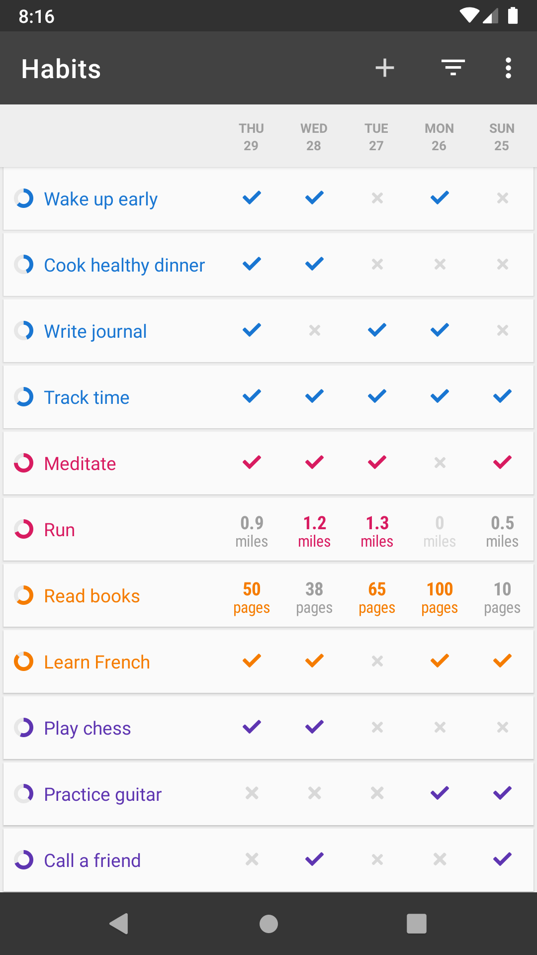
I’ve been trying to limit the days on which I eat unhealthy foods to Fridays and Saturdays (yay, it’s Friday!). I’m good at sticking to plans like that without help from an app, but when I gave “Habits” a quick spin, I admired its mission to provide a playful, game-like alternative in the sea of habit tracking apps.
Once a day (except Fri & Sat) it sends me a notification. Tapping it launches the app straight to that “checkbox”.
While the description in the post may make it seem like this is too long of an interaction, I promise you that it really isn’t, and that the haptics and animation are indeed a satisfying experience. So satisfying in fact that I stuck with the app even though I’m certain I’d follow through on my challenge without it.
(That certainty, btw, comes from how I personally have set up habits like this for over a decade, with help from a mental trick somewhat adjacent to a mind palace/loci[1] to track and reward follow-through. I bring this up because I have often thought that it might be possible to bring the power of these rewarding mental models to a broader audience via an app. And to some extent that’s what Habit accomplishes via its unique approach. The haptics and emotional resonance of the “checkbox” are a little Pavlovian mental & sensory reward for completing one’s goal. And they lead the user to a playful/gamified representation of their progress through their habit, in the form of a small, abstract 3D scene that gradually builds as you continue sticking to your goal. If I’m in a rush, I ignore that scene. But I always enjoy tapping the notification and checking off the day’s accomplishment.)
As a designer, I could maybe quibble over details of the interaction or visual style (which is customizable btw via a season of themes — another unique component) but as a a user I’m simply excited to have this app as part of my routine, thankful that someone is daring a different approach to app design, and curious to see if there will be more apps that might introduce a wider audience to the mental hacks I’ve found useful for a long time.
If you’ve read this far, I’d encourage you to check out some of the other posts on Andy.works, incl. a great retrospective on Paper’s creation[2], as well as background on the developer’s philosophy behind the “Not Boring” suite of apps[3]. Lastly, here’s the App Store link if you want to give the interaction a try (I promise I have no affiliation): https://apps.apple.com/us/app/not-boring-habits/id1593891243
This is great, Alex! I didn't write about it in this article, but much of the app is based on leading behavioral science advice for building new habits. It's great to hear stories like yours to show that something that looks and feels great can also work really well too. — Andy
[EDIT: I failed at skimming and completely missed the context that this design is for a habit tracker app, where making a checkbox the center of attention is a good idea. The comment seems popular, so I'm leaving it intact below. Pretend I was talking about your least-favorite UI instead.]
I feel bad saying this since the author is very excited and clearly put a lot of work into the "satisfying" checkbox. But...
This is why we can't have nice software UIs.
The process here seems to be to take a simple, utilitarian UI element -- a means to an end -- and turn it into the center of attention:
1. Make it big.
2. Make it flashy.
3. Make it slow.
4. Make it loud.
5. Make it literally vibrate.
These are not the characteristics of a satisfying tool; they are the characteristics of a toy for toddlers. On a deeper level, this is the sort of thinking that comes from looking at the interface instead of past it. That is an understandable perspective for a designer, but indulging in that perspective results in interfaces that just get in the way.
It's also a very artificial approach. A "satisfying ka-thunk", in particular, it satisfying in part because it's the sounds of a weighty metal mechanism operating smoothly. "Weighty", "metal", and "smoothly" are all things we associate with high quality. Aping some superficial indicators of high quality is usually not very satisfying on its own.
I don't think you get the point of this app or the check box. This is for an app that is meant to foster habits and the checkbox animation is an infrequent reward for completing a habit forming task. Secondarily the goal was also to win over the Apple user demographic and win a design award.
You're thinking of user interface in an app that you have some intrinsic motivation to use, and the UI in that case is just a means to an end.
It seems I skimmed poorly and got everything but the important part of the background. I went from the article title to "(Not Boring) suite of everyday apps" to "Designing for Feel" and somehow missed "habit tracker app" and "habit" being mentioned multiple times. This kind of design does make much more sense in that context. Thank you for the correction.
(All I can offer in my defense is that about half the article sure sounds like it could have been a design doc for making bad modern UIs, but that's the fault of other UI designers, not this article or author.)
> this is not the characteristics of a satisfying tool
You should take it into context: it's used inside a habit app, where seeing checkmarks is center to the UX. You might not be a user but I can tell you seeing checkmarks is crucial to keep the users engaged, and so making the checkmarks the center of attention can be very helpful. I personally really liked it. Learning apps (Duolingo, Coursera) should all adopt this approach (or at least allow users to opt into it).
Even in context, consider a user may want to check multiple habits off at one time (I've done 3 things, now recording those in the app), and stopping for each one to see this LONG animation would be problematic for me. (caveat - I'm not familiar enough with the app to know if it plays each time or what.)
If it does play a lot, it'd be annoying enough that I'd be looking for a new app or looking to see if there is an accessibility setting to remove animations.
I had the exact same reaction. This needs to be about 3 times faster in order for me to not to be annoyed by it, and that's why gamifying things that aren't games is usually obnoxious. If this is an interface for an actual game, meant to entertain, fine. If this was in some productivity software, it would annoy me at first, and then really piss me off after the 10th time I saw it or had to get past it to do what I want.
It reminds of Apple's Siri and its grating cuteness in failure modes. Or of the Wordpress login box that gives me a cute shaking animation if the input is wrong.
> Jason Yuan has promoted the idea of “fidgetability” where, similar to a key fob or lighter, digital actions can be designed to feel satisfying.
I love fidgeting. I used to have a switch tumbler in my pocket just to turn it off / on when I didn't have anything to do with my hands. I think I would've enjoyed a checkbox that allowed you to drag it slightly to check it instead of just tapping. You can't add "fidgetability" with just flashy animations and sfx. You need something to do with your thumb: turn it on and off, feel the thing respond, turn it half way, try to keep it there before it snaps into place, that kind of thing.
I read an article some time ago that argued phones are the worst tools for our hands. While everything else is designed to use the entire hand or at least a few fingers while providing subtle feedback on every action that requires us to exercise multiple muscles to control properly, the phone only requires your thumb.
My airpods have been ran over by a car, and they've been through a full laundry machine wash cycle and they still work, but I don't play with the lid because I'm afraid I'l break the hinge.
Mine have been through a full launndry cycle as well and still work. Don't worry the hinge is very solid, I'm regularly putting quite a lot of stress on it :D
I have a couple of hobbies or whatever you like to call them where it's a bit of a cliché that people mistake 'necessary and dispensable' for indispensable. There are activities that you need to have done, but as you grow you should not be doing them all the time. Maybe once in a while, just to keep the myelin warm, but not in public, unless you're mentoring someone at the time.
Some days I look around and wonder how many activities in software development are better off being embraced tightly and then bid a fond farewell, and instead we cargo cult them.
Edit to add: Not unlike having a childhood. Without a proper one you're a mess. But not letting it go makes you into a bigger mess.
I'm kind of surprised by all the negative responses. This is obviously a bad idea for a normal ui, but for the use case of "my app is literally just a checkbox and I want it to feel like an event to check it" this seems cool. And that use case really does feel appropriate for a habit tracker app.
Yeah but there's nothing satisfying about watching a video when the satisfaction is supposed to come from the actual interaction.
I assume though it is only available in a mobile app. Would be good if there was a website you could easily create interactive simulations from apps (e.g. it would somehow replicate what the app showed and what sounds it made in response to mouse interactions on a web page - seems technically feasible with some sort of smart recording facility).
(PS yes I know of https://www.browserstack.com/, but haven't used it, and having to install the app and go through everything necessary just to experience what's being described in the article would still be annoying).
I found the result itself disappointing as well. It's way too big and flashy for such a simple and common interaction.
The checkbox shouldn't be any bigger than the "boring" version, and any animation simple and last no more than 0.2 seconds. I really don't like the sound effect used here. If your UI elements are going to make noise when interacted with, I prefer something far more brief and tactile.
It's exactly the right amount of big and flashy for a once-a-day interaction that's supposed to motivate and reward you to do a difficult IRL thing, just so you can come check the checkbox and release a bit of happy reward chemicals in your brain.
I can see that. It could be useful for something like a daily diet or exercise tracker. I still don't care for the specific sound presented here, but for this use case I'm not opposed to something this long and flashy.
watchOS has really satisfying sounds and animations that trigger when you fill your fitness rings and meet goals.
Exactly this. Context is everything. This checkbox would be terrible for most use cases of the checkbox, but seems like it would work well in this example.
That being said, I think the approach could be really useful for a lot of interfaces. UX design often overlooks the little details that happen when a user interacts with something. A little extra zing can go a long way.
And after wasting enough time to find out what it actually looks like, it left me with this opinion: The "Simple Checkbox" they started with is 10,000 times better - although it seems silly to me to have one checkbox be the only thing on the screen (usually they occur on the left of items in a list).
The biggest disappointment is that the “unchecked” state to trigger the checkbox is a low-contrast circle with tiny “READ” text inside it. Poor discoverability, poor accessibility, very un-satisfying.
This person is clearly a talented designer and animator, but this is a bad piece of UI and would deliver a bad UX.
As a user of this app, I disagree. During app onboarding, you _create_ the unchecked checkbox by typing the name yourself. And usually you're only building a single habit at a time, so you already know what the text will be before you reopen the app to mark the habit as done.
This article doesn't describe a good checkbox to place in a list of preferences in just any old app. It describes a _destination_ checkbox, to be checked once per day, that is supposed to gamify habit-building and make tracking that habit's progress _add_ to the experience, rather than feel like an additional chore.
A checkbox is a thing to toggle off/on to select a state.
As I understand your description of the app it toggles itself off and the user toggles it on. That's not a checkbox but a button. If the user can toggle it off that's more like an undo-operation, still not a checkbox.
Of course in the sense of "checked as done for the day" it is a "check"box. But it is a little unexpected without contex when reading about a "checkbox".
Most widget sets/libraries implement the principle that it should be possible to cancel an action that you have started but not completed.
For their checkboxes, this would be pressing on the box but dragging the finger/pointer away from the checkbox and release elsewhere.
With this "checkbox" 1) filling the entire screen, 2) activating on long press instead of displaying pressed state and activating on release, this is not possible.
Also, a checkbox does not close the window/screen you are in. It may enable display/ungraying other widgets, but a checkbox itself does not navigate away: that is done by a secondary widget. Also, you could always uncheck a checkbox.
Therefore, you could argue that this widget isn't actually a "checkbox" at all but just a widget that displays an image of one. It could just as well show a thumbs up or the text "Well done" to mean the same thing.
Have you used it? The long press is progressive, not binary. I.e to cancel just lift your finger and the animation cancels. The animation consists of filling the circle for a couple of seconds so you have plenty of time to just lift your finger.
But, some other examples that I love:
• https://www.joshwcomeau.com/animation/3d-button The red "push me" button is great, but also check out the sun/moon icon near the top right!
• https://www.jam3.com/#contact The hover states on the buttons.
• https://citymapper.com The top-left hamburger icon.
(I also happen to be quite proud of the hover states on my own site: https://jonathanalland.com/)
Making this type of stuff is definitely what I miss most about working in web design.