I really don't want to be negative, but every browser update in the past year feels like a step back. This is true for Chrome and Firefox. Each update contains more "Sign in to your browser" stuff plastered everywhere. Eye candy is added. Useful configuration options are removed.[1] Many of these changes seem to be made with the goal of increasing revenue, not improving user experience.
Rule #0 of business is: Listen to your users. For browsers, one straightforward way to do this is to look at what extensions and addons users install. By far, the winner is adblock. Almost everyone who knows how to block ads does so. Therefore, if you are making a browser and you care about user experience above everything else, you will have ad blocking by default. That no major browser does tells us what their priorities really are.
Again, apologies for the negativity. This has frustrated me for some time.
Edit: I realize that if everyone suddenly started blocking ads, there would be darkness and chaos. But the current situation is only tenable because a small fraction of users have the know-how to get what they want. You can avoid ads if you are technically proficient or know someone who is. Everyone else has to put up with ads. Advertisers annoy millions if not billions of people, effectively subsidizing the usage of those with ad blockers. That doesn't seem fair to me.
Seeing how much backlash Mozilla got for even proposing to block third party ads by default, I can't imagine what would happen if they shipped adblock.
Just because adblock is popular doesn't mean everyone is using it, and as much as I don't like it, advertisers rely on that... it could seriously damage the web if they did that.
The French have an expression for this, they would say you can see no farther than the end of your own nose.
> as much as I don't like it, advertisers rely on that... it could seriously damage the web if [everyone used adblock]
I understand this. I gave the advertisers a fair shot. I didn't install any adblocking on my phone. I gave them a significant chunk of my limited mobile browsing bandwidth. I understand it's a compromise; I waste my page space and bandwidth, and the websites I like continue to exist.
Then my phone started talking to me about some TV show or some shit in the middle of the office last week. Firefox installed, adblock installed, scorched earth policy. I will never view another ad on mobile.
I'm willing to be reasonable and compromise here, but if they're not holding up their end of the bargain, I'm not going to carry that burden either. If this is the way the web is going to be, then the web needs a new business model and I'm happy to bring it about.
> Just because adblock is popular doesn't mean everyone is using it, and as much as I don't like it, advertisers rely on that... it could seriously damage the web if they did that.
The sites that suffer the most from adblocking are those that provide very little benefit for the user anyway: splogs, linkfarms, and other very contentless things built solely to lure users in for adverts. While I don't use adblock myself (I use a filtering proxy instead), seeing that part of the internet die off, and possibly a return to something closer to the noncommercialised web of the 90s where the signal-to-noise ratio was much higher, IMHO is a very good thing. Although there are some good ad-supported sites that may die off, in my experience the sites that contain lots of very good, detailed information are unlikely to contain ads too. It's a bit like chemotherapy...
I frequently visit The Verge and The Guardian. I also happen to follow their journalists on twitter because they're often interesting to listen and talk to. On more than one occasion I've seen them express their frustration at ad blocking software and the problems it causes. As such, and because I love the sites, I've turned off adblock for them. (not trying to sound magnanimous here, it's not like I disabled adblock for every site.)
I'd rather have websites sell advertising space next to their content then gate their communities behind paywalls frankly.
I guess part of the problem of that is that companies who might want to advertise on someones site might, not unreasonably, want the kind of stats and control set the hosting website just can't provide, but that a third party advertising company can.
I personally don't mind a certain level of information about my browsing being a bit leaky. I feel like it's a reasonable compromise to make for serving up content I want. Flagrant invasions of privacy are not ok, but I am more concerned with third parties serving malicious content through ads; Something I've seen enough to make me use an ad blocker by default.
I'd rather have websites sell advertising space next to their content then gate their communities behind paywalls frankly.
Those are not the only two choices. Many of the sites I like are personal ones either hosted on the author's own server+connection, or ones hosted by large institutions that would likely be able to afford the hosting anyway.
absolutely, and I'm grateful to see people experimenting with different models for making money, but as it stands the most reasonable way for websites to make money is, probably in order of effectiveness:
1) advertising
2) charging for content
3) freemium, ie free content with paid extas
4) sponsorship
5) ???
generally when I talk about websites serving advertising, I'm speaking specifically about news/media websites. The cost of producing news is substantial, so earnings have to be commensurate. Either you charge people for it, or you give it away for free with advertising, and perhaps have added value services.
You turned off AdBlock, but do you actually click on these ads? Because no money changes hands unless there are clicks, at last if they're using Google for ads.
People who say "I turned off AdBlock to help support the sites I visit" but never click on any ad are not making a bit of difference.
Speaking as someone who works for a newspaper, comments like this make me very uncomfortable. News websites don't make money off of the generosity of viewers. They make money off of advertising. Until the majority of people are willing to go behind a paywall to see content, news organizations must rely on advertising for survival. Not profit, survival.
I personally don't use ad blockers for this reason. I like supporting sites I visit, even if I hate the ads showing there.
> The sites that suffer the most from adblocking are .... splogs, linkfarms, and other very contentless things built solely to lure users in for adverts.
Doesn't adblock normally block all ads? Last time I used it was years ago, so maybe things have changed.
> one straightforward way to do this is to look at what extensions and addons users install
Oh God No! I do not use adblock. I use noscript and im happy with it. I also do not use "Video DownloadHelper" which is the second most used addon. And neither do I use Firebug which is #3. Please do not put all this stuff into my browser! And not everybody uses noscript which I use and which is #4. Im completely fine with installing it.
How about improving on the basic stuff? For example make FF use all cores of my machine and not just one?
> Please do not put all this stuff into my browser!
I was a very happy Opera user for years under the exact assumption that there is little need to install addons if your browser has all the features you need – and I didn’t use all of Opera’s features either, but somehow even with the included mail and bittorrent clients, it ended up being smaller than, say, Firefox.
> Each update contains more "Sign in to your browser" stuff plastered everywhere. Eye candy is added. Useful configuration options are removed.
- First of all, each update cannot possibly contain more "sign in to your browser". Are you talking about Firefox Sync, of which similar-yet-poorer functionality used to be in an incredibly popular extension (by your own rules, that should go in the browser!)?
- Eye candy is nice. Not everyone lives in the 90s and wants a clickable version of Lynx.
- Configuration options are as useful as the users make it. There was a massive outrage on here when Firefox removed the javascript switch, yet that is one of the best decision they made for their userbase.
Google sure did remove a lot of options over time, some of it has infuriated me as well (the removal of http: was a big one for me). But most of the time, users do not actually know what they want which is why they just want a bazillion options to be able to change their mind all the time, as if they're not using a browser but playing Wedding Tie Choice Simulator 2015. As Randall Munroe put it: https://xkcd.com/1172/
>- Eye candy is nice. Not everyone lives in the 90s and wants a clickable version of Lynx.
Then why are Mozilla removing everything? I like eye candy too. A metro-ified, totally bare browser without even a status bar is the complete opposite.
Oh, and links has mouse support via GPM.
>- Configuration options are as useful as the users make it. There was a massive outrage on here when Firefox removed the javascript switch, yet that is one of the best decision they made for their userbase.
Firefox Sync was in the browser before, you just didn't need to sign in to your browser online to use the previous version. (It also let you sync through your own server rather than Mozilla's which I don't think the new version does yet, but even if you used their server you still didn't need a Mozilla account of any kind.)
I run my own firefox sync server, and have since it was introduced. It's working fine for the current version of sync. There's a rather helpful guide for setting it up and there were a handful of alternative server implementations which have unfortunately fallen by the wayside.
Unfortunately this server is not compatible with the new sync protocol. It will continue to work while there is still old-sync support in the browser (a few versions after FF29 at least) but will eventually need to be upgraded to the new system.
(edit: actually IIRC there's an open bug around allowing android devices to use a custom sync server; desktop devices definitely work fine with it via some about:config settings)
As much as I like Adblock, did you know it blocks static jpeg images that contain the text "300x250px" or similar in the file name? I didn't know until it blocked one of the images I put into a site that has no ads.
I presume AdBlock's logic is that because promo ads often have the dimensions in the filename, that's good enough reason to block EVERY image on the web that has dimensions in the filename. Pathetic logic!
While you might be happy browsing away on the internet with Ad-Block, it could very well be blocking non-ad content, which is not something you want as core browser functionality.
How do you not see all the image dimensions in the filter rules? Picking just the those mentioned I tried 'grep 300x250 easylist.txt' and got 478 results!
Many are very specific and look like useful filters, but here are just a small sample of rules that are problematic:
-300x250-
-300x250_
.300x250.
.300x250_
/300x250-
/300x250.
/300x250/
I wasn't up to speed on the lists business. I will look into using a different list. I was just using adblock now and then at the default settings, I installed it and haven't touched settings.
I don't use it all the time because I don't want it interfering with testing and dev, messing with the document.
When it backfires and hides stuff you've just published, suddenly I'm cursing adblock because I know other default adblock users won't see the image.
Because of standardized naming convention, or lack of.
In the Britney example, there's no naming convention, only a vague approximation of the image contents.
This may work for you personal blog, but in large production environments, you don't want editors just "making up" image names without consistent naming convention.
Remember that the original digital camera image has no mention of Britney! At best, when the RAW image is converted, the general image name might be appended with "mtv_awards", but nothing further.
Same for video file naming. You can't fit all the subject matter of the video into its file name, you would instead maybe put the reverse date in the name and an abbreviated title. But to expect that to be used for SEO is not a good strategy.
I vividly remember the anger over omnicomplete and people vowing to switch to Opera, which didn't have that feature. I gave it a shot and found omnicomplete quite comfortable after a while.
Opera next is not meant to be customizable like opera 12 was. Now their focus is on streamining interface activities. Removing bookmark graveyards etc etc.
+ for mentioning Useful configuration options. Prominent examples include Last tab close and hiding the Disable Javascript option in Firefox. In both these cases, the decision seems to be driven by the preferences of a specific group of developer(s) rather than informed decision making or listening to users.
The issue with pre-enabling adblock in a browser is that chrome is financed completely by google (runs on online ads) and mozilla is substantially financed by google and other search engines (who also rely on ad money).
Tough luck. The overwhelming majority of Mozilla's revenue is from their search partnership with Google, the Internet's largest advertising company. You don't bite the hand that feeds you.
Apple is the only major browser vendor that can afford to ship an ad blocker without strangling its own throat. If Jobs where still around, he might have actually done that, if only to stick a big middle finger at Google. Now I'm not so sure. Maybe MSFT will do it first with IE, if Bing's market share gets any lower than it already is (or if Yahoo finally folds).
This is IMHO a most disturbing trend; instead of leaving configuration options available (and possibly adding more), many "UX experts" seem to have the notion that all users are exactly the same and should therefore never need anything more or less than what these "experts" think they should need. Removing options also reduces the amount of learning-by-experimentation that is possible, but experimentation is one of the best ways of learning about things. The point is often made that this is so "users don't break things", but at the same time it denies them a valuable learning experience and takes away freedom.
Meanwhile the focus is on adding eye candy and using plenty of doublespeak (some of my favourite examples of this are "decreased clutter", "simplification", "streamlining", "user-oriented") to make the users think that they're being offered an improvement. The goal of designing a browser for a novice user, which may be initially simple to use, but is "layered" so that it grows with the user's knowledge, is slowly eroding away. Instead, the expectation seems to be that the average user is one who knows little more than how to turn on a computer, and one who intends to remain ignorant --- the model of the "perfect consumer". The customisation features are gradually relegated to extensions, and advanced configuration is not a gradual learning curve, but a big jump, creating a gap that users have to cross - a gap that is widening. Maybe this is a reflection of a general societal trend, but I have no doubt that it is also contributing to it.
In consideration of this, Mozilla also has a rather curious description: "Mozilla is a global non-profit dedicated to putting the user in control of their online experience..."
Although I disgaree with making adblock a default; I think the concept of what constitutes an advert is too ill-defined to add this complexity to a browser. Personally I don't mind anything that is not intrusive or too distracting.
The title of the article is pretty indicative too: "A New, Beautiful Browser is Coming". The first thing that comes to mind is "Beauty is only skin deep."
Rule #0 is not a good rule at all. People are never happy. When Firefox was focusing on utilitarian concerns, people reamed Mozilla incessantly for "ugliness" and "user hostility". They vowed to switch to Chrome which supposedly cared more about these things because its tab bar background was blue (or plug in your pet issue here). Now Firefox releases something that focuses on fluffy prettiness concerns like "native look and feel" or "non-distracting tab bars" and suddenly Mozilla is vain and silly, and people vow to switch to Chrome because they implemented Real Feature X.
The point isn't that either side is necessarily wrong, just that "listen to your users" is not the #0 rule of business. Users can provide good feedback, but it must be tempered, because there are always going to be detractors, and detractors will always be louder than supporters.
Chrome came out and lots of people started using it because it was faster than Firefox and because Google spammed it all over their search engine. Chrome is developed by an ad company. Chrome exists in order to create a web which can serve ads to you in a manner which is more profitable to that ad company.
That's fair enough. Chrome users sow what they reap. If they want a web which develops under the control of an ad company, or several ad companies (Microsoft too), then that's what they'll get.
The trouble is, it affects the rest of us who don't want a web to evolve according to the profit interests of ad companies; Mozilla got scared by the sudden migration of people from Firefox to Chrome, so they've now started copying Chrome in many ways that probably aren't as good as they think they are for the future of the web.
I think the web is important. Important enough that making the technology behind it worse, either by not implementing tech that is bad for ads, or by implementing tech just because it is good for ads, so that ad funded sites can continue to be ad funded sites, is a mistake. I don't care who is behind those ad funded sites.
These people behind Australis are brave, competent and passionate. It shows in the remarkable experience they've built. I am a nightly user and I got to see these changes land one at a time. Hugs and cheers:)
I am not trying to be snarky, but to me a lot of the new UI is "oh, they made it look more like Chrome". I am kind of surprised to hear the word "brave" to describe that.
There are a lot of people who initially did not like the curved tabs and other visual design changes (e.g., the bookmark star is no longer in the 'awesome bar'). It is IMO brave for the designers to take a stand for the users when redesigning a widely used product. I have the same feelings for the GNOME project.
> There are a lot of people who initially did not like ...
> ... take a stand for the user ...
These statements seem at odds. I'm all for change when there's a clear need for it, but when it's done just to keep up with Chrome's aesthetic, it can alienate an existing userbase. If I wanted Chrome, I'd be using Chrome. The reason I stuck with Firefox for so long was the configurability. However, now when a settings is removed or dumbed down the default stance on BugZilla is "just install an addon".
Very much agree with this comment. I'll be sticking to v28 for now and using the Classic Theme restorer to restore the lost features when I have to move up.
Sadly, this will become the fourth extension I run to restore features Firefox has removed.
You are not bringing anything to the table with remarks like that. You may not like the design, but many do. What was "fine" for you was "clunky" for many. Remember that Mozilla projects revolve around the community which you are free to join and make a difference. If you don't, at least don't flame people who worked their butts off to build something. Criticize work, not people.
I believe that for (1), the tabs overlap so that they take the same amount of space as the old tabs. It's an illusion that they're larger (which I initially fell for also, until I was corrected).
(2) is the same as Chrome and older Firefox versions - to ensure that there is still some draggable area in the window when it is filled with tabs, and it disappears when the window is maximised.
I noticed that you used to use the URL bar on top layout as I did. Sadly that is gone now but the Classic Theme add-on will give you the option back.
To me it's just more visually intuitive to have the tab right above the content window, not over all the toolbars. I really can't fathom why the reverse has become the default.
Actually I put them my tabs on the left (default option with tree style tab), as I feel that putting them at the top or bottom of the browser waste space.
I put the tabs under the location bar out of convenience, my purpose was to look at the difference in the tab size.
In terms of intuitiveness, it actually makes sense to have the tab bar over the address bar and navigation buttons, as their content and functionality are specific to that tab, and not application-specific. That's the reasoning anyway.
Absolutely right on same space but illusion of more. It's amazing how much small tweaks can make a difference in perception of visual space and faster action: bigger targets, whether actually bigger or seemingly bigger, make users faster in hitting them.
the tabs that arent in the foreground (ie all other tabs except the front tab) are actually square.
im pretty sure the overall layout of tabs and buttons is actually more space efficient
Claims to be detail obsessed but the Mac version has the close/shrink/zoom buttons floating at the wrong height (like iTunes 10 briefly had until it recanted) and a title bar gradient with non-standard color and height (too short for integrated toolbar height and too tall for basic window title bar and too light in color for either) above a toolbar with the same weird gradient used again.
Windows and Ubuntu versions look much better; the Mac version should be fixed.
I think they lowered the close/shrink/zoom buttons so that they'd be roughly centered relative to the height of the tab container. If they didn't do this, it'd look weird and unpolished. As for the other things IDK. I still think it looks really good.
I've been surprised by the amount of hate for Australis. Are the people who criticise it actually using it?
I've moved back from Chrome to Firefox and I'm a big fan of the changes that they've made. A lot of clunky interface elements have been eliminated. I really like the customisable menu - it's a much better place to put semi-frequently-used add-ons than has been available in the past. The same paradigm works nicely on mobile, too.
The next things to tackle are probably the bookmarks and options dialogs, both of which are a bit of a pain. Chrome's searchable options were a game changer, and Firefox needs something equally easy-to-navigate.
I agree. I actually began using Firefox again because I heard this UI change was landing in Nightly, and I've been using Nightly since then. I get Chrome's UI minimalism and Firefox's customizability/flexibility - it's the best of both worlds.
Thanks - this let me reset the look to exactly how I wanted - I still prefer the square tabs personally in particular.
While I appreciate the effort spent making a new UI, it's always good to have a way back to a more familiar feel if required.
The killer feature in Chrome was and is the multiprocess implementation. I use Firefox for intranet browsing at work and Chrome for personal browsing: the former is a sloth compared to the latter, and hangs even for seconds when loading a big page whereas Chrome will happily use as many of my 12 cores as it likes and it just doesn't even slow down.
Firefox has had their comparable hack (Electrolysis?) in some prototype stage for a long time but the thing is Chrome actually delivered it... years ago. This turned the roles into a catch-up game where Firefox tries to match Chrome instead of other browsers trying to match Firefox, and the setting has remained as such since then.
The difference is still astronomical and I'm not at all convinced that a new user interface could have much effect there. The browser UI has pretty much standardized 15 years ago.
> Chrome will happily use as many of my 12 cores as it likes and it just doesn't even slow down.
I spend a lot of time profiling browsers and I don't see a lot of multicore usage when browsing in current engines. Usually layout and painting is happening for one page at the time—the tab you're looking on—and multicore performance for them is really poor in current engines.
I have not seen browsers saturate 12 cores. For example, go to [1] in your browser: no browser engine saturates maybe more than a core and a half as it chugs along struggling to reflow.
I think that Chrome- (and IE-)style per-domain process-based parallelism provides some benefits, but mainly in getting stuff like Gmail and Facebook notifications off the main thread, not really in improving throughput.
I think the main benefit of the multiprocess model is not increased performance on any one website. It is that when a website in one tab decides to calculate pi to a trillion digits, it doesn't bring down the whole browser and all the other tabs along with it.
I read that phrase as "I open as many tabs as I want and Chrome renders them all on different cores." I guess I got that partially from the subsequent mention of Electrolysis as a comparable effort.
right now my firefox uses 49 threads. Guess what? the kernel scheduler run them on all cores.
chrome uses 5 processes and 7 threads in 2 processes, 11 threads in another, 1 in nacl helper and 27 in the main process. Guess what? the kernel scheduler also run them on all cores ;-)
Although, does Firefox not use separate threads for each tab? If so, then it would seem like in normal operation, it should be possible to achieve parallelism. Of course, I do still see whole-browser lockups in Firefox, and what I really miss is the ability to actually diagnose misbehaving tabs.
Also, I think the Chrome debugger has surpassed Firefox's, especially with the experimental stack traces in asynchronous flows of control.
NoScript might be worthwhile 15 years ago, as you browsed 90s porn sites. Today, you're just making your own web browsing life difficult, hoping the "security benefits" of your paranoia outweighs all the broken functionality you'll be constantly making exceptions for, or flat out missing out on because you don't know it's there.
Other than that, it means people can't mine bitcoin with my CPUs and power bill, I'm immune to ~90% of browser-only exploits (as opposed to ones in things like flash, PDFs, etc., which I am still far less likely to get hit by than a javascript(flash, etc.)-enabled-by-default user), and a few random and generally non-critical things won't work. Even dropdown menus still work as they are generally done in CSS these days.
If a site really needs javascript, I can whitelist it while leaving google tracking scripts, adverts, disqus, etc. disabled.
It's 2014, most sites assume javascript, and the "graceful degradation" is never "graceful".
Me and all people doing front-end work I know of, who even care for any kind of "graceful degradation" (that's a minority of front-end-devs!), always go over "the layout breaks and some fonts are wrong for users with javascript disabled" with "but they cans still click the links and read the text, so we'll just leave it this way" (because the alternative will be putting at least 3x as much work into it, and nobody would pay us for it ...just as nobody would pay for a website without "live filtering" and "ajax loading" and all nowadays).
So you're basically choosing a stone-age-degraded-experience to be able to spare some CPU cycles.
(the security and privacy arguments are valid though, and you're 100% right on these... but as more and more sites become SPAs, you'll basically have no choice than whitelist more and more untill you'll have to whitelist everything)
NoScript gives you a chance to evaluate a site for trustworthiness. Yes, you have to click 1-2 times when you load a new domain that you trust, but it's worth it for that one site that looks sketchy or that you get mislead into clicking onto. For people who automatically execute JavaScript, it's already too late, but NoScript users have an opportunity to avoid this cantankerous situation.
NoScript will expose phishing schemes immediately, for instance, because it will recognize that the scripts being executed are not coming from the previously-whitelisted domain for Google.
>you'll basically have no choice than whitelist more and more untill you'll have to whitelist everything
Even if that is the case (which I do doubt), if it means I still have google analytics, advertisers, disqus, and random dodgy sites I've never before visited blocked (e.g. when a site gets compromised by injecting malicious javascript), I don't mind.
Actually, after trying NoScript not long ago my web experience dramatically improved. Where I need to enable JS I can do it in two clicks, while where I don't have to, everything is faster and not cluttered with useless stuff. I like it!
>Where I need to enable JS I can do it in two clicks
But there's no reliable way of knowing where you need JS.
It's not like every useful component on a site reveals its whole story with JS disabled. There could be a data viz animation that strengthens the topic of an article you're reading. The author refers to "the above visual" but doesn't mention it's an animation (because he assumed everyone would see the animation). All you see is a still image - the fallback to the animation. You aren't aware there's a useful animation showing the schematic of an engine part in motion, for example.
The animation was cool, you totally missed out!
However, if the way you use the web is more about fetching specific content or services from specific places - your favs basically, and you don't like to explore, then if it works for you then I won't judge :)
I'm often using different browsers on different devices and only some of them have NoScript installed, and from my experience I can tell that usually if something doesn't work without JS, it's perfectly visible that it's broken until you whitelist it. I can also tell via tiny toolbar that something is blocked on the site, so if it doesn't include lots of analytics or social media cruft then I usually just unblock it on any pages that focus on useful content.
Before I actually installed it, I had the same concerns like you described, but the reality showed that it's moot, and the advantages were even higher than expected, so I sticked with NoScript :)
I tried using Chrome (from a decade+ of using Firefox) and while it is definitely faster in some instances, it is also laggier in others. Tab switching is noticably slower for me, for instance. I also found it frustrating that it would draw an unusable interface before it was done loading, which 'felt' faster, right up until I wanted to actually use it.
Chrome has some good points though - its scrolling feels much better, one tab (flash) crashing doesn't take out the entire browser and I can just switch to another tab until it recovers and (obviously) Google products have much better performance. Ultimately though, its slowness in other areas, plus its inherrently broken mouse gestures, meant that I switched back to Firefox.
I do wish Firefox was a bit faster moving. I know there are difficulties in dealing with a huge, old codebase, but I just wish features that Chrome has had for years, like chromeless app windows and multiprocess would just hurry up. Features like window-based private browsing took years to migrate from Chrome, and it's frustrating as you said to be perpetually caught in a game of catch up.
> one tab (flash) crashing doesn't take out the entire browser
It hasn't been the case for years. Plugins are sandboxed. (plugin-container.exe)
The broken mouse gestures on Chrome are the single most important dealbreaker for me. I will never go back to a browser without good mouse support (which Chrome isn't).
Eh, I still get lockups for whatever reason, and I have to wait 30 seconds for the browser to recover, I can't just switch tab and do other things while I'm waiting like with Chrome.
Designers tend to be extremely annoyed by Chrome's scrolling. I should count the time I've heard this or something similar from a designer: "but let's use css-transitions instead of free-form scrolling, it's so-much-smoother on Chrome than that ugly chunky scroll, and most of our users are on Chrome so let's just move over that ugly free-scrolling, it's so 90's anyway" (if he/she actually got the argument this far, I'm already imagining having a foot on his/her neck and driving a chair foot through his/her skull repeatedly while splashing his/her brains on the walls...)
That's the most detrimental effect of Chrome's scroll I think: it makes designers want to look for alternatives to scrolling websites, and unfortunately for all of us, these "gorgeous" but completely user-hostile alternatives exist. And good luck if you get on such a website with js disabled if it wasn't coded in a gracefully degradable way...
>That's the most detrimental effect of Chrome's scroll
No, that is just designer's dumbness. Scrolling should be a system setting and browsers should not override it but just read and use it (I am looking at you, Firefox). And websites certainly should not override it with at all.
Yeah, but if I randomly pick any 2 Windows apps, the probability that they will scroll the same is very low. Heck, even the bultin Windows Explorer I'm staring at on Windows 8 has nice smooth scroll on the main folder pane and "chunky" scrolling for the folder tree on the left, that's two scrolling behaviors in the same window, for a builtin Windows app (!!!).
Thing are more consistent on Mac OS, but on Windows and Linux these kinds of GUI functionality are still at the "wild west" level, so the only sensible choice is to implement what's "better looking for the user" in your application, which all browsers except Chrome seem to do, btw, and they've arrived at a convergent result while doing it...
And "designer dumbness" is real, but it's root cause is in the fact that lots of good graphic designers are "control freaks", and when they know that something is "technically possible", they don't care how much work it takes, and it takes them a lot to "grok" how detrimental the overall result is for UX.
I solved the problem for myself by staying as far away as possible from "design-driven development" or teams led by designers... but it is a fact that such teams exist at lots of small agencies and startups and that they do shape the field, unfortunately.
This actually might be a fairly uncommon use case - I tend to scroll by clicking the middle mouse wheel and dragging down. On big, multimedia-heavy pages like The Verge (which can clock in at multiple megabytes in size), scrolling on Firefox is laggy, and on Chrome it is smooth.
I'm very suspicious about this astronomical performance difference you're talking about.
Like many I run both firefox and chrome all day long.
I literally cannot tell which one is faster.
Firefox does use all the cores like Chrome does btw - it's called multithreading - and both of them seem to do approximately an equal okay-ish job at it (maybe servo does a much better job but thats not useable yet).
The only times where as a user i can see chrome multiprocess model shines is:
- sec vulns where chrome sandbox is not bypassed
- stuff actually crashing or hanging
Needless to say both cases are quite rare on either browser (and when flash hangs in firefox, it does for a few seconds before firefox proposes to kill it - while in chrome it only hangs the current tab)
Note also that:
- electrolysis can be enabled right now by an about:config option
- i run firefox and chromium on linux - i guess your mileage may vary on other platforms (?)
When I do calculations in the browser, opening a second window halves the performance in the first window in FF. In Chrome the performance stays the same.
I run Firefox and last I tried Chrome it did use more RAM for the same content. However, I wonder: since Chrome runs its tabs as a collection of processes does that mean individual tabs could be swapped out by the OS without affecting the rest?
I just tried opening 30 YouTube videos with 15 additional HTML (non-Flash) tabs. My system used 6 GB of RAM (Linux 64 bit). So unless you're watching 100 YouTube videos at a time, or have more than 200 tabs open at a time, I really don't see how that's a problem.
You're ignoring the fact that many users have applications other than a browser open, and that those applications also consume memory. Start hitting the swapfile and any performance advantage disappears. It is in the best interest of everyone to make applications use less memory, since all the applications (and the OS) have to share what the system has.
> It is in the best interest of everyone to make applications use less memory, since all the applications (and the OS) have to share what the system has.
There is always a trade-off between speed and memory usage. For my use cases, I prefer this particular trade-off for a browser. I realize you might not have the same preference.
Am I the only one that doesnt like this "feature"? The reason I dont like it is because now, instead of being limited to 25% of my total CPU usage, at times Chrome happily pins all four of my cores. Granted that this is probably a result of poor plugin/webpage interaction (although, I havent been able to determine what combination...being a heisenbug and all), in Firefox, the worst case is still 25% maximum CPU usage.
You're not the only one. I can't remember the last time Firefox crashed on me. I fill those tabs up real good. It does a fine job on both my medium-spec work computer and high spec home gaming PC!
Chrome isn't for me, it's one-core-per-tab thing is not something I need or want. I hate the idea of the browser using too much system resources, I prefer how Firefox does it.
I do not think there is such difference in FF and CR performance. Both browsers are relatively close. Firefox however hangs in some common cases where as Chrome handles general cases better.
CR however is worse when it comes to multi-tab browsing with over 20 tabs!
Yes, with just a few tabs open Chrome's multi-process architecture shines at cost of being a memory hog. As a result Chrome starts thrashing long before FF.
FF 8-13 really shined in memory usage. Unfortunately even by their own internal benchmarks, it's gone downhill since since 13.
In the Firefox Nightly channel, you can test Electrolysis (e10s) using the "File > Open e10s Window" menu. Addon compatibility is still a work in progress, but many popular addons like Adblock Plus mostly work today.
In case you want to use Chrome for both, Chrome actually has a built-in multi-user system, so you can have two cookie jars. If your company uses Google Apps this would make even more sense.
This is not an issue of the design. Opera (<=12), a single process browser, had much better performance than Firefox.
Biggest problem with Chrome I see (performance-wise) is that tabs that weren't in use for a while take quite some time to load. My guess would be their memory gets swapped out. I don't know how Opera did it, but switch to any of ~hundred opened tabs is instantaneous.
Whether Opera does it or not I don't know, but in Windows at least you can lock pages in physical memory [1]. It's not really a good general purpose technique, however.
It's a lot easier to implement multiprocess when you're building a brand new product without a decade-plus old add-on and plugin ecosystem that you need to support.
I've been using it for a couple months now. Maybe it's just me, but I really don't care too much about how Firefox looks. I actually quite dislike curved tabs, but I can live with it. What frustrates me the most is that I don't want to wait for the fancy animations to finish before doing something. If I want a menu to come up, I want it to come up.
Most of the menu reorganizations have very little affect on me since I usually use shortcuts. But waiting for some of these animations just hurts my productiveness and I've seen other people share my dismay. When changes like this hurt the people who know how to use their browser and want to simply get things done, it's saddening.
A number of the menus. When I switched, I found the RSS feed dropdown mind-numbingly slow. I've since made a userChrome.css edit which I saw on Mozillazine. Even then, there's still other animations left over. I find it really distracting.
Another more minor change was, prior to this version, Firefox still allowed fixed back and forward buttons. At some point, I should probably find a fix for that as well. Animations are supposed to make the experience feel smoother, but from my point of view, it's simply more clunky.
Is the lack of a unified search/address bar a deliberate choice or the result of some weird IP/patent thing? Every time I switch back to Firefox, it trips me up. AFAIR, it's the only major browser that still does this, right?
There might be other reasons, but a big one is that having search and address bar in one box means that normal URLs you type into the address bar will get sent to the search engine for autocomplete by default. Since that's a major privacy violation, they're kept separate.
I've removed the search box myself. If DNS doesn't return anything or if what you type looks like a search query, it does a search anyway, so the only thing I'm missing is search autocomplete (there's an addon if you really want that anyway: https://addons.mozilla.org/en-US/firefox/addon/instantfox/).
The privacy reason honestly seems like a post-hoc justification... you can easily turn off auto search in Chrome. If you were really anal, you could do what IE does and actually _ask_ the user for permission before hitting the search engine. There is really no reason why the search bar has to be kept separate, other than user comfort. And that is not a bad thing: there is no need to start making up excuses for it.
I disagree. When I type something into the search box, I'm explicitly saying "send this to the search provider". I'm more than happy for that box to auto-complete. However when I'm typing into the URL bar, I want different behaviour. That data should remain private.
When I'm saying is that I want both autocompleted search and a private URL bar.
Even if it's turned off you can leak information. Mis-type a local hostname and suddenly your secret URL is public to Google. I've done this more than a few times.
Some users are skittish of Chrome's autocomplete since it could potentially send anything you type into the address bar to Google's servers. Mozilla also makes money from selling 'search box real estate' to different providers. So it's more discoverable when the search is in its own designated box.
It's also what some of us frickin' want. I like having a separate search bar, because I can easily control which engine I'm using, and I from the URLbar I can search my history/bookmarks without irrelevant auto-complete results junking it up.
Agreeing with bitsoda, so far as I'm aware the rationale is privacy protection -- either box can actually search, but having a box that automatically queries a search engine as soon as you start typing (rather than when you hit Enter) has privacy implications.
I really ask myself why they insist to put the tabs on top. With todays widescreen-displays, putting them left or right makes more sense for most use cases (at least with FF its possible to get this via add-on). OTOH they try to get rid of every pixel to get a bit more space while there are lots of at the left and at the right. Do all developers only work on 13" laptops today?
You should check out Tree Style Tab [1]. I always have a lot of tabs open and I can't live without it. It lets you choose where to put the tab bar, among other settings.
It would be better to choose a simpler add-on, such as the ones recommended by the Tree Style Tab developer at http://piro.sakura.ne.jp/xul/_treestyletab.html.en, in the section “Similar or Related Extensions”.
> I want a simple vertical tab, without tree features.
Tree Style Tab has lots of bugs for me, like permanently hiding the navigation bar after I exit full-screen, and scrolling all the way to the bottom of the tab list whenever I restore a closed tab. I still use it because I love being able to organize my tabs hierarchically, but if someone only wants vertical tabs, they should choose a simpler add-on that is less likely to have bugs.
Regarding incremental UI changes, I recall reading that Google staged Chrome's tab style and color redesigns over multiple releases, presumably to avoid upset users. I'm not sure whether to admire their concern for user confusion or to feel like the dupe of some magician's sleight of hand. :)
Why have reverse tabs won? Has anyone done any usability test on them?
On OS X, with a space left for the hit area of only 10px tall, it's really hard to drag a window that uses them. For context, 10px is about half the cursor's height.
I can see a reason for them on Win/Linux, but I find them completely unfit for the Mac. I guess people just maximize the window and leave it at that.
On the other hand, I'm glad there's still a distinction between the search box and the address bar. The annoyance of omnibar mistaking a url for a search query and vice-versa, even admitting it's a rare event, is not worth the trouble to me. Besides, educating the user on such difference seems important to me.
I thought about it a bit and decided I prefer reverse tabs (tabs above the address bar, not below) because I see the address bar as part of the page I'm visiting - as I change tabs, the address and page display changes to, so having both of these together on the screen makes sense to me.
To me, as I read the brower window top-down, I have the firefox menu and minimise/maximise/close buttons -> the tabs -> the address bar and back/forward buttons. That follows the logic of application -> 'threads' within application -> status of that thread and forms the more logical tree from general to detailed in my mind.
That's not to say it's better or worse than the alternative, it's just different and makes more sense to me.
1) I'm not running OSX so it's double the size for me.
2) there's a whopping great area to the right of the 3-4 tabs I generally have open at any one time. This is the aformentioned ~20px plus the height of the tab itself. Secondly, there's the area beneath the mininmise/maximise/close buttons and the new hamburger menu button, which can be dragged in a pinch to move the window if tabs go all the way across. Tabs don't overflow to this point and it's 26px in height. Note for reference the "1" in the white box for HTTPS Everywhere is pretty much the height of the cursor. [1]
3) Even if I had a comically sized mouse cursor, I can enable the menu bar at the top to pad a bit of extra space (presuming I can live with the idea of having 'File', etc. across part of it) which bumps it up to ~25px.
The size of the window-drag click target is orthogonal to whether tabs are above or below the address bar. What you really want is a title bar, not necessarily tabs below the toolbar.
And you can get that. In Firefox 29, open Menu > Customize and toggle the Title Bar button at the bottom left. That will give you a normal-height title bar to drag the window with, while still keeping tabs on top to reflect that switching tabs also changes the state of the URL in the toolbar.
Because Chrome. There's no other reason. It's obviously less efficient due to Fitt's law and the comparative distances the mouse pointer must travel, but you'd hear the designers justify it how "conceptually" the address bar should be inside a tab. Not if it hampers productivity it shouldn't.
I don't care where the tabs go by default, as long as we have an option to move them if we want. Unfortunately, as Mozilla are turning into google, they have decided choice is evil and bad.
I like it, but I'm seeing some serious similarities to chrome. If I had not seen this announcement and I quickly glanced at those screenshots, I would not think it was Firefox.
yes but believe it or not, the new firefox UI/UX has been in the works for so long and chrome's development so quick that it seems like firefox was inspired by chrome when in fact that didn't happen
I'm a Firefox developer and I don't think this is true. As far as I know, most of the key elements of the Firefox 29 theme redesign emerged after the last major UI redesign (Firefox 4) was released in 2011.
Its hilariously sad how new UI skin is touted as reimagining the whole browser.
Opera had fully customizable UI 12 years ago? And look at us now, somehow we moved back in functionality, even Opera nowadays is nothing more than a bad non-customizable Chrome skin :(
I dread the day most of the web stops working on Opera 12.16. I wont be even able to tune Chromium to my specific needs, after all it requires 16GB of ram to compile now (and that number will probably grow).
Opera's recent ui change atleast had a purpose.. they were trying to innovate and bring forth the browser features that their stars determined people use most.
Firefox here. As far as I can tell is just saying "ok we decided to shuffle the buttons around again"
Haven't been using firefox since they switched their patch number schema. But I still feel a little sad seeing them seal their own fate.
So many changes nowadays.. isn't there anything that remains the same, something we can rely on in this chaotic world lol :'(
Anyways, I was hoping the 'zooming' and 'back/forward page swiping animation (on a trackpad)' would be improved, to be more smooth/sexy like it is in Safari on OS X. Unfortunately this hasn't been changed however..
I agree, the inactive tabs are not very distinguishable or readable and starkly contrast the active tab's light grey when using a darker color theme on Windows 8.1. Everything else seems great so far, though.
The post goes to great lengths to say they're doing a big, meaningful overhaul instead of a UI tweak. However, the examples given are nothing more than a bunch of tweaks (and not necessarily ones I like). It sounds like someone is trying to build up hype over nothing.
Almost no new features, other than some flexilibility with the new Firefox menu (you can add extension buttons to it, for instance).
Lots of customisation options have been removed (with the justification that it prevents inexperienced users from 'breaking' the browser), like the navigation buttons being locked to the address bar, the inability ability to move the refresh button (urgh) and the addon bar. Most can be restored though the Classic Theme Restorer addon, though it broke another of my addons last time I tried it.
True, the new Firefox menu is much improved, but there still seems to be no way to access it via the keyboard so it will probably remained largely unused by me.
I like the new placement of the real menu bar (when enabled), much better than in the previous versions.
I actually think that the orange 'Firefox' button was an important part of the browser's branding. Sure, it was blatantly stolen from Opera, but it meant you instantly could tell which browser someone was using. I think moving that functionality to the new menu button was a mistake, and it makes the browser look a lot more generic/Chrome-like (and is also against all existing windows conventions which says administrative functions should be in the top left).
But, in terms of day-to-day usage, its location doesn't really matter much.
actually that one button appeared in firefox designs much before opera - there was a big drama about it back then.
opera had the same design but released much faster than mozilla did.
Please don't take this the wrong way, but what are you doing with your browser?
Up until a few years ago, I used an oldish single core processor and I never had any problems with the performance of a browser.
For the past few years I've had a dual core processor, and I still have never had any performance problems, despite being on the internet for hours each day.
The only times it's even remotely a problem, is when I try out some HTML5 demo that runs the Unreal Engine through my browser, or something like that.
Rapidly (manually) opening, switching between sometimes 20 tabs always brought FF to a crawl for me and is the reason why I always switched back to Chrome after giving a new FF version a try for a week.
If they are so obsessed with details, how did they miss that some people need bookmarks star, but not the bookmarks menu button. For some (I'm sure completely arbitrary) reason, it is impossible to decouple these two buttons in Firefox, so instead of a little star in URL bar you get a honking huge two button combo that takes like 6 times as much space (which is even more limited in Australis since no addon bar).
Bookmarks sidebar button and Add-on toolbar...nope, no one uses those AT ALL. Now I have all that shit in the upper right-hand corner instead of lower left, near Start Menu in Windows and have to use keyboard shortcuts to get to bookmark sidebar, again in Windows. OS X I'm more adept with keyboard shortcuts but monkey trained to use what he's been using last fucking decade in Windows.
I find a clean install of Firefox to be almost as fast as Chrome, and in some places more responsive - particularly when opening the browser. Chrome will get the basic UI up on the screen very fast but take a moment before you can interact with it, Firefox is usable the moment it is on screen, even though that time is slightly longer).
Chrome does have preloading of certain things which make loading some things faster although there are addons that can replicate that on Firefox.
It looks absolutely terrible having addon icons crammed into the same bar as everything else. What's the problem with the addon bar? There's even less view pane area now because the top area is so large.
The active tab curve is feminine, not in a good way, but I can live with it.
It does feel faster though, maybe they broke some addons that were slowing it down. Time will tell.
I believe you can't using the Customize UI, but for a hacky solution you could add spaces in bookmark titles, like this: http://cl.ly/image/2Q2b3L3c061a
http://i.imgur.com/Ueqq29i.png is what my current vimperator browsing window looks like (ff27), the new changes make this very difficult to replicate via changes to userChrome.css, but hopefully, as it gets more exposure, these things will get ironed out
A bit of topic here. But does anyone know of any browser that has the URL-field and bookmarks 50/50 on the same row? I don't really need to see the full URL at all times, and I only have small amount of bookmarks. On top of that I use a fairly small screen, so it would be great to combine them.
Actually, you can do this in Firefox 29! Click the Customize hamburger-button on the right and then click "Customize." Drag the search bar from the menu bar down to the tools page. Then drag "Bookmarks Toolbar" up next to the URL bar. It should display as your bookmarks, listed next to the URL bar. Here's how it looks on my machine: http://cl.ly/image/1M3N3L0h3v1s
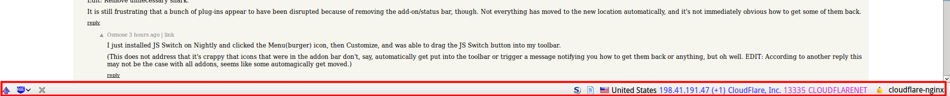
It is still frustrating that a bunch of plug-ins appear to have been disrupted because of removing the add-on/status bar, though. Not everything has moved to the new location automatically, and it's not immediately obvious how to get some of them back.
I just installed JS Switch on Nightly and clicked the Menu(burger) icon, then Customize, and was able to drag the JS Switch button into my toolbar.
(This does not address that it's crappy that icons that were in the addon bar don't, say, automatically get put into the toolbar or trigger a message notifying you how to get them back or anything, but oh well. EDIT: According to another reply this may not be the case with all addons, seems like some automagically get moved.)
I develop a Firefox add-on. In our experience, the transition to Australis was pretty smooth. Our add-on bar icon was automatically moved to the toolbar without any changes on our part, although we ended up changing the icon to better match the Australis UI. The transition might not be perfect for all methods of overlaying the add-on bar, but I think the folks at Mozilla are doing the best they can.
I don't think Mozilla should be holding back functionality to avoid breaking extensions. If an add-on is actively maintained, then the developer will update it, and if the add-on is not actively maintained, then it's going to have to break someday.
I don't think Mozilla should be holding back functionality to avoid breaking extensions.
I respectfully disagree. Extensions are the USP for Firefox, and IMHO breaking compatibility should be considered a serious issue and not something to be done lightly. (See also: all the hate when they switched to doing six-weekly updates and it kept disabling extensions every time for months afterwards.)
In any case, there was no pressing need to remove the add-on/status bar. Arbitrary rearrangement of UIs is generally bad for usability. Ditto for major things like moving tabs (for anyone who isn't using an enhanced tab plug-in anyway) and the burger menu (which is now a tiny area right underneath the close window button, and appears to be completely inaccessible by keyboard).
Some things seem to have moved automatically up to the toolbar. If that's happened, you'll now find them at the top-right of your window, between the search box and the burger menu.
I'm not sure what is supposed to happen with plug-ins that actually used the status bar for more comprehensive status information, such as the system you illustrated. You could check whether your (Burger)->Customize screen gives you anything you can dump on a toolbar somewhere as 'Osmose suggested, but since it appears you can only have one row of toolbar contents, the new model just seems to be broken for your purposes. :-(
Has anyone figured out how to get the tabs below the address bar again? This is horrible. I'm not really sure how to describe my hatred of this but it is there. I love FF but if the tab bar can't be moved I think I might have to switch to Safari.
I think I'm in the minority, but I really like Safari. It doesn't use reverse tabs, I find it to be easily as fast as Chrome (and it tends to use a lot less resources: battery, cpu on Mac OS X), and I almost always use the "Reader" and Reading List features.
FWIW I use a plug in called "tree style tabs". It puts the tabs in a hierarchy on the left side of the screen. One of the main reasons I like firebox better than other browsers is this feature.
It also allows you to move the tabs to top/bottom/right of the window, although I think top is just the default.
Thanks for the try. But that doesn't seem to work on OS X. For now I will go back to 28.0 and hope someone comes out with a work-around in the next few weeks.
To reply to my own comment. I thought about it for a bit and bounced back between tabs on top and tabs below. I think my gripe is that the tabs feel detached from the page they represent.
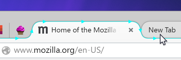
> Gone are the bulky angles and edges of tabs and menus. In Firefox 29, you’ll see streamlined, almost aerodynamic, curves giving emphasis to your current tab and subtly understating the rest.
5 years after Google Chrome introduced them [rounded tabs]
Horizontal tabs are so 2007. ;-) I'm still waiting for Chrome to have a vertical tabs solution that's as good as Tree Style Tab for Firefox. Tabs Outliner and other Chrome extensions are inadequate.
1. Aping chrome
2. Not having any option to restore sensible tab styles without an addon
3. The general 'fuck the users' mentality they have developer recently
4. Hostility to undoing the damage via removing as many customisable elements as they can.
"The Firefox UI is a moving target. It is under constant 'improvement', which means 'change' which means every few months I'm forced to upgrade it and shit has moved around and I need to re-learn how to do a task that I was happily doing before. This does not often happen with Safari. Their UI has been remarkably stable for many, many years."
Servo’s progressing well (it can render Acid2 now without problems) but it’s missing a bunch of features that are pretty essential for a modern browser. It’s absolutely still at ‘research project’ stage.
It's still a browser from the people who allowed a mob to push Brendan Eich out because he donated money to support a political cause that was and is not only legal but reflective of the views of a large minority of Americans. It's pretty, but I think I'll pass.
Wow, this storm in a teacup would be amusing if it wasn't so sad for a generally well-regarded outfit (Mozilla). They can't win - people with either your concerns or the opposite will dump Firefox.
Meanwhile both sides will continue to use Microsoft products, despite their history of extremely un-ethical business practises; and stand by while their country (pardon my assumption that they are USians) murders people in other countries with drones every day.
It would be nice to see outrage at outrageous things.
I believe exactly the opposite of this. I use Firefox in no small part due to ideological reasons (ie: I would use it even if it wasn't the best, just because I like the values they allege to stand for), and if they had let the CEO get a pass I would have literally uninstalled it and looked for something else.
im surprised people choose to use or not use firefox depending on the ceo.
the ceo doesnt take many decisions, the whole community does. some of them paid, and many unpaid.
by taking these - IMO - baseless decisions, you're only hurting the thousands of people putting their time, blood and tears without any commercial interest into firefox, not the ceo's you agree/disagree with.
remember that mozilla has no shareholders, the ceos dont get stock options, just a salary. its wholly owned by the mozilla foundation.
Why is it that anti-gay marriage supporters all can't get it through their heads that the man stepped down, and there's no evidence whatsoever Mozilla pressured him to do so? If you want to blame someone, blame the tech community at large, who find such views abhorrent and did the pressuring.
Also, choosing software based on political drama instead of technical merit is amusing.
> Also, choosing software based on political drama instead of technical merit is amusing.
Wish that Eich's vocal detractors had seen it that way, but then again, it's pretty clear that many of them didn't care the least bit about the software or open web side of things anyway. What would one have expected from people to whom Mozilla was only relevant as it touched their social agenda?
In any case, good for anyone who won't be following their example and will be supporting Mozilla in spite of what happened.
Australis is removing configurations options for absolutely no reason. If people want chrome, they'll use it. I don't care if mozilla want to ruin the default as long as they give people who want a normal browser a way out, but instead they are removing everything they can get their hands on.
Firefox is dumbing down. That's fine if it's IE, Chrome or Safari where the majority of users think said browser is 'the internet', but Firefox is for power users. People who like their privacy, who want to customise their software to their own use case, and who are rapidly running out of options in a world filled with shitty software that assumes the user has a room temperature IQ, removes options and metro-ifies everything while primarily existing to make money off your private information. Even Mozilla are not only dumbing down, but switching to privacy invasion mode with in-browser ads, and replacing their secure sync with one that drops it all on their servers presumably unencrypted as it works with a basic username/password.
I used Nightly for some time now so I know what is coming, and I started to use it after dropping Chrome. I think that the point you and the user on thedailywtf is wrongly exposed. Not necessarly wrong, but I think that it's wrong to see something different and immediatly say "it's not as it was before, so it must be bad, I want it back."
We saw this with Windows 8 and the start menu, we saw this with Android, we see this everywhere, all the time. Things changes and I think you should try it with an impartial eye and than, if you really don't like you can express your feelings in a more constructive way.
Also, "Firefox is for power users". I don't think so, I used to install it on every machine, even for elderly people. It's not some crazy super software.
>I think that it's wrong to see something different and immediatly say "it's not as it was before, so it must be bad, I want it back."
I've used chrome before. It was constant irritations, from the metro-ified right click menus to its RAM-hogging tendencies to its general inability to restore sessions after a crash. I use Firefox because I like it, and it's the best option that presently exists.
>We saw this with Windows 8 and the start menu
...and MS caved and restored it. I tried Windows 8 and found it completely horrible. As did enough other people for there to be at least 5 third party start menu implementations from Classic Shell (near perfect Windows 7 or XP menu) to a metro-ified spin on the start menu I forgot the name of.
>Also, "Firefox is for power users". I don't think so, I used to install it on every machine, even for elderly people. It's not some crazy super software.
Firefox is a platform to build the browser you want onto as much as it's a standalone browser. It has basic functionality without addons, but even random end users, in my experience, will learn to use addons and have adblock, etc, or have customised their toolbar layout.
The Pale Moon and Cyberfox browsers are forks of Firefox and they will not merge the Australis UI. I'm already using and liking Pale Moon, it's still not on par with Opera 12.17 though but is better than Firefox.
I'll see how Australis looks like on my boxes, but I'm not very hopeful: I like having a proper menu bar, tabs at the very bottom of the window, and a status bar, I couldn't care less for a touch-like interface on a desktop where I have a functioning mouse and keyboard.
I looked into Pale Moon before, but I think I was wondering whether they will be able to maintain it as Mozilla keep changing Firefox so much. Maybe it's time to try it again.
> and replacing their secure sync with one that drops it all on their servers presumably unencrypted as it works with a basic username/password.
Firefox Sync is every bit as end-to-end encrypted as it was before. The only difference is that it now comes with a login scheme that is actually usable.
Because everyone here is an uberprogrammer, right?
>Firefox Sync is every bit as end-to-end encrypted as it was before. The only difference is that it now comes with a login scheme that is actually usable.
I might have believed that before PRISM. I wouldn't even care about it sitting on Mozilla servers if I could still encrypt it with my own key instead of trusting them. Even if it is encrypted, presumably it is then derived from the user's password. For the average user, that might be 20-30 bits of entropy. Not good. I don't use sync, but if I did, now I essentially need a 2048-bit password to get good encryption on it.
What does this have to do with anything? How is the old sync system any different, then?
> Even if it is encrypted, presumably it is then derived from the user's password. For the average user, that might be 20-30 bits of entropy. Not good.
The other alternative here is having a sync system that your average user can't even figure out to use. On the other hand, it doesn't take anything away from you.
> I don't use sync, but if I did, now I essentially need a 2048-bit password to get good encryption on it.
You are confusing key lengths from algorithms like RSA with symmetric algorithms. The keys that are used for encrypting data will be either 128 or 256 bits (haven't checked) and used with some symmetric cipher.
Therefore, if you don't trust key stretching to be sufficient with a strong passphrase, you can grab 16 or 32 bytes of randomness, encode it however you wish and use it as a password.
>What does this have to do with anything? How is the old sync system any different, then?
The old one let you run your own server. It let you encrypt it with your own key, which you could know was generated from a good entropy source, not been shared, and is store securely. As it is, it's possible the new sync has a backdoor, even one many people at Mozilla don't know. There is also no point in deliberately increasing the attack surface for no reason.
>You are confusing key lengths from algorithms like RSA with symmetric algorithms. The keys that are used for encrypting data will be either 128 or 256 bits (haven't checked) and used with some symmetric cipher.
I may be wrong, but I thought the old sync used an RSA key as it's used for authenticating the user as well as actually saving/accessing the data (probably symmetric for the actual storage, with the key encrypted using the RSA key).
This is still possible with the new system, although I'll admit the ease and usability of such a setup needs work (and IIRC there are some changes required before android devices can properly use a third-party server; it may take a few releases before this become as easy as it was with the old system).
> As it is, it's possible the new sync has a backdoor,
> even one many people at Mozilla don't know.
Both the client and server are open-source, and you can verify that the client follows the protocol [1] and doesn't leak anything more than a PBKDF2-stretched password derivative to the server. It's about as backdoor-proof as any client/server system is likely to get.
But yes, it is more dependent on the strength of your password than the previous sync system.
Huh? No, it didn't. The key was generated automatically by the client just like it is now.
> As it is, it's possible the new sync has a backdoor, even one many people at Mozilla don't know.
How do you know the old one didn't? You have to trust Mozilla at some point. What if the client generates bad encryption keys on purpose, or so on?
> I may be wrong, but I thought the old sync used an RSA key as it's used for authenticating the user as well as actually saving/accessing the data (probably symmetric for the actual storage, with the key encrypted using the RSA key).
RSA keys were scrapped from the system a long time ago as they provided no benefit.
> Exactly the problem. The benefit is invisible to (most) endusers, so in Mozilla logic, it doesn't exist for the user.
What is the benefit in using RSA with the sync protocol? What sort of experience do you have in the design of cryptographic protocols to comment on this? Or are you grasping at whatever random reasons you can find to take a shit on the Firefox developers?
If you're interested in the reasons why asymmetric crypto was dropped, they are here:
Rule #0 of business is: Listen to your users. For browsers, one straightforward way to do this is to look at what extensions and addons users install. By far, the winner is adblock. Almost everyone who knows how to block ads does so. Therefore, if you are making a browser and you care about user experience above everything else, you will have ad blocking by default. That no major browser does tells us what their priorities really are.
Again, apologies for the negativity. This has frustrated me for some time.
Edit: I realize that if everyone suddenly started blocking ads, there would be darkness and chaos. But the current situation is only tenable because a small fraction of users have the know-how to get what they want. You can avoid ads if you are technically proficient or know someone who is. Everyone else has to put up with ads. Advertisers annoy millions if not billions of people, effectively subsidizing the usage of those with ad blockers. That doesn't seem fair to me.
1. Such as the old new tab page in Chrome: https://code.google.com/p/chromium/issues/detail?id=326788