I think the worst UI is simply the Teams one, because it presents as an app volume control but then simply controls the global device volume. Fuck off, you are not the only app running.
But that comes second to the microphone gain control, which Teams similarly exerts unilateral control over - only this time through an automated algorithm that for some microphone types just ends up muting them entirely. It's wild, you can go into the Windows gain control settings and see the slider wiggle around.
Teams is the reference for bad UI. Paste a code block. Select a word in the code block. Copy and you get the whole block copied not the selected word.
I could write a page of the issues like this. Maybe it would not be so bad if you only used Teams but when you use slack at the same time it is like someone is wacking you in the back of the head every few minutes.
I was grading an online exam yesterday. You're lucky.
This program used an SPA.
The core workflow is hidden and split over multiple "tabs". Tabs include: question, given answer, score awarded. That's right, none of those are available simultaneously. Yes, 70% of its window goes unused when full-screen.
Going through all students can be done in (at least) two ways. In the first, you can press a button to proceed to the next student, but you cannot go back a student. In the other, you click "save" after grading each answer. This returns you to the overview of students.
The overview displays 20 students per 'page' (tiny font, tiny rows), irrespective of your window size. There is no "next student" button, you have to click the student you want to grade. If you're grading past the first page (e.g., student #21): surprise! You're back on page 1. Clicking the student's tiny row requires more precision than you'll need the rest of your work week on modern desktops.
I could go on. I will, actually. Apparently, standard workflow is you can never go back to an already graded answer and points awarded become final; I accidentally used a workflow that didn't have this idiocy).
In short, there is no way this product's core functionality was tested. Any tester would have exclaimed "are you kidding me?!", and have walked out. Or inflict physical violence on their computer. Or whoever hired them.
In short: setting this product on fire is the best reason for bringing back floppies in 25 years.
I don't think Blackboard is an SPA (it's just very slow server rendered), but it's UI really is terrible. I wrote a script to scrape my course materials when I was at uni, it was that bad.
Blackboard has to be the worst software I ever had the misfortune of having to interact with. How come universities spend millions of dollars every year on such a steaming pile of crap?
As a student, I've never had any edtech site or "online textbook" that had good UX. It wouldn't be so offensive if I didn't have to pay $80 per semester per course for the privilege of using something that is never as good as a real textbook.
> Paste a code block. Select a word in the code block. Copy and you get the whole block copied not the selected word.
I feel like this used to work properly until a month or so ago.
The worst bug I've seen, and this is also something that only started happening in the last several months, is select messages simply not appearing!
So basically I open my computer in the morning and look at Teams and it'll have messages from overnight. EXCEPT some messages did not make it, like, at all. There was a whole thread that had replies that were simply not visible to me. I even replied to that thread and on my screen the reply appeared right after the last visible message whereas for everyone else it appeared after the 40 or so messages that came in overnight.
I haven't been the only one to run into that issue either. Restarting Teams is the only thing that brought the messages back.
Now that's what I call a critical bug! Who knows how many things I've missed.
Outlook also has had this problem of emails just not showing up. Sometimes it takes a whole day for an email to arrive. Amazingly low quality for such a wide used product.
MS in particular has the habit of actually introducing small bugs like this regularly through their usual updates. It's infuriating. One day something works the next it just doesn't. I know people who never update their machine because of this. Can't blame them. Once it works, why take the chance of breaking it with updates? It it is a certainty that at some point MS will break some functionality of your system with an update. It's just a matter of time. So turning off auto update is the most sane thing to do for most people. I recommend it myself, and if you update your Chrome or Firefox automatically it is safe enough to use an unpatched Windows for most people anyway.
Once MS started introducing new bugs rather than actually fixing old ones I knew the last MS machine I will service is a gaming machine for my family. As long as that needs to run, I will make it run. All my other systems are on linux now. Once the gaming craze is over I will ceremoniously burn the Windows license key that I used, and I will never, ever, run any software from Microsoft ever again.
Except at work of course, but I don't mind getting paid to be frustrated.
> I know people who never update their machine because of this.
HA!
I was just testing a VR app that has a Windows component when things started failing in VR. I took off my headset and noticed my test machine going through power-on self test.
"Oh crap!", I thought, "a bug caused the system to reboot".
Nope. Just Microsoft deciding it's time to apply some updates. Doesn't matter that I scheduled for a time that I wouldn't be testing.
I've NEVER been able to successfully gain control of this, despite reading up on it and doing all the recommended things.
I'm convinced the "schedule" thing doesn't actually do anything. It worked in Windows 8, and that's the last version of Windows where updating was (almost) tolerable.
I spend too much time sitting waiting for people to join meetings that have been cancelled or moved - and Outlook / Teams don't know yet. I'm connected - I know this because I'm sitting there 'in' the meeting. I'm receiving emails. I'm talking to people on Teams... Argh.
On the same note, it takes practically all day for the iOS outlook app to update my email. My organization doesn't allow for the default mail app to work anymore, so I am stuck with this worthless email app.
I've had that happen on Slack mobile so much I just don't trust it anymore. I always tell people (even if it seems counterintuitive) to email me when things are urgent because very rarely (or not, since I can't tell), it's decided not to show me critical messages.
Mine is doing a variation of this now. If I’m on a call, messages stop coming through but I’ll see them on my mobile. When I end the call, they still don’t come in until I restart the app!
> While many users would at first glance conclude that the "arrow" on the topmost button is an indicator that this is the currently selected button, it is used to indicate that this is a "special" (a.k.a. inconsistent and undesirable) type of button. Clicking on the arrow causes the button to "open" (downward) to reveal a variety of folders. Why the designers chose to use an arrow pointing to the right to indicate downward movement is one of the many mysteries of this program.
And now the expand/collapse UI pattern with right/down arrows or triangles is standard (e.g. https://developer.mozilla.org/en-US/docs/Web/HTML/Element/de...). Don't get me wrong, the example button is terrible UI, but an interesting example of how norms change.
On more than one occasion I have misinterpreted the upvote icon on HN to be "collapse thread".
An IBMer once explained to me that Lotus Notes was intentionally not improved; it was purposefully bad, a form of coordinated sabatoge. The bugs provided employees with an excuse for why troublesome directives or wasteful meetings were lost.
To this day, I still am unsure if they were joking.
So without defending Lotus Notes in any way, there was a meaning to the symbols: they were defined by some oneway function from what you were typing. So you would get used to the little symbol dance, and know if and when you’d mistyped
Wouldn't it also allow any onlookers, if they are able to memorize the symbol dance, to derive your password one character at a time by trial and error?
I seem to recall the password was client-side too. So if you had Lotus Notes in a VM and you restored from a save point you needed to remember what your password was when you did the save.
We've been using Teams since the pandemic started and we switched to WFH. It started off awful, and in that time, it hasn't got better in any material way.
Interactions still feel like your mouse pointer is moving through molasses. Notifications are misbehaved trash. Video calls make your CPU beg for mercy (useful if you want to fry eggs on your laptop though). Switching between multiple organisations is still miserable (although at least now you get notifications for other orgs instead of them just getting lost in the aether, never to be seen).
The funny thing is, none of these problems exist on the mobile apps, which are actually quite well-behaved. I guess that's because they have to use system APIs.
Perhaps saying it hasn't got any better was uncharitable—thinking back, when we first started using it I don't think you could even have more than four people visible on a call at the same time.
But the basics—the things that I mentioned in my previous comment—have remained all but unaddressed for the lifetime of the product so far, and it's utterly miserable to use because of it. They're just piling new features on. I understand why, it's just frustrating.
Yeah, Teams is notoriously bad for software engineering related messages. It wastes a shit ton of horizontal space and every code block/log snippet that you send is horribly displayed with big font and scrollbars. Of all the things compared to Slack this infuriates me the most.
My the most favorite one is when someone pastes link in a chat to MS Office document on Sharepoint/Onedrive. It is opened in Teams and when you close the document you might naively assume you will be back in the chat you came from but no, you end up on the main screen and you need to search for the chat window again.
Which is impossible because it throws meetings with chats all in the same list so you have 3000 things going on. Not to mention that meetings that ended 3 weeks ago still have active chats. Or if you were invited once now you’re forever attached to the chat of all the meetings that come after, even if you’re not invited.
Teams started ok, but it has become worse than Skype, which is something I didn’t think was possible.
From the company that made MSN messenger it’s hard to believe they didn’t have any lessons learned
Ahh, but MSN messenger was not the best of all chat clients in its day either. I remember advertisement aplenty, spam, terrible "candy bar" UIs and a password reset system that basically let others steal your account easily. I think I used the official client maybe twice at an upper limit.
Honestly, the best UI Microsoft ever invented were always those inside their video games. I still think AoE2 is hard to beat.
I mean it was pretty cancerous but it was stable and simple to use. A list of your chats sorted by last activity. Towards the end you could even play games. Voice messages, gifs, etc. It was a free ms product from the early 2000s, in 20 years we should’ve gotten much further ahead, instead we went backwards
And don't even think about looking at the document and commenting something about it in the chat, and then looking again... because it seems impossible to have the document and the chat open at the same time.
I tend to just ignore the links and download everything because of this.
We had network issues the other day and a few minutes into the meeting we realised my audio stream was delayed by a whole minute. There was no indication on the Teams UI this was happening. I'd hear a question about a window I'd already closed on screen share, type a response, and they got it a minute after asking. As someone who uses Discord at home, Teams is pain.
I don't really know how these things work but it was quite crisp while my outgoing was very choppy so I hung up the mic and resorted to typing. I was assuming a lot of packet loss and it was rebuilding a little behind the times, the network was very slow that day in general but the voices were clear.
One thing that always bugged me in MS Teams is that when you do the shortcut for :thumbs-up it always presents 20 thumbs-down emojis first instead (due to alphabetical order)... but people are way more likely to use thumbs-up! Why not put that first!!!
A small thing, but one that would annoy me almost every day...
This reminds of something that aggravates me to no end and cannot turn off: emoticons / emojis. I never use those but it keeps offering those by switching typing focus to the popup.
The issue comes from my main language being French. And in French, for some reason, there has to be a space between the word and the colon.
But in Teams, and even Outlook Web, whenever I put a space and colon to introduce a list on the line below, so I type <space><colon><enter>, I end up with a freakin' smiley, so I have to go back, delete it, and put a colon in again.
This floored me: when the app decides you typed an emoji, you can undo (ctrl+z) to get back to what you actually typed. That never would have occurred to me to try, simply because the mental model I have of "undo" pertains to things I did, not the app.
Anyone tried quoting a message in a reply in teams? For a messaging client, this should be the most important since everyone in the group wants to know which message you are replying to... But ofcourse msft has to screw it up..
https://techcommunity.microsoft.com/t5/microsoft-teams/quote...
"48,477 votes Reply to specific message in chat on desktop app"
Now that is a quotable quote when it comes to being told something has a bad UI and choosing to do nothing about it.
It's no surprise, that was classic MS strategy. Sell the thing everyone actually needs (Office, because they smothered the competition), but bundle it with something sticky which will also hoover up data about your workers - no need for the product to be any good, execs in charge of purchasing won't have to suffer with it for a fraction of the time employees spend. Oh also, I happen to have $200k of Azure credits here for you - no pressure but if you do start using Azure we'll make the bill for all this productivity software go away...
I feel like this aligns with the cartoon of big tech in my head, which goes something like this:
- Apple is the designer: I want to make everything beautiful and perfect. Sometimes that pesky messiness of reality gets in the way, but if that's the case, it's reality which should change.
- Google is the engineer: Yeah cool this project sounds good, let's replace that old technology with this new thing that will be so much better! We'll release the prototype in a month, and six months from now we'll have the whole thing done. Hmmm 4 months later, some of those details that took years to refine in the old version are actually pretty tricky, and these weird users like actually want to keep them... Yeah details are hard, let's put this project on back burner because now I'm excited about new project!
- Microsoft is the MBA: Products don't matter! They're just interchangeable widgets the grunts working below me have to concern themselves with. The important thing is what I can sell to upper management with my power-point presentation. We're data-driven, so as long as my KPI's improve, that means I have made the morally correct decision. If I can leverage or trick users into using the product the way I want, it means I'm good at my job!
Just in case an MS engineer is reading these Teams gripes…
On Mac, Teams does not honor system-level Do not Disturb. So when I turn off notifications during a presentation at work and my friend sends me snarky comments about our boss…
Teams’ notifications on Mac are an ongoing debacle. Because they are Microsoft’s own implementation, rather than using the system API, not only do they not respect DND, they also helpfully get lost behind other notifications that come in from properly designed applications.
According to the Microsoft admin updates I’m subscribed to, native notifications on Mac have been in a beta channel for months, with a full rollout pushed back repeatedly for no reason that I can discern.
Developers stubbornly refusing to utilize the tools provided by the operating system because they think they can do it better (90% of the time they can't) is one of my greatest pet peeves.
You should ONLY ever use your own engine for things like notifications if the particular OS doesn't support them (pre-10 Windows)
I believe that in this case it's simply convenience/laziness to have a single notifications codebase across both operating systems? That and Windows didn't have native notifications when it was first developed. Not that it excuses a big chat application from MS behaving this way, just saying that they probably didn't deliberately choose to re-implement notifications just because they didn't like the OS ones.
Windows has had balloon notifications since Windows 2000. These show up as toast notifications by default in Windows 10, so compliant applications would be transitioned automatically.
Some software also presents that in the settings as the choice between "native notifications, which don't have as many features" and "custom notifications, which have all bells and whistles". And the default of course is the one with more features, not the one that respects your settings. I think Mattermost was where I've seen that distinction.
This is what happens in an Electron world. Lots of experts around to make some JS+CSS notification boxes because they keep reinventing those for every SPA anyway, but.. integrate with the native system notifications? They don't even know how Electron works so how would they begin to do any of that.
overall I agree, but tbh I'm quite happy for Telegram Desktop having its own notifications - the system ones in my Ubuntu Gnome (went through a few LTS upgrades, but not heavily customized) are really messed up, especially when Firefox sends something
To add insult, the notifications are a separate window on macOS. So when you use cmd+tab to switch _to_ Teams, you might end up in that notifications window. Even when there are no Teams notifications, that window remains. This is very painful when in full-screen mode, as cmd-tabbing to Teams simply doesn’t work.
I’m on the beta where you can switch to native notifications, but they’ve only implemented that (poorly) for chat notifications. Calls still use their own notifications. Poorly you ask? Well the notification doesn’t show the sender when posting in a group channel; it uses the group name as the notification title.
They're registered as a separate window on Windows too. When I alt-tab, I frequently end up in the notification window.
My main question is, why are people still doing desktop apps in JS? (Yes, I know, cross-platform... There are other ways to do that.) They always end up breaking with the native UI conventions on the host OS, and they're stupidly resource hungry.
Could be worse. In outlook for Mac, there are native notifications but the only button on them is “delete.” I thought it was dismiss for quite some time.
And when you use command-tab to delete search terms, i what it actually does is delete the highlighted email.
Microsoft ignoring default shortcuts or even assigning different behaviour in their various macOS apps is driving me insane. On Teams one cannot even discover shortcuts from the menubar as the menubar doesn’t contain any actions beside undo/redo.
Electron must be the new embrace extend extinguish of macOS.
It makes me wonder how they manage to get it so wrong. Is there nobody at Microsoft who uses teams that they can ask for UX feedback? Does all the user feedback they collect go straight to the bin?
You would think its better on windows, but it's not. The notifications ignore the global notification settings and pop up even when you only allow notifications with priority. And they are using their own implementation as well
I see there is a setting in teams for using windows' notification vs using teams' notifications. I haven't tried it, so it probably doesn't actually work, but I figured I'd point it out.
Also the sound seems to register itself as a media sound, so it will hijack your play/pause functionality. If I'm playing music and get a call, pressing play/pause to stop my music will just stop the ringing while continuing to play the music. Additionally, if I get a call and pick up, later on if I hit play/pause it'll continue playing the Teams call jingle instead of my music.
It can even be seen in Big Sur with the new playing media icon in the top bar. If I click that I can see that there's an item for my music, and an item for Teams sounds.
Exactly. I have one screen and I am nearly always working in full screen. My mac is often muted at the same time. Like that I am able to miss many calls because MS Teams shows the notifications on a space which I am not using. This would be no issue if they used system notifications.
My company was a fairly early adopter of Teams. I remember there being a user feedback forum that was such an optimistic place. Fixing notifications was one of the highest voted issues and the MS rep promised work was being done on it, but it never got fixed before we finally accepted the increased cost and moved to Slack.
If it makes you feel any better they use their own custom notifications in windows as well and it suffers all the same issues (doesn’t respect dnd, gets covered by/covers native notifications, etc)
Pro-tip: make a second user account on your system exclusively for presentations. There's nothing more unprofessional than some stupid notification popping up during a presentation.
In the company I work at, there are telepresence screens in each conference room that appear in Teams.
Projecting something onto the screen is done using Teams, so I can't disable Teams during the presentation. People often connect in from other conference rooms or their desks, by joining the call.
ICT probably wouldn't allow us to make another user account.
I agree that making a second user account is good practice for IoT meetups, church groups, or other presentations, but it might not actually work well in this company. Teams has plenty of other issues though, such as screen sharing in a group call after unplugging HDMI, or microphone input selection issues.
Is that easier than just switching user account? Essentially all we're talking about is having a separate environment. Maybe desktop environments could support multiple environments per user more easily, but it's not too bad to set it up with a separate user account.
That doesn't really work when the app you're presenting with is actually MS Teams, as for whatever reason, during a call when you're screen sharing, Teams still shows notification pop-ups.
Teams, Google Meet, Webex, Zoom -- on Chromium, they all hijack and increase your microphone volume without you knowing. It's infuriating. Just thinking about it pisses me off. You have to have the volume control open and have a live tug-of-war with the app while you're talking.
Firefox, either intentionally or unintentionally, does not let Meet do this. I say Meet, because none of the others work on Firefox anyway.
But the recent Meet update is broken on Firefox, so yeah, there goes that.
Krisp, a noise cancelling application, is able to lock the microphone levels. I believe this works even without it on / without the trial timer counting down.
But yes, going to that kinda length to prevent those applications from messing with the gain control is absurd
What I find perplexingly awesome about how terrible Teams is is the fact that now people don’t keep bothering me all day with useless messages. The software is so terrible that like a gas station bathroom you just get in, do what you need to, and get out.
I understand the motivation. A user might set an app's volume low and raise the system volume very high to compensate. But then audio from another program, likely Teams, might blow your ears out when it starts. In a vacuum, I like the idea, but given that the standard on Desktop is in-app volume control Teams' behavior sounds worse.
In iOS I've never seen an in-app volume control (I assume its forbidden) and all volume adjustments affect the system volume.
> In iOS I never seen an in-app volume control (I assume its forbidden) and all volume adjustments affect the system volume.
Typically games will have them so you can balance out music and interface sounds relative to in-game sounds.
In my opinion a volume mixer is a requirement for a decent user experience. To reuse the game example: if I want to listen to a podcast while playing, I'd better be able to hear the podcast clearly while also hearing the important sounds from the game.
I will say I find the inconsistency in whether a game will obey the physical Silent switch on iOS to be annoying at times. I'll know I have my volume turned up but oh, this game is being silent because Silent is on. At the very least that should be an option.
While I'm on the Silent gripe, mild tangent, but Facebook on Android refusing to follow the Notifications volume and instead following the Ringtone volume is one of the shittiest pieces of UX I have to deal with daily.
Oh, it's painfully obvious that it's intentional, and that's what makes it truly infuriating. I can tolerate a genuine mistake from a developer, no biggie, we're all human, yadda yadda, I *cannot* tolerate Zuckerborg condescendingly ignoring my own decisions and autonomy with my device and asserting that his stupid app is more important than anything else in my life at any given moment.
Seems that, since the right volume to adjust is dependent on so many contextual variables, the right thing to do is to display two sliders, one for app & one for the system volume, and let the user adjust the appropriate one.
Cap every app's local volume setting at lowest in use by any app & only allow user to raise volume above this threshold explicitly for currently focused app
Also nice that it controls playback of other apps. Intended as a nice feature: your listening to music, accept incoming call, music stops, hang up, music starts again. Sounds nice, in practise it starts randomly music during calls. Or you stopped music for hours, accepting a low level call and raise your volume,hang up and get blasted away by your loud music starting to play.
Or my favorite. Accepting a call, manually pausing music using media keys, call ends, I try to resume my music using media keys, resume Teams ringing sound instead.
Thanks teams, I really wanted to here that tune again!
OT: We used MS Teams and Slack and management recently decided to close our Slack workspace and switch to MS Teams. Most of our devs are unhappy with Teams so we switched to a selfhosted zulip instance and we're very happy with that.
Microsoft‘s UX incompetence to market dominance ratio continues to baffle me. I’ve pretty much settled on blaming this on MS winning some race to first OS/Office software useable enough for mass adoption and just forcing all the rest since. If you think of productivity hours destroyed because of Excel quirks and Windows rebooting at the worst possible time, this is maybe the most damage a monopoly has ever done to the economy. But the people who had the power to stop this probably use Word and own Microsoft stock. We’re stuck.
Yeah, also, sometimes my volume buttons are not controlling my headphone, the headphone that I'm using and is the only thing producing sound at that time. It takes some time but you'll learn that you need to set the sound output differently in the Windows taskbar itself. And then later of course, you need to set it back because you don't want all sound to go through the headset you just wear while in a meeting and put down as soon as you end a call...
I literally had to install a virtual microphone device with a fake driver and make teams use that - otherwise it would keep adjusting my real microphone gain despite it being perfectly fine. The virtual microphone cannot have the level adjusted at all, so teams can't do anything, but it's just SO STUPID. Just have an option to either auto-adjust or not, don't force it on everybody.
Oh, it could be much worse. You could be using Teams on OSX. Nothing behaves properly. I've spent at least a day of work time trying to get rid of the hidden window for notifications which prevents keyboard focus from ever working.
Audio settings in every app is it's own source of frustration for me. I pretty much test them each time I join a different conferencing or audio related app...
Microsoft Teams UI is so bad in so many different ways. And in worst way possible - where it works enough for management to not ditch it, but doing something ridiculous on every occasion.
BTW, the most ridiculous instance of this that I've met is when a game fiddled with the OS-global volume when I adjusted the volume in the game's options.
It's atrocious. No slider, clicking on it "blips" the speakers so you can hear how loud it is. You have to hover pointer on top of it which enlarges the green circle by about 10% to show "Hey, you're hovering me, in case you missed it!" and then scroll so the the tiny tiny dot gets slightly more enlarged (which clearly indicates new volume, duh). Then it shrinks to a smaller size back when stopping the hover.
Oh, the arrow to the right? Does that open the customary volume slider? No that's the sound device picker. Speaker to the left is the mute. To make matters worse it's in the same "group" as the network symbol is (although there's no network settings when clicking), and sometimes clicking the thing doesn't work at all, depends on how much explorer.exe decides to hang at the moment.
But surely I just got some broken alpha/beta version.
Looks like the volume slider has no minimum width and is compressed down to a single blip. When there are other widgets in the container, it expands to a usable width. Reasonable bug for beta software.
I wonder if it has something to do with your language. I know they've had other random UI issues if your language wasn't set to english. Here's my volume setting for reference:
https://i.imgur.com/PwW0SwI.png
It's still frustrating though. I can't just click the volume icon and use the mouse scroller to change the volume. It takes two clicks now.
The wheel does work when just hovering over many sliders, at least on Mac and in Firefox. However, whether that works in any particular app or a site is a gamble.
In some apps and sites with a specific purpose the wheel is often mapped more generally: e.g. to volume control in video players regardless of the position, unless it's over the time slider.
Hmm, where do you need two clicks to change the volume by scrolling? I can just click on the volume icon (or any of the three icons there, since they're all a big button), mouse over the volume slider, and scroll to change it. I think this is essentially the same flow as before.
That's so hilariously misguided, it's like some student's experimental pet project. It gives zero visual hint as to how to use it (i.e. ‘affordances’). From the looks, I'd guess that it's a horizontal slider with the range of like fifty pixels. If this was any kind of an established control, you'd surely just use the speaker icon itself as the ‘handler’ to grab—the fact that they needed the separate green dot says enough about whether it was a good idea. How it passed any kind of review at MS is a baffling mystery.
It's actually mind-boggling just how bad UI/UX in general has become. Like, there are things which are bad because it's hard to get right, but this trend to me sinks even lower than that, it's actually spectacularly bad.
Everywhere I look: Windows, Android, websites, mobile apps... it's all so terrible. Confusing interfaces (indecipherable icons with no text), ridiculously small or ridiculously large text (either I can't read it without zooming or so large that it fits 3 lines in a 15" screen), endless whitespace, no visual feedback about how to interact with the interface, such as what is clickable or not, etc.
I chalk this up to designers not giving a rat's ass about actually designing their interfaces carefully and thoughtfully, and simply optimising for one things: looking good on screenshots. If you think about it it explains everything about this.
So you have signed up for insider builds? Then claiming that they have "randomly thrown" it at you is just odd. You explicitly told them you wanted early builds.
Not OP but I'm in the same boat. I signed up for insider (dev) builds to get X support in WSL2, then set it to switch me back to insider (beta) builds on the next opportunity. But they didn't do another beta or any other insider built really before rolling out Win11 to dev so that's what I got on the next update. There also wasn't any notice this would happen despite my machine apparently not meeting the requirements for Windows 11.
I'm not complaining but it was definitely unexpected for me despite being in the insiders program. Especially given that Windows 11 is being promoted as the "next version of Windows", not just another Windows 10 release.
FWIW my volume slider is still a slider. I have no idea what's going on in that screenshot but either they're A/B testing, this is a weird language-specific UI variant or there's a bug.
"External headphones" should be a headphones icon, not a computer icon, is my complaint, to be explicit. It used to be correct in a previous version of macOS but regressed at some point.
I've specifically went and downloaded the latest ISO of Windows 11 preview to see this monstrosity, but no, it seems like a completely normal slider to me, just like in Windows 10.
I find Apple's suggestion to use Siri to control the volume on the AirPods Pro [0] to be worse than some of the ideas on that page. The idea of having a spoken conversation in public in which I must request a volume change via a branded AI (and then repeat that request multiple times if necessary to reach my desired volume) just feels humiliating.
It's like how redbull reps tell the barkeep to only pour half the can In the drink and give you the can to hold and carry around. It makes you into a billboard for the product talking to Siri in public.
I actually really like that feature - it works with any _strongly-worded_ “stop” command: Alexa detects user annoyance and swiftly stops whatever it’s doing with the minimum of back-and-forth.
The best part is that whereas with most commands, if Alexa has any doubt about what you said or you weren’t clear it always asks you to clarify or disambiguate, even various stop/pause/volume-down/mute commands - but when spoken with an angry tone or with an f-bomb or two then she defaults to stopping without question, even if she didn’t hear you clearly.
Counterevidence: some of them (perhaps all) have a hardware switch to mute the microphone, a requirement allegedly set by the CEO.
Parallel evidence: the Ring acquisition has aggressively integrated itself with police forces.
Partial evidence: some of the devices are known to retain data even after being reset to factory settings (I presume it's a bug).
It has to be listening all the time for its activation command and we have no idea what it's doing with the data that comes in and is determined not to be the activation command.
Ha, I've been doing the same thing with google assistant. Try it politely once, and then if it doesn't work or understand change to "shut the fuck up" and it somehow always gets it.
But you still ended up buying them? I didn't know it's not possible, glad I went with Jabra Elite Active instead. Cannot imagine trying to muck around with that crap while out running.
Apple's ear buds are the only ones that fit comfortably in my ears so it's sorta my only choice. (The pros do not, which is unfortunate.)
I don't typically run with headphones in so that's not an issue, but even if I did, it's pretty easy to hit the volume button on my phone unless it's in a backpack or something.
Does seem odd they couldn't have squeezed another switch in there, or let you lower volume with the switch in one ear and raise it with the switch in the other ear.
Yea, I actually thought that’s how they worked when I first got them, I remember seeing a demo where that was done, but it was probably either concept art or a different product.
iPhone has squeeze your pocket to change the volume adjustments.
Apple Watch has volume control just using a crown.
AirPods Pro too small to handle a moment or twist.
AirPods Max trials on-head crown and whole better than other product physical controls, quality fine physical gradient control on even a large mounted device is tricky.
I'm always a bit embarrassed when I'm in public and a buddy calls me over to look at something on a MacBook. Like - "No it wasn't me who fell for Apple marketing."
Nearly all volume controls suck because by and large the software world is ignorant of the fact that loudness scales logarithmically. 99.9% of volume controls scale the output linearly.
This is in the same category of error as most programmers thinking that sRGB uses a linear light model. They try to do arithmetic like blending or blurring on the raw image data this inevitably does the wrong thing.
Similarly, most non-AAA game engines ignore the sRGB tone curve and treat all inputs and outputs as if they were linear, which results in unexpected brightness shifts in textures.
Up until very recently, Blender used linear light internally, but output that as sRGB without converting it to the appropriate gamma curve. There's guide after guide online on how to fix Blender by using "filmic" mode, which should be renamed to "not broken" mode.
Same thing as the colour picker in image editors like mspaint or Photoshop. They all have the same rainbow picker that has very visible discontinuities in the colour gradients, like a rippled curtain. It should be smooth, and it is, if using a perception-based colour model instead of linear light output straight to an sRGB monitor without any kind of colour correction.
This kind of thing has been going on for decades, and will continue for decades more. Programming is still a growth industry, so the average developer is inexperienced and doesn't know about these subtleties.
I think more people are aware of gamma correction now.
The best way to do that, if you are using shaders, is to have "fragColor.xyz = pow(col,vec3(1./2.2))"* on your last line. If it looks bad, look elsewhere, you are not allowed to touch that last line. The opposite should be done just after reading textures, if they aren't already linear.
*: sRGB actually has a weird transfer function, but it is closely approximated by a gamma of 2.2
For OpenGL, it will perform conversions automatically when sampling from texture with SRGB type, and opposite when writing to SRGB rendertarget (on desktop GL_FRAMEBUFFER_SRGB also needs to be enabled). I guess other APIs have similiar features.
This doesn't work for alpha blending since even if you output the color in the right space, the GPU might do blending in sRGB space and mess things up.
Best is to properly declare the target framebuffer as sRGB (if it is) and output linear colors while letting the GPU deal with it.
There be dragons. First, you're assuming the target display device is sRGB! There's a decent chance it isn't these days.
Second, this will prevent HDR.
Most games render to a linear HDR target surface with a very wide dynamic range, and then will tonemap it to the display gamut as the final step. This was common as far back as Valve's Half Life game. I think even the first one did something along these lines!
This is especially important for modern engines that are used by AAA games. E.g. Unreal engine and all similar engines are commonly used for XBox and Playstation games where the output display is a wide-gamut HDR television, not an SDR sRGB computer monitor.
>This is in the same category of error as most programmers thinking that sRGB uses a linear light model. They try to do arithmetic like blending or blurring on the raw image data this inevitably does the wrong thing.
I thought Blender did convert to the sRGB gamma properly, the problem without “filmic” is that the highlights clip so badly without a roll off that lighting becomes very difficult and encourages bad workarounds.
I think Elite Dangerous Odyssey recently had this problem. Any ice planet at release was literally blowing out the sun in terms of brightness a thousand fold or so it seemed.
OKLAB is a perceptual colour space, which is really useful for things like colour-picker tools, image editor controls, web development, CSS styles, etc...
You can use this kind of colour space to make two colours that are equally bright and equally saturated, but exactly 180 degrees apart on the colour wheel. If you use this instead of RGB hex codes, you get much better looking results. It'll make your app or web page "pop" with minimal effort...
Charles Poynton has good references on this. His website is very 90s, but his books (a la Digital Video and HD) are the best clearly explained introduction to color science and gamma vs linear light coding that I've ever read.
> 99.9% of volume controls scale the output linearly.
Wrong. Windows's volume output is the percentage squared, and Linux PulseAudio's volume output is the percentage cubed. Nonetheless I would prefer that the volume output was exponential (2^(slider position / constant)). This way, pressing the "volume up" key 3 times always increases the volume by a constant factor, regardless if you're on loud or quiet speaker/headphones. Additionally, on loud headphones, you won't have to fine-tune the volume in the very bottom of the slider (eg. 1 is too quiet, 2 is a bit loud, 3 is painfully loud).
On Windows, I hide the default volume control and instead use Volume2[1] set to exponential mode. On Linux, I haven't found a good solution for getting PulseAudio to use exponential volumes.
When probing my Android phone's output in an oscilloscope, I also saw that it was not linear, and the volume increased more per level when louder. However I have not attempted to compute the exact curve. And I suspect it also differs between different versions of Android or different phones (my Android 11 phones has more volume levels than older phones), or with different audio APIs (some phones use tinyalsa, some use XML files to configure hardware volume gain, some don't).
You've given me an idea for a volume control - enter a function like x^2 or x^3, which is graphed (on a linear scale). Then pick an x. The y value will be your volume. (The component should reverse any platform specific non-linearity first.)
How would you compute the current volume level? You would have to either store the current x value (which could desync if you change the volume level using the OS volume control), or derive the nearest x from the current y value (which may be possible on PulseAudio, but I haven't checked if you're stuck to the nearest 1% or if you can get a more precise or dB level).
Well if the function you put in is continuous, single-valued , then you can invert it and compute x(y). At the end of the day if the volume is represented as a syscall with a float between 0 and 1 you can play arbitrary games with any bijective function to make setting that number arbitrarily complicated.
I used to own a BlackBerry 10 phone running BB10 OS. At the time, the dev team accepted suggestions on how to make the OS better, and I suggested they make the volume controls logarithmic instead of linear, and they did! I loved how quiet that phone would go while still remaining clear—I used to listen to audiobooks as I fell asleep at night, and rather than use headphones I would just set the volume to level 1 or 2 and put it on my pillow beside my ear. I haven't been able to do that with any other phone since because the volume doesn't go low enough, or if it does the audio is muddy.
I still have my old BB10 Passport. Weird form factor but that was an awesome device. It's too bad Blackberry really shit the bed with their OS and its lack of apps.
You can go to the control centre or whatever it's called when you pull down from the battery side of the screen and tap and hold the volume widget, you can then drag your finger up/down to change the volume in small increments. I have the same issue as you when I'm listening to stuff at night.
I agree - when trying to watch something next to a sleeping partner even 1 step above muted is too loud. Annoying. I often watch Netflix muted and read subtitles because of this. I guess I need headphones.
But I do really think a volume one half of the current lowest would be useful for me.
Headphones really are the solution. I used to have wired ones and these were quite uncomfortable to handle - cable messed up all the time, and even when you untangle them you have to avoid pulling it, so I used speaker most of the time anyway.
I finally bought wireless buds a year ago and I really understood why so many people have these and talk about it - it's just too easy
Literally no one wants a logarithmic scale to interact with though. '50% volume' should definitely be in the middle of the slider. The OS should translate that in to decibels. The maths behind it has no place in the UI.
I think no one argues for having it visually. They argue for having the GUI linearity converted to appropriate perceptual linearity, which depends on the medium.
It’s weird how I nominally know this but never really thought about the implications... How does the hardware world do it? I’d expect the normal way to make a volume control would be to have an adjustable-gain amplifier using the standard opamp circuit somewhere, but those aren’t logarithmic in any resistance you could wire to a knob, are they? (Yes, I am deeply ignorant about electronics.)
It's exactly as you sugggest/doubt - in audio hardware you use potentiometers (the thing under the knob that has different resistance depending on the rotation) that are designed to have logarithmic scale.
A lot of digital audio applications just do programmable gain in the digital domain. My main rig extends samples to 42 bits and attenuates in the digital domain, then dithers to 32 bits for the analog conversion.
The volume controls in Tuxguitar are legitimately worse than some posted here. To adjust the volume of a track, you choose "View > Show Instruments" and then the unlabeled first circle in each row is the volume "knob". It's a "knob" because it is basically a circle with a dot with the 6-o'clock position indicating 0 and the 3 o'clock position indicating maximum. To adjust it, you click and hold (with no visual feedback that you have clicked anything active) and then drag up and down. Not side-to-side or in a circle, up and down.
I'm sorry to whoever designed this control for this very useful Free OSS. But goddamn that is bad.
Circular knobs in audio contexts that don't support circular mouse movement need to not exist. If you want to have the user drag their mouse up and down, just use a vertical slider.
On laptop, supposedly the simplest thing to do is to use the dedicated volume keys?
Again, this was back in kde 3 days, where desktop usage was more prominent than laptop, and even on laptop, a mouse with a scroll wheel was still a common accessory since touchpad gesture wasn't really a thing yet.
> Knobs are great in the physical world, never met one on a screen that wasn’t hard to use.
Well, I just gave you a perfect example where a knob on the screen was immensely useful. Of course it will be silly to try copying the physical world as-is, but with a little bit of creativity, applied in the right context, a knob on the screen can absolutely be useful.
Yeah but sometimes that same knob correllates with a knob on an actual piece of hardware, so maybe the design compromise was this instead of changing the UI on the fly
It is, and it kind of sucks. Worse yet: in different VST plugins, for instance, sometimes you're supposed to click the knob and drag up and down, sometimes you're supposed to move the mouse in a circle as if you were rotating the knob.
Yep,every VST seems to be a learning exercise. But the variety of layouts and colours can also be inspiring. That said, the most garish were rarely keepers.
Was going to say. It saves screen space - should you need to save screen space - while allowing fine control. A slider would take much more screen area.
This is a bigger issue on synth VSTs that have tens or hundreds of controls. When screen resolutions were smaller it was a toss-up between hybrid vertical/rotational scrolling, horizontal/vertical window scrollbars to get the controls to appear at all, and multipage UIs.
Some designs, like Korg's MS20 VST, had all of the above.
Humans may be terrible at reading pie charts quickly, but I think we do fine with visualizations such as clocks, gauges and circular controls. I wouldn't even be surprised if a circular gauge can be read more quickly or with less attention than a linear one (size/area being equal).
I don't know, I've used these and I think they're actually kind of ingenious. Perhaps not the most intuitive thing, but once you understand how it works, it's pretty easy to use, and having the entire vertical area you can move your mouse for granularity is probably superior to moving a circle back and forth on a tiny bar.
I imagine this was originally implemented just because they wanted the UI to be a 1-to-1 matching of a soundboard, but it actually has the advantage of what I mentioned (granularity), as well as being able to display the level within a circle, AND you can fit a ton of them on screen without taking up much space. They're actually very functional.
dragging UI knobs up and down (like a slider) is the standard though and anything that makes me drag it in a circle is infuriating because of how hard to control it is.
Yes, sliders are better, but if all the controls that should be sliders were sliders then I'd have so many I couldn't see shit. I agree that it's bad to not label controls and hide volume of all things behind a checkbox in a menu.
So yeah, it's not ideal, but that's actually the least worst way for it to work.
I'm not usually a fan of capital punishment, but whoever said "no, it needs to look like a real instrument knob" is on track to change my stance there.
>I’m sure a lot of people reading this has, at some point in their careers, felt that urge of innovating no matter what. An uncontrollable desire of redesigning something that hasn’t been redesigned for too long. It has to be recreated. And it has to be innovative. Right?
Made me think of the new Model S and its big dumb yoke. Elon literally reinvented the wheel, and for what? Poor ergonomics to fight 100 years of collective muscle memory and best practice, at a cost of reduced practicality with basic operations like parking, and safety when you move the blinkers and horn to capacitive buttons, and then have the ability to TURN the yoke upside down so that that their positions are inverted and your arms are crossed when you inevitably crash. It's complete lunacy and for no practical benefit. ("13-year-old-me would feel like I'm driving K.I.T.T." is not a practical benefit.)
Oh man I haven’t thought about those CDs that had extra content for computers. I had the volume issue and hated with a passion the weird players it would install.
Ford moved volume control to the touchscreen, but people wanted a knob. Solution? They stuck a knob to the touchscreen. Under the knob is an artificial "finger" that touches the screen.
I haven't used it personally so all I can say is it's a hilarious solution.
Tesla’s have great physical controls for the stereo under your left thumb. For all the complaints about the Tesla touchscreen, the Model 3 has really well thought-out physical controls.
My Nissan has a center console that cedes ALL controls to the rear camera app when the car is put in reverse.
So if you have music playing you can twist the physical volume knob all you like while in reverse and nothing will happen!
If you parallel park daily you'll probably experience this every time:
You jump in the car, start it and put it in reverse.
The music will start playing after a couple of seconds at the level that you had during your noisy commute.
You now have the choice to put your car in neutral, change the volume and then go back to reverse and exit your parking spot OR try to navigate out of your parking spot with music blasting.
I believe Ford automatically lowers the volume to barely hearable while in reverse — since otherwise I think passing over the UI to a more important component is a good decision.
Maybe it's a reasonable design decision. How often is the car going in reverse? Should you really be fiddling with the UI when the car is in reverse? Sure there could be a passenger, but is it such an inconvenience?
No, I agree that it's awful. I rarely want the volume when I get in and start the car to be the same as it was when I ended my last trip. And not "fiddling with the UI" is exactly why there should be a mechanical potentiometer knob that is always available by feel to let me quickly spin down the volume and get back to driving without being distracted or annoyed by the radio. The need for that in Reverse isn't any different than in Drive.
I can twist mine as much as I like, but the radio comes on instantly and the software that cares about the volume knob being twisted starts about 3 seconds later.
I had one that would work, but only if you rotated the knob very slowly. So if you turned the car on and the music was deafening, you had to oh-so-slowly turn down the volume with one hand, while trying to staunch the bleeding from your ears with the other hand.
The rotary encoders typically require quite fast sampling (~1000Hz) to be reliable when turning fast (it can be also done in hardware though). They are probably running a whole RTOS on that poor microcontroller that controls radio, so can’t afford so much processing power ;)
In our Subaru, the radio comes on, but you can't turn it off for at least 10 seconds, and then it might come back on, depending on exactly how many times, and when, you tried to turn it off earlier.
Mazda got this right on the CX5 (at least in my 2016). Not only is there a knob, but it is on the center console where you can easily reach it without looking. Same goes with the controls (the touch screen is disabled when the vehicle is moving)
Mazda got this right more recently by completely ditching touchscreens in favour of physical knobs and buttons. They've even been able to move the screen further away so that it's at a more comfortable focal distance -- less time for your eyes to adjust when you flick over from the road to the screen.
My 2016 MX-5 (Miata) has the same thing, and it’s one of the many reasons why as soon as I sat in the car, I immediately fell in love with it. Mazda seems to investment a lot in ergonomics and driver enjoyment. Case in point: the new Mazda 3 2.5 Turbo.
> If your car’s audio system doesn’t have a simple knob you can grab and twist, well, that just sucks.
And is an actual potentiometer with stops at min/max volume, not some kind of digital encoder wheel that debounces my input away when I spin it down fast because I want it quiet right now and both my hands somewhere else.
I dunno, I kind of like having a second volume control at the wheel, which isn't easily compatible with having a physical potentiometer. Just make it a digital control that you can spin quickly (also let me push it for instant mute).
I'm going to pre-emptively defend Tesla here, since they are usually the canonical touch screen example - Tesla cars have a volume thumbwheel on the steering wheel.
The digital clock in my car audio is half of the year correct and half of the year one hour off, except after replacing battery when it's a random number. The winner are kitchen devices with digital clocks. Recently visited house with high-end kitchen with build in coffee machine, dishwasher, fridge(s), oven, stove - half a dozen digital clocks, every showing different time, all wrong. Satan himself knows and cares what combination of buttons hidden God knows where adjusts these clocks.
The subreddit /r/Programmerhumor sometimes had a whole bunch of memes around volume controls, but there are often times other funny themes that can go on for weeks...
I used to work with a "GUI Expert" who designed everything like the 100-radio-button example, except that he didn't line anything up.
I'd look at something he'd done with controls snaking left and right as you scanned down the dialog, and I'd (sigh to myself internally, and) say "OK, go ahead and clean it up and check it in", and he'd look confused and ask "clean what up?"
He was actually UI blind in the same way some people are face blind...
Tbh, I saw that example in the post and thought "that's ugly but extremely usable; I don't think that belongs here".
Sure, it would be a little easier to use with some extra UI tweaks - e.g. aligned correctly (10x10 instead of 11x10), digits padded & maybe larger click areas - but the general idea of being able to click once and get the desired volume is pretty powerful: you can technically do that on a scale, but accuracy is tricky and the annotation isn't as detailed.
I'm not saying it's better than a scale (a certain compromise on granularity provides the optimum solution), but it's hardly a candidate for "worst".
This case was a “thread storm” instead of a single thread. Each post was a different thread over days/weeks. Challenging to link.
I remember it happening live and the endless up-anteing was amazing! Just when you thought the trend was dead someone would drop a new more elaborate take.
Challenging to link indeed. The post is from 2017 and their link is to a search results page that shows unrelated stuff. Some from just a few days ago, it was kinda disappointing.
This started out entertaining, then I realized that there is no attribution for the designs, and even though there are several links that say things like "the original thread," they are all just links to search results for "volume" on the ProgrammerHumor subreddit.
I am usually one to call out unattributed art, but in this case (IIRC) the ProgrammerHumor community is the source of this trend. You can confirm this by pasting the URL of any of these images to tineye.com and sorting by 'oldest' to check when the image first appeared online, eg:
Would attributing the posts to random Reddit names provide much value? If I knew the 3rd one was from /u/potato_up_my_rectum, it's not like I would go seek out his other art or work.
The point of attribution is to give credit to the creators. It's an intrinsically valuable act. You might not go look at their other posts, but I might. And if I were one of the creators whose work was taken to add value to someone's blog post, I'd appreciate the courtesy.
It never was a single thread but a meme that lasted for a while, with people making lots of different top-level posts. So linking to search results is the best you can do.
The one asking the user to make noise as loud as you want the volume to be made me laugh but it does have a hidden feature... It will never be lower than ambiant noise. Perhaps a desireable feature?
In my VW it's linked to the car speed and I would not want to give this away. Turning the volume up and down when entering the highway or a slow stretch was really annoying on my old car.
I would think the best version would just be a button you push when you want to adjust the volume to a “reasonable” level. I agree that continuously varying the volume would be annoying.
it's also remarkably intuitive. like I laughed and then realized that would be a fairly pleasant way to control the volume for anyone with decent vocal control.
Came here to advocate for this feature. You need to be able to set a minimum volume, so quiet sounds are audible over the current level of background noise.
Is this podcast TOO LOUD? Or are your arms tired from holding your headphones a couple of inches from your ears at all times? Or would you just like to be able to mute ads like these that override your volume settings in your podcast app? Well, you can fix that, with a $2.97 monthly plan to volumeslider.com Listeners to this podcast use the promo code "STFU" for 22% off an annual subscription.
Clippy may be a joke, but my phone actually does this (and yours likely does too).
In principle, if my headphone volume was actually loud enough to damage my hearing, I'd like to be told about it, but a given reality is the volume setting doesn't produce the same loudness with different headphones, which usually results in an inconvenience when my headphones aren't actually very loud.
The worst is newer versions of android. You turn it up full, suddenly it's down to 3/4's full again and you have to acknowledge you want to turn it up, then turn it up again. If the headphones unplug, you gotta turn it up again.
The same thing happens with brightness too. Turn it up full, suddenly, down to 3/4's again until you acknowledge yes, you really do actually want to turn your brightness up full.
The first time it happened I was outside in the sun and couldn't actually see my screen to figure out why it dimmed again, i kept trying to brighten it and it kept dimming, I finally noticed the popup on the bottom in the brief second of lightness I had after the 4th or 5th try.
I really hate the way devices try to control you rather than allowing you to control them.
On my old rooted android phone from years ago, I had alsamixer installed and could turn the volume up however I pleased, even above the artificial software limits present in all android versions.
The first couple documented solutions for the volume warning on my new rooted Android phone didn't appear to have any effect.
The volume warning is required by EU regulations, so it's hard to blame the OS maker for that. I do, however blame Google for increasingly trying to discourage rooting and providing facilities to app makers to prevent their apps from running on rooted devices.
They could, however have implemented the volume warning in a manner easier to defeat.
As far as I know, the audio functionality gained by rooting is no longer possible in newer android versions.
I don't understand why the concept of 'rooting'(as it applies to android) exists. I purchased my phone, with money, why in the actual fuck are there hundreds-thousands of folders and files my pocket computer will not let me touch?
I'm really tired of the 'safety before freedom' mentality that seems to exist these days. Humanity's managed to exist this long without being nanny'd and the people trying to do the nannying are also human.
I can understand why root is not enabled by default. Anybody who had to fix Windows PCs owned by average consumers a decade or so ago probably does too. The situation on Nexus and Pixel devices was about right: it requires the use of the command line (or third-party software), but doesn't try to resist. At least, it didn't until the introduced Safetynet so that apps can resist running on rooted devices.
I think the motivation for things like Safetynet is that general-purpose computers aren't good for business. If the user has full control, they might block ads, pirate content, or use content they legitimately paid for in a way a service provider wants to charge extra for.
> The volume warning is required by EU regulations
But the regulations most certainly do not require the warning to pop up when the volume is still to quiet to hear that guy in the video talking, which is the actual complaint. If the warning actually appeared the moment when the volume is about to get really loud, it would be cool.
The underlying problem is, of course, that the volume control only slightly correlates with the actual volume that comes from the headphones.
I sometimes wonder how much of a computer setup is actually legal from a regulatory perspective?
I have tinnitus in one ear so I usually set the volume balance on a system to 40-60 to spare it.
However in Windows this is broken for Bluetooth headsets and it's been a known bug since forever.
Last time I checked they didn't fix it and it doesn't seem to be a priority.
I have this cheap small Bluetooth speaker that's not very loud but it's fine enough to use in the bathroom when I'm showering and doing stuff. I just need to keep it at 100% to actually hear it properly. However, at some point Apple decided that this speaker was actually a pair of headphones and there's a "feature" in iOS that can't be disabled that automatically lowers your headphone volume from 100% to 50% if it thinks you've been listening to music too long for too loud. It doesn't actually know what volume the speaker is outputting and it will do it even if the Bluetooth speaker is in another room behind a closed door.
It was quite annoying to randomly get your volume cut in half because iOS decided that you'd had enough. Luckily these days you can reclassify Bluetooth devices, so I made this speaker to be recognised as a speaker, which stops it.
I have a USB speaker that apparently does some sort of volume mapping on the mixer level. Unfortunately my OS does the same thing and they get multiplied together, so the effect is volume level 0-97: complete silence. Level 98: loud. Level 99: deafening.
My iPhone (SE 1st gen, so I still have a headphone jack...) is constantly nagging at me that my average headphone volume is too loud; the reality is that when I use the headphone output I'm nearly always in my car using its line input, which requires me to max out the volume on the phone to get reasonable volume out of the amp.
It's a long time ago, but I remember a real world volume control even worse than these playful examples.
My friend had a Hifi set where turning the volume knob would digitally update the dB value on the display.
This in itself is a bad idea, as most people don't understand decibels and how it's a non-linear scale.
But it gets worse. The dB value did not indicate current output, it indicated "remaining" dB that the set could output.
So if the value is 0, it means volume is at full output. Of course, you'd normally notice that when music is playing, but you can have the scare of your life when thinking its down and then switching input sources. Or turning of music, dialing down, and then turning it on again.
That's pretty common on HiFi. It's not indicating "remaining" per se, the dB value is reduction from line level - -20dB is a 100-fold reduction in output power.
I actually find it pretty convenient since the dynamic range is actually useful (unlike most phones which have a step-change from 0 to 1).
I'm sure it's somewhat deliberate, "only plebs lack understanding of dBs and log scaling. I'm a refined audiophile! "
I've read like 3 explanations of why dB ratings are the way they are over the years and I still don't get it. Personally I think this is one instance where having a 0-100 linear scale is good UX for volume.
> So if the value is 0, it means volume is at full output.
That's called "dBFS" (= decibel full scale) and pretty standard in the professional digital audio. For example, that's how every VU meter in a DAW works.
But I would agree that it is not best idea for a consumer device :-)
YouTube Music on browser only offers single usable volume level: mute+1. Upper is not usable since volume is too high. (So some of "worst volume control" on article is better than this since it's somewhat configurable). It is really weird since YouTube on same browser offers wide range of usable volume level.
Speaking of Apple, it is more than a little frustrating that if I start driving with Google Maps, and I realise it's too quiet, the volume control changes the Ringer instead of the media volume unless I time it to be while she is speaking. Which is kind of tough if it's really quiet, and hard to catch during shorter snippets anyway. I remember on Android when the app had focus it'd always change the media volume in these situations. I'm not sure which of them to blame!
Still think changing the volume from just being one setting and hard mute switch to the granular ringer/volume and context based approach was a mistake.
I liked I could physical switch kill my phones sound so if you were browsing Twitter or whatever on public transport you knew it would always be muted. Now if you click on a video in most apps it will just ignore the mute and start playing it at likely full volume.
The physical mute switch only seems to truly silence the ringer and the OS overrules it if it thinks you want to listen to video.
Cleverness over predictability. Instead of removing or even hiding complexity they obfuscate it. It seems like a consistent theme with Apple's designs.
The extra funny bit is that the type of physical volume control it's imitating is bad even in the real world. I remember having these dinky little wheels on Walkmans and such and having to fiddle a lot with them to get the exact volume I wanted.
The insanity of the false intuitiveness is hilarious. So let me get this straight, you need pixel perfect accuracy to reduce the volume to lowest, but not as much to increase it to the highest? How was this delineation determined?
Boo, my contribution didn’t make it to the gallery.
I created a volume control panel that combines the sound Volume with C:\ Volume and links them together. If you wanted the sound louder, you had to fill up your C: more to raise the disk use percentage. I was proud of it.
Can someone explain the iPhone one? I've never had an iPhone, it looks just like a simple slider, I don't see the problem. Is the gif not playing for me?
Well, one issue (not shown) is that if your control center has so many items that it scrolls vertically, then there's ambiguity whether you're trying to scroll control center or drag the volume slider. This could have been fixed by making the volume slider horizontal.
At my school (where I studied design) there were these big screens that we used for presentations (I think it was LG?) that had an absolutely terrible gesture control below the lower bezel, the idea being that you would move your hand through the air below the tv to scroll through menu's, it didn't work at all, and the TV was almost impossible to control.
I think it could be improved, but 2d space being is pretty genius here. Rows for major changes, and columns for minor adjustments. Still overly engineered for something that can be just a single slider.
But the slider is usually so small! At best we are talking 10 steps of volume accuracy with a mouse (probably more like 5) and it is never reproducible. With the big boy I can hit 67 or whatever my favorite volume is every time.
The worst one I've seen in actual practice was that of the Openmoko Neo Freerunner, which I saw at a mobile industry tradeshow years ago. The guy, and I must stress this the type of nerd who thought Openmoko was pretty good, had to open up a teensy little xterm and run alsamixer before making a call. So bad.
The volume control in VLC deserves a place somewhere in this list. It works fine if you click on it. But if you use the keyboard's up/down arrow keys, it seems to severely rate limit how fast you can increase or decrease sound. Not great when you need to stop a big bang from waking up your neighbors.
It also can go above 100%. And it seems that I can never get it back to 100% if I move it by mistake. Even using the keyboard it will never comes back to exactly 100%. Maybe 103%, or 98%. It drives me crazy.
I dont know why, but sometimes I have this exact issue of mousewheel able to increase it by a step only every second or so, and sometimes it works perfectly.
I remember googling how to solve the issue, and I remember solving it back then, but I dont remember what it was. And it still happens sometimes, I have a feeling its related to some specific files being played.
I just ran into one of these. I just got a Garmin Fenix Pro 6 watch, and it has a Spotify client on it. Just create a playlist on your phone or computer, then download and play it from your watch with Bluetooth. Sweet! Unfortunately it autoplays, seems to set the volume way too high by default, and while the volume control is a regular slider, it takes a minimum of four button presses across three different buttons around the perimeter of the watch to reduce it. So think "Crap that's loud-press up, press down, press enter, press down..." and all the while your eardrums are being blasted out. And god help you if you deviate from the sequence and have to back out to try again.
I have the Fenix 5 so by no means the same, but it also seems like a weird "feature" to change between versions. Are you sure this isn't your headphones? I reconnect at the same volume I left it at when I join.
Agreed the UX on the watch itself to adjust is a pain, thankfully the headphones I have are adjustable to it's quicker to do it there when I need to.
No, I have simple ones by design. I don't need my earbuds launching me into a cardio workout or a meditative breathing session if I touch them in the wrong spot. (Looking at you, Samsung.)
Yes the touchbar slider is heinously bad. If my memory serves, you have to first tap one area to get a slider to appear and then slide that. <facepalm>
I got the Air instead of the Pro basically for the hardware brightness / volume keys and lack of Touch Bar. It’s such a relief to use these keys without taking eyes off the screen and to not accidentally tap something on the Touch Bar that breaks flow.
By the way, I think you can edit the Touch Bar to replace the volume slider with volume mute/down/up “buttons” instead of the slider which makes it a little better.
As a hater of hidden UI like Apple has been obsessed with for several years (force touch, most of the touchbar, edge swiping (as convenient as it can be sometimes), etc): there is a way, but why would you ever try it:
Touch-and-drag on the volume buttons to immediately drop into a volume slider, relative to where your finger started.
It's a pretty nice interaction, honestly - better in most ways than the buttons alone I think, in part because you can be both more precise and make large changes faster. It's one of the VERY few places where I think the touchbar does something positive[1]. But the vast majority of people who would like to use it have no idea it exists.
[1]: ... except when the touchbar freezes while doing this, and continually sets "max volume! MAX VOLUME! MAAAX VOOOLLLUUUUUUUMMEEE!!!!" several times per second until you do a hard shutdown to stop it from blaring [whatever you were listening to] at you because it's also stealing focus from whatever's on screen so you can't even click the "yes please shut down" button. Then I'm somewhat less fond of it.
You can also quickly swipe over the volume button in either direction to increase/decrease the volume, works for brightness as well.
Personally I don't have a terrible aversion to the touchbar, but my biggest gripe is that my right hand naturally rests in a position that randomly presses the mute button.
Honestly the way the touchbar handles volume is about the only thing I like about it. It's also literally the only thing I use on it besides the software "ESC" button.
Yes, I totally agree. I much prefer touchbar volume slider to physical keys, because you get near-instant granular level selection over large range as opposed to multiple key presses required with courser increments to move to a certain level.
I probably use this feature 10-20 times a day, and it would be a noticeable irritation for me if it was key based. I am disappointed they're dropping the touchbar in upcoming M1x/M2 macbooks, I would definitely have preferred a touchbar. Apple, are you seeing this?
When the volume slider reaches its end, it should roll over to the other end for convenience. Thus, we can do away with one of the volume buttons, and just have a single button that decreases the volume until the slider rolls over.
Apple's volume control is laughable. That stupid blipping noise for "feedback" as if you couldn't hear the sounds that is already playing. Naturally the bip is at a squarker bursting volume because all the hip kids listem to music compressed into oblivion and a bit of spare dynamic range is not something any Apple customer will ever understand.
I am sure many fanbois bemoan the fact that their hi-fi does not have the exact same apple blessed bip, it will not be long before DJs pump up the volume with accompanying bips.
That "blip" is to give you feedback when sound isn't actually playing. And, you can turn it off if you want to (System Preferences > Sound > Sound Effects > Play feedback when volume is changed). I leave mine turned off; holding down Shift temporarily re-enables it.
My personal favorite is the Mac OS volume widget on the volume status icon drop down. It somehow changes for two finger drag on the touchpad, but ignores the scroll wheel.
I think the worst volume UI is the one on the Ubuntu machine i'm using right now. It's exactly like the volume UI on every other Linux desktop you've used, except that it doesn't actually change the volume.
You spin the wheel on the keyboard, and the overlay appears on screen to let you know the volume has changed. Or you pop open the menu and adjust it there. Everything looks good. But the volume doesn't change.
Because sometimes, the sound is coming out of the speakers, but the volume control is somehow attached to the monitor port on my microphone. So when you're adjusting the volume, you're adjusting the volume of that.
This is a corporate build of Ubuntu 18, so it's pretty ancient. If i boot into current Fedora - same hardware, same desktop environment - it works fine.
The iPhone lovingly reducing the volume claiming to protect your hearing (a feature that seems impossible to disable even after changing the phone’s region) as an added iOS 14 feature was a volume control “option” that I found annoying and insanely unsafe. I don’t even think there was initially an option to disable it for specific outputs. The best part was at that stage when it kept nearly muting itself in my car while I was driving and had the windows down, taking my attention away from the road forcing me to fiddle with the volume up button. I know that it’s possible to mark each individual output as “other” now but it’s still kind of insane to force this on users.
“Reduce loud sounds automatically“ cannot be turned off here, not even if you change your region. The only real solution is to keep classifying Bluetooth sound outputs and lighting adapters manually when you connect a new one. I’m fairly certain that even that feature was added in after they implemented the main automatic volume limit thingy because I remember looking through every option and forum for a solution. It for me annoyed enough that I was considering going back to Android at that time.
Let's also not forget horrible microphone volume controls, e.g. where you crank it all the way up to "100%" and people can still barely hear you unless you yell directly into the little microphone hole.
I have the same issue with mine. I stopped used that specific mic and have used WOMic android app ever since, turning my phone into wifi microphone. The phone microphone is suprisingly good quality and picks voice nicely even from distance. Paired with nVidia Broadcast to denoise the sound it became my daily driver.
Oh my. I actually used something kind of like the third one (array of buttons for each volume level).
I wanted something more convenient than the Denon app for changing inputs and volume on my Denon A/V receiver, poked around a bit and found that the receiver has an HTTP API that the app uses, and decided to make a simple web page that could use that API. I could then add that to favorites in Safari and then control the receiver from the browser.
I think the worst volume control is on Mac OS Big Sur... the missing Volume Icon In Menu Bar. A second close is the volume controls on the MacBook Pro touch bar. Fairly subpar (push-and-hold).
You do know you can just drag the volume icon from the control center back to the menu bar, right?
And the Touch Bar volume controls are probably the nicest UX on a Touch Bar, since it allows to change the volume quite fast with a simple drag & slide.
Twitch watch parties. Ok you do have independent control of the two video streams (at least on desktop, I’ve not used it a ton on mobile) but one slider is in the normal twitch position and the other is behind a volume button. Making small tweaks because of the streamer getting loud (I do use ffz’s compressor but it’s not a miracle worker) or cause the audio isn’t of the video is greatly balanced to begin with (looking at you Invincible..) is a pain in the arse… /me tableflip
VW seems to have topped all of these suggestions. Their volume control in the latest car (ID 4, and latest Golf) is dumb as hell, and sheer dangerous.
Can't believe mature people in that company thought sliding your finger through to change the volume or temperature, when in a moving car, was a good idea. (even their steering wheel controls are touch sensitive).
The Germans are way behind in basic software/ui/ux design, to the point that having normal knob controls is considered a huge feature.
They ... abandoned knobs. I have a car from their previous generation and the whole UI can be controlled with knobs and button presses, in addition to touching the screen.
I once was tasked with creating a version of this as an interview assignment for a job at Apple. Definitely one of the more fun interview tasks I've had.
> An uncontrollable desire of redesigning something that hasn’t been redesigned for too long. It has to be recreated. And it has to be innovative. Right?
> No one needs to
Tesla's new steering wheel comes to mind. I love my Model 3, but I'm never buying another Tesla if I have to deal with a weirdo steering wheel.
Spotify volume is bad. I use a traditional mouse with a traditional scroll where where scrolling down moves the scroll bar down which moves the viewpoint down.
On say youtube, scrolling down on the volume control reduces the volume.
On spotify (well the webplayer anyway), scrolling down increases the volume.
speaking of volume.. every device I've ever used is obscenely loud. On my phone (with headphones) even just 1 increment on the volume is too much at times; on my windows PC I basically never go above 10/100. How are these things calibrated exactly
Kind of an interesting question. Initially, I'd say, "That won't work because resistance doesn't tell you anything about the efficiency of the speaker elements in the headphones."
But how about complex impedance? The phone could measure that instead. A perfectly inefficient speaker -- one where you're holding the diaphragm in place with your fingers, maybe, or where you've removed the magnet with a hammer -- will have a reactive component. It'll look like an inductive load if it's an old-school speaker with a voice coil, or a capacitive load if it uses a piezo transducer.
In either case, a perfectly efficient element that radiates all of the incoming energy would look more like a pure resistance, much like a properly-matched antenna at RF. So there might be some room to implement your suggestion, given a bit of R&D effort.
that's interesting, so it's related to the device. seems obvious in retrospect. still, I swap between 3 daily (bulky headphones, earphones, and wireless earbuds) and have the same complaint for all of them. just a coincidence?
Probably not? When I use my headphones with my laptop, 10% system volume and 100% app volume is about comparable to 80% volume (ish) on my iPhone 6S.
Evidently there isn't much standardization between devices. Personally I don't find it that annoying - devices remember what volume I last set them to.
The worst volume control in the real world is Bluetooth on cars. Somehow every time I connect to my car the volume gets lower. Now I have to turn it up to the max to hear a little bit. I have tried all the methods on internet with no success.
Bluetooth as a standard has the audio device tell the master device what volume it is set at. For whatever reason, devices are almost universally terrible at managing this.
For my WH1000 (it’s been the same with the XM2, XM3 and XM4 models), if I switch from my phone to my laptop, the laptop will leave the volume label set to say 80, but set the devices actual volume to 20. The quick fix is to pair it back to the phone, turn it all the way up and resync to the laptop.
The worst "volume experience" IMO is many (albeit cheap) laptops, with speakers that at maximum volume cannot produce sounds audible over the laptops own fan, or that can overcome someone whispering from a few meters away.
They are nowhere close, the worst exists on modern TVs, the AI volume controller = you cannot change the volume but the TV automatically senses the noise level and adjusts the volume to what it thinks you want.
What about the Fire tablets that flip the volume control hardware button whenever you change screen orientation from portrait to landscape and vice versa? I always mess up because of that.
The Rick Astley one resonated with me. I recently moved countries and now a lot of websites I frequent switched automatically to the new country; which is really annoying.
There is still innovation required. For example I'd like mouse wheeling on the volume indicator in tray to change the volume on windows like it does in KDE on Linux.
Indeed. Funny to see this article pop up now because I've been considering the purchase of a USB volume knob for this exact reason.
The Touch Bar volume control is almost right except it's too damn slow. Dragging the volume button works, but the control doesn't start for another 500ms. Try touching it and immediately swiping all the way left, the finger will leave the bar before the control opens. Sigh.
Sorry for the ramble below I'm kinda obsessed about this:
The basic theory is the current bottleneck for computing is input devices not being versatile and expressive enough. The computer is waiting for us these days. How can someone do interface "chunking" (https://en.m.wikipedia.org/wiki/Chunking_(psychology)) if they have something other than buttons at their disposal. Are their new UI paradigms to exploit?
The interfacing is thru python and is part of a larger music exploration project I've got terribly documented. That's kinda the "first application" just like office productivity was the first application of WIMP. It makes the goal of intuitively navigating multidimensional problems through geospatial and tactile interfacing less abstract.
I was exploring everything from browser tab controls to instrumenting software debuggers to window management with this thing so it's kinda a mess. There's a lot of code scattered in my various projects on this topic
The biggest UI fumble is the value repetition and tactility is great until the context of the control changes and then you get a discontinuous jump.
The "obvious" workaround of using relative values has the random walk problem. You need a disengagement mode to reset it from wandering off to one of the edges. That's a flow disrupting cognitive shift (https://en.m.wikipedia.org/wiki/Cognitive_shifting)
Also both these models are about giving the thumbs more jobs then just a single key, an idea I stole from Maltron (http://www.micwil.com/images/gallery/maltron_keyboards_dual_...). Sliding a control right next to a conventional keyboard base should be doable on the cheap and help get towards the goal. The joys were a better solution for this but then I'd have to "sell" something which I'm trying to avoid.
I just hope to get everything done satisfactorily with the midi, I don't have to manufacture anything and it's a far easier technical investment for casual people and the device in the video is only $40.
I don't want to "own" anything here. I want people to liberally iterate and innovate as much as possible. I'm certainly not the smartest person in the room.
One of my ‘favorites’ is Tesla’s model 3 volume control.
One simple physical roller, what could go wrong?
Well, if you’re trying to turn down some music to hear a navigation prompt, it actually turns down the navigation volume instead. One can actually turn the navigation volume completely off without realizing it, and now not only is your music still loud, you’ll probably miss your next turn as well.
This sort of context-aware volume control is fairly common though, right? If you adjust the volume while you're on a call, it's adjusting the phone volume. If you adjust the volume with the door open, you're adjusting the door-open volume, but it'll persist to when the door is shut (so, regular media volume) for the duration, which isn't the worst case.
That being said, I get what you mean and why this would be frustrating. I've also had a call end and been absolutely ROCKED by how loud the underlying music had been because I forgot I had it set that high and the call obviously wasn't that loud.
All/most CarPlay enabled cars do exactly the same thing. The navigation and music volume controls are treated separately but there's usually only one physical control.
As always, there's an XKCD[6] for that. Albeit for the phone, but same idea.
Would be nice if the side buttons controlled ringer volume only when the phone is either locked or on the home screen. If I'm in an app of any sort, chances are the volume I want to adjust is the media, not the ringer!
For me the issue with Silent Mode is that it keeps getting integrated into other apps. So when silent, Photos mutes audio in video and live photos for example.
worst real-life one I saw was shaped like a knob. You had to move the mouse in a circle to move the volume up and down. I don't recall what software now, I think it was some random MP3 player crapware that came preinstalled on a computer.
yeah, this is the worse, even worse is if your mouse moves outside the circle of the knob it resets back to where ever it was, which I experienced on some random audio thing back in the 90s.
These aren’t good scrollbars, but it’s clear that they were trying to solve certain problems.
And considering Waves were designed to potentially be extremely long, I can understand what they were trying to achieve.
I am ok with design that fails while trying to solve real problems, as opposed to what we have today, where designs fail because they’re trying to either look better or match the current UI fad.
Those are still all better than mobile phones that have a dozen "volumes" and when you press the volume up when a video is just starting you might get lucky and lower the media volume, or you might have missed it for one microsecond and now you are stuck on ring or alarm or whatever volume while the video plays.
Those never have enough increments for me. I'm always on the quietest end of the slider, and when I want to go quieter I always end up accidentally muting the sound. I have to resort to dragging the slider with my finger - I don't know what I would do without that ability.
On Android I installed an app that lets me scale the global volume for this. It's called "Precise Volume" and seems to work well. I wish I could tweak the "gamma" of the volume slider though: I want to make quiet side quieter without making the loud end quieter so that it works both with headphones and with other devices.
That's a compressor/limiter. A simple feature that for some reason no one seems to ever implement in any consumer app/player/device. There may be some android apps for that on XDA and for rooted phones only.
You can disable changing the ringer volume with the buttons. Then the volume buttons only ever control the media volume for apps, videos, etc. It’s so much nicer.
It’s in Settings > Sounds & Haptics > Change with Buttons.
I never want to change the ringer volume. I just set it to maximum in Settings and use the physical vibrate switch when I want silence.
I'm guessing it's probably similar to Android: it's context-specific; with nothing going on, you're controlling your ringer settings. Then you need to wait until music/a game is playing, then you can control the speaker volume. Want to get to the master volume controls? Have fun menu hunting.
That "context aware" concept has been changed for a while now, current versions of Android always have the buttons control the media volume. (If you are in a call, they control the call volume).
I've got an annoying thing - not sure if it's a bug, probably) where the media volume on my iphone maxes out. So there's a nonzero chance now of shitting myself when hitting the unmute buttons on autoplaying videos.
add to that a Bluetooth complication where vendor X earphone volume increments don't match the mobile platform. On Android you need to enable a Developer Mode setting (Disable Absolute Volume) before you get back control. I don't think that scores well on UI design either!
I disapprove that. While jokes there indeed packs some hilarity and/or creativity, the title implies its real world UI misdesign, not just stuff made for giggles.
Seriously, we have tons of terrible UI solutions actually deployed and used. It might be much less funny to find them and make a gallery, tho.
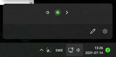
But that comes second to the microphone gain control, which Teams similarly exerts unilateral control over - only this time through an automated algorithm that for some microphone types just ends up muting them entirely. It's wild, you can go into the Windows gain control settings and see the slider wiggle around.