I'm very doubtful that by the time it reaches release, they'll bring back the icon grid and the sensible layouts (instead of those stupid iOS-like lists) in the panes themselves.
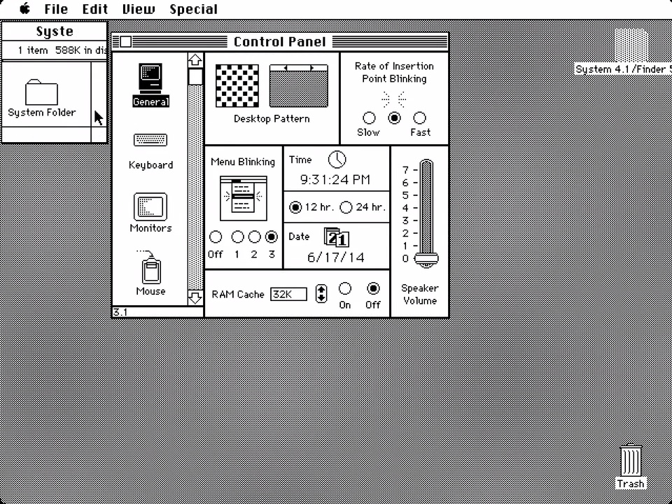
Frankly, the icon grid was arranged somewhat arbitrarily to begin with. I'd be quite happy to have a largely-alphabetical list, making it much easier to actually find the specific preference pane I'm looking for.
I've not tried out Ventura myself yet, but from the footage I've seen, the new settings app seems like an upgrade to me. I've never really found my way around the icon grid, none of the iterations since Leopard worked well for me (and I've probably used all of them), so good riddance, happy to see them they try something new. Those lists may break some people's muscle memory, but I'm way faster skimming through a list than finding things in a more or less arbitrary 2d layout. And besides, it's looks pretty similar to iOS, and if that's executed well, then I should be able to share muscle memory between iOS and macOS, like with Control Center (which is neat).
Instead of distinct readable controls with clear interactions it's a sea of gray upon gray upon gray.
It breaks Apple's own HIGs which says not to (over)use switches, and use checkboxes instead. The drop downs no longer look like they can be interacted with.
I'm still running OS X (10.11, El Capitan), but System Preferences under that OS had a View menu option Organize Alphabetically. That was present in many (all?) versions of OS X. I don't know if/when that may have been removed.
And modern Gnome is also terrible because they insist on supporting touchscreens as first-class input devices at the expense of sanely sized controls for the remaining 95% of users.
Gnome is at least capable of running on devices that have touchscreens. There aren't many of these, and many people who do have a touchscreen on their laptop don't use it, but at least it's a somewhat defensible position. Apple, on the other hand, still maintains two separate platforms for touch and non-touch input. There isn't a single Mac with a touchscreen and there probably won't be any in the foreseeable future. This design thus makes absolutely zero sense in macOS.
> This design thus makes absolutely zero sense in macOS.
well, if they didnt do it, then ipad apps on macos would look really out of place, even catalyst ones....
what i find interesting is, that instead of building up ipad apps to match macos level of ui quality/sophistication, they compromise the more functional macos on the altar of ipad.... i find that a bit disappointing personally...
Every time I would open system preferences I would just use the search bar to open what I was looking for. I think they should have just either grouped the icons better or let you choose. Right now the current layout doesn’t fit unless you make it bigger which is weird on my XDR when I can just make it longer …