This is so great. The 90s/pre OS-X Apple (the "BuT tHeREs No SOFtWaRe!" and "ApPLe is GoING tO DiiEE" Apple) had a sense of playfulness in their UIs that was largely lost when they became the Apple we know today.
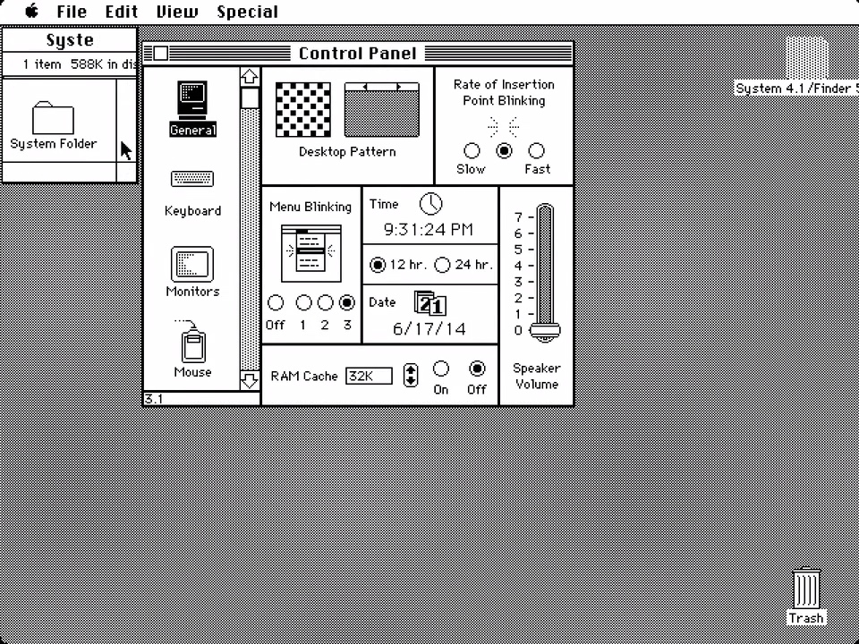
The Mac OS classic architecture definitely had some problems with its non-protected memory and cooperative multitasking, but what it _allowed_ were extensions that could really get in there and muck around with things… and I looovvvved the zaniness that provided. To name a few:
- ResEdit!
- Extensions that could seriously improve your computer's performance like RamDoubler or SpeedDoubler
- That extension that made Oscar the grouch climb out of the trash can and sing a little ditty when you emptied the trash
- The talking moose was fun for about 15 minutes, but still, I love the attitude.
- After Dark!
- Easter eggs like that "secret about box" text clipping thing that pulled up the pirate flag flying over the Apple Campus.
- Playful messaging like "Installing System Morsels", or Sim City 2000's "Reticulating Splines"
- Even the iconography was more playful—that little bloated mac icon in the Memory control panel next to Virtual Memory comes to mind
I miss the crew of developers, capabilities, and playfulness we lost in transitioning to OSX, but am thrilled that tiny fragments of this playfulness seem to be returning.
I had many of those fun extensions, I think my favorite was one that added physics to your desktop icons so they’d hang from your cursor at an angle if you dragged them from a point other than their “center of gravity”. Sometimes I’d just twiddle icons while thinking through things I was working on.
I too miss that sort of whimsy and playfulness–I don’t think it’s inherently incompatible with modern expectations of professionalism/accessibility/security but it definitely seems to have been lost from most software these days.
The Grouch was great. Or "great" if there were little kids around, intermittent fun reward for throwing file in the trash, what could possibly go wrong?
> I too miss that sort of whimsy and playfulness–I don’t think it’s inherently incompatible with modern expectations of professionalism/accessibility/security but it definitely seems to have been lost from most software these days.
Agreed completely but every now and then it still pops up. Recently, Notchmeister [0]
> This is so great. The 90s/pre OS-X Apple (the "BuT tHeREs No SOFtWaRe!" and "ApPLe is GoING tO DiiEE" Apple) had a sense of playfulness in their UIs that was largely lost when they became the Apple we know today.
What's so strange about this is that, as that playfulness has been lost, the software has, in many ways, moved in a direction that feels more childishly cartoonish. It seems the aim is now to make all computing feel fun and friendly (even when it perhaps ought to be more serious or economical), which has, ironically, stripped all the charm out of the experience by inundating us with bright colors and childsafe corners.
Small, unexpected, thoughtful moments and Easter eggs like those described in this thread are like a small piece of chocolate after a healthy meal. What we have in most software now (Apple is by no means the only company guilty of this) is more like a diet comprised entirely of candy.
> It seems the aim is now to make all computing feel fun and friendly
The weird part is most current attempts of this are actually really bad at it past initial surface appearances.
Minimalist and “content-first’ UIs look great in screenshots and I guess they prevent new users from getting overwhelmed, but they also hide all the features in a way I find quite hostile. We have an absolute wealth of pixels in our displays today, but tons of software makes you decipher abstract line icons to work out what it can actually do.
The Mac thankfully still has the escape hatch of the menu bar, which almost universally allows you to browse and search all performable actions (and see their keyboard shortcuts inline!), but mobile operating systems don’t even have a touch-centric equivalent of tooltips.
Luckily, considering they brought the menubar to iOS (you can open it on most apps if you have an external keyboard connected and hold CMD), I'd say that Apple is at least somewhat committed to it!
Can you imagine if they changed it so that you had to get those actions by doing a 5 finger swipe while hovering over an app (on the trackpad) or clicking 3 times while moving diagonally across?
Ugh I hate gestures. Such a stupid stupid non-intuitive stupid practice.
There was a very early (1985-6?) app called "Selectric." When you ran it, it immediately exited, leaving you wondering what the point was. Until the next time you started typing: every key you typed made a "Chunk!" sound, the spacebar went "-diggit-", and the return key went "zzzzz...DING." Way fun.
OSX was also easy to modify and add extensions to for many years, as Objective-C is so extremely dynamic... until Apple started really trying to lock things down on purpose, turning macOS more and more into the miserably rigid iOS.
Given how much grief I’ve had from corporate mandated “enterprise” virus and firewall programs, I’m happy they started locking things down. Poorly written kexts were one of the worst user experiences I’ve had to deal with. When your computer crashes because you plug in a USB network adapter (due to a buggy firewall), you’ll want a more stable and locked down system too.
(Oh, and all USB-C/Thunderbolt docking stations have these adapters)
Sadly, there’s a reason why we can’t have nice things…
I never had a Mac in the 90s/early 2000s, but a lot of this still sounds pretty familiar as a passionate Palm OS user at the time:
No memory protection, no multitasking (not even threads!), more minimalistic than the competition at the time in many ways in its core features – but on the flip side, extremely extensible in almost every way.
As I later learned, PalmOS was heavily inspired by Mac OS!
Incredible! I have a couple of old Macs lying around and it's a dream of mine to write a native app for them that does something modern, like a way to control spotify of something. Thanks for linking
I as well miss that playfulness of that era. We use these things all day, why shouldn't they give us a smile from time to time from something that happens.
I would pay a frankly distressing amount of money for reproductions of After Dark screensavers, even if it was just videos I can set my TV to play when it gets tired.
I don't entirely disagree, but I think it is worth noting that there was still quite a bit of playfulness in the UX even in the transition to O SX. There are tons of animation and icon secrets as detailed here: http://mewbies.com/easter_eggs_and_then_some.htm#macx
Further, using traffic lights for window control icons, the magnification effect in the dock, inclusions of the genie and suck window minimize animations, the iTunes visualizer, (still present in Music.app) the cartoon "poof" animation whenever toolbar icons are dragged out and removed...these are all fun features and secrets that are new or at least persisted into the transition to OS X (not to mention the FreeBSD cal and emacs easter eggs). Some were lost when OS X 10.10 released, or when macOS 11 released, but now here with inclusions like Clarus, I think it is obvious that this culture of fun is not lost.
Sadly no amount of UI levity can excuse all the ways modern macOS phones home and violates my privacy. I'd rather have a boring OS that doesn't need remote permission to let me run unknown applications, one preferably made by a company that haven't publicly stated their desire to scan my devices for distasteful/illegal personal data.
Sure, this is a sweet little hit of nostalgia -- but it's also symptomatic of just how far Apple's come (back) with the Mac, and why. It's clear that we're way, way over the doldrums of the butterfly keyboard, abandoned Mac Pro, "continues to be a product in our line-up" years. Little things like this, little acknowledgements of the past and the Mac community, suggest to me why: the people in charge of the Mac are now people who _grew up with it_, who love it, and who have that same nostalgia as (some) of us outside Apple.
They want the Mac to be great, too! If this was strictly playing on nostalgia it would have been a bit PR feature, or at least called out in WWDC. But instead it's just dropped in as an easter egg. Such a great sign.
> the people in charge of the Mac are now people who _grew up with it_, who love it, and who have that same nostalgia as (some) of us outside Apple.
So then how does one explain the unending UI regressions with every single major update? This whole system preferences thing for example? The terrible, terrible toolbars combined with window titles? The borderless buttons (with borders being an accessibility feature)? The utter disregard of the pixel grid? Everything else slowly becoming ever more un-desktop?
They clearly are regressions because they confuse many people and make a worse use of the same screen area.
Also what are the problems being solved by these redesigns and rearrangements? What was solved by going flat in 10.9 -> 10.10? What was solved by going even flatter, and using the dreaded SF Symbols icons everywhere, in 10.15 -> 11.0?
It's a done product — it's been one for quite a while. Could they just stop meddling with the UX already and maybe rewrite their PDF parser in a memory-safe language instead?
People who complain are loud. Just because they’re loud doesn’t make the UI changes bad.
I find I legitimately prefer the newer UI of Big Sur onwards. I just don’t feel the need to shout it from the heavens.
An alternative take: you’re really going to suggest that one of the richest companies in the world doesn’t do extensive UI/UX testing before putting things out the door? They’re not just saying “yeah, this looks nice - ship it!”.
Why do you prefer the new UI? I can make a list of reasons why it's bad. The only reason I can see why anyone would prefer it is because it looks "cleaner", but that cleanness is artificial and gets in the way when trying to parse and use the software.
A good UI designer makes buttons look like buttons so our brain can quickly recognize them as such, without mistaking them for something else. A good designer has the window title in the same place no matter the application, so we know where to look before we even look. A good designer gives us a place to reliably perform common actions such as dragging the window.
We use our computers daily, and even imperceptible improvements to cognitive load and the amount of time it takes to perform actions make a difference over time. When I use my 2009 iMac running Snow Leaoprd, I perceive a reduction in friction compared to the latest macOS versions, and even compared to Catalina, which I use as my primary OS.
> but that cleanness is artificial and gets in the way when trying to parse and use the software.
I really don't agree. When software/UIs were simpler, the buttons screaming loudly "I AM A BUTTON!" worked. Now it quickly gets way too busy. It was important when almost everybody was a computer novice and couldn't detect subtle hints and conventions about what is a button and what isn't. Now? Not as much.
Look at screenshots of older iTunes vs Apple Music. I can feel absolutely no difference in how fast my eyes finds play/pause buttons. I don't need borders around the icons when there's not a whole bunch of skeuomorphic noise around them, such that there being any visual complexity at all (icon itself) instantly grabs attention. I really can't see a single thing I think the old iTunes interface does better for common use cases. Not that the old iTunes was bad per se, just a different UI for a different time.
I agree that often UI designers go too far, but I think you can see a bit of back and forth going on, trying to tune into the perfect balance of simplicity and clear signaling.
Obviously, everyone is different. So it's not going to be perfect for everybody no matter which way they do it.
I'm running a copy of iTunes 8 right now, and I disagree.
I also disagree that the old style of design is less suited towards complicated software. Apple's iWork software feels like it's suffered the most in terms of usability as a result of modern UI design.
Humans evolved in a world where things have depth, light and shadows. Even you admit that back when user interfaces were designed with that in mind, those interfaces were more friendly to novices. By ignoring these aspects of our visual perception, you're requiring prior knowledge on the part of the user, while simultaneously making it difficult to acquire that knowledge. That's not a good thing, even if you assert that "flat" interfaces are no worse once you get used to them (which I clearly disagree with).
>The only reason I can see why anyone would prefer it is because it looks "cleaner", but that cleanness is artificial and gets in the way when trying to parse and use the software.
That's... your opinion, though. I don't particularly feel any friction when trying to navigate or use modern macOS, at least from a usability perspective.
Even the example everyone throws about - the settings redesign - I fundamentally don't find to be that bad. It follows modern UI trends so I can intuit how it works, thus if I needed to poke around to find something I'm not really left wondering how to do so.
On top of that, it's not a tool you're in constantly, and as long as there's a search box, you're probably going to use that anyway as a power user. I don't even think I've tried stumbling around the mess that's System Preferences recently, I just straight up head for the search bar.
>We use our computers daily, and even imperceptible improvements to cognitive load and the amount of time it takes to perform actions make a difference over time.
I've been using macOS since... Leopard or Snow Leopard, ish. The adjustments over the years haven't ever thrown me for more than a few minutes. I preferred the skeuomorphic UI trend for a variety of reasons (of which nostalgia is included at this point) but I think modern macOS/iOS has found a decent line to ride.
IIRC Apple doesn't do user testing because they know better.
I have 20/20 vision and I had to turn on contrast and button shapes, the new design is so bland and unreadable.
Macs have large screens and that's why... they changed all dialogs to be tall narrow boxes with center-aligned text?
Properly labeled color-differentiated icons are now indistinguishable grays crowding the title bar removing all affordances (from being recognizable to being able where you can drag the window).
Keyboard access is being removed or broken across all first-party apps.
Desktop metaphors like multiple columns, tabs etc. are removed in favor of tall narrow strips of gray text that surely look great on a screen that fits your palm. But that's not the screen Mac OS operates on.
The new designs break Apple's own HIGs and other recommendations like WCAG.
So please tell me what it is you like about new designs and, more importantly, what the hell is their purpose?
>IIRC Apple doesn't do user testing because they know better.
Citation needed...
>The new designs break Apple's own HIGs and other recommendations like WCAG.
You may have missed it, but they redid that HIG and released it during the latest WWDC. This train has left the station and it ain't backin' up.
>Keyboard access is being removed or broken across all first-party apps.
How about you... list some of these apps? I've been using macOS since Snow Leopard and all my muscle memory on the keyboard still works.
The newer designs feel smoother and less constrained, and don't fundamentally feel at odds with how I work.
I will, however, give you this point with little argument:
>I have 20/20 vision and I had to turn on contrast and button shapes, the new design is so bland and unreadable.
Someone needs to smack Apple UI designers upside the head and tell them to stop using 255,255,255,1 as the light mode color. With how good their screens are it's just way too much.
I use dark mode exclusively and maybe that's why I have less complaints?
> You may have missed it, but they redid that HIG and released it during the latest WWDC.
They didn't redo it, they redesigned it. All the recommendations they are breaking are still there.
> How about you... list some of these apps? I've been using macOS since Snow Leopard and all my muscle memory on the keyboard still works.
Except Messages all of their new first party apps have horrible to no keyboard access: Home, Music, App Store...
> The newer designs feel smoother and less constrained
How can it be less constrained when they literally crammed toolbar items into less space and redesigned dialog to be narrow? :)
Edit: there's of course more, as evidenced by the redesign of System Preferences: https://news.ycombinator.com/item?id=31746133 And IIRC they are not properly keyboard accessible either.
My point is that they have clearly acknowledged it's a thing and that it matters.
>Music
I really don't get your point here... I'm listening to Music right now and just spent a few minutes trying to use the keyboard. I don't really feel unable to do so.
>How can it be less constrained when they literally crammed toolbar items into less space and redesigned dialog to be narrow? :)
The dialog that they're... expanding in Ventura? Where they acknowledged it should be bigger for certain cases? I've not been bothered by it in Big Sur/Monterey otherwise since most apps (understandably) aren't cramming shit in there anyway.
You're welcome to dislike change, I just think you're really stretching here.
> I'm listening to Music right now and just spent a few minutes trying to use the keyboard. I don't really feel unable to do so.
I'm not subscribed, but here's my experience.
When Music just starts, Tab is locked to a single pane.
Cmd+F to find something, how do I exit the search? Visually Esc does nothing.
While in Search Tab is locked to Search field. After Esc tabbing first does nothing, then cycles through top buttons, then goes somewhere?
There's no way to focus sidebar with keyboard. None of sublists there have a dedicated shortcut.
If you select something in the sidebar, Tab, And then Shift-Tab, the focus doesn't go back.
Once you've selected something (radio, or album, or artist, or...), how do you go back?
Focus is broken. Select an album, and tell me how exactly to get to the song list and navigate through it (hint: when you cannot see where it's gone, you can press Arro Down, and start going through the list).
That's 30 seconds of using this amazing first-party app. And that's before we start listsing all the ways it's badly designed, badly implemented, and breaks multiple Apple HIGs.
> The dialog that they're... expanding in Ventura? Where they acknowledged it should be bigger for certain cases?
Key word: "certain cases". So, they acknowledged nothing, but grudgingly reverted this inane behaviour for some random unknown length. As if desktop displays are have so little horizontal space.
> You're welcome to dislike change, I just think you're really stretching here.
Definitely not stretching. Changes to GUI have to justified. None of the changes since BigSur are. They are aggressively removing readabilty, affordances, plain humane contrast, etc. They introduce touch-only paradigms to a touchless OS. And so on.
To quote people much smarter than I [1][2][3]:
--- start quote ---
...the work of people who put iOS first. People who by now think in iOS terms. People who view the venerable Mac OS user interface as an older person whose traits must be experimented upon, plastic surgery after plastic surgery, until this person looks younger. Unfortunately the effect is more like this person ends up looking… weird.
These people look at the Mac’s UI and (that’s the impression, at least) don’t really understand it. Its foundations come from a past that almost seems inscrutable to them. Usability cues and features are all wrinkles to them. iOS and iPadOS don’t have these strange wrinkles, they muse. We must hide them. We’ll make this spectacular facelift and we’ll hide them, one by one. Mac OS will look as young (and foolish, cough) as iOS!
---
Going through Big Sur’s user interface with a fine-tooth comb reveals arbitrary design decisions that prioritise looks over function, and therefore reflect an un-learning of tried-and-true user interface and usability mechanics that used to make for a seamless, thoughtful, enjoyable Mac experience.
...an interface designer — who really should think like a chess player in these circumstances — can’t simply say It seemed like a good idea at the time to justify a UI change. There has to be a plan, a design. “Let’s try this, let’s try that” is not a strategy
...every time I point out some terrible or questionable UI design decision in Big Sur, there’s always, always someone who tells me “You’re just resisting change! You’re not willing to adapt!” without even entertaining the thought that, hey, maybe it is terrible UI design.
---
Apple’s approach when presenting the last few major Mac OS releases has always felt as if the most important thing to work on an operating system were its look & feel, rather than how this foundational tool can actually improve people’s work or tasks.
This insistence around the most superficial aspects of a graphical user interface — the look — often reminds me of the constant redesign iterations of some third-party apps in an attempt to make them more alluring to customers and to increase sales. The hyperfocus on always looking new and fresh
> It's a done product — it's been one for quite a while. Could they just stop meddling with the UX already and maybe rewrite their PDF parser in a memory-safe language instead?
Can't wait for this. And the same for the e-mail app. Even just a Swift rewrite of the 'hairy' parser code would be a reasonable starting point.
Can you elaborate on what problem you have that this rewrite would solve? (Serious question, not trying to be combative.) I can't remember ever having any problem displaying a PDF in macOS, though I don't do anything particularly outlandish with PDFs these days. Does Preview crash frequently for you? (Or does displaying PDFs from within your own apps crash?) I haven't heard of this issue, so just curious what the problem is.
The problem is that writing a parser for a file format as complex as PDF in an unsafe language is just asking for trouble. There were many exploits already that involved a specially crafted PDF file to gain RCE, and there would probably be more, unless they do rewrite it. At this point we should just accept that it's next to impossible to write a 100% safe parser in an unsafe language.
Why are people so eager to go back to a system where you have to hire an artist who knows how to make 1000 inner bevels so you can have any custom controls or app icons?
> So then how does one explain the unending UI regressions with every single major update?
Strategy Tax. They have a bigger strategy they are pursuing to align iOS<>MacOS. This is the big ecosystem play that raises ARPU and improves customer loyalty. This means standardization of UI to improve approachability for iOS users, who outnumber MacOS users considerably but whom are less loyal customers than combined iOS+MacOS users.
There's a secondary argument about moving off ObjC and code maintenance, since they want to gain the value of more modern language & to have new devs be able to jump on old products. This means every part of MacOS & every app is probably slated to be rewritten in Swift & SwiftUI as time goes on.
It's easy to rose-tint the past. I also remember the hockey puck mouse, the UI skeuomorphic choice to combine "brushed metal" window backgrounds with "plastic" buttons and "black and white LCD" info panels in iTunes and Quick Time Player, and the placement of the apple logo in the middle of the menu bar.
That's so weird, it took me a bit longer than I'd like to admit to see it.
A 10.0 beta looks like they ultimately made the better decision as I've never seen that image, nor, obviously, used that interface. Even prior versions to 10.0 didn't do that kind of stupidity. I honestly feel like beta testers aren't paid their value for dealing with that kind of asinine BS.
Luckily, they seemed to have learned quickly and never released to public with that monstrosity.
Do you remember what the battery icon in System Preferences looked like in the first beta of Mac OS 12? It's a beta. Give it some time. It's not out yet.
I'm very doubtful that by the time it reaches release, they'll bring back the icon grid and the sensible layouts (instead of those stupid iOS-like lists) in the panes themselves.
Frankly, the icon grid was arranged somewhat arbitrarily to begin with. I'd be quite happy to have a largely-alphabetical list, making it much easier to actually find the specific preference pane I'm looking for.
I've not tried out Ventura myself yet, but from the footage I've seen, the new settings app seems like an upgrade to me. I've never really found my way around the icon grid, none of the iterations since Leopard worked well for me (and I've probably used all of them), so good riddance, happy to see them they try something new. Those lists may break some people's muscle memory, but I'm way faster skimming through a list than finding things in a more or less arbitrary 2d layout. And besides, it's looks pretty similar to iOS, and if that's executed well, then I should be able to share muscle memory between iOS and macOS, like with Control Center (which is neat).
Instead of distinct readable controls with clear interactions it's a sea of gray upon gray upon gray.
It breaks Apple's own HIGs which says not to (over)use switches, and use checkboxes instead. The drop downs no longer look like they can be interacted with.
I'm still running OS X (10.11, El Capitan), but System Preferences under that OS had a View menu option Organize Alphabetically. That was present in many (all?) versions of OS X. I don't know if/when that may have been removed.
And modern Gnome is also terrible because they insist on supporting touchscreens as first-class input devices at the expense of sanely sized controls for the remaining 95% of users.
Gnome is at least capable of running on devices that have touchscreens. There aren't many of these, and many people who do have a touchscreen on their laptop don't use it, but at least it's a somewhat defensible position. Apple, on the other hand, still maintains two separate platforms for touch and non-touch input. There isn't a single Mac with a touchscreen and there probably won't be any in the foreseeable future. This design thus makes absolutely zero sense in macOS.
> This design thus makes absolutely zero sense in macOS.
well, if they didnt do it, then ipad apps on macos would look really out of place, even catalyst ones....
what i find interesting is, that instead of building up ipad apps to match macos level of ui quality/sophistication, they compromise the more functional macos on the altar of ipad.... i find that a bit disappointing personally...
Every time I would open system preferences I would just use the search bar to open what I was looking for. I think they should have just either grouped the icons better or let you choose. Right now the current layout doesn’t fit unless you make it bigger which is weird on my XDR when I can just make it longer …
If you can run the beta you should complain about it to feedback but the new UI is harder to navigate. It seems like they are incrementally changing the UI to be the same across the product line though….
> It seems like they are incrementally changing the UI to be the same across the product line though….
And this is a misguided idea to begin with. Input devices are different, interaction paradigms are different, why should UI ever be similar? IMO when designing macOS, they should simply forget that iOS exists.
I too like the current state of Mac development, but this is also a sign of how sterile the company has become when any hint of personality needs to be drawn from Apple's past.
> The keen-eyed among you may notice that although, it had a .pdf extension in assetutil info, I’ve given it here as a PNG. I was confused by this too, but upon closer inspection I believe the PNG is what ships with the OS. Although the .car format is not documented, you can still open it up in a hex viewer and learn a bit about what it contains. Looking through it, there appears to be some metadata for each file, followed by the image data itself.
I reverse engineered the asset catalog format for a bit recently, hoping to be able to unpack and repack existing ones to create system appearances (themes/skins — these also come as .car files, and you can load one as an NSAppearance object and then apply it to your app/window/view).
If it says it's a PDF, then it must be an actual PDF as a "raw data" rendition. I did successfully extract some with nothing but my own code. But, there are no PNGs present in .car files; as of Monterey, bitmap images use a proprietary undocumented compression format called "deepmap2". I wasn't able to exactly reconstruct how it works because my skills of native code reverse engineering are lacking (or am I not using Ghidra correctly to get at least somewhat sensible code out of it?), but I did find the related functions in the vImage framework inside Accelerate.framework.
You're right: I believe it's using the "Preserve Vector Data" option Xcode shows in the asset catalog editor and the PNG is just what's being rendered by the CoreUI framework.
Side note: What an odd webpage style. Makes some things look like they're markdown, but they're actually added with css ::before and ::after. Plus I found the link style very distracting and unnecessary (since browsers already have built-in ways to show you the URL of a link).
I write and think in Markdown and there was something about seeing it laid bare that I enjoyed. Wouldn’t want it on every site, but for something a bit different, call me a fan of this one.
> As assetutil showed, there are multiple entries for ClarusSmooth2.pdf—and one of them is followed by data that starts with the PDF file format header (%PDF). But, unfortunately, extracting that data into a separate file seems to result in a blank PDF. And I don’t know enough about the format to figure out whether there is any vector data in it, or if it truly is empty.
I suspect this _is_ a vector format, and they’re using the Xcode 9+ features for a scalable image at runtime. I’ve never tried to extract the data back, it wouldn’t surprise me if they’re optimized for themselves, since in theory apple’s frameworks are the only “consumer” of the compiled asset catalog.
Ah, that definitely seems like what it is—CUINamedImage.isVectorBased is true for the Clarus image. Reverse engineering the format could be a fun project.
I love it. It’s about time they brought some personality back to the Mac. I miss things like the startup chime (it’s back!), the backlit Apple logo, the pulsating power light on the iMac G4 when the system was sleeping, etc. Apple got to a point in the early 2010s where they started stripping away these things, and I’m glad they’re somewhat on their way back.
AFAIK, it will present you a choice, _if_ you've already created a separate APFS volume such that there's more than one option of installation target. I saw someone do exactly that (create an APFS volume for Ventura, start the installer, and then choose said volume as the target) in the first YouTube video I saw about the beta's release.
Yeah, that’s what I tried, even named the volume Ventura. It has worked in the past with previous releases e.g. Monterey. It sounds like the original poster (and some commenters) was trying to do this too, had done in the past, and was surprised.
The process didn’t give me an installer, it just jumped to the volume building process. TBH I kinda knew it was messed up, but after cancelling and trying again, I just let it go.
I didn’t see any options in the dev site to pull down a full installer.
My M1 is fairly new, so I have recent practice reinstalling Big Sur from scratch if necessary.
Huh, really? That's exactly what I did—I still have an empty, vestigial volume called Ventura in the same APFS container as Macintosh HD—and I was not presented with a choice.
I had a couple that I wore out. got them in I think it was 1998 at the "Company Store" that Apple had at the Laguna Blvd (Elk Grove, CA) location. The whole store was on sale. As you can probably imagine....I had absolutely no idea what was even happening and why things were all on sale, and most definitely didn't archive things that I should have. :)
I still have a set of the 6 color Apple rainbow logo fridge magnets from that day.
Really wish I could dig up the old HyperCard stack that first released Tech Note #31. I was so excited when I found it in the Resource Fork of one of stacks on the Apple Developer CD...
Thanks to Wikipedia contributors and to Archive.org!
> That dialog shows Clarus on the page preview in every app.
Weird, on my MacOS (12.3 Monterrey) I think I always see a thumbnail of the actual page I'm previewing there?
Surely they haven't taken a step back to showing a generic clarus icon instead in new version of OS? That would be weird. I must be confused about what he's talking about.
The distinction is between the Print dialog (Cmd+P) and the Page Setup dialog (Shift+Cmd+P). Print still shows the normal page previews, but Page Setup is where Clarus is. In a Monterey VM, there's no page preview at all in Page Setup.
What was lost? Aside from gaming, everything is now 64 bit so it sounds like a successful transition. And there is a lot more wrong with gaming on mac than 32 bit support.
Eh, I'm not saying it was a net terrible thing, but it wasn't just gaming; there's value in being able to run old software. Or maybe it's better to just go full virtualization at that point.
The Mac OS classic architecture definitely had some problems with its non-protected memory and cooperative multitasking, but what it _allowed_ were extensions that could really get in there and muck around with things… and I looovvvved the zaniness that provided. To name a few:
- ResEdit! - Extensions that could seriously improve your computer's performance like RamDoubler or SpeedDoubler - That extension that made Oscar the grouch climb out of the trash can and sing a little ditty when you emptied the trash - The talking moose was fun for about 15 minutes, but still, I love the attitude. - After Dark! - Easter eggs like that "secret about box" text clipping thing that pulled up the pirate flag flying over the Apple Campus. - Playful messaging like "Installing System Morsels", or Sim City 2000's "Reticulating Splines" - Even the iconography was more playful—that little bloated mac icon in the Memory control panel next to Virtual Memory comes to mind
I miss the crew of developers, capabilities, and playfulness we lost in transitioning to OSX, but am thrilled that tiny fragments of this playfulness seem to be returning.
Welcome back Clarus! Moof!