> "We’ve redesigned and modernized the core experience to be cleaner, more inviting, and easier to use."
Why does the UI change with every single Firefox release? I find myself having to re-adjust every time a new update is shipped.
What's wrong with having a consistent experience that survives for more than 6 months? It's just a URL bar, and a bunch of tabs. Just leave it be already.
Last major Firefox UI overhaul was... Firefox 57, the first Quantum release, in November 2017.
It's had various tweaks since, but my day to day experience has been the same since then. This is not an absurd pace of UI change in my opinion.
And yes it is a conceptually simple UI, but with the whole stuff around the web with security, permissions, tab and window management and how an awful lot of modern computer use by an awful lot of people is conducted entirely inside a web browser it's a UI that is worth improving where improvements can be found.
Your day to day experience isn't necessarily the same as everyone else's. It hasn't been long since "View page info" was confined to a hidden menu and all context menu labels were changed for absolutely no reason.
My issue with the context menu is "Search [selection] with Google" is in the middle of the context menu, after "Print selection" and "Take screenshot". Why?
I cannot be the only one that uses that functionality 100 times a day at least, and it's so not conveniently placed I used to misclick "View selection source" instead a dozen times a day, and now I'll be taking screenshots or opening the print dialog by mistake. I've been googling a way of rearranging the context menu on Firefox so that selection search is rearranged or has a keyboard shortcut and not _one_ soul has ever mentioned it in the past decade, which is maddening.
One of the reason I use Edge nowadays is that "Search with Google" is the second option, between Copy and "Search with Bing in the sidebar", which isn't ideal, but it's still search.
Is it just me or is it not obvious that this entry actually does something useful instead of duplicating the OS screenshot feature? An image of the entire page including the part not on screen isn't even a screen-shot.
Also I think holding shift while right-clicking will show the context menu even if the site hijacks right click. (And for some sites, I'm pretty happy with a custom context menu, so it's good to have both available.)
You can use your userchrome.css to apply a background-color selectively to individual context-menu options. I do it for "view background image" and "copy link location," both of which I turn a deep purple. I've found this makes misclicks on these options (which are pretty much the only two I ever use) next to zero.
Easiest is to just hit CTRL-I. Otherwise click the lock/not locked icon to the left of the address, click Connection secure/Connection not secure, then click More Information.
In addition to what you've been told this dialog resides in the Tools menu, ALT+T I (ALT opens the classic menu bar). CTRL+I is the menu item's associated shortcut.
I find Page Info (Ctrl+I, [1]) dialogue pretty useful: especially list of all loaded media and information presented in Security tab is something that you could dig in devtools quite cumbersomely or not at all.
You can get to the security tab of it by clicking the lock to the left of the URL, the right caret in the popup menu, and then clicking more info, in case you wanted another way.
When Chrome first came out, the lightweight, clean and out of your field of view tab bar was a welcome change.
FF did pretty good with small changes that, in my view, have made it look better over the years.
edit : Ok, checked the new design. Definitely don't like the tab buttons, mainly because when there are multiple open, there are no discernable borders among them. So a tad bit confusing.
IDK, I like it, I would be one of those people that would complain about the 90's look if they didn't do this every now and then. But, people like you are ok with desktops like XFCE I guess, I like trying new paradigms, see what works, change what doesn't. I enjoy the occasional refresh in look and feel. Actually I think people like you are a minority, the majority just continues to enjoy evolutionary steps in design and never complains.
Yea, I fucking love Xfce. Its been the SAME for over a decade. I can't remember the last time they did some crazy/stupid UI/UX shit.
The most recent change was GTK driven, where the buttons on common-file dialog moved to the top. But, it hit every app at once so the relearn was abrupt but short. And it was only one thing. Not a frustrating batch of a dozen inconsistent half-baked "tweaks"
The number one complaint I get from non-technical people using computers is "This doesn't look like it used to, I don't know how to do anything anymore."
This is what happens when you have UX designers as full-time employees. They need some sort of grand project to work on. Same thing happened with reddit.
I would point out that "the UX community" is no more a monolith than "the developer community" -- many UX designers do not spend their time chasing the latest UI fads and adding novelty for its own sake.
UX and designers don’t initiate changes. That is driven by product managers who define features, ask for new designs, review options and choose the final design.
The same can be said for developers. Few devs can just make arbitrary changes to an application. They take requirements, produce implementations, and go through review and revision.
I've been on FF for decades, what are you talking about? The last "major" change was quantum and it still looks 90% the same. Even the UI changes look mostly the same. I've seen bigger UI changes between every Android/iOS version. GitHub has changed more. Spotify. Slack. I'm still the tabs, url bar, bookmark toolbar that I've had since the early 2000's. I actually appreciate the fact that things haven't changed much.
Edit: I just upgraded after I posted this. Difference? Slightly darker and forward/backward buttons don't have a circle around them. And pocket button isn't in the URL bar and I can actually remove it (and here the other day everyone was complaining about it being bigger. GONE NOW). That's almost unnoticeable (unlike Android changing the clock location) and I can remove pocket. Win?
Check out mobile. I had to spend a lot of time with parents to teach them how this works after upgrade. Only to realize I did not understand recent changes - I though collections are there instead of bookmarks, but it's a collection of tabs... Really confusing for me and my parent-users. Also very easy to mess up by them.
So collections/bookmarks weirdness, menu moved to bottom, dark style, major changes on "new tab" screen. I hope there will be no more changes to mobile view in this update.
For good reason - design changes of a web browser might be the least of our troubles though.
This problem is everywhere. The last thing we should do when we need a problem solved is creating a department or office whose continued existence depends on the problem being there.
It makes me dread taking their monthly releases. I wish they would decouple security fixes with everything else. My address bar is permanently broken, I cannot delete previously viewed sites as suggestions at all anymore.
I tried that a few years ago, but within months they overrode my update preferences and policies.json file to force push an update that broke functionality I use. That and some other really annoying decisions are why I never recommend Firefox to anyone any more. I grudgingly use it as the current least worst option but would love to bail if there were options.
Oh man, I would LOVE it if more software was developed as a tool. I absolutely don't want the look and feel of my miter saw to suddenly change to a "fresh" layout, and I feel the same about my browser.
I get that a lot of people feel differently and that's who Mozilla and many other companies are targetting, but it really bums me out that my tech tools can't be stable and reliable.
Considering how complex the web is, and how technologically complicated a browser needs to be regardless of UX, a car analogy is perhaps more appropriate; and you do have '21 models of cars.
Yet none of these new model cars re-arrange the pedals. They'll change the style of the brake lights, the trim, etc, but the basic "4 wheels, front two steer, wheel turns towards the direction you want to steer, brake, gas pedal" is fixed. But with software (including Firefox) even the operational aspects change, not just the cosmetics.
But the basic way you navigate the web doesn't change much either; there's still the address bar, back button, and html and JavaScript.
And you're underrepresenting how much change can happen for a given model: over decades the Honda Civic has gone from manual to continuously variable transmission, and entirely different chassis, etc. as technology and safety expectations evolve, and it's no exception.
UIs can be function first just like clothing, which is how I like it, just like clothing.
Fashion is nothing but an obstacle for people with practical concerns. Pardon me for hating fashion, but I do.
I also frequently wish developers would leave well enough alone, but what changes are you referring to? I don't remember big changes since Firefox 57 and even those took me maybe thirty seconds of adjustment.
This recent update seems more like a very minor reskinning than anything that would require adjustment.
Even the back button is wrong in the new version. Previously it spanned up to the left edge of the window. Now it's moved to the right, lacks immediate feedback and then it is drawn to the right with some new empty space for no reason but to make it harder to hit the back button, the most used button of the interface.
The visual cue with the circle around it is also gone. Even the lines used to draw the arrow are thinner, making it less visible. Compare:
> Even the back button is wrong in the new version. Previously it spanned up to the left edge of the window.
When you actually try it instead of comparing screenshots, you'll see that its clickable area still goes all the way to the edge of the window. The button hasn't moved to the right; there's just more negative space because they removed the circle around it. Deleting that space would actually move the button to the left and make it more difficult to hit. As it is, it's as easy to hit as ever, and the “empty space” isn't there “for no reason”. (Moving it closer to the edge would actually be a mistake; there needs to be some margin for situations where pointing close to the edge changes the cursor's function to resizing the window.)
> lacks immediate feedback
How so? As soon as the mouse pointer touches the clickable area, the button lights up; after a second of hovering, I get a tool-tip explaining what it does, what the keyboard shortcut is, and how I can use it to show the tab's history. Again, that seems the same as it used to be?
After I move the mouse over the back "button" at first nothing happens, it's surely nothing happening "as soon as the pointer" enters the area.
Then after some delay, the "area" of the button is shown, but not inclunding the newly "empty" space, which you claim is clickable.
But what is highlighted starts to the right. If my mouse is already close to the edge, it visually signals that it's not over the button, that is, that I moved the mouse too far.
It's very awful experience: not having the limits of the button drawn (which doesn't give me any hint of the area I can target), then not showing the limits fast enough once the pointer is there, then misleading about the limits (forcing me to move the mouse to the right even if I was already on the right place), drawing with the thinner line the arrow (also making it less obvious where it is): four wrongs in just one enforced update which is claimed to "improve" UI. On the most used button.
That sounds like a "you" issue, not an "everyone" issue. You may have a corrupted settings. You can reset them (and customize the toolbar to your liking) by going to the hamburger menu and selecting More Tools --> Customize Toolbar.
Hmm, it seems like what I've observed (I only tried MacOS so far) is what's supposed to happen, and what you got is bugged; hopefully they'll fix that soon.
In the case when the button does light up the instant it becomes clickable, I don't get the perception of ‘I've moved the mouse too far’ — instead, it's easier to see why the highlight isn't bigger: I don't just get a “hint of the area I can target”, I see exactly a standard-sized button, which I'm aiming for — but when I miss a bit, there's also a bonus area where the click still works.
Without the immediate feedback, the highlight seems ‘off’ (in the sense of displaced) in some arbitrary way. But really it's way more sophisticated (an overly pedantically detailed elaboration follows; I promise this is not apologetics on behalf of the Firefox UI designers, but illustrating a point I will attempt to make in the end and that I couldn't be bothered to put in fewer paragraphs out of sheer laziness):
1) There's a bonus area to the left. It's nice to have when you happened to click a bit too far to the left. But how far off you can be in that direction depends on the exact circumstances: E.g. in my case, in windowed mode I can approach the edge to within 1 or 2 px before the mouse cursor switches to ‘resize window’, whereas in fullscreen mode, I can go to 0 px, but pushing beyond that triggers the dock which otherwise lingers beyond that edge of the screen. So that's why it's a bonus area: It'll try to do the right thing, but it's not a promise that clicking there will work. And by directing your focus to the standard-sized button that would ordinarily be all you can click, it's more likely that you'll hit the intended target.
2) There's no bonus area to the right. Because the forward button is to the right. Instead of extending the standard-sized click target, hoping that this is what you meant to do, the GUI refuses to interpret your click as something that could be the exact opposite of what you meant to do.
3) There's a bonus area upwards. On MacOS, moving up even farther gets you to the buttons for closing and minimising the window, but they're a good few px away from the bottom of the title/tab bar, so we can approach that border all the way without risking a wrong click.
4) There's no bonus area downwards. Because that's where the web page you're viewing is, and making the top left corner of the page a link (e.g. to the home page of the site) is really common, so ignoring ambiguous clicks wins out over risking doing something you didn't want.
Thank you for your attention — you made it to the end where I attempt to make a point: AFAICT, the click target is the exact same it has always been. I understand that it can be annoying that they removed the circle when you're used to the circle being there; but I assure you, the circle never was the actual clickable area — it was just the visual target you were aiming for. You want ”the limits of the button drawn”? The circle doesn't do that. The button is a rectangle, and the clickable area is another rectangle that is almost the same, but a bit more generous in exactly those cases where the extra leeway can't do any harm.
> Wait, It's All Ohio? Always Has Been refers to an exploitable template in which two astronauts are in space. One looks at Earth and realizes the entire Earth is made up of something other than what is expected, and asks "Wait, it's all X?" The other astronaut, preparing a gun, says "Always has been."
The button area is visible as soon as one hovers with the mouse over the button.
Above: when the new code is turned on.
Below: when the new code is turned off.
The problem is: the area covered on hover should match the clickable area. If left of the button can't be clicked, the button is wrongly positioned. If it is intentionally bigger, the visual feedback should match it. The new code doesn't do that.
I remember liking the circle in the Back button 20 years ago (Netscape 6, Phoenix and Firebird). Unfortunately, it was dropped when Firefox 1.0 was released. Since then, I’ve come to accept that styling of UI elements come in and out of fashion.
Most of the time, it doesn’t take too long to get used to the interface changes – though I think a lot of such changes are superficial (make it look shiny and new) and I’d rather developer resources were used elsewhere. It’s not like there are no open bugs on Bugzilla. Also, I wonder if they do any testing of the UI changes with an older demographic.
Sounds like there's something going wrong with your installation or profile. You might try resetting it.
But I also realized I would never notice any of what you're talking about, because I pretty much exclusively use alt-left arrow for back and alt-right arrow for forward. You might try that for a while to see if it sticks in your muscle memory.
(Though it's likely that other things are mangled in your setup if something like the back button is misbehaving.)
If you use niche or power user features frequently, then it can feel like almost every single update is reworking or removing a feature you depend on.
Firefox updates are a constant stream of "1% of users use this feature so it's fine to do X to it" but it turns out that a lot of people fall into a lot of those small buckets at once.
The 1%, that was the excuse to delete my live bookmarks feature. Which was fine in a way because addons took its place, but that further pushed the 1-3% of users that knew about it to almost certainly doom it to 0.1% over time. No discoverability at all.
E.g. the last update removed right click -> open image, which I used all the time to view images in full screen. Now there's only an option to open the image in a new tab, which requires additional clicks to achieve the same thing.
Plus clicking the original "Open image" with middle mouse button (or invoking with alt+enter, IIRC) always did exactly what new command does, opened image in new tab.
New command apparently lacks alternative usage forcing current tab, but still opens image in new window instead of tab with Ctrl modifier. (Maybe it would be possible to plead for re-introduction of similar modifier?)
At least we can still drag/n/drop plain images to the Tab bar.
I disagree. These small unnecessary tweaks can really disrupt regular users' workflows.
For example, they just changed "Undo close tab" to "Reopen closed tab". Not only is it difficult to justify how this is clearer (any casual computer user should be familiar with the concept of 'undo'), but for a regular user:
- There's a period where you have to adjust, scanning for the correct menu entry each time;
- This change also modified the hotkey from 'u' for 'undo' to 'o' for... re-open, apparently.
Imagine if your editor changed its key bindings, or renamed features with each minor update?
I love Firefox, am a daily user, but I get very annoyed at the lack of proper change control that's applied.
This kind of arbitrary change at the very least annoys users, but can also degrade usability and workflow.
Finally, by showing they don't review their minor changes very well, it makes it harder to trust that they won't accidentally introduce some major bug or security flaw.
> Imagine if your editor changed its key bindings, or renamed features with each minor update?
I honestly wish my editor did. Emacs very deliberately does not do such things, and the result is a complete mess of weird keybindings, and many duplicated commands and modes which are just slightly different to each other. It's so scared of disrupting an existing user's workflow that the product as a whole definitely suffers.
The solution is to change the default keybindings for new users (bonus if there is an option to get the old presets for new installs) while not messing with the setup for existing users and let them change their settings when *they* want to.
Small tweaks are like living with opinionated people who have to touch and move everything that is not where they think it should be.
You have no clue how annoying and nerve wrecking that is.
Changing my daily workspace where I am supposed to be productive is something that should be considered a breaking change. I'd like software to leave my workspace alone if at all possible.
Make another product for those who want it different.
It does. As you said they are small and maybe you don't notice, but for some of us, it may mess up our muscle memory. I believe parent poster's honesty because in every update, trying to change back new UI elements is really annoying. Worse, some of them cannot be reverted. You have to adjust yourself to a libre software's changes.
idk. I kind of trust that the firefox team has competent designers that know what they are doing. Perhaps they found some issues in usability studies, tested a redesigned that fixed those, and sent the patch in the current release.
The feedback form basically get 20% of total feedbacks about how do they don't like the new tab bar (see their github issue list generated from the proton feedback form). Consider how people are lazy about fill a proper form for just complain something. That is a lot.
Has something which made it into Beta ever been reverted prior to release due to negative feedback from users testing it? From the outside that just doesn't appear to be a thing they use the beta channel for.
I find it infuriating how designers keep adding more and more whitespace and padding on my desktop computer. If you want to make your UI easier to use on touch devices that's fine, but Windows 10 has a tablet mode that I keep disabled, so there's no reason to assume I'm not using a mouse. If I go to Customize toolbar there's three density options: Touch, Normal, and Compact (not supported). Why aren't there a supported compact mode, and why is the normal mode so full of unnecessary padding?
With the new design my bookmarks menu that previously had plenty of vertical space left now needs scrolling. Tabs have poor contrast and lack visual anchoring to the web content they contain.
I'm going to keep browser.proton.enabled to false in about:config as long as it's possible.
This is absurd, but I wound up finding some settings in about:config to compensate for it.
- browser.compactmode.show = true, which brings back compact
- layout.css.devPixelsPerPx scales the whole app. I brought it down from 2 to 1.95, which looks normal scale on a retina screen.
- But this also scales down the content of the page. To compensate for that, I want to be zoomed in slightly at all times. So I added 1.05 to toolkit.zoomManager.zoomValues, and then set 1.05 as the browser default.
The tabs shrink back down to normal scale, the web stays the same, and it fits much better on my 13" display.
Having the tabs be free-floating buttons is still weird, but you can't win them all.
Having empty space is considered «clean», «light», «fresh» and having less buttons (by hiding everything into some menus that you need 3 clicks to access) is called «streamlined interface».
I hate that too. On my phone that is 2.5x larger than my old Samsung I see less information on screen compared to old phone, because everything needs to be «light» and «clean».
I miss text that would just wrap along the length of the window. Using Github always infuriates me because I have a nice, wide macbook screen, yet they force code to be displayed in a text box that uses maybe 1/3 of my screen width
sadly it seems to be very common UI pattern these days. Heaps of standard layouts / static generators for documentation etc. seem to have given up on the original concept of flexible layout and just pin things at a fixed max width. Very sad.
"works" in quotes. Compact after an update I measured as a third taller than "normal" density before the update (100px vs 75px). I want maximum vertical space for the website, not for the browser UI. It's really not compact anymore.
Looks like "Compact" is only in the list, if you had it selected prior. If not, then go to about:config and set "browser.proton.enabled" to false. Then, you'll get the option.
I can't stand this new UI. Removing icons that which ends up making navigating menus more difficult, these new "floating" tabs are ugly as sin, you can barely see them in light mode...just...awful. Making the browser harder to use to follow "design trends" is ruining Mozilla. That Alpenglow theme was a completely asinine waste of resources, just make your browser match the system theme - we have theme extensions for a reason. They claim they are removing unused features but give us useless garbage like that built-in rainbow theme.
The only reason I use Firefox is because it's the only decent FOSS option that I can use on all my devices. My patience is wearing thin and this is not going to be a good enough reason for much longer.
Make your browser competitive with Google instead of trying to impress your inner circle of designer hipster friends. The CEO gave themselves a fat raise and gutted staff for _this_?!
- Non-Google, non-chromium, non-blink engine browser
- Support for good keyboard navigation (vimium etc)
- Support for Ublock Origin
And the only browser that satisfies those requirements is ruining my user experience by removal of «compact» mode (I know it can be brought back but it's temporary) and making UI bigger without any reason, because having unnecessary empty spaces everywhere is what's considered good design now.
Recently I opened some page that was filled with ads and banners and only 17% of my screen was actually filled by content that I want to be reading. Now, with the new Proton™ design I guess I'll have to get used to 12% of my screen being used.
The lack of tab separators and the poor contrast between the tab bar and the rest of the chrome are my biggest issues. Chrome has both tab separators and higher contrast between the tab section and the rest. And of course, the old Firefox design also has tab separators and very high contrast.
One of my biggest complaints about Firefox is how much work I have to do in my userChrome.css to make it look nice. My current one is almost 400 lines and it's mostly adding separators/element padding, changing border radiuses and disabling hover and focus styles.
I never wanted a carbon copy of Chrome, just something that looked good, so I'm glad to see Firefox provide a nicer default experience and add its own unique style. It's actually pretty similar to MaterialFox anyway, aside from the "floating" tab style and slightly higher vertical space usage.
Not really, theme is currently only allowed to alter css variables(basically colors). There is a special type addon that do allow to alter the browser theme directly (behave like userChrome.css). But that requires addon signing from mozilla and enable certain hidden control in about:config. Basically not likely done by a general user.
that and the container highlight has moved to the top of the tab. On windows 10, i am having a difficult time identifying which tabs are in a container and which are not...
Hm, your tabs don't have favicons. I can still clearly differentiate tabs because of the spacing, though I guess if you had a lot of tabs with very minimal spacing, you might get some visual ambiguity.
Personally, the previous design was fine and this one is too. Neither has made any meaningful difference to my user experience.
Edit:
Scratch that. I've just noticed that tabs can now have a sort of status line, telling me, for example, that's it's playing something. There was functionality sort of like this before, but this is a nice improvement. Great.
This addon looks good, but I'm too tired to have to relearn new locations of elements, differences in UI, changes in context menus every 1.5 year Mozilla decided to improve shit. I've been using Firefox since Phoenix 2002, but this time I'm giving up. Moved all to Brave Browser.
I really don't like the UI changes in this upgrade, but setting:
"browser.proton.enabled" to false
"browser.uidensity" to 1
(while using the `System Theme`)
Seems to have done the trick, so, I can just ignore the UI changes (which is great)... fingers crossed in that this keeps working in the future.
UI changes are very much subjective, so, I think that it's great that some people like the new UI better and keep using it as long as there's also a way to not alienate existing users that like the existing UI.
The browser.uidensity setting is actually exposed in the UI, in the customise toolbar panel, so it seems to be an official setting that should stick around.
It no longer exposes compact option, despite it still being in many places in chrome's browser.css (if you grep browser.css there's about the same amount of references to compact and touch variants). Just why? It looks like it was not removed for any technical/maintenance reason, but just to spite users.
Does anyone feel that this new UI brings notable improvement? I don't think it is much worse, other than taking some extra vertical space but for the most part my reaction is "meh". I feel like these resources could have been spent much better in other parts of the browser. Am I missing some reason why this is worth the investment?
My initial reaction to the beta version was that the UI was much worse, but I decided to give it a chance and spend a few weeks trying to get used to it.
Now that I've had time to play with it, I'm even more convinced my initial reaction was correct. But I've also had time to reflect on why, and in my view there are two problems with this new design.
Removing visual separators from the tabs makes them much harder to distinguish - the only difference between one tab and the next is a larger horizontal space. In prose, when we want to separate sentences, we don't just use longer spaces; we use other visual indicators like capital letters and full stops (periods). Paragraphs are separated by vertical space, which is visually distinct from a horizontal one.
The second problem is that the tab you're not supposed to click on (the active tab) looks like a button, while the tabs you are meant to click on (the inactive tabs) are presented as text. This is opposite to normal UX conventions.
There are some subjective improvements to the look and feel of this UX change, but overall I'm confused as to why the Firefox UX team would go against established conventions to produce something that's visually more difficult to use and less intuitive than they had before.
Fortunately userChrome.css is still usable if you set an about:config option (toolkit.legacyUserProfileCustomizations.stylesheets), so I can see about fixing the problem myself, but I'm concerned that Firefox's march toward reduced configurability will eventually remove this option.
Overall, my concerns on Firefox are the same as most; in the pursuit of market share, they're moving further and further away from their roots by removing customisation options. Remember when you could change Firefox's theme without using hidden configuration options?
Oh god, you were not joking. I'm honestly wondering what graphics designers are thinking to come up with a design that _literally will not distinguish neighboring elements from each other_.
Pretty good observations. I'm someone who knows very little about UX/UI and what you said makes a lot of sense. Having the active tab "depressed" is more typical.
While I think the redesign looks good, I don't really have strong feelings on it. I mostly just want a supported interface, so I finally gave up on compact mode. It's just ok. I guess they wanted to differentiate themselves from Chromium browsers in a more significant way?
While most complaints, including from my spouse, are that the tabs are no longer delineated, that part hasn't bothered me much. I consider the delineation the icon on the left, and x on the right.
Part of me likes the freshening up. I won't quit using Firefox over these changes, I've been using it for 20 years now and won't be changing until I'm forced. There's still no other browser with a built-in search bar that also works correctly with a keyboard shortcut other than Firefox and Vivaldi. Vivaldi has everything I need in a desktop browser, it just isn't supported at all on iOS which is equally important for me these days. And honestly, Firefox is probably the only browser that isn't from Apple or Microsoft that I'd use. Otherwise I prefer something as important as a browser backed by a truly large organization. Microsoft Edge is really hard to beat in my view once you consider all the intrinsic qualities to it like support. I'll put it this way, no one is making a mistake using Safari or Edge.
I like most everything about Firefox, the browser hasn't ever been ruined, but you got to wonder if there's truly even a place for 3rd party browsers in this era. If I weren't a legacy user, I'd just use Edge and be happy not knowing what I'm missing out on with alternatives.
I personally think it's a big improvement over what it was before -- on macOS at least. On macOS, Firefox had always felt a little bit off. Nothing too egregious, but just enough to make it slightly unpleasant (like the non-native context menus). I feel like that has been resolved in this update.
Since you've already mentioned it - I hear that Firefox has non-native context menus all the time, but for the life of me couldn't tell any difference between "native" and "non-native" context menus. Anybody has any proof/example of this?
It looks close, but details and behavior are a bit off. For example:
- Firefox context menu does not respect system's dark mode
- Different horizontal and vertical margins between items
- Different font rendering (e.g. text looks bolder)
- Different right caret icon
For behavior difference, for example: when navigating sub-menu items, macOS uses cursor velocity and cursor direction to determine if user is trying to go to submenu and immediately dismiss it if user is not. Firefox context menu uses a delay to archive similar effect. (To test this: open a sub-menu in a context menu, then move the cursor up. macOS native menu dismiss immediately, where old Firefox has a small delay before it is dismissed.)
And on Big Sur, the old Firefox menus were still using edge-to-edge rectangular selection but the system ones now use rounded-rectangles that appear to detach from the edges.
Try streaming a call on MacOS... you'll feel a bit off.
40x the energy usage vs Safari. It's atrocious. Laptop gets to silly high temps, has to be bad for battery life... But I'm sure glad we have some new popup confirmation windows. Cool.
EDIT: I use FF on my Mac as my primary browser. Just so frustrated at how little fucks they give about performance and battery usage.
BUT, I really do like Firefox's ability to clear history and cookies on close. I like the extensions for Firefox... Safari doesn't really have any extensions... not really anyway. Things work funky, if they work at all. I think I run 40+ Firefox extensions for work.
Everything from ClearURLs, to Wappalizer, to Reddit Shine. Nothing works on Safari.
Firefox is great, except they don't give a flying poo about battery life or heat issues on Macs. Really frustrating given we're all mobile these days.
To be honest, Microsoft has given up trying on Windows as well. Every Microsoft application feels different and MS Teams even ignores the Windows notification infrastructure.
I think the new design is really beautiful. For me that is an improvement and I switched from Edge to Firefox for now. But design is always subjective and I can understand how many people would rather see technical improvements over UI refreshes.
But as you can see it brings some users back to Firefox.
I've been using it for a while now with Firefox developer edition and I can't figure out a reason why it was done. Does it give a new look? Sure, but I too don't know if anything was made better because of it.
Many of these changes are made not to improve some actual user grievance but merely to satisfy designer egos or product managers' needs to remain employed.
I'm absolutely sick of this trend of dumbing-down lowest-common-denominator UI, removing useful features and affordances for learning. Insanely huge buttons, rounded corners everywhere, floating controls in a sea-of-white/blackspace...
On the bright side, I believe the UI is still highly customisable so it should be possible to make it look exactly as you want, but it's not exactly straightforward.
I'd like some arguments for why this inane trend of UI is occurring, instead of just downvotes... otherwise the "we'll dumb you down so you can't rebel" theory gains more weight! If there's one thing this fucked-up industry is good at, it's lying and pulling the wool over your eyes so they can herd you where they want.
I think I'll throw a fit when my 'tabs-on-the-bottom' css inevitably stops working. Why? I don't know. It's not notably better, it's just I like having the top of the content at the top of the screen. But it uses the most legacy of firefox's legacy features, so I can't see it staying around forever.
Someone who went to the trouble of moving the tab bar to the bottom, which AFAIK was never a built in feature, probably also dragged around the taskbar at some point if they use an OS/DE that has one.
I don't like it. The tabs look like buttons and not tabs. It's such an unnecessary deviation from a standard tabbed interface look and feel that everyone is accustomed to. I'm not sure what their reasons are for experimenting with something new but I would be curious to know.
I'm using https://github.com/ShatteredIcicle/firefox-ui-regression-men... in my userChrome.css file to use more traditional looking tabs. I'm trying to figure out how to make the active tab background the same colour as the bar where the forward/backward buttons are so it integrates into that UI.
"I'm not sure what their reasons are for experimenting with something new but I would be curious to know."
This is pure speculation on my part, but I assume the "Firefox team" wanted the selected tab to stand out visually. The selected "tab" turns white in the default theme. But if the tab is attached to the URL toolbar, then the URL toolbar also needs to be the same colour as the selected tab. It would look odd if they were attached but each was a different colour.
I assume the "Firefox team" wanted the active tab to stand out visually, but not the whole URL toolbar. So the tab becomes a button and is detached from the URL toolbar. Now the active "tab" and the URL toolbar can have different colours: A "louder" colour for the selected tab to make it stand out, and a "quieter" colour for the URL toolbar that lets it recede a little from the foreground.
That's what I think may be the reason for the tab change - but as I say, it's pure speculation (and could be completely wrong).
After using it for a couple of hours the new version is super annoying. It takes more time and effort to find a tab, everything is less legible. What could possibly be the point of this?? Look more like Chrome?
If I want something that looks like Chrome I can use Chrome. It's not like it's more expensive or anything...
There's more info on tabs now, e.g. when a tab is playing audio. And it apparently was also triggered by observing that people didn't really know they could move tabs around and manipulate them in other ways, which does seem more obvious now that they're "detached" from the content.
That said, I won't really notice since I use the Sidebery extension for vertical tabs. But I've got a separate profile running to isolate Spotify and its desire for DRM, and there it's been nice in a small way.
Yeah, not only did the old tab design have an indicator what tab was playing audio, it actually was more helpful since the audio indicator did not take over the favicon. I could clearly see that it was YouTube's favicon next to the speaker icon - now I only see the speaker icon.
Can it? My bar is full of tabs so all I see there is "PLAY" (the fading at the end of the button makes the "I" and "N" hard to see and the "G" is completely gone)
I would assume so, but as said, I have vertical tabs so I'm not really using it myself. If it doesn't now then it at least seems obvious it can in the future.
True - my only gripe with it is that video icon is in the same place - if I have 5 YouTube tabs, 1 playing, that one with audio icon is very hard to distinguish from the other 4 with video icons. Not sure if video icon is useful to some people at all, especially since it's shown even if video is not actively playing.
Huh, for me the speaker icon doesn't show unless I mouseover the tab. So I can't see which tab is playing at all. And the Muted/un-muted icons are almost identical.
With the disconnect from the page, they’re not really “tabs” anymore at all, and haven’t been on mobile for a while. The tab bar is now a dock/task bar/window manager.
I had the same reaction. It reads a bit like the UI engineers didn't have enough to do and stared at it until they found things to change. For instance, having the tab visually disconnected to cue that you can rearrange it is fine... but at this point if a user doesn't know they can rearrange tabs, maybe they shouldn't be rearranging tabs.
I don't mind the changes. I had to look a bit for the new location of the screenshot tool. It's now a button you can add to the toolbar. Otherwise, the changes are mostly pretty subtle and they make sense to me.
They have UI people and designers. So they are going to be doing UI and design things. IMHO they are better off with these people than without. Browsers are very competitive. So, keeping the UI fresh and up to date is important.
Also, they can't keep everyone happy by changing nothing, which would make yet other people unhappy. So, kind of a damned if you do and damned if you don't. I feel the changes are mostly reasonable and not disruptive so I see very little reason to get upset over these changes.
I had the same issue with the screenshot tool, and added it back, but then I learned that it's been added to the right-click context menu and now I'm torn on whether I still need it as a separate button.
If it exists, it's likely buried in about:config, which is guarded by a warning telling you to go away. And eventually it will be removed because no one[1] used it, which proves that the designers were right.
[1] Except for some weirdos who disabled telemetry.
They're probably so paranoid they believe Mozilla would abuse the studies feature to promote a TV series or something like that.
One notable recent improvement I will mention is better support for dark mode in the default theme (although I think this fix precedes Firefox 89, it's definitely available in Firefox 88). I previously had to hack the CSS to prevent Firefox pages from searing out my eyes with white at night.
These days I'm more satisfied with the default CSS on e.g. the Firefox Home page, although some pages like "view source" still do not respect dark mode unless I edit them.
I found the UI changes on windows, while being fairly minor, being much nicer than what was before. It's added a lot of polish without affecting my workflow in any ways.
yeah honestly I don't understand why they don't just freeze the UI and focus on some privacy incentives, that's what end users care as well as where VC money is.
Really? They seem much bigger, like twice the size.
I don’t dislike them as much as I initially did. They’re just a little to big on low resolution monitor.
Personally I’d like to see browsers move away from trying to be “special” and just follow the design of operating system. A little tricky on Linux, but for Windows and macOS just follow the guidelines from Microsoft and Apple.
The UI/UX team that works on this likely aren't backend coders. They can either fire the team or put them to use, but reassigning them random C++/Rust tasks probably isn't possible.
To be perfectly blunt it doesn't matter what a team is doing. They paid $X million to "design resources" and directed those resources at the redesign featured in this release. Instead they could have paid that to backend, other UX initiatives, the extension team, the privacy team...
I understand that you can't swing resources around freely in the short term but you don't have a bunch of designers sitting around by accident. Someone decided that they should hire them.
I definitely agree that we need to think about people, that was a large component of "you can't swing resources around freely". Firing people is not something that I would like to see. The point I was trying to emphasize is that it isn't as if Mozilla just happened to have X people with design skills and Y people with whatever other skills. There was planning to build the teams and planning to pick the projects. So while I agree that you can't just put people on random projects I wanted to point out that Mozilla had a lot of agency in the decisions that lead up to a team working on the redesign, it didn't happen just because they happened to have a bunch of designers available.
Human resources is just a depersonalizing term for personnel. Design resources is just a depersonalizing term for designers.
Human resources is less bad because it doesn't refer to specific people. And most people can't choose what the department is called. But they can choose what they call other people.
Good UI developers are incredibly hard to find. If they let them go, it will take a couple years to get a new team assembled and integrated into Mozilla.
I agree with the idea of other UX initiatives though. They could definitely have the team work on other parts of Firefox even though that isn't as immediately visible to all users.
I love Firefox ethos, Firefox keeps redesigning itself over and over, and this time, for the worse.
I have a 400 LOC userChrome.css file because the new redesign was barely usable since Firefox beta received this makeover.
- There is no tab contrast, and very difficult to tell tabs apart. Made worse on sides without Favicons.
- I loved the mic/speaker icon when a tab is playing/listening audio. They had to make it TWO lines in the tab, and made it difficult to notice when you have more tabs.
- I could use some icons in the right top menu. It looks nice and easier to use in Edge, that has icons for every option.
- Compact mode is gone, that was discussed here before.
That said, I like the native elements (buttons, up/down arrows, etc). The new icons in the addressbar look nicer and fits nicely in.
There is no tab contrast, and very difficult to tell tabs apart.
It seems every UI eventually turns into a featureless sea of white (or black) once enough "modern" "designers" have their way with it.
I seriously do not understand the appeal of "clean" or "sleek", and the ridiculous hiding of everything that's important; the appropriate analogy here is that of a machine shop, where tools and work are everywhere you look --- and a "clean" one with everything put away is a sign of nothing being done.
The speaker one threw me for a loop today and I hate it. So much harder to scan for...
Beyond that, I do not understand why the active tab cannot be "connected" to the browser chrome. I don't hate the strong shadow nor the subdued non-active tabs but the disconnect feels like an unnecessary abstraction.
I use the Tree Style Tabs extension [0], which took some getting used to but is miles better for tab navigation.
Vertical tab sidebar means you can see more tabs at a time, the collapsible tree means you can organize them into logical groups, and it's super customizable.
Tab contrast and audio icons are identical to the way they were in FF 88.0 for me.
Previously tabs always took one line of text, but now they sometimes take two (e.g. to show the currently playing indicator, which is now text and not just an icon)
I suspect that a large percentage of Firefox's remaining user base are power users - people who tend to value function over fluff. It seems odd to me that they'd alienate their current users like this. I've used Firefox for over 10 years, but I think I'll start using chromium until the next Firefox UI overhaul. The tab design is just unacceptably awful.
I've been using FF for 20 years. More if you count its previous incarnations. Not that it's a competition or anything.
Looking at the screenshots, UI changes seem mindful and subtle to me. They even removed some useless iconography.
Content aware tabs aren't such a bad idea and seem to be executed nicely. Having an option to remove the clutter would be nice, though.
I've been reading about people switching to Chromium due to UI changes for over a decade. Still doesn't make sense to me. I feel people just want to vent but I could be wrong and UI changes do have this powerful effect on some.
Still though, Gnome and FF making UI changes somehow generates tons of rage that I mostly ignore but sometimes find amusing.
I used to think the same. Then they broke my favorite extensions, then removed RSS, later bookmark descriptions. Just wait long enough and they'll probably get to the features you like. The other day I installed a different browser to see what it was like and you know what, there wasn't anything I missed from Firefox. I didn't change my default because I'm used to the Firefox dev tools, but I really have no reason to prefer it anymore, I'm one extension or feature away from becoming one of those people that left for something else.
I give it a try every now and then, but somehow it never sticks. Random perf hangups, keyboard shortcuts not working like I'm used to, but this time I didn't run into anything obvious yet. Hm, now that I write this, Ctrl-A/Ctrl-E are wrong: They're supposed to jump to start of logical line, not visual line on macOS, and Firefox gets this wrong. But it took a lot longer until I ran into an inconsistency like this.
The UI looks a lot less clunky than I remember.
Nice job, Mozilla! Keep working on OS integration :)
It is fascinating how much negative feedback the redesign is getting on HN. I am using it on Mac and Windows now and I think it is great! The Firefox design always felt very dated compared to Chrome, Safari and Edge. Not the case anymore :)
There have changes I disliked, but since a while it's become better. For me. This change, however ... I don't fancy the new tabs (macOS). It feels like they want to be pushed, like a button. Either that, or that they're not really part of the browser, but a third party application floating over the window. I'll get used to it, I suppose, but it's not love at first sight.
But if you didn't like the preceding batch of changes, and then this one comes along, I can imagine you're going to give negative feedback. It surprised me more to see so many people that like it!
Agree on Safari point, only because Safari looks like an actual native macOS app and Firefox could not be farther than that. Which is not a good thing to be clear.
1. the menus use their own font instead of the one specified by the OS (Windows 10). And of course, there is no way to disable this, or at least I could not find one.
2. The "current tab" highlight looks too much like an entry field. Please bring the tab metaphor back, or at least allow the user to keep the existing interface.
3. The padding on the browser tabs (and may be the address bar) have increased. Why?
In short, I don't want a "cleaner" interface. I want an interface with clear affordances.
Colors in Firefox on macOS will no longer be saturated on wide gamut displays, untagged images are properly treated as sRGB, and colors in images tagged as sRGB will now match CSS colors.
Finally, red is red again. PITA since FF3.5 — Thanks
Anyone remembers these old Win 95-era programs that faked tabs and tab panes by having a number of buttons in a row and switching the content of the pane below? The new tab bar certainly gives off these vibes. :/
Interestingly, they (or at least not all of them) didn't fake it - there's a style option on the tab control to turn tabs into push buttons. It looked exactly like the task bar - maybe the task bar was actually implemented using that control.
Yes that feels very weird. I expect I'll get used to it, but as somebody who used to be very passionate about how tabs must be above the address bar because that is part of the tab not the overall browser, losing that visual link of "all this page stuff is inside the tab" is weird.
Removing menu iconography and making background tab separation less obvious seem odd choices from an accessibility point of view
The use of more vertical space is also bothersome but a personal preference
Overall, meh, at least on Windows. Feels like nothing important has changed other than it looks worse and screws with muscle memory. I'm sure I'll get used to it.
It feels like the "form over function" type of designers had their hands all over this. Experience is taking a backseat to design and I always hate that
The Firefox UI team keeps rotating the same chairs, but hasn't touched the awful bookmark UIs for five+ years.
They're just lucky that Edge-Chrome's odd floating Favorites box is what it is, or they'd have the worst offering (and even in Edge-Chrome you can open the Chrome-like Bookmarks tab).
I was legitimately hopeful that everyone would just copy Chrome's very functional and clean Bookmarks approach, but I guess we have to keep dragging around this kludge from the 1990s.
The last time they touched the bookmarks interface was when they added "collections" to the Android version, which now coexist side by side with bookmarks. Kind of bizarre.
Agreed! That overscroll bounce is huge for MacOS users. I know there was an open bug forever on that - super glad they implemented it. Makes it feel way more native.
I've been using Firefox full-time since Quantum again - mainly for speed - but it's amazing how nice it is starting to feel too.
It's just how macOS works, and it should've been done years ago. If your entire mental model expects it, Firefox _not_ having it was really, really annoying and offputting.
I outright didn't use Firefox for years due to this. I like 89, though. Very glad they finally got this done.
> The popular Total Cookie Protection moves from the optional strict setting to always-on in private browsing. This feature maintains a separate “cookie jar” for each website you visit while browsing privately. Any time a site deposits a cookie, Firefox locks it up in its own cookie jar so that it can’t be shared with any other website.
Why isn't that on all the time, even in normal browsing mode? Like, what breaks because of that? I thought cookies were locked per-domain since the invention of cookies.
> Why isn't that on all the time, even in normal browsing mode? Like, what breaks because of that?
Traditionally speaking, anything with a "Login with facebook/google/microsoft/apple account" would break, because the cookie wouldn't be able to work across domains.
> I thought cookies were locked per-domain since the invention of cookies
That is sort of what this mode breaks. Even if your web page on foo.com loads an image from bar.com, bar.com still cant set a cookie that it will get back next time you go to bar.com. So cookie's aren't "per-domain" any more, they are something much more complicated.
And yes, it breaks stuff .... so if for example, if you watch an embedded Youtube video on page A, youtube probably doesn't know its you and if you signed into Youtube previously as a suscriber to avoid ads guess what, you're now going to look anonymous and you'll get treated to ads even if you pay to not have them on Youtube normally.
Can't say I'm a fan of this. The new redesign looks dreadful; the weird floating tab button thing looks like a UI toolkit bug or maybe someone trying to fake tabs using buttons, rather than an intentional design choice. As other commenters have noted, there is also now no visual distinction between open tabs (tab separator is gone) - how is the user meant to tell that the non-open tabs are even intractable UI elements, let alone distinct from each other?
The menus and omnibar look the same to me though, for better or worse.
It seems like FF is getting worse with every release. Who thinks the changes (read: regressions) over the past few versions are a good idea? Who is the target audience of FF?
If this is really important to you (as it is for me), try Tree Style Tab (https://addons.mozilla.org/en-US/firefox/addon/tree-style-ta...). First just installed it to move the tabs to the side, but now I gotten so used to tabs in a logical tree that anything else is a big hassle to use.
For me, I really liked how it has "panel" functionality that also let me replace Simple Tab Groups, and how nicely that interacts with Multi-Account Containers. I have a panel for work, and when I'm done with work I can switch to another panel for another task and no longer have to look at my work tabs - then the next day I can have just those in my tab bar again.
This is the same order of improvement over plain tabs, that tabs were over 1-page-per-window. All browsers should come with this by default, and the fact that they don't is proof to me that UI innovation is stagnating.
Edge and Vivaldi are the two that I know of that have it as an option built in. Opera has a sidebar and uses workspaces to organize tabs now, but they used to have vertical tabs in the past.
Thank you for this. While searching I also found `browser.uidensity`. Setting it to 1 makes the whole UI more compact, which gives some more vertical pixels for the website window.
There is also browser.compactmode.show set to true that will allow compact density. Unfortunately that won't reduce the padding around bookmark entries. For that can go to https://github.com/black7375/Firefox-UI-Fix/
I remember the day when Firefox was one of the first things so many people installed on a new Windows machine. I struggle to figure out how Firefox is going to gain marketshare today. I think the privacy features sound great but most people probably believe that the existing browsers consider their privacy as well. Google has such an advantage that they can promote Chrome to users who use their search every day multiple times a day.
I think the mobile OS Firefox attempted would have been great for them if it had succeeded.
What would make me download and use firefox today? I download and install Chrome on my mac because I feel more productive with the developer tools when I'm doing web development. When I wasn't doing any frontend work I actually stuck with Safari.
For me, one of the biggest advantages Firefox have over the competition, beside nostalgia from having used it since launch, is the search bar. I prefer having navigation in one bar, and search in another. It makes it much easier to quickly choose between my installed search providers, and do the same search query on multiple sites.
for me personally adblocking on firefox android, feels actually snappier than chrome with the exception of youtube, no tracking, I like the containers for privacy and some small things like a good picture-in-picture mode built in.
- Tabs have been redesigned to look like buttons. Why? Surely altering the appearance of an interface component or control to reflect something it isn't is basic UX 101? And why remove the outline of non-selected tabs? Isn't "affordance" of components also UX 101?
- Themes: Isn't one of the goals for a web browser to minimise the "chrome" (the toolbars, tabs, status bar) so that as much of the browser page is visible? Theming a thin toolbar strip seems a bit pointless. (It's pointless in Chrome too, why copy them?)
Sigh. Another UI overhaul, another reduction in information density. I just updated on Windows, and all menus (context and otherwise) have their items spaced remarkably far apart. How come they switched to native context menus on Mac, but away from native menus on Windows?
The Windows menus just looked native. They wanted to stop maintaining different styles for each system. But they knew Mac users wouldn't put up with the new menus.
For us compact UI users, if you go into Customize Toolbar you'll see it still selected and listed, but it says "unsupported". It might be time to bite the bullet and go to the normal density setting since they'll likely rip it out in time anyway.
Which would be a mistake, not only did compact get slightly larger itself, but the now-unsupported compact mode merely match's Microsoft Edge's UI pixel usage. If it's just normal and tablet mode, Firefox is now larger than Edge. Edge is supposed to be the good-default browser, not the power user's choice.
It would make more sense to have compact (in reality this is desktop density), and tablet mode. Just remove "normal". At the rate they're going, may as well go whole hog and remove compact and normal, having everyone use tablet mode density. Burn the house down.
Compact mode looks so much better than normal it's not even funny. Mozilla needs to stop disrespecting our precious vertical pixels.
I don't think you'll win over the masses or power users with an oversized Fisher Price UI.
I liked the UI changes, except that they removed Compact Mode due to "Low Engagement" Why is that even a metric for a browser UI? Are they putting ads in the settings?
It's now hidden by this bool in about:config, `preference browser.compactmode.show `
The best part is despite all the shit they've gotten for telemetry, they didn't have any metrics to justify this, just a product managers hunch. They've put in metrics now, now that they've hidden the menu option so nobody not gone out of their way to look for it can turn it on, so likely nest year they'll use it to justify killing it for real.
I'm not familiar with how Firefox UI works.
Would it require a non-trivial amount of work to maintain a compact theme?
I'm assuming it's some form of style sheet and they share assets like icons.
Don't like how the inactive tabs are 'connected' to the window plane and the active tab is an island.
The scrolling feels smoother and slower. Maybe it's updates in general, even switching between already rendered tabs appears a bit slower. OTOH, maybe it's always been this way since I updated to Big Sur but didn't pay attention. No it's certainly slower, even as I'm typing this comment the cursor is lagging behind trying to show characters. This is the worst FF update that I ever recall.
I do think the new padding on tabs and menus is a positive thing, but I don't think they needed to remove things like "compact mode". It's a useful feature for those who want their UI out of the way, and it seems lazy to take it out rather than keep in what is essentially a ratio adjustment wrapped in a checkbox.
> "Clear, streamlined menus: Re-organized and prioritized menu content according to usage"
"Backup and sync data, sign in" is used more than "new tab"? "Print" is used more than save? More than exit? More than anything?
> "Updated prompts: Infobars, panels, and modals have a cleaner design and clearer language."
Changing "don't allow" to "block" makes me think they will do different things, temporary no becomes permanent no; was "don't allow" actually blocking the site forever in the past, not just denying the request this time?
> "For macOS users, we're introducing the elastic overscroll effect known from many other applications. A gentle bouncing animation will indicate that you reached the end of the page."
Is there an option to enable this on Windows, please?
This is really exciting, I've been waiting forever for elastic scrolling. It seems like they fixed a majority of the issues that made Firefox feel awkward and out of place on MacOS. I might actually switch over now!
There is so much padding now, that the titles are shortened to a single character when you have more than a few tabs, despite the tab bar already being horizontally scrollable.
Just because they renewed the look does not mean that Firefox is doing very well. The entire research industry was fired. Firefox in the future will be stagnant and will be swept away by Chrome. But I'm sure the community will raise another titan to fight Google's ills.
Firefox's market share is already a rounding error. A change in focus to the browser (not saying that this is what's happening) could be nothing but an improvement or a no-op.
Is this irony? A lot of the fired developers worked on the engine and all the surrounding levels below the UI, there are bugs lasting years in the current engine, but this is the UI lipstick change nobody needed anyway but its convenient for the management to demonstrate that "they" did "something".
A tab that doesn't look like a tab but like a button. Progress!
Do people remember borders? They seperate two elements or layouts. The full-on assault for removing borders is preposterous. Step back from the fashion realm and look at it this way - it is a line segment that seperates two elements and provides context to your eyes. There is a reason why artwork is usually framed - in that it provides a seperating element between it and the background wall. Borders should be made cool and trendy, not the opposite. This is just one small fragment of the many issues with post-2010 design assault.
Good thing that userChrome.css is still working, and one individual even took on the task of fixing this UI update while it was happening: https://github.com/black7375/Firefox-UI-Fix .
New tabs are gross. Wastes so much space. Luckily there is that Firefox-UI-Fix linked elsewhere in this thread. Pretty much wanted to complain after upgrading and found that repo, which fixed most my complaints. Sadly I now have to make sure I keep that maintained ...
I update and the Mac's native sharing is gone.
Wondering if the company employs product managers responsible for Mac features (i know it's complex to handle various capabilities for different OS versions) because i assume a storm of negative feedback is coming.
It looks good. I hope next they address other functionalities such as bookmarks. I find them important and the bookmark management window design still looks legacy.
Setting browser.compactmode.show to true in about:config allows for setting density to compact again. But unfortunately the padding around bookmark entries remains huge.
I like some of the UI changes, but dislike some of the others. I'm using userChrome.css to make the following changes:
1. connect the tabs to the toolbar, with the active tab using the same background colour as the toolbar;
2. using flat, compact tabs;
3. placing the sound icon over the favicon and not having the secondary sound status label;
4. restoring icons to the hamburger menu.
You may want to check out these tickets [1][2]. The latest comment in the second link nails it for me.
> I don't understand this decision. First the removal of compact mode was motivated because is has bad discoverability. Then community raise its voice to say that not what it wants. And the answer is to make the setting even less discoverable…
> Of course is won't be used if it is less and less discoverable. And this decision break the meaning of doing telemetry on compact mode altogether, how are we going to mesure if people prefer Proton normal vs Proton compact if they don't even have the option showed at all???
> Please keep support on compact mode, don't let it rot and broke
I see these kinds of changes as "smiling product manager" changes. They have chosen an answer to a question and the data _will_ be made to justify the decision. That path is inevitably paved with catch-22s.
The new design language looks beautiful imho. They characterize it as the following, and I think they nailed it:
>Cohesive, calmer visuals: Lighter iconography, a refined color palette, and more consistent styling throughout.
Also the cookie-handling update, moving Total Cookie Protection from strict mode to normal mode, is a good thing especially for non-techie users:
>We’ve enhanced the privacy of the Firefox Browser’s Private Browsing mode with Total Cookie Protection, which confines cookies to the site where they were created, preventing companies from using cookies to track your browsing across sites. This feature was originally launched in Firefox’s ETP Strict mode.
I didn't want to whine about the changes. But why did they move "Restore Previous Session" button into History in the menu. That was by far the most used button in the menu for me. Now I have to click 2 buttons.
I'm using developers edition so not sure how the final release turned out - did they revert their compact mode decision, or do you still need to re-enable in about:config?
I liked the new design but what always keeps me out of firefox is the performance. I dont know if its some UI trick but chrome just feels a lot faster no matter what the benchmarks says. (https://arewefastyet.com/)
Agreed. I've said it here before but the only thing which is keeping me away from completely switching to FF for personal use is YouTube stuttering issue. I've searched everywhere, updated all drivers, also ran FF in safe mode where all extensions are disabled but nothing. After every 10-15 seconds or so (not an exact number) the video skips a couple of frames. I have no idea why it happens.
This version is painfully slow for me. Yet, starting with a clean profile seems to do the trick. Does anyone know how to troubleshoot it so I don't need to lose all my configuration. I have only 3 addons, but 5000 tabs/21 windows. Also a decade of random about:config tweaks which I suspect are the cause. Issues started with version 87 but got a lot worse today. (I'm on Ubuntu with mozilla.org binaries, Intel Haswell)
Thank you Mozilla!
edit: this is so bad I can't even scoll through about:config to take a look. Typing this text has a >1s delay. Looks like I'm going to need to bite the bullet.
That's what I was trying to avoid to be honest. I'd like to keep the 5000 tabs and the tab containers. Maybe I should try migrating to a new profile. Thanks anyway!
Tell me about it. The newer Android Firefox UX is so bad I'm forced to stay on version 68. I can't use other browsers since extensions are core to my web browsing experience (especially userscript managers). Maybe once a year I'll try out the latest version to see if they've ironed out some of the problems.
Not very helpful comment but I want to say it anyway because I usually feel quite critical and maybe a bit harsh on Firefox/Mozilla but from the get-go I like this update and new design, a lot.
Tried it on my Mac since there was where the improvements appear to be centered. I use dark mode there.
I like the context menu update.
Dark mode about:preferences seem to be darker and bluer. Highlight color is hardcoded to light blue, even though I have orange set in Mac prefs. Don't like, but can't remember highlight color was however.
Also don't like how the tabs are disconnected from the rest of the toolbar. I want OS standard tabs. Who has ever asked for this? Just a year or two ago they finally reverted the round tab fashion and I hoped that would be the end of it. :-(
When will they learn to just not touch what works? I clicked "update" and now I have to chase settings how to get back to the old UI. The new one is just annoying.
Does anyone know a way to disable tab scrolling? The main thing that prevents me from switching is the fact that I can't see all my tabs at the same time. They don't continually shrink so I can't use any spatial awareness of where things are to know where certain pages are. I looked into trying to disable the tab scrolling on the top bar about two months ago but couldn't figure it out. Any tips would be very appreciated.
I noticed a light blue or sky blue color used as the accent color (on Windows at the moment). Screenshot: https://imgur.com/a/yZUXhxf
It's even used as outline on this textbox I'm typing in. I would expect it to use the system accent color, but it does not! Any ideas if I can customize just this color, without installing a different theme?
If you want to revert the UI changes, go to about:config, search for browser.proton.enabled, and set it to false. Then restart Firefox and you should be good.
just downloaded it. theres a black border around the window on every edge but the top edge. im running windows 10, i wonder if its like that for anyone else.
still no ability to not check for updates. only given the option of 'automatically update' or 'check but let you choose when to install' . it really makes no sense to me. if they are letting you choose when to install, which could be never, why not offer an option of never update?
popup just now saying 'your privacy matters'. the last thing i want is for a browser to ever try and help me 'learn' about how it is helping me with my 'privacy' or anything its doing. it reminds me of opening up Internet Explorer back in the day, the endless amount of garbage you have to check to confirm you've seen the notification before it just finally leaves you alone.
searched 'google' in the input bar - another popup, this time helping me 'learn' how to use the URL input bar, with an 'Okay, Got It' confirm button.
decided ive had enough and closed out, with a popup saying im about to close 2 tabs
Does anyone really need a "reminder" that the tabs can be dragged around...?
I don't think these UI changes are going to attract much of the Chrome userbase, but meanwhile they do have the effect of alienating a lot of the existing userbase. They look more like acts of desperation, while the marketshare continues to slowly decrease. It's sad to see.
I noticed the URL bar can look a little squished if you had the UI density set to compact before the update (it now says "Compact (not supported)" in the customization menu). When trying out the new UI you may want to switch to Normal density to get the intended experience, though as a fan of vertical space I might go back at some point.
I don't mind the new design, except for the 2-line "Playing" message on tabs playing audio. It just seems really obnoxious.
I know in compact mode it's similar to how it was previously, but knowing that's now hidden away and unsupported doesn't exactly inspire confidence it'll stick around for long…
If I use mouse to navigate webapges, the most used actions would be back/foward stop/reload (it took them maybe a decade to combine this into one action) and the address bar.
Makes sense these actions would be close together, right? So what's the motivation for moving one (address bar) away from the rest?
I bounce between qutebrowser, brave, and firefox - could anyone who exclusively uses ff convince me to switch? I've always viewed ff as a solid fine out of ten, and would be interested in hearing more about any unique and cool features.
This and three extensions that make it even better:
- https://addons.mozilla.org/en-US/firefox/addon/multi-account... - bit easier to manage, you can place a sensible button next to "Open a new tab" that gives you a menu to open a new tab in specific container, also easy to assign site to a container which is vital
- https://addons.mozilla.org/en-US/firefox/addon/temporary-con... - this makes a temporary container every time you open a new empty tab (if you open a tab from within it stays with the temporary container), when you close the last tab from the container it will remove the container after a while. This extension should not be used with tab syncing from the former extension if you use Firefox Accounts to sync tabs and stuff.
- https://addons.mozilla.org/en-US/firefox/addon/i-dont-care-a... - this makes it manageable to use the temporary containers extension. Because every time you open a new tab with new Google search you will see a cookie consent popover. It gets old fast, this clicks it for you.
* Not Google
* Multi-Account Containers (a bit of a power-user tool, but great for isolation)
Frankly, that's all I have now. You can't customize the UI like you used to, the extension marketplace for FF and Chrome are pretty much parity, and the speed of FF (and Chrome) is great. I think they're both power hungry, though.
Simple Tab Groups work pretty well, especially with Sidebery.
Both are recommended by Mozilla, so they are checked to not be malicious. Recommended extensions are another bonus over Chrome as you cannot tell in general if a chrome extension is safe.
It's the plugins and the possibilities they bring that makes Firefox great. It means that you aren't held hostage by Google and whatever their corporate goals for the quarter might be, that you can customize Firefox to fit your needs.
I've been appreciating the new UI for a wee while now on the dev edition. Very easy on the eye. Especially appreciate the improved access to tab syncing between devices (which I use frequently!)
does this 89.0 have the annoying update now dialog, or at least a setting to block it? In version 72.02 that I am using it pops up with every new tab and there is no setting to block it.
I notice on macOS that Firefox now finally has the standard ‘rubber banding’/bounce effect when you scroll past the start/end of the page or text field content.
The only way for Firefox to survive and have a slight chance of beating Chrome is finishing[1] conversion to Rust[2] - it will allow to spend less time chasing memory bugs and focus on what matters. Also to reuse some of the already-written crates as building blocks.
I'm very excited to try this out on Android! Is there anybody else out there using Firefox Android for long-running web apps like Twitter? For me FF crashes a few times a day. Crashing so hard that my whole phone locks up for 10-30 seconds. Even the power button doesn't do anything.
Chrome does superficial ui updates way less than Firefox. One of them got the priority right. Honestly these kinds of change can be welcomed by some people and not by some others, I personally don't like that thick ass tab bar.
I commented specifically about the perceived priority. I didn't say Chrome was better.
However, Chrome also seems to be rather consistent with its minimal UI philosophy. Firefox's UI doesnt appear to have a philosophy, I liked it regardless, at times.
my 3 cents here would be: I wish I could have an option to install full desktop version of Firefox on my mobile. There is no performance or memory obstacles any more.
Is there any way to make page inspector work on browser chrome to see xul tree/css? Searching on the internet for "firefox chrome inspector" is just ridiculously frustrating because of naming conflict with the other browser.
Hmm, looking at css, it's still possible to toggle browser.proton.enabled to false, to get at least some of the old UI back (tabs will be less crappy), but the new "color" theme will persist.
> Based on our research, we found out that more than half of you have 4+ tabs open all the time, and some of you have more, a lot more.
This is surprising. I rarely have over three tabs ever, and i usually like to keep it at one. If i really need to multitask that many things I'd prefer to open another window and either splitscreen or move it to a different workspace.
I don't like the redesign. I think I'll be moving to brave or ungoogled-chromium despite my dislike for chromium dominance.
I have I think 70 tabs open right now. 10 tabs across, 3 rows visible, plus scroll bar.
It's not about multitasking. I open every link in a new tab and generally close the tab once I've consumed that tab. For example, I opened both this article and the comments in new tabs at the same time.
Generally I close down most tabs at the end of the day.
I'm sure this redesign will again mess up my workflow.
> This is surprising. I rarely have over three tabs ever, and i usually like to keep it at one.
Two weeks ago I had a major cleanup after I reached over 1800 open tabs(with few duplicates). A few years ago I though 100 tabs were excessive. Turns out they're just better bookmarks than actual bookmarks.
Luckily Firefox can handle it without any issues or slowdowns.
I use tree style tabs because I regularly have 20+ tabs open. Android on my phone right now actually has the infinity symbol instead of a number of tabs open, I think it did that when I crossed 100
Ditto .. tree style tabs revolutionised the way i tabulated :)
That said, I wasn't completely happy with how TST sat alongside the default tab bar (and my use of pinned tabs) - thankfully its infinitely customisable so I put together a basic, timed custom style to clean things up a bit (with respect to my personal preferences!): https://gist.github.com/theprojectsomething/6813b2c27611be03...
You can set browser.proton.enabled to false in about:config to get rid of the new design. I agree that it is a downgrade, but I also think that it's important to keep Firefox around as a counterweight to Chromium.
I am in the same boat with you on the number of tabs, but I love the new redesign. I am not sure how this is enough of an issue for anybody to jump browsers.
I stopped updating firefox on version 74 since the UI became unusably bad (it was already bad at 74, even with my userchrome.css hacks, but it went over the edge to unusable at 75).
They need to separate out the UI updates from the the rest of it. Then they'd actually have a browser for people.
I just want to chime in and mention that I’ve been using an old version of Chromium with the trapezoid tabs for years now and nothing bad has happened yet. Not updating isn’t as big a deal as people make it sound, especially if you use ublock origin and some common sense when browsing.
How would you know if something had happened? Are you constantly monitoring your network traffic? Who's to say that you haven't had data exfiltrated from your machine, or that you haven't participated in a botnet somewhere?
The only issues that I'd care about are: having money stolen from me and having my social media profiles hijacked. So far I haven't noticed that happen. I don't care if anything else happens.
Still can't use it. The tabs have the close button on the wrong side, for me as a Mac user. And yes, this is a serious issue. So far Opera and Vivaldi got it right. Brave and Firefox lack behind here.
Windows, the OS, introduced closing on the left. (Supposedly to evade lawsuit from Apple.) Closing on the right is the traditional way, from PARC onwards. On a Mac windows and everything else (eg Mac OS 9 palettes) has the close button on the right, as it should be.
That's too much work. I wrote a Perl script to detect if a tab has been unused for a specific amount of time based on a Vim spreadsheet I wrote back in grad school and send a command line prompt to kill the page after updating all cookies with a randomized hash using only CJK unified ideographs.
Is it really? I have so many tabs open at once, it's just a slight move to the right to close a tab. But then I usually close my tabs with Command+W anyways.
For me as a die-hard, old-school Macintosh user the irritation is just too much.
This wasn't a problem when you could just hide the tab bar and use windows instead. But having loads of windows open, all with one tab AND the tab bar, that's ridiculous.
You must not have as many tabs open as I usually do or you're more of a mouse user than a keyboard user. If I ever do want to close a tab with my mouse, the tab width is so small, it's not that big of a deal to move my cursor over to the right instead of the left. But like I said, I don't ever do that, my hands are usually always on the keyboard, so Cmd-W is way faster.
I stopped using Firefox the minute I realized that `enable DRM' actually meant `run unfree secret-source software on my computer'. Don't know what this is doing in my distribution's ``free'' package repository.
Qutebrowser. I get that the choice is there, people want it and Firefox is still better than Chrome; but (1) Firefox should no longer be advertised as free software; and (2) it should be made abundantly clear what `enable DRM' actually means.
Unfortunately some of the Linux kernel mainline has questionable licensing too. [1]
In short, [2] and [3] are probably linux-firmware territory in the mainline kernel.
Please look closely. All the commits there are tree-wide cleanups, or automated patches, documentation fixes, warning fixes, and mostly adaptations to internal kernel API changes,...
This is normal "noise" for all code inside the kernel. That's the reason why having the driver mainline is good. But try to find any other activity since the start of git history in 2005.
It doesn't show the driver is in use in the wild. The hardware might as well be extinct.
Maybe I'm being swayed by my ideological views on licensing, and I understand that pragmatism is important, but if it's not in use in the wild then is that really a good argument for keeping? The status quo is a sensible default, but if the issue at hand is magic bits that are not even licensed under MIT, unlike most of the others that are sprinkled throughout the kernel source, is the cost really that high?
Then again, I fully understand that kernel hackers have better things to do than listen to my ideological quibbles and start removing kernel code that might be important to someone running a hospital with Xeroxes that only work with AppleTalk, but by that point what is the chance that the same hospital would at the same time be going around and updating all the devices to 5.10?
What put me off the most was that there was no warning: I had to know what DRM meant or run unfree software without realizing it. But, as was pointed out, this is also true of most Linux distrubutions, which is bad. There should be a clear warning and the default should be nothing unfree.
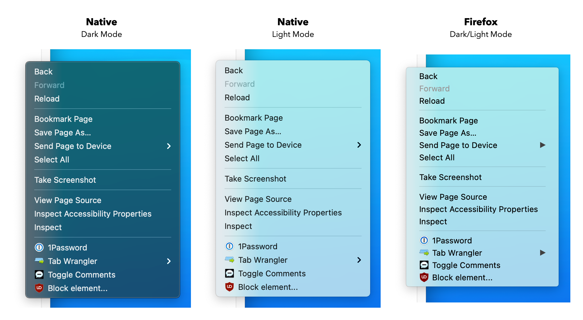
Why does the UI change with every single Firefox release? I find myself having to re-adjust every time a new update is shipped.
What's wrong with having a consistent experience that survives for more than 6 months? It's just a URL bar, and a bunch of tabs. Just leave it be already.