Icons look pretty good, always grateful for free stuff like this.
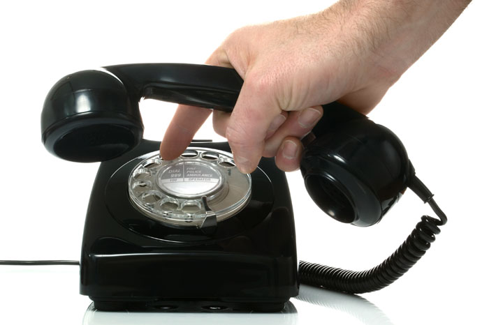
Minor side: the first thing I typed into the filter box was "save" because I wanted to see how the designer thought about the whole "floppy disk == save" problem in a greenfield icon set. I thought it was even more remarkable (or just notable, I guess) that there's no Save icon at all, which really speaks to where the world is at around cloud-based web apps.
> Why require someone to click Save at all, right?
Sometimes saving is a high latency operation.
Sometimes you don't want to show others data as it is being edited, think product data for an online story. Heck the "reply" button beneath the text box I'm typing into right now is a form of "save".
Paradigms matter! Saving was necessary for all disk IO for a long time due to technology limitations, but even now days it is still the appropriate paradigm for certain circumstances.
> Sometimes you don't want to show others data as it is being edited, think product data for an online story.
In modern CMS workflows (used by e.g. newspapers), the software will auto-save draft versions; while you then explicitly publish particular versions (or, more likely, submit particular versions for the next stage of the pipeline, e.g. editing) by changing your latest version's state in a drop-down.
This process really has no analogy with saving per se. It's more like tagging a commit.
Yes I agree that "draft" / "published" as a paradigm maps users' intentions better than "saved" / "unsaved", which is more like an implementation detail borrowed from apps exposing raw filesystem concepts.
Oh, I totally agree with you. I was just making an observation of the trend more than anything.
I'm someone who does everything that I possibly can while offline, and I'm mostly in the camp that the "Save" button being a floppy is not much different today than learning how to pinch-to-zoom or click a mouse (i.e. there's an up front cost to learning it, but it's already ubiquitous, so why change)
Many elevators have placebo ones. It might behoove you to test it out sometime - is the button actually working immediately or is it taking time after pressing (or multipressing) the button? Many elevators ignore the button and close when they want but people still think/feel like they were the cause.
As I understand, basically no elevators have placebo close door buttons, but some have ones that only function when the elevator has been placed in manual operation mode, which requires a special key and is usually only done for service, emergency operations, and other special circumstances, and in which mode doors do not close automatically.
You can find photos of elevator control panels where the "close door" button is falling off, and is revealed to be just glued on with no electronics behind it. So commonly the button has a special-operating-mode purpose, but not always.
This is interesting. Let's assume that I do require to use a Save icon and my usage makes sense. I can't think of a "better" icon to represent the saving action than a floppy disk right now.
Of course, ten year olds today wouldn't probably understand its origins. But what in today's world could represent a platform-agnostic, general purpose, "Save" icon? A flash drive? SD Card?
Consider a text field that changes a webhook destination URL. You don't want that thing to auto-save a half-typed "https://examp" unless there's some secondary "Deploy" button -- which then really becomes the save button, with a different name.
Please though, if you ever use these (or any icons, frankly), PLEASE accompany the icons with text so my aging parents -- and heck, me too -- know what they mean.
All too often I am helping my family members navigate UIs that are "clean" yes (plenty of whitespace! too much) but with icons that hide everything and don't mean anything.
"Oh, to send it to your daughter? Click the 3 lines in the top right corner, then click the two lines joined by a circle. Er, the one that looks like a chart. Yeah, that means 'share' apparently. You just have to know that."
I kind of miss the days when software didn't change so much and came with instruction manuals.
On mobile you very often simply don't have the space for text.
And if you say "well just make it a scrollable area for all the options" let me tell you, many people will never realize there are any further options to be scrolled to, especially if your phone's height randomly happens to make it so that the viewport area terminates between lines rather than in the middle of a line.
And just in case you say "well then you shouldn't have that many options, simple is better", you're probably wrong. The functionality is probably there because it's necessary for certain users.
I agree it's a little annoying to have to learn what the icons mean. But they're also awfully standardized at this point. There are a couple different common versions of menu and share and link, and occasionally the context doesn't clarify among search/find/zoom or back/undo... but otherwise it's pretty good. A gear icon always means settings, a person icon always means user/account, etc.
For real -- every computing environment has common conventions you just have to learn, whether Ctrl+Z/X/C/V, or pinch-to-zoom, or what the Apple logo is for in your menu. Icons aren't particularly worse here.
I remember those dark days when everyone was using a different icon for "share" and you never really knew what icon did what. The icons even changed across Android/iOS versions, and there was Microsoft in the corner tooting its own horn on Windows Phone.
I'm hardly tech illiterate, but the way apps use icons these days makes me almost go into "those darn kids" mode.
> I remember those dark days when everyone was using a different icon for "share" and you never really knew what icon did what.
Is that not… today? Android is "a node splitting into two nodes", OS X is "leave the box". Neither scream "share" to me, especially when there's no text accompanying the hieroglyph.
Mobile is such a stupidly confined platform for UX with its imprecise input constrained not only to boxes 1cm/1cm wide but also the lack of hover. They're crude approximations that fail to benefit from true human dexterity and simultaneously rob us of hover and other input signals that can be used to enrich the UX and show hints or provide context. And desktop UI designers scrambled over one another to throw out their rich and carefully designed UX paradigms to adopt a similar least common denominator for their user interfaces.
It's still like that. But at least we've come to some consistency across versions. iOS 5 and 6 had different icons. Android's icon would change with every new version in the early years. There's no Windows Phone anymore.
I don't see three lines but there are three dots in the top right corner...
Yes, text labels please or at least tooltips if on a desktop platform.
Here is an example for icons that are saved by their labels: the Windows 10 Mail app has a menu with two magnifying glass icons. One with the handle to the bottom left symbolizes search, one with the handle to the bottom right is for zooming. Now imagine that these would not have their accompanying text labels. ><
A clever way that the Material Design icon font works is to define ligatures for all the icon names, so the text in the document is default readable by a screen reader.
This only helps when the icon is used for something relevant to its default name. I'm not sure how you opt-into a more descriptive name because some alt-text on the containing elements, ie <mwc-icon-button> has a label attribute for this.
The symbols are pretty standardized these days. I am always perplexed on the rare occasion I encounter a physical radio, but I wouldn't ask them to waste space by adding text to the buttons! On the web, hover text is probably good enough.
For the love of everything that is holy, if in your design the icons for "Undo" and "Jump Backwards" are practically identical -- as in this font, where only the outline of the arrows differs -- , please, please "waste space" by adding text to the buttons.
Don't make people discover which one's "undo" and which one's "discard the current screen" by trying the buttons out. That's not a friendly interface. An interface can be friendly without looking like a five year-old's doodle. A wall of text is intimidating and unfriendly, sure, but nobody older than eight is intimidated by having to read six or seven words.
Fair enough! I didn't look closely at this icon set, and definitely agree that we should strive for high-clarity icons if they're the only signal about what a button does.
The last "bad luck" I had was with the Google Photos app, where they use a speech bubble icon for... sharing pictures. And there's no tooltip on it.
It gave me a hard time finding out how to share a picture.
Those 'phone' icons are the most generic things. Maybe useful to distinguish an iPhone vs iPhone X/11. If I was expecting anything other than a phone there's a 50:50 chance I could believe it was something else.
UI never "became" UX, they are different but related with overlapping concerns. Typically a person doing User Interface work should have User eXperience considerations in mind. This is not a thing that changed, it's always been the case (even if there wasn't a name for it or it wasn't in common usage).
This isn’t new at all; it has been commonplace for decades. People have been complaining about this since at least 1998, when the term "mystery meat navigation" was coined:
Though I'm always afraid of using icon sets (especially for a big product) because if I couldn't find an icon I need then sometimes it's not that easy to find this icon from another source with similar styling
This project actually started because of that haha. I've started off with a mix of obscure and commonly used icons, but I've got another 200 coming soon, and will continue to make more.
I'm also setting up the site with a request option. Just wanted to get the project out otherwise it'd never get out :)
Is there anything that you're currently after? Will try and sneak it in to the next release.
you could always bribe the author, I hear he's a nice guy :)
worst case you might end up paying some other designer to supply the icon you need in the desired style. shouldn't break the bank, "especially for a big product".
If I don't have a necessary icon, I just draw one, and contribute it to them.
The only problem is that Google lately seems to have abandoned nice simple material icons in favour of rather ugly outlined icons. Their current design with this fat new font is way worse than it was when Material Design was introduced in Android 5.0
I use noun project or flaticon. Though in order to get full advantage you got to pay. So yeah, I'm actually looking through tons of icons trying to find some with similar styling
I've opened up the repo now (https://github.com/CoreyGinnivan/system-uicons), the licence is officially "Unlicense License" - it's all public domain. The SVGs are all in the repo (or can download on the site). I'll be releasing Sketch and Figma files soon :)
Thanks! I chose it because I want it to be public domain, people can copy, remake, improve, do whatever they want with it. Don't having to worry about any infringements.
Thanks, I love me some icons. Looks like it could work well stylistically along side those also using Github's recently redesigned octicons (https://primer.style/octicons)
Maybe it's just my particular setup, but these icons look blurry to me, especially when you mouse over them. It looks as if there is no antialiasing. I'm on Ubuntu with Firefox for whatever it's worth.
Other than that they look like nice icons and this is a nice effort.
As far as I'm aware, ISO 9995-7 only specifies symbols which would be used on or in relation to a keyboard -- glyphs representing functions like Shift, Control, Escape, Scroll Lock, etc. Useful if you're trying to describe keyboard shortcuts, useless if you're trying to describe a more concrete operation like "zoom in", "add a comment", or "delete this".
Looks good! Push left vs. push right icons are inconsistent though. The "push left" icon makes sense (arrow pushing on a line), but the "push right" icon is more like a pull right icon. The line needs to be shifted to the other side of the arrow.
Minor side: the first thing I typed into the filter box was "save" because I wanted to see how the designer thought about the whole "floppy disk == save" problem in a greenfield icon set. I thought it was even more remarkable (or just notable, I guess) that there's no Save icon at all, which really speaks to where the world is at around cloud-based web apps.
Why require someone to click Save at all, right?