How about when you click on a spot it pulls up a graph of that particular location's temperature over time? Maybe add a slider for windowed average to smooth things out?
Very cool implementation and pre-loading action...it's almost impossible to talk about global temperatures without talking about climate change. A view that I think many people would find interesting is the map colored by temperature deltas, over a given time...i.e. let the user set start and beginning and color the map based on the difference (and yes, that will probably increase hits on your DB, so I'm guessing it may not be trivial to implement)
It's something that we wanted to show too. Apart from the technical complexity involved it would be hard to show warming. In the last century overall warming was maybe 1 deg C, but temperatures fluctuate from year to year by up to 15 degrees. Here is a delta graph for 1900 - 2012, for example:
https://www.evernote.com/shard/s5/sh/6d1d932a-c1ed-411d-9b74...
One way of doing it though would be to use a rolling average of, say, 5 years.
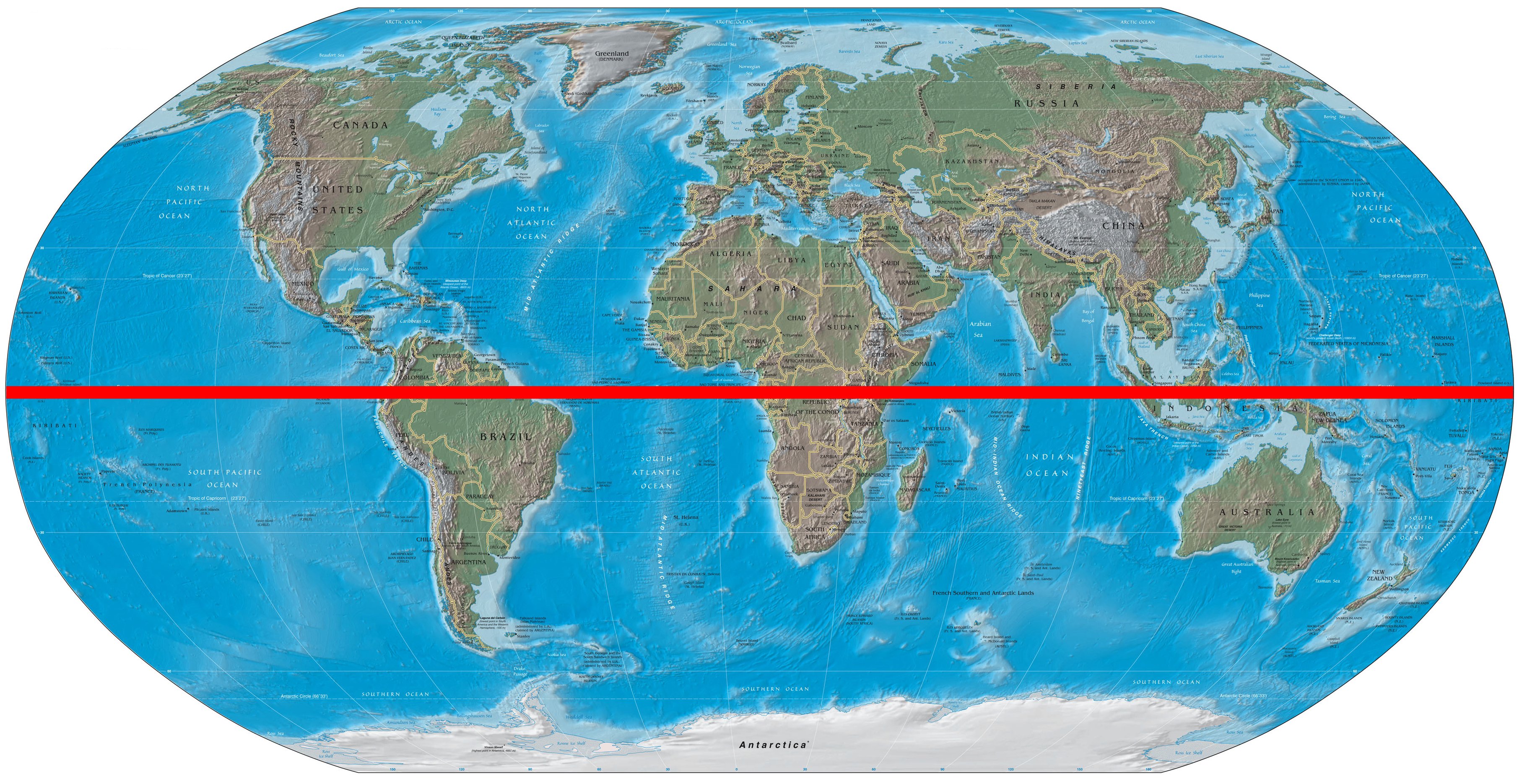
It isn't, though. You are probably looking at the equator and may be thinking this way because southern hemisphere has much less land than the northern hemisphere, and almost all of this land has tropical weather. But most of the land is also clustered near the equator: Australia, Brazil, South Africa etc. are warm, but so are Egypt, India and Mexico. This image [1] may help.
"Hey there. It looks like you're on a mobile device. Just a quick warning: This project will download a lot of data from the interwebs (no really!), and even then it probably won't look that great.
Your best bet is to bookmark this page, go home, check it out on your desktop, and see it in its full glory."
I am at home, on the couch, with an ipad. That is my favorite computing device at home, I hardly touch my desktop these days... Times are changing... Why would I want to use a truck at home?
>I am at home, on the couch, with an ipad. That is my favorite computing device at home, I hardly touch my desktop these days... Times are changing... Why would I want to use a truck at home?
That is the most pretentious load of bullshit I've heard in a long time. The creators took the liberty to warn you that they might eat into your data plan that you may be capped on and you call them out? Not to mention the rendering on this site would bring your little ipad to it's knees. This attitude has got to go.
It would have been ok if they hadn't made so many assumptions, telling me to go home, etc. just saying "this will not work on a phone or tablet" wold have been much better.
Assumptions they made:
* you are not at home, (I am sitting on the couch)
* you have a desktop at home (I have an aging five year old iMac, which I won't be upgrading any time soon)
* a tablet is a mobile device (no, it's mostly used at home, not on the road)
Firstly, if this still let you attempt to view it on your device after seeing the warning, then I think this is a brilliant warning. Sure, we all get pissed off when we see "Cannot view website on Firefox" et al, but this is not just about rendering, but also data usage warnings.
Of course, my problem is not that I'm on a mobile device at home. It is that I'm on my "truck" at home, but connected via my phone's 3G connection, which is capped at 1.5GiB a month... However the website is not aware of that. It's like opening a page where HD youtube videos start to stream without my knowledge. Pity there's no way to warn me about lots of data (except that I tend to read HN comments before visiting the page :)
The northern climes are the ones seeing the most heating. I think you can see it most clearly for the month of May. Set the month to May and then click backwards by year through the century, and keep focused on the northern climbs. You can see them colder as you go backward in time.
For more reliable comparison of temperatures, the minimum temperature should be set to zero Kelvin. Otherwise, the colour shown in the visualization is completely arbitrary, and its intensity cannot be quantitatively described.
Strongly disagree.
1. Your chart could be simplified to 'the temperature at every point on Earth is broadly always the same' - is this a useful visualisation? (Perhaps, but surely not at the same level of detail)
2. In your chart, what should the maximum temperature be set to?
Since we're talking about temperatures on Earth, it's statistically more appropriate to use a range which covers just the minimum and maximum (conceivable) temperatures on Earth.
Not sure why you are getting downvoted. In addition to your comment it would be more interesting to see a visualization over the past 5000 years rather than the past 100 years. 100 years is a small sample given the context.
Very cool use of Voronoi tessellation. Did you use D3?
Also, I see you're using data from ground monitoring systems. You're probably seeing the result of residual heat being let off from surrounding industrialization over time.
Yes, it's essentially Backbone & d3 (with topojson for data). And it's a better intro to "real life Backbone" than todos, so if you're interested, take a look.
Very nice, but it would be even nicer if, when you've changed the month (e.g. from January to June), and you then go and change the year, it should retain the selected month (rather than resetting to January)
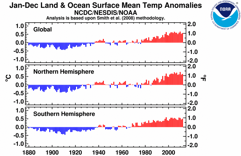
Here's the Land vs. Ocean plot in addition to the hemisphere plot.
I'd like to incorporate this bar chart, because I saw some tweets claiming that this project is evidence that global warming is not real. That annoys me.
It's not as pretty, but NOAA's single graph looks smoother for both hemispheres[0]. Then again, one's an average of an anomaly, the other is averages of real temperatures.
make sure that you have it on the same month for each year sampled. The dragbar actually changes both year and month. If you instead use the dropdown menu to change the years, it's much more difficult to discern any warming
It would be nice to have a "play" button that automatically goes 1 year back every second or something like that.