The perfectly round Os in toyota are the giveaways. I got them all correctly, except for MATTEL for which the only difference is the stroke width; and which I ended up flipping a coin for (incorrectly).
That said, I did get a degree in graphic design, so I may not be typical when it comes to this.
I picked the one with the longest distance between the T and the E. That was the wrong answer.
This quizz is an excellent training though. I didn't know anything at all about typography prior to taking the test (never bothered to learn the names of the fonts or their shapes), ended up scoring 17/20.
I have three degrees in CS, and I (correctly) answered the titular question with "No", and then proceeded to prove it with 10/20 on the button.
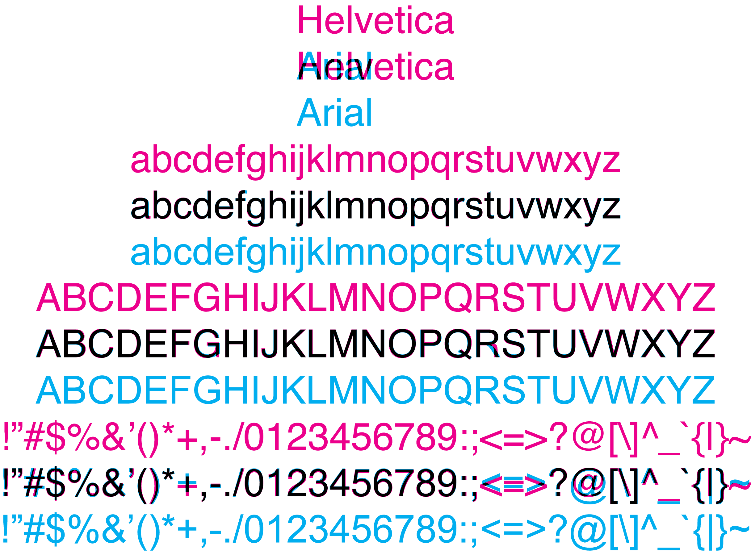
I notice the differences (slanted terminals, narrower "A"s, etc.), but had no clue which was which. Weirdly, I'm super-picky about typefaces, but mostly in a "I like what I like" sense rather than a "I know the precise details about why" sense. I dislike both Helvetica and Arial intensely, and so never bothered to learn much about what made them different. They're both just fonts I don't choose for anything.
I noticed the round Os in TOYOTA also -- for MATTEL, the height ratio between the top two and bottom two horizontal bars on the E is more even in Helvetica than Arial.
For uppercase, the tip offs are the following:
* The capital A in Helvetica is narrower (more isoceles and less equilateral)
* The capital G has an extra hatch on the right side (looks like an arrow and not an L)
* The capital R does not have a straight leg in Helvetica
* Conversely, arial chooses a non-straight hatch mark for the Q whereas Helvetica's Q hatch is straight.
This image provides a good overview on the capital (and numeric) differences: http://cdn.ilovetypography.com/img/gqr.gif
In the case of TOYOTA where it seems that kerning might different in two images, the heavier strokes in Helvetica should tip that off.