How can you tell that any Windows or Mac clone UI is a re-implementation? Easy: try to move your mouse diagonally into the Send To menu after letting it pop up. If the send-to menu closes as you mouse over the item into the submenu, it's a clone. If the menu stays up even if you brush over another menu item, it's either real or a Good Clone. :)
For the fun history, @DonHopkins had a thread a few years back:
There was an economies of scale back then with OS-level UI components.
If Microsoft spent money on UX research that improved its UI controls, it would benefit a lot of people. Essentially the cost of that research was bore by all application developers.
The problem now? Every company is designing their own UI components. Every company has to bear the cost of UX research individually. It’s a lot of wheel re-inventing. UX easily takes a backseat.
I work on design systems for an enterprise software company. I was talking with one of the engineers on the team about how great it would be if there were better built in browser-based solutions for things like autocomplete, select and multi-select.
As a side note: With the Internet (and myself) getting older and older, I appreciate the effort of the Internet Archive more and more. So many links I was able to revive thanks to a cached version. So many of my own works I was able to retrieve. It's a blessing, and not praised enough.
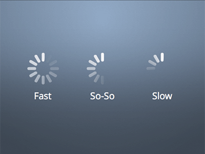
Man nothing drives me further up the wall than when a nice progress indicator with discrete segments gets animated with a lazy `to { rotate(360deg); }` etc[1]. It is my molehill to die on
You know talking about progress bars, it takes a lot of confidence to program a linear progress bar. You think you know when loading will be complete and think you know can break down the incremental progress made during loading.
Instead we get these spinning wheels that are like "maybe in the future this wheel will stop and we will have a return value." No confidence whatsoever.
I know this is true because Apple tries to implement progress bars in IOS like real chads. But their progress bars are just fake. They are a cheap animation all the way up to 90% and just stop moving until the progress is actually complete which could be 5 seconds of 90% and 40 seconds of the last 10%. So they think they are chad but lie.
> I know this is true because Apple tries to implement progress bars in IOS like real chads.
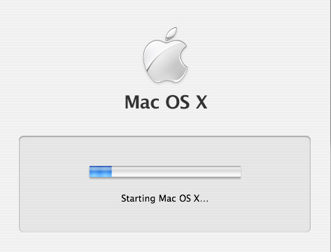
Back in The Day, Mac OS X Tiger just faked it by measuring how long it took to boot to LoginWindow, writing that number of seconds to a file, and displaying the next boot's progress indicator as a percentage of that time.
Power words: `/usr/libexec/WaitingForLoginWindow` and `/var/db/loginwindow.boottime`
Calling it fake also doesn't mean I'm calling it poor engineering; in fact the opposite since it's very accurate for the common use case of a computer that's used on a day-to-day basis with no major hardware or software changes. It's fake in the same way that illusion magic like slight of hand is fake. Its not lying to anyone about what it is, because it prompts your senses in a particular way that causes your brain to lie to itself! The slight of hand is this:
- Observable fact: Taking the computer from a fully-powered-off state to a usable state happens when the user presses the power button, involves loading the operating system from slower disk to faster memory, and takes some amount of time to complete.
- Observable fact: `WaitForLoginWindow` is the first “Aqua” UI element one sees after powering their computer on, the first visible thing that's drawn by the operating system that's being loaded instead of drawn by OpenFirmware or by BootX.
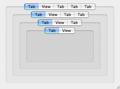
- Observable fact: Aqua has an `NSTabView` control used for grouping panes of related UI elements. In original 2001 Aqua, NSTabView looked like something that “stuck out” toward the user from a window. In Panther (2003) it was redesigned into something that looks “sunken in” to visually allow for nesting multiple layers of grouping.
- Observable fact: Panther-style NSTabViews get progressively darker as they are nested, indicating controls which are “more related”. See here for an example of four layers of nested NSTabView: https://cdn.arstechnica.net/wp-content/uploads/archive/mac-o...
- Observable fact: Any OS X user will be familiar with `NSProgressIndicator` as the UI control they see when they tell their computer to do something and some aspect of the computer itself (like disk or network bandwidth) is the limiting factor causing their action to be non-instantaneous.
- Observable fact: The progress indicator is the only part of `WaitForLoginWindow` that moves, and it's grouped with a text label reading “Starting Mac OS X…” in what looks to be a `noTabsBezelBorder`-styled `NSTabView` even though the grouping-box and even the “Starting” text are actually just a static image that the Wait window draws and overlays the progress indicator on, not really Aqua controls because the UI frameworks are still being loaded.
The coloration makes your own brain tell you that the progress indicator and the “Starting Mac OS X” text are as related as any two UI elements could possibly be, more related than any other pair of UI elements you will ever encounter in Mac OS X, because no reasonable application designer would ever nest four layers of NSTabView.
Since the progress indicator is so strongly visually grouped with the “Starting Mac OS X” text, and every Macintosh going back to 1984 has displayed some form of “Welcome to Macintosh” text while the OS is loading from disk, and progress indicators are the UI element for long-duration user-initiated work, and the computer was fully off so pushing the power button was the only thing the user did, and the wording of “Starting” means it isn't fully “Started”, then the progress indicator must represent how much of the OS is loaded in the current session, right?
I would imagine that progress bars generally represent the progression of the task state and not time, for that very reason. Or is that not the case in practice?
It is, but traditionally progress bars were often paired with labels showing estimated remaining time.
That said, back in DOS era, this kind of thing was much more straightforward because most operations that would warrant a progress bar involved some kind of disk I/O, which - if you amortize it - is fairly linear, so one can estimate the completion time relatively well. In more complicated cases - e.g. Win95 installer doing things like hardware detection - those estimates were often wildly off.
Progress bars are very hard. I implemented a PowerShell progress bar in a script I wrote, and even that was hard. The script did a nested iteration, deleting objects and re-starting the iteration. I updated the progress bar based on completion of the outermost iteration, but because of how things processed, the progress bar would move more or less logarithmicly; super fast at the start, but slowing down significantly at the end.
I'm sure I could have made the progress bar move more smoothly, but it would have required restructuring my entire program. (It probably needed it, but for a simple script I ran occasionally, not worth it.)
A CorelDraw version from the 1990s I used had an honest progress bar. Sometimes it went backwards, but by the time it got to the end, it was truly finished.
The irony of progress indicators like the sunburst here is that everything okd is new again
In the Before Times your UNIX would have a progress bar that was basically the same spinning icon: overwrite - \ | / - \ | / in the same character location in quick succession.
It was as useless then as the spinning sunburst is now.
The linear indicator provides two bits of information: that something is happening, and that progress is being made towards completion. The sunburst only provides one.
I second everyone talking about fake progress bars, but yeah I was just talking aesthetics. Having a progress indicator with obvious segments and animating it with a smooth tween looks wrong. Compare the above with [1], which is how Apple does it -
Back in the dark ages, "idiot dots" or "idiot marks" was a phrase I heard for the various text terminal equivalents.
It would cycle through a small number of text values with some kind of backspace/overwrite to keep things localized to where the cursor ought to be.
One version was a variable length ellipses: . .. ... that would grow and reset in place.
Another was an expanding "dot": . o O that would cycle in place as one character.
And the early "spinner" was: - \ | / that would cycle in place as one character. Hmm, not sure this will render properly on HN but it is hyphen, backslash, pipe, forward slash.
Also back then the movement of the symbols was kind of proof that the program was still running properly and not crashed because it had to be updating the symbols. But nowadays, waiting animations are independent of the thing they're waiting for and their movement isn't a sign of life but just a puppet made from a corpse.
this reminds me of a tool at work that uses a progress bar but the software doesn't calculate the job size so it just fills up quickly and then goes back down again, and repeats endlessly.
I don't have the time to research where I heard this, but I recall a UI focus group study that found pretty much equal user satisfaction between accurate linear progress bars and random progress bars, but universal dissatisfaction with progress bars that "reset". My own feelings mirror this finding.
I've had times where I aborted an operation that was obviously not working. Eventually out of ideas, I waited out the 1,163 seconds and it completed normally.
There's something like this in every desktop Linux I've tried, which made it feel like using the mouse was in some way weird and broken. But I've been using it for long enough now that it either got fixed, or more likely, I got used to it. I don't even remember what it was, something about clicking drop down menus a certain way?
Reminds me of the first time I ever used classic Macintosh System OS, and how you have to hold the mouse button down to keep menus open. It doesn't take much to throw everything off.
It also fails the "hold right click" test, Windows didn't popover context menus until right click was released. Instead, for file, it did a kind of "contextual drag and drop".
I don't have an appropriate machine (virtual or otherwise) at the moment to check, but I believe this is another one of those things they screwed up around Windows 10 or so --- right-clicking on the Start menu and trying to get to the submenu that has the shut down / logout options was made significantly more frustrating because of it.
Have you considered that you can actually right click the start button, open a window, throw machine out of window? (I’ll get my coat!)(it’s cold out here collecting discarded pc’s)
If you have another option with a submenu on either side of Send To, the Send To menu will close. It closes as soon as you move over any item with a submenu. But it just so happens that Send To is typically by itself, so it's a good test regardless.
I must be a freak then because one of the first tweaks I do to any Windows install since possibly Win98 days is to set menu delay to 0ms. I like the snappy precise feel and have no problems not taking shortcuts across menu items.
In the web sphere, I recall Amazon having done something like this in the very early days when there was a sidebar with categories that you could kinda drill into. Mouseover one, and there was an invisible triangle off to the right that if you kept inside of, it wouldn't switch the current category.
Another example, half of the stuff I tried had a different outcome from a actual Windows XP, on the systray, explorer side bar, what About dialogs were supposed to show, and so on.
I believe that anyone who isn't explicitly looking for it is subconsciously frustrated by the lack of it and they just don't know why the UI is "annoying".
For the fun history, @DonHopkins had a thread a few years back:
https://news.ycombinator.com/item?id=17404345