I worked at a grocery store in my teenage years and a couple of times a year we were enlisted to shift entire segments of items to different isles. The owners were quite transparent: every time they did it, they got an uptick in sales that lasted much longer than you would think (like months). The effect of people wandering around trying to find the item they needed inevitably leads to them stumbling on other things and buying them on impulse. And I think those "impulse" buys were often much higher margin than whatever they came into store to buy in the first place.
Another bizarre thing was positioning items right on the edge of the shelf, as if they are about to fall off. Apparently this creates some kind of psychological impulse as well.
>Another bizarre thing was positioning items right on the edge of the shelf, as if they are about to fall off. Apparently this creates some kind of psychological impulse as well.
This practice was called "zoning" where I used to work. It was explained to me that people think the shelves are more full and will report in surveys etc. that the store has a better selection.
I definitely remember a grocery store I went to years ago was going out of business. Asking the cashiers only said "nah, not happening".
But the shelves were getting bare. there was space around cans and bottles on the shelves, and there were a limited number in each row.
It definitely gave you a feeling of impending demise. That the store was sad and unhealthy, and that prosperity was limited.
also, all of this stuff also works in casinos, where every part of the design is carefully chosen.
Dimmer warm lighting, since you and your companions always look happier and healthier even a 4am when complexions are actually pale, eyes are bleary, and makeup is smudged.
In Australia they called it "facing up" (e: seems there's a wiki article calling it "facing" and maybe my boss just Aussied it a bit) and it was something I had to do every night while/after packing the stock. It also helped find stuff that people put back in the wrong place, or had expired (you're meant to pack back to front but people get lazy and then those fish fingers have been there for months).
I worked retail in Australia and they used the same language. Though I only worked at Dick Smith (entirely during it being a WOW company) so it could’ve just been WOW language. However by the time I left I’d completely adopted the language and have used it in passing when e.g. asking someone something in another store, and they all seemed to get it.
- “There’s only one facing of these hard drives”.
- “There aren’t customers, go face up”.
I haven’t worked retail in well over a decade yet I still sometimes subconsciously face up shelves when I go shopping, especially if I take something off a shelf. It’s a curse.
My first job was at Woolies and we used the same terminology.
> I haven’t worked retail in well over a decade yet I still sometimes subconsciously face up shelves when I go shopping, especially if I take something off a shelf. It’s a curse.
Same here!
Worked at a couple of fashion retailers after Woolies and will also ensure clothes hangers are always facing the same way.
And I also still do the casual facing up. It's kind of satisfying, but also my wife is a bit short so there are times when someone her height can't see any stock left and I've had to dig for it so I guess it's nice to be helpful and bring it forward so people can at least see it's there.
Grocery store I used to work called it "facing", and it does make the store look neat and organized, but we were never instructed to make it look like they are about to fall off which seems strange to me.
Still do it, too, when I happen on the occasion. Partly that's because it's no effort and it helps keep the store looking nice, because I shop there too, and because Giant management gives the people who work there more than enough problems already.
And partly it's because fronting shelves in passing, in the days when stocking and bagging were my summer job in high school, was what prompted the first compliment I ever had in my life that I knew I'd really earned. Leaving things to look like they're about to fall off a shelf isn't how you get told "you ain't no scrub," by a man who looks as if he's worked that store for five hundred years and has absolutely no reason to waste words he doesn't mean on a weird nerdy high school kid. So I do it right.
When I was a little kid, my mom often took me with her for shopping. One time there was a big barrel full of some cheap products, and bored and weird as I was, I started sorting and stacking everything in the barrel. Looked really nice. At some point a clerk came over and explained to me that this is not in the best interest of the shop, as people are more likely to buy stuff if it's in this cluttered mess, as it's more inviting to quickly grab something. For some reason that made sense to my 6 year old self so I happily abandon the stacking and moved to something else. Note, I'm generally rather a messy person. Maybe it's the fault of that clerk.
Another bizarre thing was positioning items right on the edge of the shelf, as if they are about to fall off. Apparently this creates some kind of psychological impulse as well.
Many people might not even notice the items are present if they're far back inside the shelves. I can see how making the items prominently visible and easy to grab would also increase impulse buys.
I’ve noticed I seem to get restaurant service quicker the closer I move a glass to the edge of the table. Either that, or I’m so occupied with my silly experiment that the time to service feels shorter.
You're not getting faster service, you're using an additional non-verbal signal.
Moving your glass to the edge is how you say, "Please refill my glass." Similarly, if you're in a Chinese restaurant, flip the lid upside-down on the teapot to ask for more tea.
If you're looking around while you do it, that may more likely be why. And if you haven't tried making eye contact when you need something, you should.
Classic example of why some companies own two, three, or more "competing" subsidiaries branded differently and aimed at differing but often overlapping demographics | price points | etc.
> It is named after Austrian architect Victor Gruen, who disapproved of such manipulative techniques.
That's cold. I quite wonder why.
Nevertheless, I found this article extremely difficult to read. Its "Description" barely describes it, seems to contradict itself, and somehow just makes my head hurt trying to parse it. Is this attempting self-exemplification?
When Gruen used it, it was about the shopping center itself definitely not 'items on a shelf' like many use it today.
He wanted shopping centers to be like the a nice European town or city shopping street - self-contained shops around the outside and 'town square' type broad pedestrian spaces in the middle that were open, public/community focussed, full of light and trees, and hopefully connected for pedestrians to other areas of a town. He saw this as a good alternative to the car-clogged main streets (with frequently no open space and narrow, poorly maintained footpaths) that were common in post WWII America.
What he objected to was the 'square'/circulation area becoming psychologically overwhelming experiences (complex layout, sensory overload, full of advertising billboards, constant changes, no links to other pedestrian areas, etc.) which was adopted by most shopping centres as their studies showed that it meant people bought more (I think he called it 'a machine for spending' or similar) but (for Gruen at least) it killed any sense of a true benign European 'pedestrian street' or 'town square' that he wanted to bring to America.
I get the effectiveness of that—you're essentially getting free advertising for everything walked past. The article just doesn't seem to describe that. It talks about "hyperreality", confusing customers, making them calm, and placing things in attractive positions.
I feel like that is a separate effect... making you walk past items you might want to get you to buy them vs intentionally confusing you so you forget what you came in for in the first place, which makes you more susceptible the the previous and many other effects.
Just like unlocking your phone for one specific, quick purpose then getting distracted by notifications and 10-15 minutes you've forgotten what you actually needed to do. Deliberate gruen or poor ui design?
Social media & their ilk UI is likely not a mistake (eg youtube, X, netflix) given it nakedly optimizes engagement.
I don't know, Snapchats UI is so confusing that I find it hard to believe that they did that deliberately. Every so often I get lost in some weird corner of the app and need to force close the app and start over.
> I don't know, Snapchats UI is so confusing that I find it hard to believe that they did that deliberately.
You're assuming someone is actually thinking about these design changes. Constantly changing things around based on detailed telemetry is effectively doing backpropagation by hand - the result doesn't need to make any sense, it only has to improve the metrics with each change.
I go to the more expensive grocery store in my town simply because they never move anything. I can get my staples, vegetables, and eggs at the pace of a brisk walk. I'm in and out in under fifteen minutes.
They did move the organic section once about ten years ago. People still bring it up.
Aldi is also pretty good about keeping a consistent layout.
In the UK, the supermarkets were extremely prone to confusing deals (like two-for-one and worse), but they dialed that down a lot since Aldi and Lidl entered the market with much, much simpler propositions. Customers might fall for your shenanigans once already in the shop, but it turns out they do prefer shops with fewer shenanigans in the first place.
That's an interesting observation, Aldi is now defunct in Denmark, but Lidl share one objection I had to Aldi, I can't find anything. It's true that Lidl doesn't really move their stuff around much, but they constantly have "limited time product" that will just go where ever they have room. The location of many regular products also seem completely random and not necessarily related to the items next to it.
So it's not that they move items, but they do place some items so illogically that my brain won't remember where. I can get maybe 80% of my shopping done in 10 minutes, hunting for the remaining 20% can take 20 minutes.
There's lots of stuff they don't sell, keeping the list of items small is part of the strategy of both Aldi and Lidl. Why pita bread in particular didn't make the cut for Lidl, I don't know.
As always with any purported finding related to sociology or psychology: does it actually replicate?
I can see how the people who design malls will try to sell up their magic 'Gruen transfer' powers to mall developers. But how much of this is wishful thinking?
Reminds me of the alleged magic power of Facebook ads to eg swing elections.
> Reminds me of the alleged magic power of Facebook ads to eg swing elections.
... but the preferred candidates of the founders of Facebook and Google etc still losing elections. (I'm fairly sure comparative technocrats like Mitt Romney or Michael Bloomberg and so on would be more to their liking than the people who are actual front-runners in the elections.)
The flip side of this is that making a store harder/slower to navigate makes it more frustrating.
Classic examples would be escalators: They can be arranged in an alternating pattern so you can enter the next "up" escalator as you exit one, or to make you walk around the escalator tower before you can take the next one. Or, in a particularly frustrating mall, scattered randomly throughout the building (different locations on each floor) so you also have to search for it first.
This definitely makes the customer see more of the product/mall... but especially these extreme forms also make the customer (subconsciously or consciously) hate the place and avoid it in the future. I've noticed malls and department stores ease up on these kind of tactics over the past decades, probably because they realized this effect.
Which also makes me wonder: The amount a customer that enters ends up buying is likely easily measured, while the long-term effect on customer attraction/retention is much harder to measure. So it may be one of the many situations where the thing that is easily measurable gets attention while neglecting a possibly more important, but harder to measure thing. Is there a term for that effect?
> In shopping mall design, the Gruen transfer (also known as the Gruen effect) is the moment when consumers enter a shopping mall or store and, surrounded by an intentionally confusing layout, lose track of their original intentions, making them more susceptible to making impulse buys. It is named after Austrian architect Victor Gruen, who disapproved of such manipulative techniques.
> The Gruen transfer is a psychological phenomenon in which an idealised hyperreality is realized by deliberate reconstruction, providing a sense of safety and calm through exceptional familiarity. In a speech in London in 1978, Victor Gruen disavowed shopping mall developments as having "bastardised" his ideas: "I refuse to pay alimony for those bastard developments."
(citing in case the article ever gets edited in the future)
Based on these descriptions it sounds more like Victor Gruen first came up with the technique described in the second paragraph, with good intentions behind it. Then, after implementing said ideas, the effect described first was discovered, and mall owners and other shops started doing this on purpose.
Maybe it would be better, and also more fair to Victor Gruen, to explicitly distinguish two as "Gruen transfer" and "Gruen effect", with the transfer causing the effect?
(also, as an aside: assuming my interpretation is correct, it's kind of funny that for once Stigler's Law of Eponymy[0] doesn't apply, but in a monkey's paw kind of twist it still backfired)
It's a large part of why I always shop at the same supermarket despite having closer options now. I feel like it takes twice as long with even minor layout differences. Then they go and move things anyway.
My first order of business upon entering an Ikea is finding the map, checking the shortcuts, and going straight to where I need to go. Always feels a little naughty with how they position the flappy doors between areas, like I'm walking through a staff-only entrance, and I guess that's intentional.
My wife does the shopping list and I do the shopping... she hasn't been to the supermarket in ~2 years. It's been a really interesting view in to how the supermarket layout changes because her list is getting more and more out of order and requires me to correct it before going to the store.
I guess we should swap roles for a bit to correct the issue!
Let's just say I have the typical mindset of someone on this site and so for larger buys I add ingredients into Excel per recipe/need then rearrange into sections (Meat, Fridge, etc) roughly in order of store sections, 2 column layout, print. Only takes a few minutes and saves more time than that, but it is helpful being both the shopper and list writer like you say.
I'm very quick since I'm on a mission. I don't like the process of browsing but enjoy completing lists (I blame video games), there's a strange enjoyment folding that paper to hide the completed sections. When we go together my wife just wanders off knowing she needs 2 things for work snacks or for the dogs or something and by the time I've found her, I finished the entire shop and she's barely carrying 7 items since she didn't need a basket for just 2 things. Totally different mindset, she would say I worry too much, I would say I like certainty where I can have it.
That gives me an idea for a nifty tool that could reorder shopping lists according to the layout of the supermarket of your choice. Obviously someone should train the tool first; either you or the community.
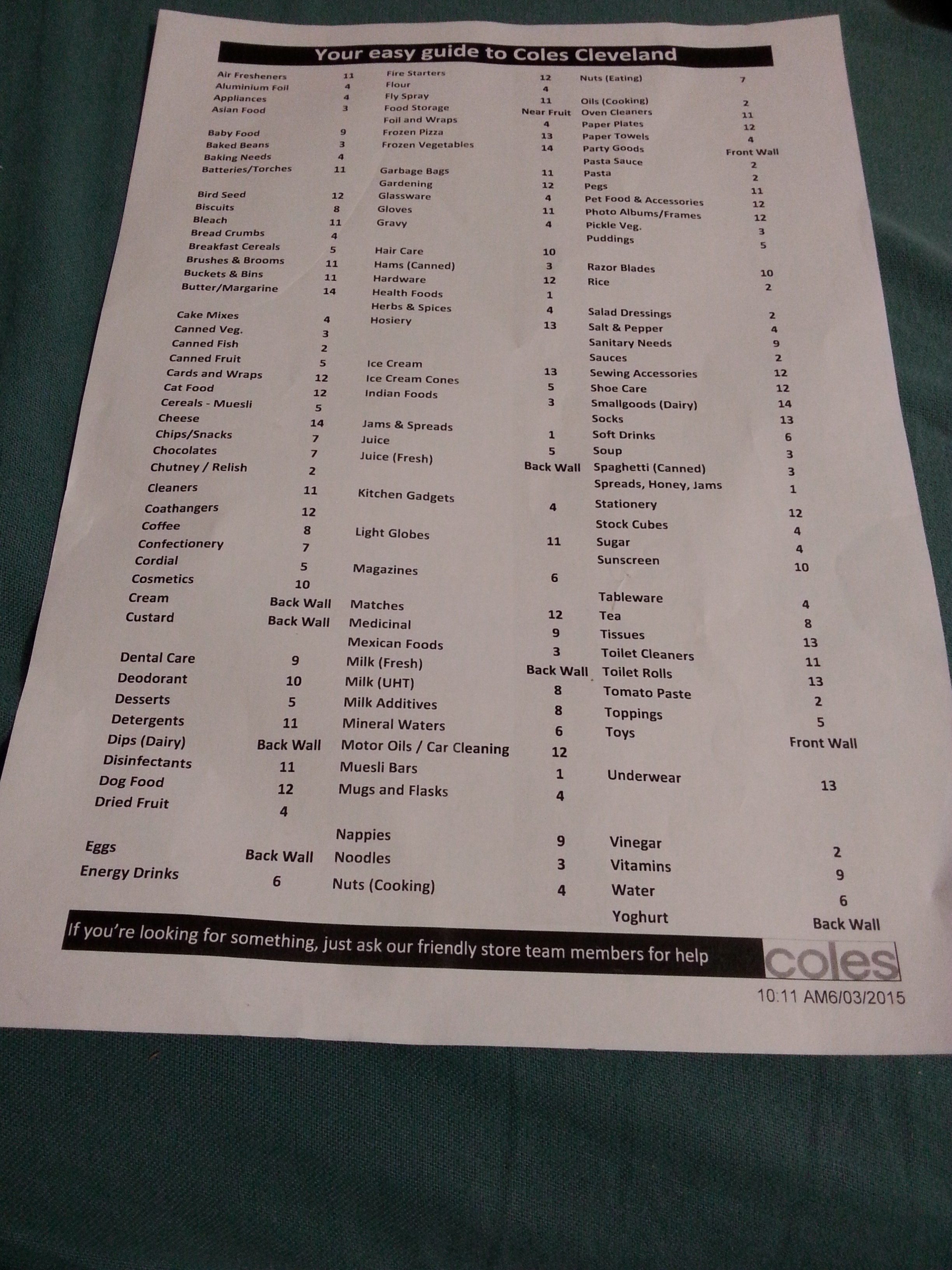
Basically every supermarket has a laminated aisle guide hanging somewhere that tells you what is where - snap a pic of one of them and use that for training.
Thanks! I'll ask the next time I'm in the store then. So far, the only such inconspicuous document I ever found lying around in a supermarket was a binder with a list of allergens for products in the meat and pastry sections.
This is really useful, but this example is curiously missing things like veggies, fruits, meat, or bread. I believe they think that those items are not hard to find.
Those specific items need a full-size map of where every specific type is placed; and/or clearly visible large labels on the shelves/boxes. Yes, a significant part of the population - myself included - has to resort to hunting for labels or doing image search on their phones, to save themselves from the shame of asking a store worker which one of this green stuff is the "blue peanut pepper broccoli" or whatever it is their partners put on their shopping lists.
The opposite of this, IMHO, is Home Depot. Hop on their site, do a quick search for the items you want, arrive with a list of aisle and bay numbers. I feel like I'm speed running whenever I go.
Except the HD website is slow AF. I can often walk somewhere in the store faster than I can find it on their site if I know the general area to begin with.
I found something that was supposedly in stock with 2 or 3 in a particular store. I drove to that store, looked everywhere and finally gave up and asked an associate. This person walks to a different aisle, looks up in the higher areas and then says that “only 3 in stock isn’t that high of a number and that they probably don’t have it.” I drove to Harbor Freight and made my purchase of a slightly lesser but available floor-stand belt/disc sander.
An interesting anecdote and counterexample (at least to me): Just yesterday I visited a rather large mall to visit a jeweler for a simple ask, and while standing in the store 3 other jewelers were visible. The jeweler I had visited was unwilling to assist. After visiting two others that were noticed while waiting, I got some help. Was very convenient!
I wonder if placing the perfume department at the entrance of some large convenience stores also serves a similar effect (additionally the islands with luxury goods in your way also makes the other part easy to implement as well). The smell alone, however, always makes me dizzy and I tend to hate entering, now I see it with a slightly different perspective.
Also a good reminder that ö, ä, ü should be subtituted with oe (like in Goethe), ae (aether) or ue here (Gruen's original name was Grünbaum); not o, a, u.
Another bizarre thing was positioning items right on the edge of the shelf, as if they are about to fall off. Apparently this creates some kind of psychological impulse as well.