Open Infra Map; shows major electrical lines, power plants, gas & oil lines, and telecom/data centers. Gets its data from Open Street Map: https://openinframap.org/
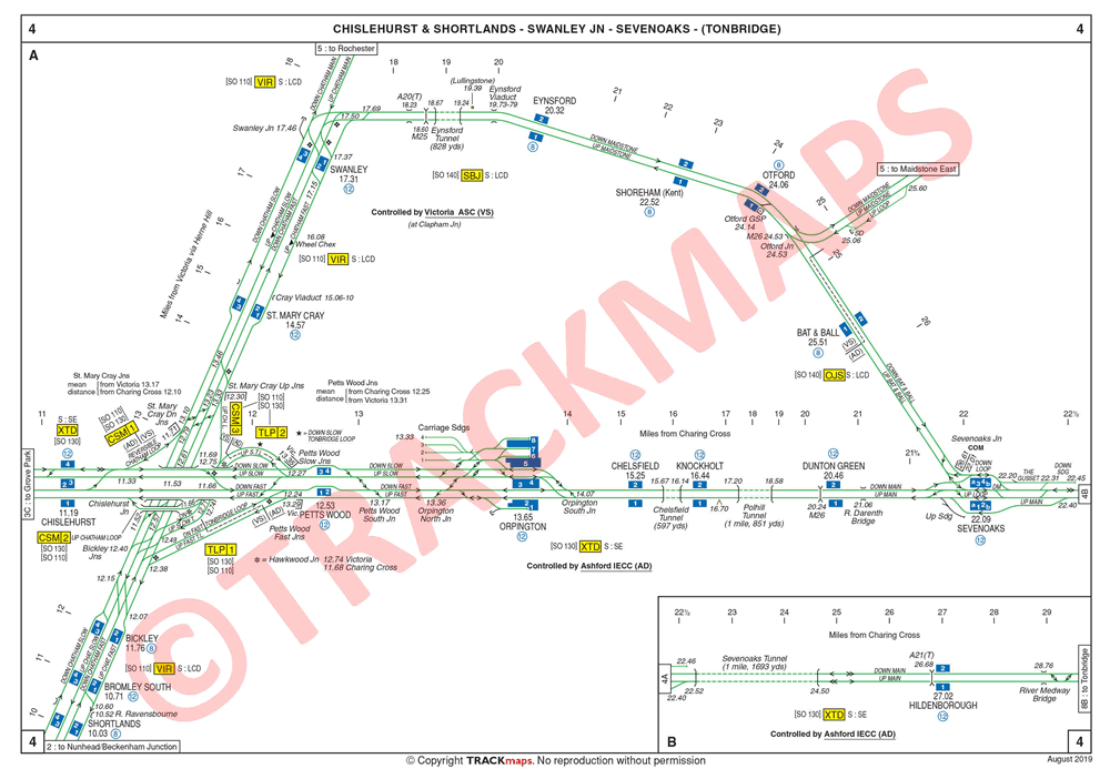
For railways, there is a genre of "track diagrams" which are more like circuit diagrams for the railway, showing lines, crossovers, platforms, etc. The best ones for the UK are perhaps the Quail maps, which include all sorts of gory details, but are commercial:
Open Infra Map is just the kind of thing I was hoping for! I'm interested/surprised at how many megawatt batteries there are in the UK, and how many 10MW+ solar farms and at all the names of the offshore wind farms and where they connect back to.
True, unfortunately lightning maps doesn't seem to be accurate - at least I had 0 luck with it.
On the other hands flightradar24 and similar are so fascinating if you are on a busy plane route. The observation time is so perfect to speculate over the plane and destinations, chat about interesting facts or recent developments at destinations.
A few years ago I visited a small village where a relative of mine lives and happen to show a kid the app. Next year, I heard that the all the kids there made it a hobby to do plane spotting.
I agree. And I'm glad you put quotes around live. Much of the data for the US is estimated, not actually sourced from the grid operator. It'll be great when we have realtime data everywhere.
Is there a collection like an "awesome maps" list anywhere?
[1] https://news.ycombinator.com/item?id=37187760