Hacker News new | past | comments | ask | show | jobs | submit login
Ask HN: What's your favorite illustration in computer science?
461 points by gnull on Jan 11, 2023 | hide | past | favorite | 313 comments
I'm curious to see some examples of what people consider good visual illustrations of CS concepts, from both usefulness and aesthetics perspectives.


I, unfortunately, cannot find an online copy currently.

Knuth's TAOCP's latest published part, Volume 4 Fascicle 6, on Satisfiability contains a number of visualizations that really are amazing and worth just buying a copy of the book for, just to ponder over these images.

The satisfiability problem of whether there exists an assignment of boolean values that makes a given boolean formula evaluate to TRUE is, IMO, truly a fundamental problem in computer science.

Any piece of code with some inputs and outputs can be transformed into a boolean formula (albeit a huge one). This process feels akin to expressing molecules, from simple ones like H2O, to the highly complex proteins that make up much of our Cells, in their constituent atoms and more importantly the atom interactions.

Knuth (EDIT: Actually, Carsten Sinz) takes this concept one step further and produces visualizations of non-trivial boolean formulas that clearly show the regular, both symmetrical and asymmetrical, sometimes fractal-like nature of these formulas.

In my mind, these visualizations are quite powerful and strikingly show the fundamental building blocks of (digital) computation.


> Knuth takes this concept one step further and produces visualizations of non-trivial boolean formulas that clearly show the regular, both symmetrical and asymmetrical, sometimes fractal-like nature of these formulas.

The visualizations were done by Carsten Sinz.

This is his paper describing the technique:

Carsten Sinz. Visualizing SAT Instances and Runs of the DPLL Algorithm. J. Automated Reasoning, 39(2):219-243, 2007.

https://www.carstensinz.de/papers/JAR-2007-Visualization.pdf

https://doi.org/10.1007/s10817-007-9074-1


Aha! I have edited my post. Thanks for the correction! Beautiful work, looks like something I'd like to play around with as well :)


And that's why I love HN! (sorry for a non-contributing post).


These seem to have structural parallels to Wolfram’s classification of cellular automata.


PDF: https://kolegite.com/EE_library/books_and_lectures/%D0%9F%D1...

Physical pages 116-117; PDF pages 126-127.


Also 4B (1st ed) pp. 300-301.

ProTip: Order the 5 vol set directly from Addison-Wesley, it's much cheaper than anywhere else.


I am lucky to be paid to work on SAT. I wouldn't yet say I am an expert, yet, but it is really a pleasure to do so. Trying to improve on algorithms to solve these problems is truly humbling.

Edit: Fixed a typo.


Im jealous! To me, from the sidelines, people working on SAT are like the experimentally-focused particle physicists of computer science.


The spread on page 300 (iirc) is really stunning.


Page 116/117, to be precise ;-)


Huh, that is odd! Which version of the book do you have?


Wow, you weren't kidding about those images.

What I found particularly striking about them was how much they reminded me of both neurons and larger brain structures, as well as some of those newer, ML-assisted FMRI imagery.

Probably just coincidence and wishful thinking, but it instills a sense of daydream-like wonder all the same.


Bret Victor's interactive version of this in Dynamicland:

https://twitter.com/worrydream/status/977058412990152704


I pity the youngsters who will never be able to mentally playback the dialup sound.


I still remember the small adrenaline rush we had as soon as we would detect the tone for a successful connection.


I remember installing Mandrake Linux on my PC (via CD ordered online as magazines still hadn't started to include the CDs). I had the dial-up line and the modem but didn't know how to set it up as I was new to both Linux and dial-up. So I used to print the steps from websites/mail groups at office to try them at home. Initially I couldn't make it work and had no choice but to wait to get to office the next day to start again.

Finally I read a bunch of docs about how to talk to the modem and eventually I managed to do the correct steps and the modem produced its sweet handshake tone and the indicator lights started to blink - it was such a pure joy to finally be online from Linux!


That instant was unique for human-tech interaction. Perhaps comparable with becoming positively viral, but at small scale.


I grew up after that sound, but I can mentally play back a dialup sound purely because it is used in every second show, podcast, documentary on computers.


reminds me of two 17-year-olds attempt at using a rotary phone (2018) https://www.youtube.com/watch?v=1OADXNGnJok


Same here! I played it in my mind while looking at the picture. Wow, we're so old school!


I wonder what the equivalent sound is now?


Not sound, but visual: The moment the video stream goes from blurry to crisp.


"This was back when chatbots weren't actually intelligent and used to spout out random nonsense"


The opposite, connections that drop or slow down, the sound of music that is buffering or got automatically downgraded to the worst available quality.


There is still a lot of emblematic sounds, the skype calling sound, netflix loud bang bang, the iMessage or messenger notification pop sound, etc.

But there are all from company sound design and the same experience as the dial up sound.


The animated video that explains this is also great: https://www.youtube.com/watch?v=AgqEIp2YmtE


On that topic. I never understood why the initiation needed to be audible, but afterwards the connection was silent.


It kept the speaker on at first so you could hear if a human answered the phone, or got some network message like "all circuits are busy". It muted once it had a confirmed modem on the other end.


It used to be useful to me back when my ISP had 28800 bps and 33600 bps capable modems in their pool, and I had a 33600 -- I learned to hear from the handshake when I hit one of the slower modems and would then immediately hang up and try again until I got one of the fast ones ;)


You can hear all the post-handshake data sounds by adding &M2 to your modem script, or &M0 to mute the handshake too.


It was pretty useful in my experience because sometimes the line you called was busy, sometimes a human answered instead of a computer, and sometimes a computer modem just didn’t pick up for whatever reason. Hearing the dial & handshake was a way to know what exactly went wrong when you weren’t able to connect. BBSs didn’t have this problem so much, but it happened often enough when modeming with friends or with small businesses that didn’t have a large modem bank and a lot of lines. Typing the wrong number was common. I also remember experimenting with robo-dialing with my childhood friends, calling through a list of numbers, like in War Games, looking for unknown computers to connect to.


You could turn it on by sending the correct Hayes command before connecting. It's really annoying! And it can't be turned back off again until you disconnect.


it doesn't have to be, ATM you could turn it off, or ATL you could control how loud it was


There is no need. Speakers could be disabled.


Is it just me or... does the modem audibly say "Hi" when the connection is successful? Probably just me projecting from my imagination, but listen to the part after the handshaking and before the white-noise dataflow. There's a very clear 'boing-boing' sound and then a bunch of static that sort-of sounds like someone whispering the word "Hi". It's not just on the linked recording above, I remember being conscious of this back in the day when dial-up was "normal". Just curious to know if anyone else encountered this trick of perception...

Anyway, hearing those tones again did bring back all the feels, the joy of hearing that "boing-boing-Hi" greeting as I stepped once again onto the "Information Superhighway".


That would make a good poster.


The author does sell it as a poster here: https://www.redbubble.com/people/windytan/works/31262230-the...

I'm actually surprised the link, company, and poster are all still valid/working 10 years later.


It was actually distributed as a poster along with the 2014.2 issue of the Finnish computer culture magazine Skrolli.


Never forget :')


Eternal September


The list of linux distributions on Wikipedia: https://upload.wikimedia.org/wikipedia/commons/b/b5/Linux_Di...


This makes me wonder: 1) Does Wikipedia / Wiki* not have a JS pan & zoom tool for graphics like these and 2) Has no one else made something like that just for this graphic?

Asking because the graphical linux genealogy concept / this illustration have been around for a while, as have JS pan & zoom plugins, and it's totally worth having something like this in that format.[1]

Edit: OK, there is Gadget-ZoomViewer (below), but maybe it doesn't work for SVGs? I don't see the option to open ZoomViewer from the Commons image page for this image.

https://zoomviewer.toolforge.org/index.php?f=Quaternary_Geol...

https://commons.wikimedia.org/wiki/Help:Gadget-ZoomViewer

1. See "Expand" tool here: https://digitalcollections.lib.washington.edu/digital/collec...


What you're asking for should ideally be supplied by your Web browser, not by Wikipedia.


Right, I had no problem zooming and panning on Firefox.


Next you’re going to ask for JS scroll bars…


Yggdrasil was seriously badass, first live-CD, overlay filesystem and much more. Details and video of what was my first Linux distrib: https://retrocomputingforum.com/t/yggdrasil-first-live-linux...


It was my first as well :)


I come back to this timeline every once in a while, the timeline of web browsers [1] is equally good.

[1] https://upload.wikimedia.org/wikipedia/commons/7/74/Timeline...


After looking at git commit trees for a while It seems clear to me that there is a glaring deficiency with this linux distros. No Merges!


Does Wikipedia have diffs for the stanzas of svg xml? This is quite a bit of work. I'm sure there's many contributors


Not sure you can find diffs, but this is the repository that builds that svg in case you wanna poke around: https://github.com/FabioLolix/LinuxTimeline


This is awesome! Man, really amazing to see how linux has spawned an entire forest of different lineages. Wow!


I like railroad diagrams for language grammars. So much easier than just looking at production rules.

https://en.wikipedia.org/wiki/Syntax_diagram

They're used at https://json.org/, for example.


I also love railroad diagrams! I taught them briefly as part of CS61A at Berkeley last year, when we were learning BNF/Scheme/Interpreters.

https://inst.eecs.berkeley.edu/~cs61a/sp21/assets/slides/33-...

They're used in the SQLite docs as well, where I think they're really well suited.


Agreed. I find the SQLite diagrams very helpful. They are generated with Pikchr, which itself was created by the SQLite developers I believe:

https://pikchr.org/home/doc/trunk/doc/sqlitesyntax.md


The Apple Pascal poster has a very 70s vibe: https://www.whatisepic.it/wp-content/uploads/2022/05/apple_p...


It's not very useful as a technical reference. The text is so de-emphasized in comparison to the graph, it's impossible to read.


> Instead of learning how Raskin’s color scheme worked, Jobs hired an artist, San Francisco’s Tom Kamifuji, who was a hot, up-and-coming artist in the late 70’s / early 80’s. Jobs gave him free reign to make it more artistic, though Jobs failed to explain that the original color scheme was important for using the chart easily.

https://vintagecomputer.ca/the-history-of-apples-pascal-synt...


There is a generator for railroad diagrams on GitHub:

https://github.com/GuntherRademacher/rr


SQLite also uses them on the website.

Bit of a discussion on how they're created here: https://wiki.tcl-lang.org/page/Generating+Syntax+Diagrams+Us...


Ah they are called railroad diagrams, it makes sense. I first saw the in sqlite documentation [1]. Thanks for giving them a name!

[1] https://www.sqlite.org/lang_select.html


Another place that uses this style of diagram is the original JSON spec.

https://www.json.org/json-en.html


railroad diagrams for regular expressions: https://www.debuggex.com


I learned Pascal with these, which seemed to be all the rage in the 80's, or for Pascal, or the intersection of them.

SQLITE uses them now as well: https://www.sqlite.org/lang_aggfunc.html


I would like to see a lot more of them in the world, as interactive tools as well as simply diagrams. I think they would make a great basis for a UI to design multi-step async processes where things can fail at any point and you want to handle different failures differently.


Love these for finite state machines - one of my favourite topics at uni.


It's strange that most of the times, they just confuse me more. I'd prefer just looking at the BNF grammar...


It's my favorite, too!


Yes, I love these!


Not sure if it fits in scope, but I find this classic to be an ingenious intro to where to start from in terms of visualisation: https://bost.ocks.org/mike/algorithms/


Mike Bostock is a legend in computing and visualisation.


This is fantastic!


I often cite this diagram: https://upload.wikimedia.org/wikipedia/commons/3/37/Netfilte... as my favorite picture. It shows the logical flow of packets through Linux. I'm pretty sure my career would be on a very different trajectory had I not discovered an earlier version of it back in ~2006.


This is great. Don't suppose you've seen anything similar for the flow when you include SR-IOV/DPKD a google didn't help.


Sadly I have not. I've been on the lookout though. I've also considered adding annotations for ebpf hooks to this one, but that turns out to be rather difficult to keep up with too.


DPDK/SRIOV eats the interface so Linux kernel does not see it at all. The above diagram is kind of irrelevant as it would look like a giant bypass.


Not as academic as some of the other replies, and certainly not all of them are CS-related, but Bartosz Ciechanowski's interactive web illustrations are fantastic examples of modern visuals.

Things like:

GPS: https://ciechanow.ski/gps/

Alpha Compositing: https://ciechanow.ski/alpha-compositing/

Floating Point numbers: https://ciechanow.ski/exposing-floating-point/


I love these, the mechanical watch post is a favorite of mine. https://ciechanow.ski/mechanical-watch/

It's the sort of interactive educational content that I always imagined computers and the internet would be amazing for, it just never panned out at a large scale.

Maybe not easy enough to create, maybe not profitable enough, who knows.


Everything by Bartosz Ciechanowski is great. Truly one of the few who understands that diagrams/animations are a crucial aid to understanding.


I love that one, and this perhaps more educational take: https://www.reddit.com/r/ProgrammerHumor/comments/pafo1v/und...

(direct) https://i.redd.it/e7ltreiv98j71.png


So unplanned interruptions affect programmers less than planned ones ? Next time I need to talk to a dev, I'll be sure to pop to their desk unannounced rather than trying to find a suitable time beforehand then ! /s


That doesn’t account for the loss of goodwill, risky strategy!


There are some great visualizations by 3b1b: https://www.3blue1brown.com/

Recently he had done a video about convolution. And his videos about neural networks are pretty good. He has recommendation video for other good channels too.

Great blog on Myers diff series: https://blog.jcoglan.com/2017/02/12/the-myers-diff-algorithm...

Not technical illustrations but, some funny jokes in unix haters handbook is pretty funny. https://web.mit.edu/~simsong/www/ugh.pdf

There is also unix magic poster: https://archive.org/details/unix-magic-poster-gary-overcare-...


The video on FFT finally, after decades of casual understanding, helped me better understand what it was all about.


While on the topic of FFT, the "butterfly diagram" sure is profound, although it takes me effort to wrap my head around it to make it a personal favorite in the same way that other illustrations make things click to me.


My favorite artistic illustration is probably Jorge Stolfi's drawing inspired by the self-adjusting splay tree data structure of Sleator and Tarjan: https://www.link.cs.cmu.edu/splay/tree5.jpg


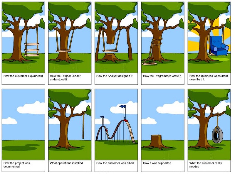
I don't remember the original source of this image but it's a comical take on the SDLC, showing how different roles / teams understand what the customer wanted versus needed when building a tree swing:

https://www.amarkota.com/Content/images/portfolio/trees.jpg


In a similar vein, I thought of the comic on how software companies are organized.

https://bonkersworld.net/organizational-charts


is there much truth to these patterns? I've never worked for FAANG so am unaware of their structures.


The Microsoft one was VERY true, at least until the mid 2K's. Small groups with lots of middle managers, bad communication, and hatred towards the other small groups.

Dunno how it is now though.


http://minimsft.blogspot.com is highly recommended for a view into this era.


Worse.


For MS, it was definitely true when there was the policy of firing the bottom 10% every year or something like that.

It created extremely perverse incentives where nobody wanted to help each other or would even go as far as to sabotage other people's work in order to make sure they're not on the bottom. Some managers would hire people with the intent to fire them later.


It was probably very true 10 years ago, for some of them it has become less true


Apple these days is very traditional with the SLT comprising the various VPs and everyone reporting to them via middle management layers.

In the period where Steve Jobs was not CEO it was a lot more like Microsoft with the various geographical divisions e.g. EMEA, AMR in particular having their own fiefdoms and starting wars with each other. And then of course the ridiculous number of skunkworks projects that would compete with other teams.


Looks about right for Google, but then which software company doesn't look like that?


Honest question for those who have worked at several software companies: What works best? The chart displayed with Google with lots of connections but also a lot of complexity, or the "traditional" Amazon chart?


Variations of it date back to at least the 1970s: https://www.businessballs.com/amusement-stress-relief/tree-s...


Impressive how not modern we are.


Completely orthogonal to yours, but the undergraduate text "Operating Systems Concepts" by Silberschatz et al. has always been good.

Every edition features dinosaurs, which totally relate to the concepts of CPU scheduling, IPC, memory management, etc.

The seventh edition is the absolute pinnacle, as the sauropod family on the front cover enjoy a host of electronic devices from the 80's and 90's:

https://i.imgur.com/5U87Pgt.png

Most of the covers are great.


It at one point was an illustration of how large and ponderous operating systems felt back then compared to most other programs.

https://pbgalvin.files.wordpress.com/2007/03/scan0001.jpg

A nice touch that got dropped was that the minicomputer and microcomputer OSes were smaller, more evolved beasts.


That's amazing. Thank you for the history!


Interesting that what operations supposedly installed was closest to what was actually needed, and only an additional binding away from a complete solution.


I worked in many companies that had it at the door to the Dev department.


This is exactly what I thought of coming into this post! I think I actually saw this first nearly 20 years ago and boy oh boy things don't change much (or should I say, people don't change much)


I thought it was from commitstrip


I first saw this cartoon in 1971.


https://paleofuture.com/blog/2009/3/23/computer-criminals-of...

  "The 1981 book School, Work and Play (World of Tomorrow) features this beautiful two-page spread. Apparently, thanks to computers, there's no crime in the future outside of the computerized variety. The "computer criminal" pictured really doesn't appear to be running very fast. Maybe they're playing a game of freeze-tag. Or maybe that policeman's gun has special settings the author didn't tell us about. I like to believe the former, but that's just me."
The book is full of really cool images like that one of "The Future" as seen from '81


> Computers will make the world of tomorrow a much safe place. They will do away with cash, so that you need no longer fear being attacked for your money.

Hahaha


It's not wrong. You no longer have to be physically present to have your money stolen. It's safer for everyone.


The growing use of Debit and Credit Cards eliminating the need to carry a hundred or so with you at all times for spending/errand purposes without requiring the merchant to take the risk of taking personal cheques was a huge revolution made possible by mass computerisation in the finance industry. This includes the current discussions many governments are currently having about simply not issuing cash money any longer.


Cash money still has its uses. I always carry some for tips and for when a business's payment card reader goes down and nobody knows how to process a card without it.


Since the pandemic especially, a number of businesses don't take cash, only cards, particularly some small breweries and independent fast food places in our area (Silicon Valley). I guess if the card readers all go down they are out of business until they fix it.


You are completely right but the core issue is that they don’t want to process credit cards or avoid fees.

Having money with you though is good in emergencies. Carrying a one dollar, five dollar and or a ten / twenty though is always a good idea.


> when a business's payment card reader goes down and nobody knows how to process a card without it.

Online fraud prevention is the most important part of online card processing, and can't be done offline.


Online fraud prevention is the most important part of online card processing, and can't be done offline

It was done offline for decades.

All the world's computers talking to one another is far more recent than credit cards.


I was paying for services rendered at the optician, and luckily had a wad of cash, but what's the user story there other than wait while they call support? I guess they could have invoiced me.


Yeah it's an interesting thought. Credit card scams, phishing, etc. have made new ways of stealing possible.

It's 'safer' as in I think you can claim muggings or burglaries (or losses to these) have reduced because people just don't carry as much cash anymore.


There is even a song written about that :)

> You don't have to rob me

> It's not really worth it

> I only have credit cards

> And I can just cancel them

> Know that you needed cash

> But what the fuck's up with that?

(DOMi & JD BECK - U DON'T HAVE TO ROB ME)


what a horrible website. Takes over my trackpad so I cannot zoom in on the image.

Where did we go so wrong? as to literally remove UX for no benefit


I can zoom in.


There is also UNIX Feud and Unix Views poster. All three are there in bonkers high quality at archive.org: https://archive.org/details/unix-magic

Also see: https://news.ycombinator.com/item?id=27029196


I have one of these hanging in my living room, they're beautiful!


I like your retro battlestation.

How did you hook your c64 up to an LCD?


Not the GP, but I have a composite / s-video to hdmi converter from ebay. You can get DIN to RCA or S-video (the C64 exposes seperate luma and chroma signals) cables for the C64 fairly easily as well. Picture quality is... fine.


Could be an Ultimate64.


But which shell is it?


Not strictly computer science, but I love this animation of a Fourier Series and I show it every time I have to explain it to somone

https://en.wikipedia.org/wiki/Fourier_series#/media/File:Fou...


Ultimately leading to: https://xkcd.com/26/


The classic sorting algo videos with sound come to mind first: https://www.youtube.com/watch?v=kPRA0W1kECg . Mergesort is my favorite video.

The main resource on learning Erlang, https://learnyousomeerlang.com, has a lot of funny ones, some of which are useful.


i also love this page, comparing different sorting animations for different use cases such as random, almost sorted, ...

https://www.toptal.com/developers/sorting-algorithms


May I add one that I made?

Illustration of QuickSort and MergeSort as two sides of the same coin: http://lkozma.net/images/sort/duality.pdf

I find this somehow both obvious and counter-intuitive, and usually the two algorithms are not presented in this way, as duals of each other.

I wrote up this view in more detail, but the figure above should be self-explanatory: http://lkozma.net/blog/a-dual-view-of-sorting-algorithms/


There's an important distinction that your explanation glosses over, which is that MergeSort is an out-of-place sort while QuickSort is in-place. As a practical matter, this distinction is important and it makes the two algorithms not quite duals. Your explanation of why we can assume that QuickSort pivots are medians makes sense, but it also glosses over one of the deep insights about why QuickSort works at all, which is that with unsorted data, the choice of pivot will rarely be bad (it will be "near the middle on average.")


Yes, this efficiency-aspect is not captured in the illustration -- while splitting perfectly _by index_ comes for free, splitting perfectly _by value_ needs nontrivial work (median-finding).


Yes and with naïve median-finding comes pathological inputs that hit the worst case O(n^2). Something to watch out for if you’re sorting user-provided input as that could open you up to some silly denial of service attacks!


QuickSort should be called PartitionSort - it would make this duality more obvious.


This is awesome. I think ppl should def share anything they made. As long as its not low-effort shilling... and your contributions are anything but!


That is great and should be in every textbook!


How do we understand, inside this model, that merge sort is easily stable but quicksort is not a stable sort?


What's the significance of this?


It's cool.


Super cool!


Various things explained without words in the same style as IKEA mounting instructions. Here is public key cryptography: https://idea-instructions.com/public-key/ and quicksort (KVICK SÖRT) https://idea-instructions.com/quick-sort/


Concerning the public key cryptography for the exchange of private encrypted messages, I would have rather represented the shared public keys by padlocks, and the private key by the key allowing to open the padlocks. This way, it is easier to understand that there is a relationship between the two keys. In his drawing, 2 different keys can open the safe door, which is not possible in the physical world...


I like this visual explanation of the Diffie-Hellman Key Exchange https://en.wikipedia.org/wiki/Diffie%E2%80%93Hellman_key_exc...


Yeah I've always liked this video explaining D-H using the same paint-mixing metaphor: https://www.youtube.com/watch?v=YEBfamv-_do


Just to let you know, out of interest, you can have two different keys for a physical lock. It's how master-keying works.


What about signed messages? Then the private key is the padlock and the public key is the... key.


In Networking, two illustrations of congestion control are just fantastic IMO.

First one is [1], by Chiu and Jain (page 7, figure 5), showing that Additive Increase / Multiplicative decrease is the only simple policy that converges among 2 senders (with rates x and y) to a rate that is fair (along the y=x diagonal) and efficient (along the x+y=Bandwidth). This is the basis of the algorithm that made TCP (and the Internet as we know it today) possible.

The other one is this diagram from BBR [2] (from the paper in [3]), that shows how BBR sets the window ("amount in flight") to the bandwidth-delay product (BDP) of the bottleneck link (the "volume" of the pipe in a water analogy). The cool thing is that you can only measure the delay of the link if you window is <= the BDP, and you can only measure the bandwidth if your window is >= the BDP, so the algorithm has to hover around this point to make sure it can determine both.

[1] Chiu and Jain, Analysis of the Increase and Decrease Algorithms for Congestion Avoidance in Computer Networks, 1989, https://www.cse.wustl.edu/~jain/papers/ftp/cong_av.pdf

[2] https://dl.acm.org/cms/attachment/9cf72499-b32d-4426-914b-cd...

[3] BBR: Congestion-Based Congestion Control https://queue.acm.org/detail.cfm?id=3022184


Chiu-Jain plots are great for getting a grasp of AIMD. Another related one I like is the figure illustrating ack-clocking in Van Jacobson's original congestion control paper - Figure 1 here: https://ee.lbl.gov/papers/congavoid.pdf


This is great indeed, and makes it for 2 illustrations from Van Jacobson's papers, separated by 28 years! (The 1988 paper and the 2016 BBR paper)


For network communication (and other stuff), I like sequence diagrams:

https://en.wikipedia.org/wiki/Sequence_diagram

There's a standardized UML version of this, but I think it's easier to read when the arrows are sloped a little, like in this random example: https://www.graffletopia.com/stencils/1560


The relations between Hilbert Curves[1], Gray Code, De Bruijn sequences[2]...

https://en.wikipedia.org/wiki/Hilbert_curve https://en.wikipedia.org/wiki/De_Bruijn_sequence

I want to make use of it in ClickHouse, but we did not (yet), see https://github.com/ClickHouse/ClickHouse/issues/41195


oh shiiiiit lol. I get it. that never made intuitive sense to me before. that's a good one.


Centralized, Decentralized and Distributed Networking https://www.rand.org/content/rand/pubs/research_memoranda/RM...


Drawing of self adjusting trees by Jorge Stolfi.

https://www.link.cs.cmu.edu/splay/tree5.jpg


My favorite is more a small presentation than an image: Admiral Grace Hoper Explains a Nanosecond. https://www.youtube.com/watch?v=9eyFDBPk4Yw

For me it changed my mind on wasting time on less efficient algorithms.


"What The Hell Have You Built" a classic from the NoSQL / Big Data / Distributed Systems heyday of the early 2010's

https://i.imgur.com/TOoXyVs.png


I really like the diagrams from Refactoring.Guru. They provide clear representation of what the design patterns are solving, along with real world analogies.

Example with factories: https://refactoring.guru/design-patterns/factory-method


I can't really come up with any good illustrations for something complex off the top of my head, so I'll go for a really simple one. In fact, that's part of its beauty.

When I had to deal with the signals from a rotary encoder the first time (being a programmer with two left hands and zero hardware affinity), I had a look at a couple of C libraries but didn't have the patience to slog through their implementations in order to understand what signals they were decoding.

...until I saw this: https://github.com/PaulStoffregen/Encoder/blob/master/Encode...

I'm not sure if it was this exact library, but that's the comment I saw. Nice and obvious, in contrast to all the obscure attempts to convey what was happening all the other libs made through prose comments.


The "cascading failure" GIF[1] from Wikipedia's entry of the same name[2].

(I'd love to see similar style animations of various crypto algorithms like MD5, AES, etc if anyone has the cycles.)

[1] https://upload.wikimedia.org/wikipedia/commons/b/bd/Networkf...

[2] https://en.wikipedia.org/wiki/Cascading_failure


Diagrams that show LDA, STA, cycles, etc. Like this one -> https://iitestudent.blogspot.com/2011/06/timing-diagram-for-...


Wow. Didn't ever think that there is something like this. I've heard about UML, but I've always thought that it is something related only to programming.


Variations on mean time between failure curves: https://hpreliability.com/wp-content/uploads/2015/09/Failure...

Comparing solutions based on the perceived reliability curves of their lifecycles is useful.


Fun chart, here's an article to explain a bit more (it was necessary for me)

ps: https://reliableandefficient.com/2015/07/how-your-equipment-...


Amazing article. I wish I had found it when I searched for the image. It's such an important explanation.


You forgot to include the article!


You forgot the link.


edited, thanks a lot


Not from the CS world, but I've always enjoyed the Smith Chart. It's a tool to figure out impedance (eg resistance but a complex number) matching on a boundary to reduce reflected power.

https://en.wikipedia.org/wiki/Smith_chart


I love nomographs. My favorite is this Van-der-Pol nomograph that calculates asphalt stiffness for different temperatures, penetration amplitudes, and loading rates. https://www.researchgate.net/profile/Hasan-Al-Mosawe/publica...


This gif explaining aliasing completely intuitively, without any words or symbols: https://commons.wikimedia.org/wiki/File:Nyquist_Shannon_theo...


No CS but Mathematics. A series of videos/animations by Welch Labs;

Imaginary Numbers are Real - https://www.youtube.com/playlist?list=PLiaHhY2iBX9g6KIvZ_703...

The above presentation in pdf: https://www.welchlabs.com/resources

This is the first teaching video/animation which wowed me (i prefer hard copy books).


These animations by Mike Bostock are great:

https://bost.ocks.org/mike/algorithms/


Ahmazing...


I absolutely adore this Dilbert comic, not really strictly Computer Science nor illustrating a concept, but I think it is pretty funny. https://dilbert.com/strip/1995-06-24


The cover of the second edition of Stevens’ “Advanced Programming in the Unix Environment” has that strip on its cover. [0]. Love it.

[0] https://www.amazon.com/Programming-Environment-Addison-Wesle...


http://www.r2d3.us/visual-intro-to-machine-learning-part-1/

This one will stay with me for life i think

Though perhaps more of a visualization than an illustration


This would be perfect, but in English, the description on the left refers to graph points in Meters while the visuals' data points are in feet.


Not only that, but they're different measurements: 242.8 feet is 74.005 metres, not 73m.


Anything from Setosa [0] is really good. It contains interactive, animated illustrations of several Machine Learning ideas.

I _loved_ reading papers from Distill Pub [1] as they contained interactive diagrams.

My most favorite one so far is the thread on Differentiable Self-organizing Systems [2]. I liked the lizard example very much as it is interactive, and lizards grow lost organs back. I think this is funny.

[0]: https://setosa.io

[1]: https://distill.pub

[2]: https://distill.pub/2020/selforg/


Bret Victor's animated explanation of Abstraction: http://worrydream.com/LadderOfAbstraction/

His approach to visualization is I think by far one of the best things on the internet. His rework of a classic paper on small world networks is fantastic as well: http://worrydream.com/ScientificCommunicationAsSequentialArt...


Shameless plug: I drew 36 illustrations of various data structures from simple ones like stack and binary trees to advanced ones like skip list and Merkle tree, and sell them as collectible card decks [0].

Use code HAPPY23 to save 15%.

[0] https://cs.cards


Quick thoughts:

Nice effort, and the format of the diagrams looks good. I do find the description close to impossible to read due to the use of all caps, monospace and most of all, lack of line spacing. I haven’t thought more on this, but within the constraints of the card sizes if this part could be improved, that’d be great.


Thanks for the feedback! I'll incorporate these suggestions in the next version.


Is it possible to ship to India ? Unfortunately I don't see it in the checkout page.


Can you email me at hello@cs.cards along with a screenshot? This is something determined by Shopify and I did not set anything that specifically leaves out India as a shipping destination.


I've been enjoying the illustrations at architecturenotes.co especially the posts about redis [1] and things you should know about databases [2]

[1] https://architecturenotes.co/redis/ [2] https://architecturenotes.co/things-you-should-know-about-da...


The two plots that explain Kernighan's lever: https://www.linusakesson.net/programming/kernighans-lever/


My favorite illustration is from Thinking Forth by Leo Brodie.

Here is a link to an article with my favorite picture from the book as its main image:

https://hackerboss.com/thinking-forth-the-unsung-classic/

It shows the "Universal Processor" which looks like a cross between a computer and a liquidizer and has a big knob on the front with "Data", "Word", "Food" on it! It is a humorous illustration of "An overgeneralized solution".

In fact Thinking Forth has lots of great humorous cartoons and super insights into making real software that it is still a good read today. You'll learn a bit of Forth too!

I read this book at a formative age, and despite not writing a great deal of Forth code, the philosophy of this book has stuck with me.

Here is a link where you can get an electronic copy as it is out of print now and Leo Brodie has graciously allowed it to be distributed under the Creative Commons license.

https://thinking-forth.sourceforge.net/


Youtube user Musicombo has plenty of videos showing different sorting algorithms in action and their runtime behavior under different (pathological) cases:

e.g.: https://youtu.be/vr5dCRHAgb0


If you're more of a Lindy learner:

https://www.youtube.com/watch?v=3San3uKKHgg


I believe this is the original account. They produced several similar videos:

https://www.youtube.com/@AlgoRythmics


That is really neat :)


Watching SORTDEMO.BAS at the formative age of ~11 baited me into programming. I recall messing around trying to make even faster versions. https://www.youtube.com/watch?v=leNaS9eJWqo


Not only related to CS, but to most management areas and life as a whole. Going from state(A) to state(B) should never be that complicated, right? Oversimplification at its prime.

https://www.thelogocreative.co.uk/wp-content/uploads/How-to-...


The old Usborne books as a kid

https://www.fastcompany.com/3056519/design-lessons-from-the-...

They released them as free pdfs a while back, but I can't find it now. Looks like they stopped that.


Great choice! Looks like they're officially up after a brief hiatus: https://usborne.com/us/books/computer-and-coding-books


I don't know how useful it is, but this depiction of a lexical scanner in Bob Nystrom's Crafting Interpreters always stuck with me.

https://craftinginterpreters.com/image/scanning/lexigator.pn...


Anything by Maggie Appleton.

For example: https://maggieappleton.com/databases


Does Hungarian dancers implementing sorting algorithms count as an illustration?

https://www.youtube.com/watch?v=EdIKIf9mHk0&list=PLOmdoKois7...


The Elliptic Curve explainer GIF in this blog post:

https://blog.cloudflare.com/a-relatively-easy-to-understand-...

Maybe this image if the URL doesn’t get munged:

https://blog.cloudflare.com/cdn-cgi/mirage/551bd7d005a1232db...


My fave is the “aging” diagram[0], for software bugs, from Steve McConnell’s famous Software Quality at Top Speed essay[1].

[0] https://stevemcconnell.com/wp-content/uploads/2017/08/art04-...

[1] https://stevemcconnell.com/articles/software-quality-at-top-... (The illustrations are slightly broken. You need to tap|click on the placeholder, to display the image).


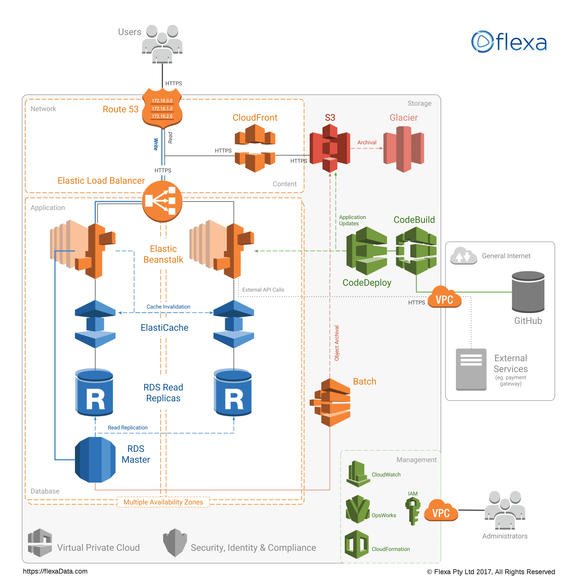
De gustibus non est disputandum, but I find these ugly. The icons draw too much attention, and (IMO) are incomprehensible.

They have zillions of products, so I understand that not all their icons can be immediately recognizable, but is there meaning to the colors of icons? I can’t think of, for example, a reason why “Batch”, “CloudFront” and “Glacier” have the same color.

Similarly, is there a language for recognizing icons? I don’t understand why EFS and CloudFront both are stacks of cubes, for example.

I think I would choose the same colour and/or similar shapes for all icons that denote data stores (examples: S3, Glacier, RDS), for example, a different one for compute (examples: Lambda, EC2, Batch), and a third one for connections (load balancer, Route 53, CloudFront)

Also, why are there such subtle differences in some of the colors? Do they mean something?

Finally, if one of your 100+ products is called “S3” and you have to design a recognizable icon for it, how on earth can you not put a big “S” and a big “3” in that icon? It can’t be that they want to avoid text at all cost, as they wrote “Aurora” in an other icon.


100% agree with you. The AWS icon/drawing design kit is just rubbish. It's super hard to read.


The Tanenbaum books on operating systems [1] and networks [2]. Here are just two samples, the various editions each have their slightly different illustrations.

I've always found it really awesome how the cover of a book can clarify concepts in such a funny and concise way :)

[1] https://www.amazon.com/Modern-Operating-Systems-Andrew-Tanen...

[2] https://www.amazon.com/Computer-Networks-2-downloads-Andrew-...


From Feynman Lectures on Computation:

Figure 7.64 "Circuit diagram for a PLA", which demonstrates how the logical duality between AND and OR is reflected, at the physical gate level, by a π/4 rotation between encode and decode planes.


The list monster from _Learn you a Haskell_:

http://s3.amazonaws.com/lyah/listmonster.png


If you include deep learning in CS then https://distill.pub/ has a lot to offer in this category.


My favorite is the JSON syntax diagram https://www.json.org/json-en.html


Anything from Red Blob Games: https://www.redblobgames.com/


I worked at several companies that had this poster hanging on the wall back in the day and spent a lot of time staring at it while on the phone. It comes immediately to mind.

https://www.scribd.com/doc/223671868/Poster-Protocolos-1


More recent (2006) version without paywall: https://www.cisco.com/web/offer/emea/7193/docs/Agilent_Netzw...


Thanks I had a hard time finding the original at all. I do remember it was specifically the one with the blue background in my case, though. Probably not “better” or even as accurate but it’s the one that really stuck out in my mind.


The cipher mode of operations on wikipedia. I bet you anyone that does even a little amount of cryptography will bring up the CBC one from https://en.wikipedia.org/wiki/Block_cipher_mode_of_operation...


I remember the Tux one showing the disadvantage of ECB.


that's a great one as well!


The cover of the 1st edition of the "dragon book" -- Compilers: Principles, Techniques, and Tools, by Aho, Sethi and Ullman

https://www.amazon.com/Compilers-Principles-Techniques-Alfre...


Log-structured merge trees have some good diagrams.

If you know a little bit about the problem space, the 3 main diagrams (2.1, 2.2, 3.1) in the whitepaper basically tell you how to implement it.

https://www.cs.umb.edu/~poneil/lsmtree.pdf


"The Library of Babel" by Jorge Luis Borges [0].

Borges was a direct influence on William Gibson most notably (to me at least) seen with the short story "The Aleph" by Borges [1]. Gibson had an "aleph" device simulating reality in "Mona Lisa Overdrive" (which many of the characters mispronounced as "LF" device).

[0] https://en.wikipedia.org/wiki/The_Library_of_Babel

[1] https://en.wikipedia.org/wiki/The_Aleph_(short_story)


There's another compsci tower of babel from 1969: https://archive.org/details/TNM_Programming_Languages_histor...

On the right. It's also the cover art for the book

Direct: https://ia800101.us.archive.org/BookReader/BookReaderImages....


I have no clue what's going on here. Context?


It’s based off a 1941 short story in which there’s a library of books which hold every possible combination of letters.

The idea is that every story, song, piece of knowledge, etc are in there if you know where to find them.

(And also, every erroneous fact, false story, etc)


Not as exciting as many others, but I always have a soft spot for the old centralised/decentralised/distributed systems diagram: https://www.researchgate.net/profile/Christopher-Ehmke-2/pub...

It was my first introduction into actually thinking about and working with distributed systems at University, a field I've been in love with since, so it seems quite formative. Plus I always thought aesthetically it looks lovely, like it'd make a good tattoo.


Absolutely loved the illustrations from https://pikuma.com/blog/isometric-projection-in-games about isometric projections in games. A work of art, and engineering.


Weird that no one seems to have mentioned the Unix Wizard poster: https://jpmens.net/2021/04/09/the-unix-magic-poster/


Oh man a friend of mine used to have a shirt with a delightful illustration of the madness that is ATM, or maybe it was just illustrating IP-over-ATM. It had packets being like thrown into woodchippers and reassembled if I’m remembering right. Wish I could find it again.


Martin Fowlers diagram on the cost of presumptive features / YAGNI. It nicely breaks down the costs, whether it’s the right feature or not!

https://martinfowler.com/bliki/Yagni.html (Scroll a bit).


Diffie-Hellman key exchange pictures that use mixing colours to illustrate the concept.


https://9gag.com/gag/ayd9jRb

I really like this comic. Mainly the "Testing in production" near the bottom right.

It mocks agile in it's different forms.


I have the opposite: my most hated illustration.

It's the standard diagram of how Transformer language model works (https://www.researchgate.net/figure/Transformer-Language-Mod...). When I tried to figure out transformers, I saw it in every single paper, and it didn't help almost at all. I think I finally got a good understanding only when I looked at a few implementations.


Also it is wrong. The paper has add and norm, but the official implementation and all other good implementation has pre norm architecture: https://twitter.com/francoisfleuret/status/14671353665032192...


Wikipedia's animated illustrations of sorting algorithms are awesome:

https://en.m.wikipedia.org/wiki/Quicksort


From Transaction Processing: Concepts and Techniques:

Figure 2.3 (also inside the front hardcover) "The Price/Performance Tradeoff"

A diptych of size vs. cost, and latency vs. cost, for various storage technologies (in 1990. that said, the shape of the curves has not changed much in 3 decades; only the absolute numbers are out of date)

(FWIW, the "tape robot" streamed architecture they predicted has indeed come to pass; it's just that we use network flows instead of tape robots as our stream endpoints)


Not useful, nor aesthetic perhaps.

https://poignant.guide/images/the.foxes-2.png


I think the field of automata has some lovely diagrams.

https://en.m.wikipedia.org/wiki/Automata_theory

I'm sure many are familiar with state diagrams, directed graphs that can be used to explain regular expressions or any other FSM

Turing machines also can be represented with a diagram featuring a "tape" - so elegant

Professor Rick Thomas made a great impression on me whilst lecturing on the subject of Automata


A visualization of the basis functions for the discrete cosine transform by Brian Hayes in his American Scientist post a long time ago [0].

For some reason, Fourier transforms just didn't click until I saw that picture.

[0] http://bit-player.org/wp-content/extras/bph-publications/AmS...


And also every article in this website:

https://ciechanow.ski/gps/


From Gödel Escher Bach:

Figure 40. (a collage of scripts, demonstrating how meaning can be carried in strings of [many different choices of sets of] symbols: compare Turing or Shannon)

Figures 135 & 136. (Escher's Drawing Hands, followed by a structural sketch showing how the paradox of mutual recursion can be solved by something implicit and prior to both: compare McCarthy or Curry's Y combinator)


Learn You A Haskell is full of useful illustrations.

http://learnyouahaskell.com/


arbital's article on Bayes Theorem contains a waterfall diagram that just perfectly encapsulates the idea, at least to me.

Linking the whole article but if you scroll it's the 5th image. https://arbital.com/p/bayes_rule/?l=693


I'd really like to see more eye pleasing version of this, but those symmetries are wild - Quasi-periodicity 17 fold symmetry - https://www.goldennumber.net/quasi-crystals/#jp-carousel-988...


tcp/ip state transition diagram (over here: https://users.cs.northwestern.edu/~agupta/cs340/project2/TCP... )

however it takes a while to get all the details...


Definitely not my favorite, but useful enough. A cheatsheet for `lens` haskell library:

https://raw.githubusercontent.com/wiki/ekmett/lens/images/Hi...


Everything from Land of Lisp!

http://landoflisp.com/


Does this count?

https://www.kaspersky.com/content/en-global/images/repositor...

I don't think it needs explanation. Pretty wild.


It needs explanation


I drew a 9 page DTM that implemented binary multiplication for an assignment in a CS class at USC (southern cal) in the mid-90's. It is my favorite CS illustration. However, I am certain that no one else would be interested in it, as it is very specific, archaic, and personal.


What came to my mind is "An Introduction to Microcomputers" by Adam Osborne. I don't think I can find my copy anymore. If I remember correctly, there were block diagrams showing the main functional components of a microcomputer, E.G. the ALU, Arithmetic Logic Unit.


Likely the diagram of the multiphase multi-tape sort diagram that was a foldout in the first edition of TAoCP. As tape fades from memory and usage, the diagram has been removed. It is a sentimental favorite of mine as tape was important in the early part of my career.


For me, Penrose Tiling (https://en.wikipedia.org/wiki/Penrose_tiling) is an intersection of math, computation, architecture and design.


A while back I made a small NFT collection with my favorite CS illustrations:

https://instagram.com/citationsnft

It was an experiment that didn’t do much commercially, but we learned a lot from it.


Seems weird to make unique someone else’s work. How does that work from an IP standpoint?


I re-drew the artwork based on the originals from the publications, it’s not copy-paste images.

This, plus the fact that the original source is cited, makes it work.


It doesn't.


The progress graphic in the Disk Defragmenter tool shipped with Windows 95 and Windows 98.


Ah, my sweetest memories are of getting the whole family on the couch, grabbing some popcorn, pouring some soft drinks and watching Windows 95 defragment my disk for three hours as soothing chirps and hums emanate from the grey box beneath the monitor.


The “I wan to run an agile project” animation https://youtu.be/4u5N00ApR_k Nothing comes close to this, sums up the whole idea from bottom to the top perfectly


Thought this was pretty bad. The leading parodies were straw man examples of “agile project”.

The author certainly seems to hate “agile” but doesn’t have any critiques for it. Instead he’s punching at ghosts.


I guess someone has to mention the Periodic Table of Perl-6 operators: https://www.ozonehouse.com/mark/periodic/


Ever wanted to look inside of a CPU executing code? http://visual6502.org/JSSim/index.html


https://github.com/girliemac/a-picture-is-worth-a-1000-words

Specially the git-purr one that explains git.


All the basics of computer science and algos explained brilliantly https://medium.com/basecs


A couple of my favorites, including “A good architect leaves a footprint”

https://imgur.com/a/xH2YIg3


Sorting out sorting is a classic! https://www.youtube.com/watch?v=HnQMDkUFzh4


I love these mechanical mechanisms animations: https://mechamechanisms.com/


This comic by Rory Blyth is my personal favorite:

http://wyorock.com/excelasadatabase.htm


Watching sorting algorithms _play_ out. For example:

https://www.youtube.com/watch?v=f0zcl5ERS8E


I’ve always found https://rxmarbles.com, illustrating rx functionality pretty neat


Time space diagrams in distributed systems. Very obvious once you see but never before saw some critical problems in distributed systems like fifo ordering, causal ordering and other things explained with such diagrams.

did not have formal education on distributed systems in my country but learned many things in this topic on job.

So then me took course by lindsey kuper on youtube. it is amazing course, super clear instructor even for me with not good english.

i think professor in this class say these diagrams came from leslie lamport who did lot essential thinking in distributed system space


maybe not CS concepts, but wanted to re-share Perpendicular disc storage from Hitachi. https://www.youtube.com/watch?v=xb_PyKuI7II It's a simple concept to explain, but animation sure makes it fun and lasting.


Not an illustration, but I really like the Hungarian Algorythmics videos


Grokking Algorithms is a funny and enjoyable read


TCP Windowing


which diagram/illustration were you referring to ?


The glider


https://xkcd.com/627/

(Tech Support Cheat Sheet)


Xkcd, this one https://xkcd.com/303/


I am a little bit surprised that there isn’t more references to cartoons, especially xkcd


breads


Guidelines | FAQ | Lists | API | Security | Legal | Apply to YC | Contact

Search: