I don't think it's too bad, it just needs a bit more discoverability.
I use KDE now as main driver which has a ton of options compared to macOS and they use the same format. What I do find myself using a lot more is the search. Part of the reason I didn't have to do this with the old macOS preferences was just my muscle memory (only slightly thwarted by Apple's changing of the icons). And the other part was that there's simply less to find there.
But essentially I think the scrolling left and right panes are not a bad idea. The old format consisted of a non-scrolling and non-resizable(!) window that would be replaced, and this caused some issues on really low-res screens in the past, at 800x600 pixels (or even 800x480 like the eeePC) it was impossible to reach all the settings on the old preferences.
At least this is now fixed to a format where more controls don't need to be crammed into the same space, it can simply expand. And the number of "menu" options is now also dynamic and no longer constrained by screen space.
But it's going to mess up decades of muscle memory which is not fun :)
> I use KDE now as main driver which has a ton of options compared to macOS and they use the same format.
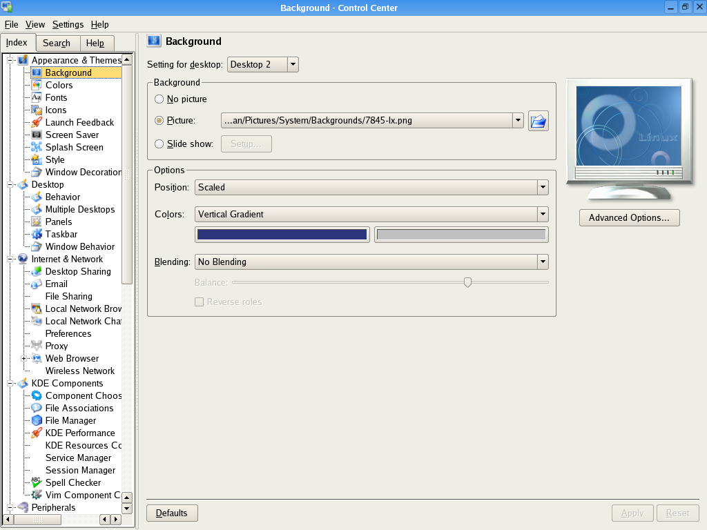
Those of us who remember the old tree-based layout from before Kirigami took over were about as happy about the change as macOS users are about the new Preferences layout in Ventura. It used to look like this a long time ago: https://fedoranews.org/krishnan/review/kde3.2/fullsize/contr... -- it was a lot more space-efficient and going into one sub-section didn't automatically hide all other sections, so it was a lot easier to look for things.
I don't recall if the window in Plasma-era releases was resizable but it certainly replaced one that was both scrolling and resizable. Early 5.x releases still supported the tree-based layout IIRC but it hadn't been the default since the 4.x days, which used that awkward icon-based layout, eek!
> But essentially I think the scrolling left and right panes are not a bad idea.
Until touch/mouse inputs have a widespread support for horizontal scrolling by default, like they do for vertical scrolling (scroll wheels or two-finger drags), I think they are going to remain a bad idea: you have to move your pointer from the thing you are looking at to the scrollbar and then back.
One could say it's a chicken and an egg problem, but displays are already much wider than they are taller, and if you do need them even wider, you are failing miserably IMO.
Apple's trackpads have supported two-finger horizontal drags for ages. If you're on a Mac right now here's something I did that's explicitly designed to be a very long horizontal scroll that you can try it with: http://egypt.urnash.com/rita/chapter/01/
Yeah sorry about that, I meant that both panes scroll independently (but only vertically).
I totally agree about horizontal scrolling by the way, it's horrible. I used to use Siebel 6 which used that heavily. And Microsoft's Azure portal does it too Though in Azure it's more like a 'breadcrumb' thing to go back, you don't normally need it. In Siebel you actually needed it to get to some important fields.
I use KDE now as main driver which has a ton of options compared to macOS and they use the same format. What I do find myself using a lot more is the search. Part of the reason I didn't have to do this with the old macOS preferences was just my muscle memory (only slightly thwarted by Apple's changing of the icons). And the other part was that there's simply less to find there.
But essentially I think the scrolling left and right panes are not a bad idea. The old format consisted of a non-scrolling and non-resizable(!) window that would be replaced, and this caused some issues on really low-res screens in the past, at 800x600 pixels (or even 800x480 like the eeePC) it was impossible to reach all the settings on the old preferences.
At least this is now fixed to a format where more controls don't need to be crammed into the same space, it can simply expand. And the number of "menu" options is now also dynamic and no longer constrained by screen space.
But it's going to mess up decades of muscle memory which is not fun :)