Edward Tufte gives the pie chart a more succinct and decisive treatment in "The Visual Display of Quantitative Information":
  A table is nearly always better than a dumb pie chart; the
  only worse design than a pie chart is several of them, for
  then the viewer is asked to compare quantities located in
  spatial disarray both within and between charts [...] Given
  their low density and failure to order numbers along a
  visual dimension, pie charts should never be used.
Tufte is simply wrong here. A pie chart implicitly conveys an additional piece of information which a series-style chart like a table or bar chart does not: that the information presented represents some meaningful total. A table listing percentages can achieve the same result, as can a single bar, but both require closer inspection. For a small number of variables, and particularly where there is a large disparity between the values, a pie chart is better. Unfortunately, many people break this contract with the viewer and present a pie chart solely to show the ratios, in which case I would agree that it is poor presentation.
Showing the ratios is fine: your meaningful total is their total.
For instance, showing revenue breakdown while trying to explain that some department pulls more than the rest. Here, without normalization (via pie charts, percentages, stacked bars) it becomes more difficult to compare the ratios. This perfectly mirrors the idea of sufficient statistics for a particular inference.
I'll also argue that pie charts are still terrible ways to display "data of bounded measure". The primary arguments are (a) people are quite terrible at doing accurate comparisons with area or, worse, arglength and (b) it tends to destroy the consistency of you labels since there's not a clear preferred ordering in a pie chart.
In this case, I'd say that stacked bar charts or empirical empirical CDFs do a much better job displaying bounded data, and, if you can suffer removing the bound, then simple bar charts or dot plots do it best.
I'd be amazed to hear of a time that a pie chart is actually optimal. I think perhaps the best argument going forward is if ratios are sufficient for your story even with the labeling obscured (it just adds noise). Here, the ambiguity of the ordering on a pie chart might provide exactly the right vehicle.
I still wouldn't know whether it should be computed by arclength or area, though.
I think perhaps the best argument going forward is if ratios are sufficient for your story even with the labeling obscured (it just adds noise). Here, the ambiguity of the ordering on a pie chart might provide exactly the right vehicle.
The use case you describe is actually quite common. If I have eight products and want to see at a glance which are contributing the most to my bottom line, a pie chart is perfect. The two conditions are met:
1) I'm looking at a meaningful total (all of my products)
2) I'm only interested in the ratios among them
To clarify, showing ratios is fine in a pie chart as long as the pie represents a meaningful total. If I just showed my top 3 products rather than all of them (or at least all of them in some explicit category), then using a pie chart would be inappropriate because there is no meaningful total; a bar chart or table would better in that case.
I still respectfully disagree that there is almost any purpose at all for using a pie chart. We're just, as humans, not terribly good at making visual comparisons on angular scales.
I think you may have missed his point, I had an opportunity to go to Tufte's talk and his issue is their mixing of of area and lack of numbers. He points out that you can take any pie chart, convert it to a stacked bar chart of one 'bar' and put the numbers along the stack axis on one side and qty labels along the stack axis on the other side and convey more information, more accurately, and in less space. Pie charts are big wide open wedges of color and no additional information so they were inferior.
What Tufte is missing is that a pie chart does immediately convey one additional piece of information that a bar chart can't without closer inspection: that the individual wedges add up to some meaningful whole. With a bar chart, you need some kind of explicit labeling to indicate that the bar represents a total, whereas with a pie chart it's implicit. It's inherent from the topology: as a circle, the pie chart is closed, implying that there is no additional data and that only the ratios are important. A series such as a bar chart or table is not closed, carrying the implication that it might simply have been truncated for reasons of space or clarity. A series-style chart also may or may not be presenting absolute values rather than ratios, and further inspection is needed by the viewer to distinguish which is the case.
I get what you are saying, basically that the 'pie' itself is a sum of units. However, I expect that Tufte would tell you to include that information more succinctly (or densely). I actually re-did the graphic in Corel Draw to show this but darned if there is a way to upload here, so I've put it in a google 'drawing' : https://docs.google.com/drawings/d/11hLh7DarPLrRHwVOQAC6Semn... which may or may not come through.
The top bar, which bounds the bars with the axis label 100% conveys the same 'from a whole' concept that the pie does in less space. Its also commutive across all three bars :-)
I think you're overstating the value of a pie chart's to ability to communicate that the parts make up a whole.
I agree with the OP and Tufte: something else is nearly always better than a pie.
Not too fan boy Apple too much but it is one of the few that uses pie charts effectively. But it is normally with only 2 or 3 pieces and usually to reinforce the difference in share.
I'll point out that less information can in fact be a good thing. A min-max-normalized line chart is not always better than an unnormalized one, though people often assume so, and adding the numbers or other easy means of comparison to imprecise or insignificant data only serves to distract.
For example, consider the voting pie charts earlier. Is it really helpful to notice that independents pick "other" a whole 1% more often than republicans? Because with a bar or labeled chart, you will pay attention to that.
See jgrahamc's post above for a great alternative: a set of bar charts color-coded into subsets. Much more effective than a big pie chart. Many other "part-of-a-whole" charts improve on pie charts as well.
Another aspect - pie charts beyond about three wedges are utterly useless to the colorblind. The OP's Microsoft example is particularly egregious in that aspect as well - I can't distinguish most of those colors, especially given the minuscule legend. So the entire pie chart is quite literally wasted on me. A blank rectangle would convey nearly as much information.
As a colorblind myself I couldn't agree more. But this is not limited to pie charts, any kind of graphics that uses more than 3 colors to identify labels in a list is completely illegible for me.
>pie charts beyond about three wedges are utterly useless to the colorblind
The problem lies in using a color-coded legend, not in using pie charts per se. The slices of a pie chart can be labelled directly (instead of indirectly via a legend), e.g.,
http://www.fedstats.gov/kids/mapstats/graphics/pie.gif
>particularly when the actual numbers are unimportant.
That's more or less my philosophy on pie charts. I find them helpful to use at the outset of a presentation to help provide some context for what's to follow (for example, the relative sales of Divisions A, B & C).
That said, I have no sympathy for anyone who uses side-by-side pie charts in order to make comparisons.
* Put the segments in sequence of size (smallest first or biggest first going clockwise)
* Add a legend or labels
* Make sure any colours you use can still be differentiated when printed greyscale
Honestly, I'd tolerate them more if I could just understand which segment was bigger than another segment and had some meaningful way in which to vaguely guess the value behind a segment.
What pie charts are good at is providing a visual comparison of a series of values that compose a whole. Pie charts work when you're trying to represent a percentage of a total value. The example in the link about "features" is crap because unless you're given a value of "100 features were implemented across these versions" the comparison that Word 2000 and 2003 provided similar values is meaningless.
Its not that you shouldn't use a pie chart, it is just about knowing when to use the pie chart to represent your data
In section 7.6 Plots and Charts the author explains very clearly the typical issues with bar diagrams and pie charts. Moreover, the whole chapter 7 Guidelines on Graphics is worth reading even for those who are not interested in the PGF package.
The PGF manual is one of the best introductions into that topic I'm aware of.
Re: the claim that groups of pie charts are especially awful, I have a counterexample. How would you express this more clearly without a series of pie charts?
The example you give falls into the 'multiple pie chart' nightmare where it's hard to compare the percentages across charts. At the same time I can easily see how far from a majority each group is and also the pattern in abstaining from the question.
The problem with using stacked bars in political situations is that the 50% threshold is critical. Without reading the numbers, it's much harder to tell with stacked bars whether a close vote (or poll) is at 48% or 52%.
You don't need to go back to a pie chart for that. On the chart above that I created there is a clear 50% line in the middle. If necessary, it could be darkened to make the mid point more obvious.
That doesn't mean it's inaccurate, that means it's emphasizing the comparison between relative numbers rather than absolute numbers. If it was the way you wanted, then the percentages would be difficult to compare.
Couldn't you encode the sizing with the size of the pie? ie, if Independents are the smallest group, they should be a smaller circle. In this manner, area allows for accurate comparison (it could be that more Republicans disapprove of direct voting than Independents approve for example).
You could do that, but then you compound the problem of comparing the size of slices with an additional size of circle comparison. Humans aren't good at comparing size between these kind of shapes. We're much better at comparing rectangular shapes. You'd be much better off splitting the visualization into two bar charts - one for the % of group calculation and one for the total count of people calculation.
There is a really good exception to this rule. When you're only conveying two options in a pie chart it's much easier to discern a winner then in a table or in a bar graph.
He is very good at explaining Tufte's work. The best part of his books and website are comparisons between a typical charts or dashboards and his re-designs.
This fellow has been heavily downvoted (at 1:32 EST, anyway), but he has a point. For conveying information, pie charts are definitely not the best. To make an audience happy with your presentation, sometimes it is just best to give them the pies they want. Most laymen are used to them and find them friendlier than more complex charts.
For what it is worth, couple of things I regret about that post. I was terse, and the tone comes off arrogant. Mainly, my use of "You're" instead of "Your" which I'm usually careful not to mistake.
I'd like to think those are the source of the down votes--as I'd hate to believe we've forgotten the golden rule "customer is king". If their client comes to them and says "I want a pie chart" they should not give them 48 reasons why pie charts are terrible. They should just give them a pie chart.
I'm not suggesting that when ever they have data to convey their first thought should be to use a pie chart. I'm simply reminding them pie charts are a commonality of customer data visualization requests--hate them all they want they still will be using them.
- they fail to convey information because people have a really hard time judging relative areas instead of lengths.
- there are times when a pie chart is appropriate
- once you get data that isn't widely different or you have lots of categories your pie chart would be better as either a bar chart, or as simply a data table
- pic of horrid "word features" chart
- why is it bad?
- releases occur chronologically, but the data is displayed in a clockwise fashion with no obvious starting point
- the pie chart has no values on it at all, so we are left staring at the chart trying to guess the relative sizes of the slices
- the chart is 3D
- which makes it extra bad for estimating relative sizes
- 3D pie charts are simply an abomination
- making them 3D just makes them even harder to interpret
I have yet to see a single example of where a pie chart was superior to any of the obvious alternatives. They are particularly troublesome for those that have less than perfect RGB vision, and even then I often find myself trying to deduce which arbitrary shade of blue is which due to the fact they're sandwiched between two other random colors.
If you wanted to make a chart that looked impressive but contained as little information as possible, you'd have to work to do better than the pie chart.
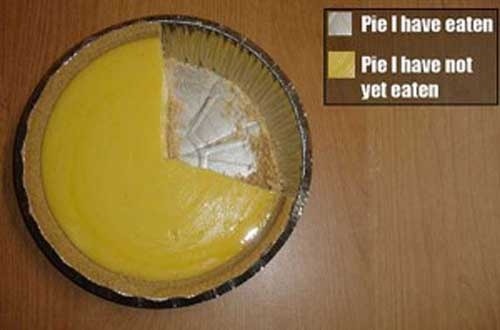
I was going to leave a smartass comment about the deliciousness of pie when I scrolled down and realized that I left a similar smartass comment on the post last time I saw it years ago.
Pie charts are never fine. They're always useless chartjunk which serve little to no purpose. They're used all the time by people who should know better.
Even a case of comparing A vs B is better represented by bars than pie slices.
Pies give you an at-a-glance indication of whether something is more or less than a half (obtuse/reflex angle) or a quarter (right angle). This seems to be the sum total of their utility.
Stacked bars may be ugly but at least you can use the segments to make more precise measurements.