Related: high- versus low-contrast. Most colour schemes are low-contrast, and I haven’t the foggiest idea why, because I’ve always hated that, and find it makes no sense whatsoever (zero) as a decision.
I used to use molokai (dark, fairly high contrast); a few years ago I decided to build a new minimal, light, high contrast one from scratch, which I called “bland”, inspired by the printed code of yesteryear. Paired with Triplicate, the only true serif monospace font that I can think of (I have a vague feeling I found one other once, but can’t think what it was). Black text, white background, keywords bold, comments italic, that was it. I tried that for a few days and decided I liked it, but did want strings and comments distinguished, so I made strings red, comments green, numbers blue. Over time then I’ve added a small number of other cases for specific languages and constructs, but it’s stayed very minimal compared with what almost everyone’s doing.
Well, I deliberately tried it for a couple of weeks, then went back to molokai for a week before I broke and went back to bland because I found it just so much better.
It was a couple of years before I even bothered to make a dark variant of the theme, for the occasional low-light situation where dark actually works better, and because I wanted to have a dark mode on my website. I almost never use bland-dark.
I highly recommend the various tempus color schemes[0], they are designed to be high contrast.
Tempus is a collection of themes for Vim, text editors, and terminal emulators that are compliant at the very least with the WCAG AA accessibility standard for colour contrast (which stands for a minimum
contrast ratio of 4.50:1—while some items have a 7.00:1 rating, or else WCAG AAA).
I use one of the AAA schemes. It's not perfect though, certain color pairs are low contrast (typically the "dark" and "light" variant of the same color).
Yeah, high-contrast is much riskier on dark themes—it all depends on whether you’re going for æsthetic dark, accessibility dark or low-light dark, which are three different situations with quite different needs. But for light themes at least, high contrast has no serious risks.
I think the "molokai" theme mentioned a couple times might actually be "monokai" getting autocorrected. This is probably better known as "the Sublime Text 2 default theme" to most.
I think it's just an individual thing, and we should all respect that.
There is a litany of posts and opinions of people who say their eyes hurt with a light color scheme, or it produces spots in their vision, or it hurts their concentration etc. I have no reason not to believe them. Many people prefer to even show their code in a dark scheme on websites. Furthermore, many people don't care but think dark is cooler.
On the other hand, I know that for myself, coding in a dark scheme is rather painful, especially if the background is very dark (as opposed to some gray). It makes it very hard to concentrate and I experience this on all of my displays. I do not have scientific evidence for any of that, nor do I really care to produce it. However, I look at code every day, so I know what works for me. The same will be true for other people here.
I think developers should treat it as an accessibility issue. Apps should have a dark mode, since many people clearly need it. Apps should also have a light mode, since people like me need it.
It's not that these people are lying, but it is common that people's subjective experience is biased by their expectation.
If I expect that dark themes are easier on the eye, I'm likely to experience any eye strain that might be caused by a bright theme in an exaggerated fashion.
Similarly, if I were to buy into this "the Pulfrich effect will slow you down" hypothesis, I might subjectively experience a benefit from switching to a light theme.
I don't buy into the hypothesis, so I'm sticking with a dark theme (as well as f.lux cranked up to eleven).
This is absolutely the right approach. Who cares which is "scientifically" better? The truth is, probably around half the population prefers dark mode, the other half prefers light mode. Apps, tools, dashboards and the like should give users the choice to toggle between the two. That's it. All this evangelicalism for one mode or the other is pointless.
So, I have used both routinely, and don't really care too much one way or the other. I use dark more often, but if for whatever reason I'm in an editor that is light-themed (which happens not uncommonly), it's not worth any of my time to switch. So I don't have strong emotions on this.
However, I do notice that "because science says so" is becoming a more and more common "you are not allowed to argue with my conclusions" kind of add-on to any assertion. It is an oddly religious, faith-like use of the word "science".
It's so weird. Why isn't it enough to just say "I've tried both, and light backgrounds are easier on my eyes." Pulling out weak science just makes it seem like they're insecure in their opinion (if you can even call it an opinion when talking about which option is causing an individual discomfort)
> However, I do notice that "because science says so" is becoming a more and more common "you are not allowed to argue with my conclusions" kind of add-on to any assertion. It is an oddly religious, faith-like use of the word "science".
True.
I don't care with what science says, I actually tried to use a light theme and I just couldn't do anything.
> However, I do notice that "because science says so" is becoming a more and more common "you are not allowed to argue with my conclusions" kind of add-on to any assertion. It is an oddly religious, faith-like use of the word "science".
Conclusions are based on science? So, in a sense, they are the best result available based on evidence, best accepted theories, reasoning? Isn't it logical to say then that one approach is better that another because it's "based on science"?
What is faith-like here? Faith in scientific method, instead of having scientific method based on best results?
What is faith-like is taking conclusions which the science justifies, at best, as being true on average and treating them as invariably true for each individual. It's the fallacy of division elevated to dogma.
I think the point that's missing is reflective vs. transmitive surfaces -- that brain is used to processing not the latter, but the former -- where reflected light is related to, and less than, ambient light. If we were using hi-res color e-ink displays, I think he'd be right about eye-strain. However, using a light scheme with mostly text, you have a huge rectangle of LED (most of the time) white light blaring at you, which itself causes eyestrain.
> However, using a light scheme with mostly text, you have a huge rectangle of LED (most of the time) white light blaring at you, which itself causes eyestrain.
I'll basically repeat my comment from below, but ergonomically set up displays meet ambient brightness, but don't exceed it (much). If you're sitting in front of a display set to 80 % brightness (~300+ cd/m²) in the evening, you're simply holding it wrong and compensate by limiting the content to dark tones only, which is a crutch at best.
That's not to say people shouldn't use dark themes. But if the reason for choosing a dark theme whenever possible is mostly "white is so bright it literally hurts my eyes", then the environment is decidedly wrong and needs fixing.
Over-bright displays relative to the ambient light are definitely an issue. I've found myself feeling much less strongly about light vs dark since I installed some LED strips on the back of my monitors as bias lighting. (I didn't want to dim my monitors much more because you do lose contrast when the backlight is low)
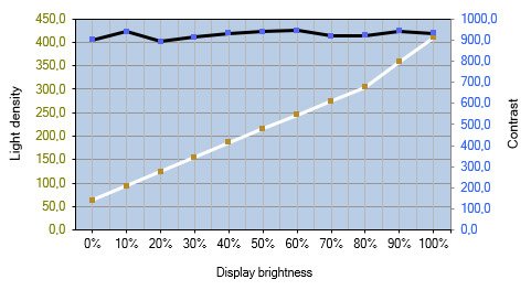
Contrast ratio is largely independent of backlight brightness. Intuitively this makes sense, because the panel is essentially just an adjustable light filter, which you'd expect to behave linearly.
I have three screens. I adjust the brightness on all of them twice per day, but you couldn't pay me to navigate the on screen displays with the mushy buttons more often than that.
> I'll basically repeat my comment from below, but ergonomically set up displays meet ambient brightness, but don't exceed it (much).
This is true in a world where many UI backgrounds are close to "white", i.e. maximum brightness. That in itself is an unfortunate situation (though driven in part by the technical limitations of display technology until now) because there are plenty of cases where you actually do want the ability to display above ambient brightness, just not for what is meant to be a neutral background. HDR displays are designed for high peak brightness and shine with photorealistic content - pun intended.
Content such as games, video, photos all have in common that their colour/brightness histograms are much less skewed towards the extremes than typical UIs which are dominated by large uniform, mostly bright areas. Those should be limited to ambient brightness, and ideally on a true brightness plane, not clipped to the faces of an RGB cube.
White text on black background is hard to read, at least for me as I get a halo effect around text edges due to my astigmatism. However, that is an extreme colour scheme. A more balanced colour scheme like monokai is much better and gives better contrast than a light colour scheme for syntax highlighting, and reduces my eye strain as the monitor isn’t emitting as much white light. I also suffer from floaters, as others here seem too as well, and the main way to make them less distracting / hide them is to use dark colour schemes.
My work office, back when I had to go into the office, used overhead LED ‘energy efficient’ lights that were far too bright and had a colour temperature that was too white. They then painted the office walls white, I thought I was entering limbo every morning.
I think the key takeaway is that it all comes down to personal taste, and there is no universal colour scheme or brightness level that everyone is comfortable with.
Unscientifically, I can attest to light schemes being easier for me to handle than dark ones. Of course, I adjust my overall monitor brightness according to the ambient light (so do not use full brightness in the evening).
I'm astonished (dismayed?) by how many people give presentations or record otherwise very useful videos with dark mode content. That content is unviewable when the ambient light of the viewer's surroundings is high (such as daylight, or especially when outside). A great presentation is diminished in worth if it can only be consumed in less than all circumstances.
As an aside, it is important to control the ambient light if possible, especially where "daylight" (high K) LED lights are concerned. Not only does the high volume of blue rays take a toll on your eyes, but it also impacts melatonin production. And of course it means you likewise have to have your display brighter.
Recording low-contrast, low-brightness screen contents also significantly increases compression artifacts (or, alternatively, increases bitrate to maintain the same quality as a light scheme).
> Of course, I adjust my overall monitor brightness according to the ambient light (so do not use full brightness in the evening).
I suspect this may actually play a significant role here, since "light themes are way too bright / blinding / etc." is a common reason for the preference for dark schemes, and hints at incorrect monitor brightness settings.
As a rule of thumb, indoors in an office space around 100-150 cd/m² are the right ballpark. This corresponds to a brightness setting of around 20-30 % on most screens. In the evening with a little bit of bias light 0-5 % are usually the right area, though too bright on some models.
> Using a dark colour scheme to write code requires more eye processing power than using a light colour scheme. Sure the difference seems negligible, it's only a few milliseconds. Actually, it's a few milliseconds every time you "rescan" your screen; that's between 10 or 50 times a second, depending on what research you want to believe.
Why is it assumed that this delay is a bad thing or necessarily increases cognitive load? It seems to me like it could just as easily be a positive.
Reading faster doesn't indicate higher reading comprehension. There's a substantial amount of cognitive load in reading "flat" text and constructing the whatever structured representation exists in one's mind. Slightly delayed reading speed could help rather than hinder comprehension and higher-level semantic processing.
It's a pretty tenuous idea that seems to be based on the assumption that the brain is like a single core CPU, and wasting a few ms extra on visual decoding will leave less processing power available to reason about code. Also seems to assume that every time you "scan" a scene that your brain has to start from a blank slate, whereas my own (probably stupid and not based in any presentable scientific fact) assumption would be that it's more of a delta process.
Articles like this are pointless. What kind of actual research has been done? What actual understanding of both the Pulfrich effect and how our brains process visual imagery does the author have apart from having read a couple articles online? None you say? Well. I’m going to continue using a dark color scheme to code as I have for years. Because it works better for me.
I have bad floaters in my vision and dark color schemes are the only ones that let me get work done without problems. I consider a light/dark toggle to be a worthwhile accessibility feature. Indeed, I'm using a Stylus script to make HN gray on black.
Just because it doesn’t look like this has been mentioned already. I’m not sure that the time it takes to process and recognize a character in milliseconds is the primary bottleneck to understanding code. It
is merely assumption, but I assume that code comprehension is far more difficult and slower for most than standard reading. There can be a significant mental burden when working out all of the fine details of how the code will operate, especially if written by someone else. It can be even more difficult when the code isn’t intention revealing.
On another note, there are the often cited user studies that show that interfaces that are purely more aesthetically pleasing tend to be used more efficiently vs the exact same
interfaces with “uglier” presentation. So a color scheme that is most aesthetically pleasing to each user might provide a subconscious boost in wielding their editor and its features.
As a third and less related thought, I think we could make much bigger strides in understanding code by creating better tools, better static analysis, better IDEs, etcetera. This is just my opinion but I would guess that additional tooling to help you discover and analyze the behavior, relationships, and history of the code you’re reading could yield better results than the 15ms character recognition optimization. I would also guess that for most, far more time could be saved speeding up builds and tests. That’s not to say that it’s not worthwhile to optimize character
recognition speed. But I would guess that character recognition speed is not the main processing time in the mental “stack” when reading code.
That's a pretty interesting post. I'd never heard of the Pulfrich Effect.
For myself, I prefer an "off-white" theme, with a light parchment background. The old Xcode "Sunset" theme used to be my go-to. They have removed that, now, so I modified the Classic (Light) theme to have a parchment background, and that does me fine.
I find it kind of amusing how much some folks use choices of editor/theme as a "value judgment" on our skillset.
People do what's comfortable, and what helps them to work more efficiently. In some cases, it's all CLI, in a spartan black and white screen, for others, it's Romper Room GUI. Whatever helps us to work more effectively. Even if it's a "placebo effect," if it helps me to be more productive, it helps me to be more productive.
There's a number of singers that perform barefoot, and are highly skilled (Google "Rhiannon Giddens" I saw a video where she sang at the White House, and wore a really long dress). Basquiat would often paint in Armani suits (and barefoot).
Every now and then, I'll try something new. I'll usually give it several days, before making a decision. Sometimes, I adopt it.
It took me months to become effective at a standing desk. It was an issue of health, for me, so I powered through all the awkwardness.
Computer science is not a field in which learners can reason about best practises for themselves. There is so much to learn that most of the habits we adopt are just articles of faith.
For example, it took me 15 years to ask myself if I was really happy using camelCase. When I thought about the issue for myself, it was glaringly clear that snake_case is easier to read and reason about.
If light color schemes are truly easier to read, it benefits the industry to have people advocating for it.
Very true! That undercuts my choice to use snake_case, but strengthens my overall argument to advocate for light color schemes (assuming they are indeed better).
> I wanna do the same with you: try it for one week, and let me know whether you're switching back to a dark theme or not.
So, I tried light themes predominantly from about 1995-2015, after using dark themes predominantly from 1985-1995, and before using dark themes predominantly from 2015-present.
The context matters. Dark themes, where? I guess OS? Or WWW? In terminal and CLI, it was and is the default. The difference has been the color of the text (green, white, grey, yellow). This was during the time of CRT monitors though.
The commercial web popularized white background. Companies like eBay, for example. Although my favourite website back in those days (Webwereld) had some kind of pastel light yellow, IIRC. Marktplaats (popular alternative to eBay, old) also still has this. I suppose the colour is mostly akin to old newspapers, and backlight.
HN also has this colour, by default. Goes very well with the orange (tho I'm biased as that is my fav colour). Though I use a CSS sheet to turn HN into Solarized Dark (which according to the article is voluntarily hurting myself). I'm actually fine with the HN theme, during day. I'd be OK with Solarized Light during day, and Solarized Dark during night. Same with Android and macOS. What worries me is that it ain't going to work fluently for all the programs and settings.
This is a pretty sloppy just-so-story for the author's preferences.
Mentions the Pulfrich effect, but this is for lateral movements with stationary vision. Author then leaps into a discussion about how this happens every time you "rescan" without giving a single line of evidence that this happens.
This is especially dubious given Saccadic Masking[0] meaning there's no perceived visual input while the eyes are in motion. How exactly are we being slowed by the Pulfrich Effect during reading if motion ("lateral motion" required to satisfy the conditions of the effect) is blocked by the brain?
I use dark colour schemes when programming because otherwise I get distracted by my floaters. That overrides any other theoretical justification to me.
For me it depends on the editor. I usually just roll with the default. For Visual Studio and Netbeans I use light themes, but I can't make VSCode to look good with a light theme, it always feels off to me.
The argument about light themes being "blinding at night" I don't buy. If the screen is blinding you, then you should get better lighting in your room, it's not good to work in the dark.
Also, dark themes give me depression. When I open the IDE and it's a dark grayish rectangle I am like "oh no, I have to work with that again".
Is Netbeans still used? I remember it was a thing long time ago. I'm going to install it just out of curiosity and see if it can handle my java project.
well I might be working in the dark because I am sitting in the same room as my sleeping son because he might have problems if nobody is there. I assume other people might have similar reasons why they would be in the dark instead of a well lit room at night, given that most people have electricity and know how to switch on the lights.
Bias lighting might be a good option. Just light the area behind the screen to reduce the contrast of the bright screen, but still leave the remaining room somewhat dark.
Some people have photosensitivity. Those with lighter colored eyes tend to have more photosensitivity. I wonder if this affects the preferences one way or another.
There's also plenty of shades between white and black, and maybe there's some kind of sweet spot.
Another issue is that syntax highlighting is easier to notice on dark themes, and differentiating between type annotations and variables and functions and operators probably takes much more brain power than the visual recognition of the text.
My 2 cents: I used to use dark themes for a couple of years only to realize that I had to increase the font in my IDE to almost twice as big as I have it now, after I switched back to light theme. Reading dark text on light background is so much easier to me. However, I also adjust white balance of my display to very warm end of spectrum using “night shift” on Mac even during the day.
A hack for viewing the video showing the Pulfrich effect:
Grab a pair of 3D glasses and point the side with the linear polarizer towards your LCD screen (it is the one that will not let the screen show through if rotated correctly). You can now adjust the brightness of this image by changing the relative angle between glasses and screen to change the intensity of the 3D effect.
Yes, that's expected and since the only thing that mattered for the purpose of viewing the video in the article was orienting the linear polarizer towards the computer screen, I omitted the details.
Here is the explanation.
3D projectors normally use circularly polarized light because this method is insensitive to head movements and tilts which would lead to unpleasant effects if they were using linearly polarized light instead.
The different images for both eyes are projected with clockwise and counter-clockwise circularly polarized light.
The glasses first convert the circularly polarized light coming from the cinema screen (these are special screens that don't mangle the polarization) to linearly polarized light which is then going through a linear polarizer, eliminating the unwanted polarization. The filter for the other eye eliminates the other polarization which allows to target the left and right eye individually.
Because the glasses are built like this, the linear polarizer has to be towards the eye and therefore we need to turn it around for us to work here. It doesn't matter for the eye that the remaining light goes through the quarterwave plate by the way.
(I'm not sure why this technique works with different colors at once btw!).
I use only dark schemes for programming and is way more relaxing for my eyes.
One of the reasons is that the minimum brightness of my screens are just too bright compared to ambient light at night, and I love my ambient light at night, that is quite bright but illuminates all the room, so I can work on the room, and use things like blackboards or notepads, not just the computer screen.
It hurts my eyes to have white rectangles at the middle of the night so higher than the environment.
Those screens are supposedly high quality and they can be way too bright in order to compete with the sun, but not dim enough for low light places.
Dark themes let you have letters with higher visual contrast as all colors contrast with dark way more than against white.
It is a complex issue with multiple variables, not just one.
BTW I don't see science anywhere in the article. Science needs you testing your hypothesis with actual experiments and collecting data.
If it's true that the minimum brightness is still too bright, that's an easy fix.
If you're on a Mac, there are several freeware utilities to do exactly that, Shady was at one point the most popular. I assume there are similar utilities for Windows and Linux.
They work by lowering the RGB intensities of all the pixels on your screen, instead of lowering the backlight further. It has exactly the same effect in the end.
It doesn’t have exactly the same effect: you get lower contrast. When you reduce the brightness of the backlight, blacks and whites alike become less bright. When you reduce the RGB intensities, the whites become less bright but the blacks stay just as bright. How big a deal this is depends on the technique. On OLED panels there’s approximately no difference, but it’s a huge deal in low-light scenarios with most LCD panels.
I just tried it on my MacBook Pro in a perfectly dark bathroom to double-check.
Yes... at minimum brightness #000 isn't pure black, it's a very, very, very dark gray.
But nevertheless -- there's still plenty of contrast. So while it's technically true you get slightly lower contrast... I don't see how, in practice, this would be a problem for anyone who's simply doing reading/writing/coding.
(Remember, many coding themes are intentionally lower-contrast anyways -- black text on white is really dark gray, bright text on dark background is a dark gray background. So it's doubly not a problem.)
Some people may remember: first there were video terminals with light-on-dark to conserve fluorescent layer of CRTs, IBM PC continued the tradition and then Apple Macintosh came out with white background. Apple's argument was that people's eyes were trained for black-on-white print and it was one of the distinctive features of the platform then.
There must be a reason why the print developed as black-on-white, maybe people preferred it this way.
So pick what you prefer: paper-style or CRT-style.
Print developed as black-on-white because ink/dye is expensive, and a light paper with dark ink is much easier to achieve in general than the opposite.
I agree that light schemes are better, although I'm not sold on the reason given in this article. My understanding is that eye strain isn't purely a function of brightness (accumulation of photons), but the focusing effort needed to differentiate glyphs on screen (for which dark glyphs on light reduces eyestrain).
I used dark schemes for years but having switched to a light one in recent months, I don't see myself switching back. This area is mired in dogma unfortunately.
This theory (it seems to be only a theory) does match my subjective experience. I find it quicker to scan 10s of lines of code to find something with a light theme.
However I find it easier to distinguish individual characters with a dark theme. So when trying to parse something like a line of jsx, it's better.
Overall I prefer (and use) a light theme, but I will admit that dark themes look 1000x cooler.
I dunno. For me, a variety is more important than strictly using light or dark. I tend to switch things up every so often similar to how I might rearrange furniture or bring a new meal into weeknight rotation. Sometimes I just need a change of scenery (in a loose sense of the word).
I know VS Code has a way to do it depending on window color scheme. Not sure if it is supported in Linux, but it is in Windows and MacOS. If your overall OS theme auto-changes based on time of day (or if you manually switch between light and dark mode whenever), VS Code will adjust as well.
In the settings turn on `window.autoDetectColorScheme: true` then select a theme for each: `workbench.preferredLightColorTheme` &
`workbench.preferredDarkColorTheme`
No, it's not supported on Linux due to this Chromium bug [1]. For example, GNOME automatically switches themes via an extension [2], and most apps like Firefox honor that setting. But not for Electron apps, at least not yet.
It would be great, since my personal preference is also light theme during the day, dark at night.
Trying to claim light color schemes are scientifically better based solely on the The Pulfrich effect is absurd. The best color scheme for programming is the one you like and can comfortably look at for extended periods of time. Your eyes are different than mine so trying to claim this is a scientific means of determining the best color scheme is about as useful as you telling me what my favourite color is based on 'science'.
>The best color scheme for programming is the one you like and can comfortably look at for extended periods of time. Your eyes are different than mine
No, your eyes are not different than theirs or mine. We share a common psysiology and optical mechanisms. Eyes work (in the absense of some mutation or disease, which covers most of us) the same way, with the same wiring, etc.
Your preference (e.g. like vs dark backgrounds) might be different, but that's not the same as your eyes being different.
And you could very well slow down/hurt or dellude yourself that your preference is better.
This is akin to someone saying a salad plus chicken is healthier than a McBurger and another replying that they like McBurgers, that what's important is what they can "comfortambly" eat, and that your mouth is "different" than theirs.
The preference part simply doesn't matter as to whether something is better on the eyes or not.
And while the "Pulfrich effect" might not be a good or enough justification, it's much less absurd than the above, which implies that there can't ever be a justification because whats easier/faster to process/etc on the eye is just "taste".
I have enough of astigmatism to have it corrected in my glasses and yet the colour scheme I found the most comfortable over the years is Zenburn. Though I do prefer the high contrast version with darker background.
The only time I managed to use a light theme for an extended period of time was a couple of years in a room with weird lighting and reflective screen of an imac. That's when I was using Solarised Light, because my Zenburn just couldn't provide enough contrast.
Then I moved to a different room and it was back to Zenburn.
I used to use molokai (dark, fairly high contrast); a few years ago I decided to build a new minimal, light, high contrast one from scratch, which I called “bland”, inspired by the printed code of yesteryear. Paired with Triplicate, the only true serif monospace font that I can think of (I have a vague feeling I found one other once, but can’t think what it was). Black text, white background, keywords bold, comments italic, that was it. I tried that for a few days and decided I liked it, but did want strings and comments distinguished, so I made strings red, comments green, numbers blue. Over time then I’ve added a small number of other cases for specific languages and constructs, but it’s stayed very minimal compared with what almost everyone’s doing.
Well, I deliberately tried it for a couple of weeks, then went back to molokai for a week before I broke and went back to bland because I found it just so much better.
It’s what I use in code blocks on my website, though with light grey backgrounds rather than white. See https://chrismorgan.info/blog/rust-fizzbuzz/ for an example.
It was a couple of years before I even bothered to make a dark variant of the theme, for the occasional low-light situation where dark actually works better, and because I wanted to have a dark mode on my website. I almost never use bland-dark.