I really like your tone throughout and the length is perfect. It is difficult to put down something everyone uses without coming off as arrogant and rude. Even the calls to action at the end seem gentle enough to not spark flame wars. It's a fine line, someone may disagree with me on that.
I can see this becoming one of those canonical pages that is still being referenced 10 years later. Being short enough to share and simple enough to understand makes this a great resource. I have tried to convey similar feelings to people who love the applications you've used as examples. Maybe this will help.
Great use of images to demonstrate your points. Many articles lately seem to just add in unrelated images for no reason.
> HTML and CSS gave developers perfect visual control over what their interfaces looked like, allowing them to brand them and build experiences that were pixel-perfect according to their own ends
I'm not sure this is quite right. It takes a ton of work to get an HTML/CSS page to display properly in every browser. I think my response is specifically related to the use of the word "perfect" -- maybe something else like "total" would be more appropriate.
All I could think of while watching the clip from Minority Report was how tired my arms would get from all that full-range motion.
I like the submitted title better than the title on the actual page. You should consider revising it!
Thanks! It makes me really happy to read your thoughts here. (I wrote TFA.)
Calling out Slack in particular may have been a little incendiary, but I hope that it's adequately conveyed that it's a general problem and not meant to be a particular slight to them.
> Many articles lately seem to just add in unrelated images for no reason.
Totally. This drives me nuts :)
> I'm not sure this is quite right. It takes a ton of work to get an HTML/CSS page to display properly in every browser. I think my response is specifically related to the use of the word "perfect" -- maybe something else like "total" would be more appropriate.
Yes you're right. "Total" seems more apt in this case.
> I like the submitted title better than the title on the actual page. You should consider revising it!
+1. I've been told by a few people (including you) now that my titles could use work — and they're right. Thanks.
While you're fixing the 'pixel perfect' thing, Mark Zuckerberg probably did not 'ignite' anyone either (one hopes). Perhaps you mean 'incensed' or 'infuriated' or something like that?
Yeah but you're not saying ignited a reaction, you're saying ignited people. I guess it would make sense metaphorically for some profoundly moving thing but then it just seems overwrought. Zuck, Igniter!
Ever since software design became a thing there's been a tug-of-war between visual design and interaction design. And it doesn't help that those skills are usually not held by the same person on a design team (even if many visual designers think of themselves as interaction designers).
I agree with the general thrust of this piece, and think we're in a bit of a dark age of interface design right now. Too much attention is paid to visual design and not enough to interaction design.
But while speed of response in a UI is certainly a factor in usability, it's not as significant as things like mode, navigation, habituation, vocabulary or consistency. So to that extent I think the article isn't really addressing the main problem, which is that time spent on visual design should be better spent on designing for usability.
I'm also not sure what to make of the idea of calling for the terminal to be revised and considered the way forward in user interfaces. Apart from speed, what problem would that solve?
And I'm intrigued when it says interfaces should be "composable by default so that good interfaces aren’t just something produced by the best developer/designers in the world, but could be reasonably expected from even junior people in the industry".
>And I'm intrigued when it says interfaces should be "composable by default so that good interfaces aren’t just something produced by the best developer/designers in the world, but could be reasonably expected from even junior people in the industry". I'm afraid I don't understand what that means.
It means that you should be able to re-use (compose) interface elements, so that even a junior developer could create a great interface (UX-wise) by assembling one from parts that are made to work well together.
Sort of like anybody can make a command line app and trivially have it work with other cli tools like grep, tail, awk, sort, uniq, cat, ps and the like.
Or like anybody could throw together a perfectly good hypercard UI.
> It means that you should be able to re-use (compose) interface elements, so that even a junior developer could create a great interface (UX-wise) by assembling one from parts that are made to work well together.
I don't think "compose" == "reuse" as you suggest. Reusing well-designed interface elements gets you very little in terms of usability, because the important parts of UX design - like page structure and navigation - cannot be handed to developers in ready-made toolkits.
I do agree with the second half of your comment though. Mozilla's Ubiquity project [1] is the best example I know (see [2]) of on-the-fly composability in modern GUIs. Admittedly Ubiquity is somewhat underdeveloped, but the core idea is solid, in my view.
There's also things like IFTTT, Zapier, and Slack integrations, but:
1. They involve up-front configuration, and,
2. You need to redo this configuration for every pair of apps you want to compose together, which is obviously not scalable.
> I'm also not sure what to make of the idea of calling for the terminal to be revised and considered the way forward in user interfaces. Apart from speed, what problem would that solve?
So I didn't mean to imply exactly that this is definitively the way forward. What I meant to imply is that the terminal programs we have today are flawed, but overall closer to a better model compared to other interfaces we're producing — mainly the web.
Interfaces in web browsers are decently okay, but they have some fundamental problems that are unlikely to ever be tractable. For example:
* Speed. Even the fastest websites are slow compared to native applications. The median speed of a web application (for say your bank, credit card company, or local utility) is _terrible_ because that's the default given the current framework. You need to a high level of mastery and knowledge beyond what most developers have to build something better.
* Consistency. Every web app looks and behaves differently. Instead of learning common conventions once, users learn everything afresh over and over again.
* Usability. You'll never get better at using most web applications because there's no framework for advanced usage at all; instead all of them cater to the lowest common denominator. There are a few exceptions like Gmail's keyboard shortcuts, but they're rare, and not very powerful compared to something like Vim, where the more more you learn the greater your productivity becomes.
* Composability. I try to show in my GitHub copy + paste video that even copying things out of web pages is hard. (This one addressed further below.)
> And I'm intrigued when it says interfaces should be "composable by default so that good interfaces aren’t just something produced by the best developer/designers in the world, but could be reasonably expected from even junior people in the industry".
>
> I'm afraid I don't understand what that means.
I might have mixed a couple different ideas there, but when I'm talking about composability, think like pipes in a shell. Just imagine if I could say something like: "okay Credit Card App, pipe the list of charges that I've tagged with 'corporate' into Concur and file expense reports for each one".
The closest we can hope for something like that is for someone to build a third party app that uses the APIs of both your credit card and Concur and does this for you, but even there, you're still operating along the fixed rails provided by another app. Imagine if you had flexibility on your own terms that was available to even non-power users by having your credit card and Concur provide standardized primitives that your web shell could hook into and use.
As for the comment on junior developers: what I meant is that it's possible to create a fast and good interface on the web, but the amount of knowledge that you need to do so is mind boggling. You'll need to understand at least: design, CSS, JavaScript and probably using it to build fast client-side interfaces, asset compilation, CDNs, server-side performance measurement, etc. The barrier is just too high.
Do you think it's totally out-of-line for me to expect front-end web frameworks to help alleviate the style consistency and response-speed problems? Certainly we can come upon design conventions, but people would have to willingly subscribe to them. For speed, we could embrace background processing of tasks and have much of the page remain static.
> I might have mixed a couple different ideas there, but when I'm talking about composability, think like pipes in a shell. Just imagine if I could say something like: "okay Credit Card App, pipe the list of charges that I've tagged with 'corporate' into Concur and file expense reports for each one".
This, I think, is too generous to the command line, even as I am a vim/grep/etc fan. When it comes to real life data coming through grep, for example, cleaning that data, iterating through it with bash, and passing it along is often not worth the bother and I end up manually processing it. Unless it's a recurring script and I can reliably parse and clean the data, handle failure, etc, it's not worth automating.
I'm late to this thread, but quite surprised to see nobody mentioned Mozilla's Ubiquity addon [1], which I think best demonstrates the idea of "composability" in a GUI you're trying to convey. I think adding a description/screenshot of Ubiquity or explaining one of its use-cases would explain your idea more clearly and actually put someone on the right path if they accept your call to action.
Incidentally, Aza Raskin, one of the main developers of Ubiquity is the son of Jef Raskin who led the work on Apple's Macintosh.
At one point in college I was fascinated enough with Ubiquity to try to continue the work on it (since the project was shelved), but my programming skills were just not up to it. Perhaps I'll get back to it sometime soon :)
Ubiquity (and it's related predecessor, Enso) was an excellent idea and I'd almost forgotten I'd used it for about 18 months before the project died out. Raskin took the idea from his father of course, and it's discussed in his book "The Humane Interface", one of the best books about software design ever to have been written.
Yep, The Humane Interface is already on my (apparently ever-growing) reading list! Should probably bump it up as I've seen it recommended so much. Thanks :)
I've been thinking, with all the huge advances in AI/ML in the last few years, now might be exactly the right time for an ambitious project like Ubiquity, since it relies heavily on natural-language processing. Thoughts?
I can see where that's coming from, but this is a one-sided view. It misses the obvious conclusion: interface agents (to use the article's terminology) are complementary to direct manipulation interfaces, not a replacement.
Direct manipulation is great at discoverability, when I'm exploring the choices available to me, but it sucks if I'm looking for something specific (for software with a minimum level of complexity, like Photoshop or Excel). Interface agents have the opposite characteristics, as the article explains. So, they're complementary techniques.
To provide a simpler example, not involving AI: if the user is a domain expert (say, a graphic designer), the ability to search for and perform a specific action quickly is far more important than discoverability. For example, the user may already know that GIMP provides a feature for drawing a path but have only used Photoshop in the past and now they just can't find that action.
Aside: it is telling that established design software like Photoshop / GIMP has such a bewildering maze of menus even today. But if you take Google Chrome, for instance, it provides a stellar searchable user interface [1].
On the surface, yes. But calling it a launcher does it a disservice - it was more ambitious [1] than any other launcher I've seen, although they unfortunately stopped developing it. Their ultimate goal seems to have been to build something like Unix pipes for the web, e.g., see use-cases like [2]: "insert a map for the selected location into the email I'm writing, without leaving my current tab", and this without any help from the developers of Gmail or Google Maps.
Moreover, this was way back in 2008 [3] vs I think Alfred in 2011 and the others are recent clones. I think Ubiquity was a few years ahead of its time - with today's AI advancements, they might actually be able to achieve a large part of their original mission. This has got me thinking...
> "Instead of learning common conventions once, users learn everything afresh over and over again."
Software interface design and HCI in general is a very young field. The web itself is a teenager. Now is not the time to start pushing to fossilise interaction conventions, because many of those we have right now are demonstrably bad and have been born of laziness and ignorance. As Isambard Brunel once said "I am opposed to the laying down of rules or conditions to be observed in the construction of bridges lest the progress of improvement tomorrow might be embarrassed or shackled by recording or registering as law the prejudices or errors of today."
> "I'm talking about composability, think like pipes in a shell"
This is in fact a very old idea in UI design, the last major push for concept based on it was a joint project between IBM, Apple and Microsoft called OpenDoc: https://en.wikipedia.org/wiki/OpenDoc That effort became mired in technical difficulty, but even if it had overcome those issues, there would have still been a problem, which your ideal scenario leads to: that outside the F/LOSS world, software of any kind is essentially a platform to sell things on. And to get investment, forecast sales and generally plan ahead, you need to make sure that the use of your software is predictable. This is why open APIs and things like Facebook Apps have had a rough history. The minute users start hacking out their own features or making a tragedy of the commons, then things get difficult for the participating companies. They are forced to respond by shutting down that behaviour or bring it within their own platform as new functions. For this reason, we will never see significant scenarios such as "'Credit Card App, pipe the list of charges that I've tagged with 'corporate' into Concur and file expense reports for each one'." Maybe in F/LOSS, in which case I suggest you join Richard Stallman.
So as I said before I think you are idealistically on the right lines - UIs are in general awful, and for reasons that their designers often cannot recognise or appreciate. The discipline of UX design in particular is extremely immature, is populated largely by idiots (I know, for I am one of them). It learns very little from its mistakes. For example, Bruce Tognazzini's design principles are barely ever observed, his findings of fundamental user interface issues over 30 years ago have yet to make it into mainstream design at all. This is despite many designers professing to be familiar with the work of Don Norman and others in this field. in the end, Design has been hijacked by the desire to create an emotional reaction, to be "visual" and to regard usability as suspect if it counters those desires.
Those are, I think, the real problem. Yours is fundamentally a technical approach to counter this. But it's the wrong one.
The most successful terminal system is the web browser, of course.
It's not a conventional terminal, in the sense of a monospaced grid of characters, but the architecture is the same: server and client are separated, all "business" logic resides or originates in the server, and the client is generic and reusable. I could offer public services over SSH, and anyone with an SSH client could connect. (Makes me think of BBSes.)
A specific application offered over SSH requires no pre-provisioning on the client; likewise web applications require no pre-provisioning. Of course, the web wasn't really intended as a terminal system, it was a hypertext system theoretically divorced from any given user interface, but it's certainly become an applications platform, and the way it's managed to inherit some benefits from terminal systems is a major reason why.
Nowadays probably most line-of-business, intranet applications are web-based, but there appear to be exceptions. I did see one business who kept its orders in some unknown application accessed via PuTTY, used quite proficiently by salespeople who AFAIK were otherwise nontechnical.
Nope, a kitchen appliance retailer in the UK, a small business. The application was basically a CRM for storing records of customers and orders with a DOS or IBM-esque console UI. Blue background, context-sensitive function key legends printed at the bottom of the screen. Modal dialogs were overlaid and didn't fill the whole terminal.
Since it was entirely keyboard driven it seemed pretty productive, probably moreso than the average webapp where even if you use Tab a lot there are cases where you're switching between keyboard and mouse a lot.
Lately I've been thinking about this exact thing, so it's interesting that someone has actually written an article about it. (With much better supporting details than I could come up with.)
I find it frustrating that in 2017 I still spend plenty of time waiting for the computer to do something. Occasionally even typing into a text field in a web browser is laggy on my high-end late-model iMac. For every extra cycle the hardware engineers give us, we software engineers figure out some way to soak it up.
The terminal is not for everyone, but lately I've found it's the one environment where things can be instantaneous enough that my flow is not thrown off. For kicks, I installed XUbuntu on a $150 ARM Chromebook with the idea of mostly just using the terminal (and having a throwaway laptop that I'm not scared to use on the bus/train). I expected to mostly be using it as a dumb terminal to ssh into servers, but amazingly, most local tasks are still pretty instantaneous.
> I find it frustrating that in 2017 I still spend plenty of time waiting for the computer to do something. Occasionally even typing into a text field in a web browser is laggy on my high-end late-model iMac. For every extra cycle the hardware engineers give us, we software engineers figure out some way to soak it up.
I totally agree. In a very subjective sense, it feels like despite our massive advancements in hardware, computers aren't getting any faster.
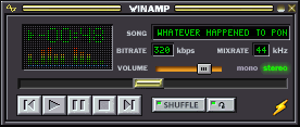
I have vivid memories using web browsers around 2000 or WinAmp 3 back in the mid 90s and they felt like about the same speed as what I get today. Obviously the complexity of our apps have increased by an order of magnitude or two, but the things we're doing with them are not an order of magnitude more complex. In a very real sense it's like you say: we're soaking up all the advances that new hardware is providing, and mostly just because we can.
One thing that drives me crazy nowadays is the bloody telly and the stuff around: insane warming up (boot) times, insane delay for channel switching. The second used to be immediate and the first almost immediate (I am not talking of very very old CRT which needed a long time to warm up the screen, but 80's 90's models were fast).
And then we have to periodically (like weekly) do a hard power-off and re-init, else the bloody thing gets slower and slower every day after a while.
> For every extra cycle the hardware engineers give us, we software engineers figure out some way to soak it up
This seems to be true in way too much of the tech field these days. My go-to example is drive storage. Every year, our hard drives get increasingly larger, by pretty big margins even, but game developers just make bigger and less compressed assets, even though they're not needed.
Animations don't have to mean waiting! In particular, you can freely interact with tabs in iOS Safari (an example the article mentions) while switching between them, even during the animation. Good animations reinforce the relationships between UI elements. They help you remember where you are, how you got there, and how to get back when you're done. We shouldn't throw them out -- we just need to make them work properly.
I think you're right, but I also think that there's very few examples out there of animations that I'd consider within the bounds of making acceptable trade-offs between the usefulness of their visual hinting and their effect on productivity.
For one example, Apple designers are considered amongst the best in the world, but every animation on the iPhone could stand to be 10x faster. It's frustrating for me even just waiting for it to move from an app to the home screen after I hit the "home" button. Even though the animation is relatively short, there's a non-negligible effect on my workflow, and that adds up as I do it a thousand times a week and thousands of times a year.
I'd personally rather see all animations disabled rather than what we have today (or even just an option available to us to do that).
My point is that the animation speed wouldn't matter as much if the transition were implemented properly. Tapping on an app icon during the animation should start switching to that app right away. There's no reason you should be forced to wait at all!
Right above in "Increase Contrast" you can also trigger a "Reduce Transparency" setting which may speed up animations (but admittedly alters the UI style).
It's not yet what we'd want but it's what we have so far.
The root problem is that no one sells software anymore. The vast majority of software is an interface to a service, where the goal is achieving minimal results in minimal time. Only software used by professionals gets the attention required to make quality, mature interfaces.
Yes, very true, but I'm not sure that this necessarily precludes good/fast/usable interfaces.
Imagine if instead of building apps inside a browser, you instead have a good OS framework that allows you to build a native app for which you can ship updates easily and which simply talks to your backend's API. It would be a very similar model to what most of us use today in our browsers, but would open a lot of doors around what we're currently getting wrong with interfaces on the web.
It also already exists in a few limited forms: apps on iOS or Android for example.
Needing to ship updates frequently is the root of the problem, in my mind. If people would just build something they could stand behind, and not rely on any environmental flux corrections to stay useful, software would go back to being quick and minimal.
When I look at games in particular, I'm amazed that you can have AAA titles that get hotfixes for bad bugs on pretty much the day they're released. This is made possible by sophisticated content distribution networks like Playstation's.
Twenty years ago your pressed a master disk, crossed your fingers, and tossed it to the wolves. If there was ever a serious problem discovered after release, it would be a huge hit to your bottom line to ever have to try and recall everything that went out.
Testing must have been much more comprehensive before to make the old system workable.
IMHO good animations are good design. Apple does a great job here. They display the minimum animation necessary for you to understand. You open an app and you see it opening.
Text terminals are terrible for something I need to do every single day: Showing others what I am doing on the computer.
Without animations you are like a person with autism disorder: It works for you but nobody that is watching you can understand what you are doing, you are in your world. You do a key combination you know(but others do not) and the screen changes instantly.
Repeat this a few times and you have a lot of confused people in your audience.
I agree that we need everything: something extremely fast, intuitive while beautiful and useful and extremely easy(and cheap and fast) to program.
But nobody has done it because it is hard as playing violin to be able to design a simple design alone, let alone make it fast. In the real world you need to pick your priorities, to constantly triage and make decisions.
Having animations 100% of the time to help with 1% use case of having an audience (if it even helps, I seriously doubt it) is horrible design. I also doubt that's the reason Apple had for putting them in, designers need to do something to prove they're useful so they add useless little bits of eye candy that really just slow everyone down.
Animations aren't just useful for when you have an audience. They convey a sense of space that's important to help the user orient themselves within the operating system. Things instantly appearing and disappearing is jarring, and you can easily lose your place unless you maintain an internal model of how everything works. Remember, Apple is laser-focused on user experience, and subtle animations are a part of that. Users have a hundred other things to do and the applications they use should be as low of a cognitive burden as possible.
I agree animation can help get oriented with a new system but they quickly get in the way. Some people even like having animations just because of the feel of it and that's fine too. I don't mind UI having the animations as an option, even if it's on by default, I just want a big, fat single button to turn them all off.
Side note: I expected to be downvoted heavily for my original comment given the bad tone (animations are a sore spot for me, I get emotional about it) but some how the opposite happened. Obviously I was 100% correct :) but I should have been less of a dick about it.
> IMHO good animations are good design. Apple does a great job here.
I used to sit next to my boss at a previous job, when I was first hired, so she could show me the ropes. She used a Mac.
Sometimes she'd get mail, but because she was working with me, she wouldn't answer it. And the icon would bounce up and down and bleet, over and over. Microsoft had Clippy, and Apple has Claptrap.
I've found it easier to communicate with people about what I'm doing in a terminal because most things are just command strings that you enter and very few applications actually have interactive GUIs that need to be explained (or learned.)
That's a good point. I think there is necessary and unnecessary animations. The 1password animation mentioned in the article is absolutely unnecessary. Animations should only be used to help the user understand what is happening and they should be fast. There's no reason why a user should wait for an animation to continue doing what they intended to do.
I think a useful way to accomplish a nice compromise between beautiful interfaces and usability is to allow the user to skip animations. For example, if I start typing after an action was performed the animation should skip to the end. In this case the user is clearly familiar with the interface and knows what they want to do next.
I like the spirit of this article. We don't really have a successful paradigm for how to design ambitious user interfaces for power user tools.
But I'm not sure I agree with most of the examples.
For example, Slack isn't really a power user tool. It's a tool that does its job best if everyone in the organization can understand and use it, and making it more like a terminal isn't going to help with that. Speeding it up would still be beneficial, of course. (Also, it looks like there are plenty of terminal clients for Slack if you're in to that.)
Things like animations can actually be very helpful in giving you an almost visceral understanding of the spatial logic of the UI. Without animations it becomes very abstract. It's about balance obviously, using repeated slow animations for branding purposes is not a good idea in a tool like a password manager that you unlock 20 times per day.
It's frustrating to be shoved animations, with no intentionality, purpose.
As a designer, it's concerning that so much of ux design right now is focused on facade. Even among teams that care holistically, the surface level things still take priority.
Nielsen's usability heuristics from 1995 is still, extremely relevant today.
I'm not sure terminal-like interfaces are the way forward, but I have to say that I love the design of this site.
As an aside, you can actually turn off the sliding animation in MacOS spaces. There's a "reduce motion" setting in the accessibility preferences. Although, reducing motion replaces sliding with a glitchy fade animation, so it's swings and roundabouts.
I actually like the sliding animation, it's pretty fast and it shows what's going on. I often use it with the three finger swipe, so it'd be pretty weird to suddenly jump to a different space, but even with Cmd-1/2/3 it helps to orient oneself.
Although when reading ebooks I have page animation disabled, I guess because you mostly proceed to the next page, and there's no context switch it's all reading.
But I also prefer having two monitors for multiple contexts, no amount of virtual desktops with or without animation will beat that.
> Somewhere around the late 90s or early 00s we made the decision to jump ship from desktop apps and start writing the lion’s share of new software for the web.
I would argue that this started much earlier and was because of the problems with distributing, installing, and updating desktop apps. We even had names like "fat client" (it was meant to be pejorative) to refer to traditional desktop apps and "client-less" (it was meant to sound magical) to refer to web apps. There wasn't a problem with desktop development frameworks. There was only one, Windows, and those people who used it enjoyed it.
> HTML and CSS gave developers total visual control over what their interfaces looked like, allowing them to brand them and build experiences that were pixel-perfect according to their own ends. This seemed like a big improvement over more limiting desktop development,
This isn't how I remember it. Developers didn't want total control, but publishers did. Browsers let you select background colors, font colors, sizes, and types. A website was never meant to render exactly the same. But then the publishers entered the picture and they expected a website to behave like a magazine. That's why we had whole websites that were made up of images only. CSS was invented to put a stop to this madness. However, it institutionalized the publishers mindset that websites should render the same everywhere.
Overall a lot of this article can be summed up as "just because you can, doesn't mean you should." As an industry, we do self-restraint very poorly.
Some very interesting thoughts; I've been thinking them myself for some time. With regard to the limitations of terminals (rich media, typography, whitespace), these are limitations of current terminal emulators but are not an intrinsic limitation.
I've often wondered about the history of the terminal emulators we use. From xterm and onward, they have all emulated a basic DEC VT-100. A historical accident, or inertia? The VT-100 wasn't very sophisticated, and most emulators don't even emulate it fully. There were much more featureful terminals succeeding it, with colour and graphics, yet we didn't add support for them. What caused this whole aspect of computing to become stuck in the late 1970s? There are also specifications like ECMA-48 which standardise control for font and size/spacing/justification and a number of layout features, colour selection and much more. It also defines separate data and presentation layers. Mostly unimplemented except for a minimal number implemented by xterm. Some emulators have also implemented rudimentary graphics, wider colour selection, unicode support and mouse reporting, but nothing truly ground breaking.
It strikes me that what's really missing here is the development of a new class of terminal emulator which implements a much more advanced presentation layer. For example a full PS/PDF-style drawing model, and/or OpenGL-style graphics facilities. Combined with an extended set of control codes to manipulate the data layer, you could effectively have a browser rendering engine and DOM equivalent in terminal form. Which could be driven by any language capable of using stdin/stdout, from a shell script to Python and C++. No reason it couldn't be xterm compatible either; there's lots of ways to extend the control code space, and we already have termcap/info to add support for new functionality.
There was a bug in the last version of iOS which, using an obscure series of commands to trigger, turned off all animations. It was amazing how much faster and more responsive the OS felt. It disappeared after each reboot and I eventually got sick of trying to trigger it but it was a good couple of weeks of iOS bliss.
Yes! I saw this too, and it was like a momentary glimpse of Shangri-La before it disappeared back behind the clouds. I'd love to see Apple offer an option to disable all animations, permanently.
Absolutely agree. I find myself frustrated with using iOS Safari when opening a tab in the background - the animation has to finish before I can resume browsing the current page.
I also frequently think back to the OS we had on the Nokia 3310 generation of phones; how easy it was to navigate to exactly what you needed (with shortcuts like menu button > keypad 3 > keypad 2 or something like that). There were no animations to slow down that navigation either.
On the desktop, prelighting _used_ to be a functional aid: as the mouse cursor hovers between two items, the instantaneous lighting of the next and darkening of the previous provided immediate feedback that a click would reach that widget. Chromium and Chrome decided to fade this in and out (countering the whole usefulness of the feature), and now do some sort of lagged/animated mouse surround, which seems to make even less sense.
Have you ever used BeOS or Haiku?
90% of the speed in Haiku is placebo, because it exactly has zero "effects".
Of course it is also a very cleanly designed system and it takes advantage of the parallelism today's processors give us.
If you work for a little while is Haiku, you will find everything else intolerable and slow.
I wish the author had gone into more detail as to how we elevate users to the skill level that they can use more "power user" oriented interfaces. Is it more training for the elderly, more exposure to computers when children are young, a combination, or something else? Per research from the Neilsen Norman Group (https://www.nngroup.com/articles/computer-skill-levels/), the vast majority of users are simply not at a "strong" level of computer skills. As a UX professional, if I had to make a UI that was tailored to the general public, I would specifically focus on power users last since they make up the smallest user group.
That being said, I agree with the opinion about superfluous animations. More programs need to have the ability to turn them off.
Perhaps it would be enough to just stop offering the shiny dumbing-down that are just there for marketing advantage. After all, people could manage to get their things done with DOS, people could manage to get their things done with Windows 3.1, Windows 95, etc., with early Linux. And, except for the last example, I don't mean computer scientist or technically literate people, non, just the average Joe could use those OSes and the software running on it when they wanted to or had to. So if we stop dumbing down people and doing everything to forbid them from learning anything, most of them are able to make the tiny effort it takes to learn at least basic things.
Animations are a lot more useful than no animations, if used correctly.
I love material design's principles on this regard, where animation is used to convey how the app works (where a menu came from, what will happen if clicking on something).
As for the examples, the author needs a faster computer or connection, all the apps mentioned that I've used don't feel sluggish at all. This includes Slack, which although takes a while when first connecting, it runs great after that.
I guess the way I see it is, animation isn't bad, but it can be used ineffectively, but like anything else.
Given that Slack is IRC on steroids, I always think about e.g. the Freenode webchat - it makes you wait something like 20 seconds or so. Yeah, they do it for antispam/antitroll, but the effect (initial delay) is the same.
It seems to straddle between being a CLI and a GUI program.
And it got me thinking that while for Apple and Microsoft it kinda made sense to sideline the CLI and focus on the GUI as their CLI offerings were anemic to be polite, this hard split feels misplaced on unix derived platforms.
Instead the GUI on _nix can be used to enhance the CLI.
I recently had some problems with my smart phone losing battery power too fast, so I started putting it in battery saving mode. I would have expected things to get more sluggish, but I actually experienced quite the opposite. In battery saving mode, most transitional animations are disabled, resulting in an (in my opinion) vastly more responsive experience. Since then, I have went out of my way to disable as many animations as possible, and I have not found myself missing any of them yet.
For any interface state, there are only a few hundred plausible user interactions. CPU cores are getting cheaper and more numerous, so let's speculatively execute all of them and keep the one that was actually chosen. Zero latency interface unless you do something extremely unexpected. The wasted power is irrelevant on desktop, and wouldn't be a serious problem on mobile if we stopped making devices so ridiculously thin. Human time is more valuable than a few watts.
I don't think it's "the terminal" that tends toward composability - rather, it is the shell and some measure of standardization around I/O. I think many people are confused here because the shell typically lives in a terminal, but a lot of terminal applications compose poorly (as opposed to utilities).
That said, I'm super in favor of getting some modern takes on rich terminals going.
> Animations are a particularly egregious visual gimmick
some lightweight animations might work to cover actual loading times.
> The learing curve is steep, but rewarding
That's almost a contradiction, at least considering parts of the curve. If you average an upward curve to a linear function, of course the slope will look less steep over time than it actually is at the time.
> Monospace is the best family of fonts for programming,
Citation needed. Seriously. People state it as fact when it is quite debatable.
I only use a monospaced font because using Vim is more important to me. Otherwise I’d probably switch to the Poly variant of Triplicate, which makes it not-quite-mono.
One problem with the argument...animations are often added for a very good reason.
I suspect in the Slack example, it's to cover for the fact that there's a bunch of network calls being made behind the scenes. A terminal version of Slack wouldn't be that much faster since it would still need to make those network calls.
Also, adding animations can improve the trust that a user has in the product. The CoinStar example is a great one...when they just immediately displayed the count of coins to users, they didn't trust the count because it was too quick. When they added a delay and played the sound of lots of coins bouncing around inside a machine for a while, people start to trust the count. And that's not unique. I've worked on at least 3 projects now where we've done something we felt differentiated our product but, in testing, our users notice. But after adding a delay and animation, we retested it and our users were much more impressed and happy with our product. By making it slow, it was much more apparent that the system was doing something impressive. Never mind the fact that we'd optimized the hell out of queries and made the execution time snappy, it needed to be slow for them to see the value.
Also, animations can be useful to draw the eye to a change that's happening in the system. When something changes in a UI, you can't just expect the user to notice it. The human visual system isn't good at noticing those small deltas without some visual cue to make the change pop.
None of this means that all usages of animations improve the user experience. But nowhere in the article does the author acknowledge that animations can serve an important purpose. We need to take a balanced approach to animations and make sure we test each and every animation we use with users to ensure that it's better than the non-animated alternative.
One other small point, as someone who has developed software for people over the age of 70, I believe the author will be singing a very different tune with regard to "overly-large fonts sizes" once his eyesight starts to deteriorate. I'd actually say that the tendency is actually worse in the other direction...developers make font sizes too small, since they're young and have good eyesight. Apps should be optimized for large font sizes with a setting to allow users that want smaller fonts to choose that. But the number of times I've seen my mother be unable to find the setting to increase the font because the default font is too small is a non-trivial number. And even when I increase it for her, it's a good bet that the app is unusable since that configuration hasn't been tested.
OR perhaps engineers and UI/UX people should be doing the design instead of PMs, sales people, and tight schedules.
Though on the engineering guilt side, add to that dozens of layers of bloat, VMs, interpreted languages, and, "performance doesn't matter, scrum deadlines do" attitudes, and yeah, I bet you end up with 45 second load time for your chat client.
Looks like the author has very vague and wrong idea about computing in the past. With so many factual errors, it is hard to accept it seriously.
> Somewhere around the late 90s or early 00s we made the decision to jump ship from desktop apps and start writing the lion’s share of new software for the web. This was largely for pragmatic reasons: the infrastructure to talk to a remote server became possible for the first time,
I am not sure what this means. Javascript (1995)? or XMLHttpRequest (2005)? You can create web apps without any of this technologies -- they make web apps faster and UX better, but they were not the critical pieces. for example, one of the most famouse webapps of this era -- webmail interfaces such as yahoo.com or hotmail.com -- worked just fine without javascript at all.
> good cross platform UI frameworks had always been elusive beasts,
Technically true, but misleading. This sentence seems to imply that this mattered, and web was somewhat better. Both of these are false. Back in then no one cared about non-windows systems, and the amount of effort required to display site properly on all major browsers was staggering. It was way, way easier to make desktop apps which worked on 99% of all computers than web apps which worked on 99% of the browsers.
> and desktop development frameworks were intimidating compared to more approachable languages like Perl and PHP.
This was a time of VB 6, Java, Delphi, and later this fancy .net thing. Designing a desktop all was drastically simpler that creating a website of the same complexity.
> The other reason was cosmetic: HTML and CSS gave developers total visual control over what their interfaces looked like, allowing them to brand them and build experiences that were pixel-perfect according to their own ends.
This is so false this is not even funny. The desktop apps were trivial to make pixel perfect, the web took a LOT of work (I still remember the countless nested tables with 1x1 images in them)
> This seemed like a big improvement over more limiting desktop development, but its led us to the world we have today where every interface is a different size and shape,...
> Today I installed Google's new email application by typing Alt+D, gmail, Ctrl+Enter. There are far fewer compatibility problems and problems coexisting with other software. Every user of your product is using the same version...
Then the article goes on to advertise the advantages of terminals and "terminal programs": fast startup, no animations, "interface elements are limited", optimized for advanced user, "output that I can process in some way to get into another program"
This is accompanied by a picture of emacs running in a terminal.
The problem with that, of course, is those properties are not bound to "terminal" programs at all. Many software which comes from Linux/Unix world will have all of these properties, even if they do not require terminal to run. Even graphics editors like "gimp" start up fast, have no animations, etc...
Conclusion: the only way this article makes sense if the the author equates "the terminals" with "apps without animation". The author does not seem aware of what the "terminal software" means (all communications go through a single bidirectional pipe).
Notice that the interface (which is extremely customizable, feel free to look up other images, each will be rather different) is more-or-less a tiling window manager with terminals in each window that have rich media, nice fonts, non-ASCII UI elements (albeit ones that seem somewhat stuck in the '90s), etc. Quite bit to learn from there.
So here is the flaw: I am afraid the reason most interfaces that non-technologists have to use cater to intuition and a pleasant appearance rather than rewarding expertise is all to simple: No one wants to spend any time becoming an expert at using a gajillion specialized, but infrequently used, software interfaces, each of which would, according to your ideal, be optimally designed to allow an expert to perform the associated task efficiently and well.
The average person pays off their credit card once a month, and pays their taxes once a year. The incentive for them to learn to do these things more efficiently isn't very compelling, and the number of people who have 20 active credit cards for whom it would be compelling isn't large enough to be worth creating an expert UI for (that may change as another couple of billion people get online, if software markets don't fragment further)
Now, all that said, there is certainly a lot of room for improvement in web-based user interfaces: animations can be faster and more subtle, the use of whitespace can be reduced, typography can be more restrained, decoration and color can be used only when it conveys information (basically, everything Tufte has been telling us for a couple of decades).
Windows' Metro and Modern, and Google's Material, are both nice steps in that direction (with the exception of animation), and each represents a lot of difficult design work by large design and development teams. Less certainly is more, both in the sense of the return it offers but also in the investment required. The simpler and less cluttered a user interface is, the more you have to sweat the tiniest of details. This post on redesigning bits of the Chrome browser's, uh, chrome is a good case in point: https://medium.com/google-design/redesigning-chrome-desktop-...
You can expect user interface redesign churn to slow down only once display resolutions stop climbing (because they have exceeded what can be distinguished by the human eye) and form factors stop changing (because the only remaining meaningful constraints are ergonomic).
> First, there are a few places where non-developers have user interfaces that reward expertise. One prominent example are Bloomberg terminals:
I didn't mean to say that it was just developers that have access to these sorts of power tools, but it is the most common case. I would have actually used Bloomberg terminals as an example to support my arguments, and in general am hugely in favor of this sort of app that rewards the time invested in learning it all the way up to advanced levels.
> The average person pays off their credit card once a month. The incentive for them to learn to do it more efficiently isn't very compelling, and the number of people who have 20 active credit cards for whom it would be compelling isn't large enough to be worth creating an expert UI for.
Yes totally, but what if you had just one common UI that was pretty standard and which your credit card company could easily plug into while building interfaces for their users?
Modern native apps for smartphones are probably the best example there because even though they're not perfectly consistent, at least they have standardized toolbars, navigation, and controls (far beyond what you get on the web). I think this idea could be take even further.
> what if you had just one common UI that was pretty standard
Yes, well, the reasons that is unlikely is because banks need to differentiate their offerings and... you know what, scratch that. Just observe that this hasn't happened on the desktop in the way you describe, though every so often someone does try to reintermediate an industry in that way, which usually only works if you (a) control the distribution platform, so can bundle in the standard UI to the platform, and (b) manage to fool the industry into going along, eg. iTunes, Kindle). Banks, specifically, have yet to fall for any of the attempts along those lines, and there have been quite a few.
The situation is unlikely to change until/unless newly formed banks embrace splitting out the "dumb money pipe" as shared infrastructure and modern standardized interfaces so their value added services are separate (but integrated). To some extent you see glimmers of this in medicine with (almost, but not quite) portable electronic medical records. What progress has come about is solely due to the government ratcheting up the carrots and sticks to get "meaningful use" to happen, and those may get rolled back now.
And there was an article some time back about Norwegian doctors getting floppies mailed to them because they refused to upgrade from their keyboard driven patient journals. This because once they had internalized the keystrokes, they could do them while maintaining eye contact and conversation with the patient.
I like snappy as much as the next guy. But then I switch to another UI and find myself delighting in animations (the very ones the author deprecates). Animation disguise loading times or make them more bearable. They're useful for conveying semantics of actions and relationships. If you choose animations thoughtfully and time them well or make them opt-out, there shouldn be no problem.
I'd also like to address "big fonts": I grew up with UIs from the turn of the millenium and back then I thought professional software had to show a lot of things on the screen and have extensive menus. But I also noticed I could burn a CD much more easily using a free wizard-like version of the burning program than the paid full version. Thanks to mobile, at the price of shortening applications to apps, the world got easier, friendlier, cleaner UIs. While we previously thought that reducing the font size on our websites made them look cooler, now we saw that using big fonts we could make text look good while actually being radable.
So let us not go back to terminals maybe. Let us use the right (visual) tool for the right job.
I also love animations... the first time, and for a short while after. They are new and exciting. But they quickly start to grate, then frustrate, and then become downright annoying. Like the article stated, the MacOS spaces transition wastes time. Animation has its place--progress/loading being one. Or situations where processing takes time and/or you might want to abort the action before it commences. But any time an action could and should have an immediate effect, a transition effect actively impedes the user's workflow. These are unnecessary, and should at a minimum be configurable.
I can see this becoming one of those canonical pages that is still being referenced 10 years later. Being short enough to share and simple enough to understand makes this a great resource. I have tried to convey similar feelings to people who love the applications you've used as examples. Maybe this will help.
Great use of images to demonstrate your points. Many articles lately seem to just add in unrelated images for no reason.
> HTML and CSS gave developers perfect visual control over what their interfaces looked like, allowing them to brand them and build experiences that were pixel-perfect according to their own ends
I'm not sure this is quite right. It takes a ton of work to get an HTML/CSS page to display properly in every browser. I think my response is specifically related to the use of the word "perfect" -- maybe something else like "total" would be more appropriate.
All I could think of while watching the clip from Minority Report was how tired my arms would get from all that full-range motion.
I like the submitted title better than the title on the actual page. You should consider revising it!