I am amazed that their 'huge revelation' was that perhaps they shouldn't be doing huge amounts of dynamic image generation client side.
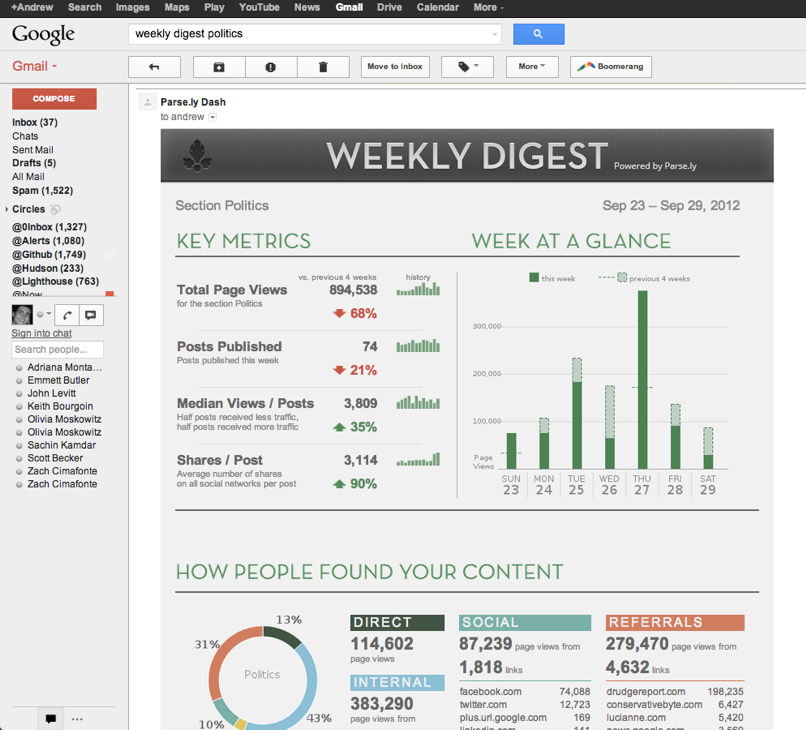
Is the point of this article "we managed to get charts into email"? In places there is a bit too much subjective self-praise for anything other than a sales pitch: "...elegant, beautiful, and timely..." I personally think their greyscale and doughnut charts don't look great.
Absolutely agree. Doughnut charts add nothing but a distraction layer.
I would even go further to say that majority of this dashboard is meaningless, just noise. What it lacks is the Why's..
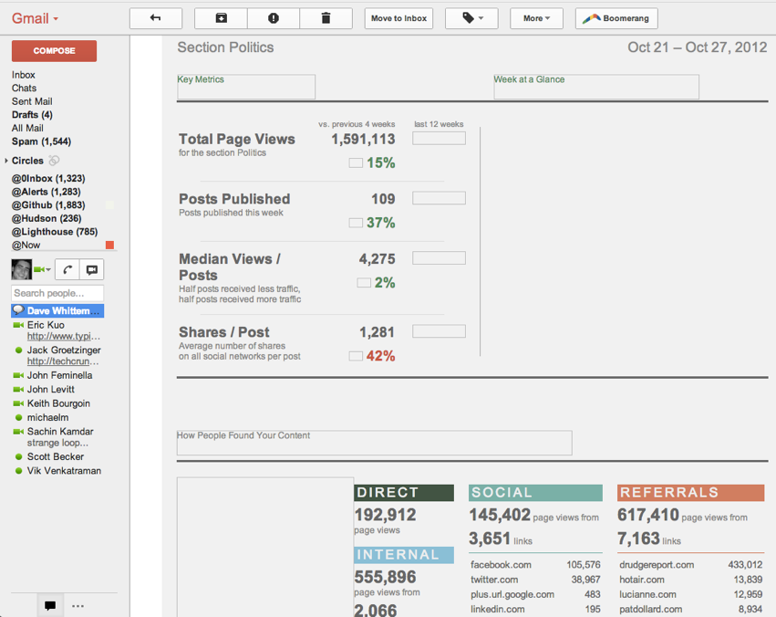
For instance, "Total Page Views" has dropped by 35% in comparison to the previous 4 weeks... why?
The doughnut chart can be reduced to a series of bullet points with a comparative sparkline to identify the main points of change.
Please don't post comments like this. It adds no value and it violates the HN guidelines, since no one who isn't a jerk would say this to someone's face when they were showing their work. You would simply keep it to yourself.
I would argue your post and its tone - "no one who isn't a jerk would say this" - is far more offensive than pointing out that getting charts into email isn't exactly a massive victory for mankind. Pointing out that this post is also self-promotion doesn't hurt either given we see tons of extremely thin blog posts make it to the front page here which are basically adverts for the company of the blogger.
On the contrary, my assumption is that Colliwinks is not a jerk and would never have said that in person, and therefore broke the guidelines (presumably unintentionally) by saying it here. That's why I said "to someone's face" - it's the most important part.
If you go and look for such a thing as a server-side 2D rendering API that will work on a headless linux server and support a nice visualization API comparable to D3 and not pay someone several thousand dollars for a license, you will find that a headless browser that supports SVG is not such a terrible answer.
The same reason that pie charts are not very effective - it's relatively hard to make comparisons between angles instead of lengths like in a bar chart. It's probably even harder with a doughnut.
That's a compelling article and I think I'm going to be a lot more cautious about using pie charts in the future, but the thin-doughnut design they're using here looks OK to me.
When you're summarizing coarse relative size across arbitrary categories, bar charts and tables give your selection of categories too much weight: everyone looks at the biggest bar or the biggest number and it's really hard to measure a long tail distribution visually.
If the message you're trying to send is, "nothing but X and Y matter, everything else combined is tiny", I still can't imagine a better visualization than a pie (or a doughnut).
You're absolutely right. Everyone harps on pie charts for being awful for element-to-element comparisons. This mainly stems from Tufte's work and experiments from Cleveland and McGill.
However, in part-to-whole relationship tasks, pie charts can outperform bar charts, since in bar charts there is no true "whole".
Beautiful. I ended up resorting to RMagick and some custom charting code to build personalized infographics for the weekly digests that Planscope sends out.
Weekly digests + sexy charts = unbelievable upticks in retention. It's also a great way to push product updates and blog posts directly to your customers.
Awesome article! Loved the mashup in technologies.
Just wanted to point out: Although the title/article emphasizes d3, I think additional emphasis should be put on PhantomJS. There are a lot of complexities with implementing a headless browser. Libraries, such as Rhino and Selenium, have fallen short. PhantomJS really has created a nice balance for developers.
Bottom line: if you need reports you should be thinking about phantomJS. There are other projects like wkhmltopdf but I think phantom is better and more flexible.
Phantom sites on top of QTWebKit (and more specifically QTWebFrame/Page) so the code is quite approachable if you want to look under the hood. I think the only downside is that QTWebKit lags a bit so a competing technology built on chromium would be even better. The other downside of course is that your rendering needs are significantly higher than generating text based email (if you are at significant volume).
I should also note: if you want to go this approach you might have luck embedding the generate report image in a dataURL so the user doesn't have to turn on images to see the data. However, I don't know if that works in all browsers or web mail clients.
Great article. We are doing something very similar with phantomjs to generate daily digests of our client dashboard for customers. Are you pointing the img tag to an external URL or are you inline embedding the image in the email? I notice that some email clients like mail.app and sparrow will replicate the attached image twice when you inline embed the image as an attachement. This is because it will render the body of the email but then show the attachement below the body (as an attachement preview). Wondering if you guys ran into a similar issue.
Could someone point out examples of visualizations that make a big difference. I've spent quite a bit of time creating maps and graphs for corporate bigwigs and it always just seems like eye candy. It seems like a list with percentages, instead of fancy graphs, is often just as good and way cheaper.
Aside: I understand trends like stock value over time can be useful to see in a chart, but often times other charts seem unnecessary to me.
Good visualizations show trends that would take longer to discover by reading the numbers. They're a lot more user friendly, too.
I think they're a great communication tool between the technical people and everyone else, and it creates a simpler dialog. "Why is there such a big drop in the graph here" "Well, our traffic was lower because..."
I think it's also an emotional/psychological thing. Business people like to see upwards trends! It makes them more confident in the business.
etc. I'm sure there are far more qualified people to answer this.
Graphics help make stories memorable. There is a well-documented physiological phenomena called the “picture superiority effect.” Stories told with pictures and words are more memorable than when told verbally or with words alone. See http://en.wikipedia.org/wiki/Picture_superiority_effect
I'd say, yes numerical is often just as good, but not always. Also, in my opinion, whether information is displayed numerically or visually, the key is to be as minimalistic as possible.
Lots of text is hostile. Much business runs on PowerPoint. A visualization competes for attention. In rare cases it encodes analytic information graphically. Like distances on a map, or the rate of job growth in a line slope, etc.
>and it always just seems like eye candy. It seems like a list with percentages, instead of fancy graphs, is often just as good and way cheaper.
It seems like a lot of engineering type folks just won't accept that most people would rather look at a colorful picture than a list of percentages. If you gave me a choice between looking at a fancy graph that took up more space and showed less data and a list of numbers, I'll take the graph every time. Because I'm a human, and humans get bored easily, and humans appreciate art and color.
Don't downplay the importance of eye candy. People like eye candy, just like they like mouth candy. Sure, eating raw sugar is rationally stupid especially when there are many more logical, healthy choices out there. But sometimes you just want to taste something really really sweet; sometimes you really would just rather look at something really pretty.
A picture should not be worth a thousand words. Any chart included in a report should be an illustration of a single sentence like "sales are way up this quarter" or "visit frequency is highly correlated to user age".
  I wondered: could we perhaps get PhantomJS to run our data
  visualization on the server, capture the rendered output,
  and then assemble an email with light HTML, CSS, and
  rendered images?
This server side rendering technique is a quite powerful one. I've used it in a couple of projects and expect to see it used more often as people incorporate it into their tool kits.
Much more brittle, handicapping, and more expensive to boot. What if the user wants to zoom in a portion of the data, ignore all but top 3 categories, pan over 100s of points in a series?
If you think about it, it's no more brittle than ajax calls that return HTML. Having used this technique successfully, I know it works and can work well.
I don't recall any handicap at all.
Yes, this kind of solution requires more resources.
Yes, if zoom, filtering, panning and other interaction is required, then the server would have to output SVG and some javascript to manipulate it.
These objections are all worth raising but do not negate the power of this kind of solution. For certain categories of highly interaction apps with a large amount of image or data processing, doing all the work on the client side is a really bad idea, given the wide varieties of client capabilities and available bandwidth.
This is similar to how we do our email delivery of dashboards at Indicee (http://www.indicee.com)
We don't use D3 for our visualizations (I'd love to, but our users can use the dashboards "live" and, well... Internet Explorer 8) and we snapshot the entire dashboard - which isn't quite as clever as what is done here, but does have the advantage that the resulting mail is self-contained and does not require the dynamically generated images to be hosted somewhere.
Like these guys, I have nothing but good things to say about PhantomJS. We'd previously used another "headless webkit" - wkhtmltoimage - in a similar role but Phantom's design as a general purpose scripting engine for headless browsing tasks is much, much more useful.
I know I cannot be the only person who sees this and thinks text only emails are still the way to go. If you are going to generate something like this maybe you should just make it a pdf and attach it to the email. HTML emails are still a bad idea.
Interesting approach, and nice work. I did something similar a few years ago to generate dashboard screens for a digital signage product. I used svg templates I'd initially create in Inkscape, and erubis to handle XML valid embedded ruby. Inkscape has an amazing command line that handled converting the resulting SVG document into PNG or PDF.
I liked the idea of using regular HTML and CSS, but pre-phantomjs the closest I could come was princeXML, and even then it lacked js support and the licensing costs were pretty high.
I looked through the parse.ly homepage and even in the source code of the blog post, can someone answer a quick question:
How does parse.ly actually work? Do you sign up for Google Analytics and open it to them to they get the data from there?
Or do you embed a piece of javascript from parse.ly which tracks the referers, etc. in their database?
I did not want to sign up just to learn this and there was no technical information or FAQ on the homepage or I overlooked it!
I just the other day looked at phantomjs and ended up using casperjs on top as it allowed to use standard selectors to pick the elements I wanted to capture.
domshot is a Python API that lets you include JavaScript / CSS modules (e.g. jQuery, d3.js, your brand style). You then render PNGs using from Jinja2 templates. Under the hood, what it does is render static HTML from the Jinja2 template, open a PhantomJS headless browser instance on that page, and then render it into a PNG.
This way with a few lines of code, you can go from Jinja2 template -> rendered PNG without having to worry about the details of passing information back-and-forth between your Python app and a PhantomJS instance.
Sound interesting? We're planning on open sourcing it. Ping us (hello at parsely dot com) and we'll notify you of when it's available.
It would be open source already, but we're a bit backlogged on spare time projects at the moment. We just made an open source release of http://schema.to a couple weeks ago, and now Sandy struck so we find ourselves catching up. But, soon!
Is the point of this article "we managed to get charts into email"? In places there is a bit too much subjective self-praise for anything other than a sales pitch: "...elegant, beautiful, and timely..." I personally think their greyscale and doughnut charts don't look great.